パーティクルは、3D 空間に粒子を発生させ粒子に様々な形状や効果を割り当てて動きのある表示を作成します。
HTML(index.html)
<!DOCTYPE html>
<html lang="ja">
<!-- 参考サイト
Webサイトに華やかな表現を!
HTML5用パーティクルライブラリ「ParticleJS」を公開
https://ics.media/entry/11172/
-->
<!--
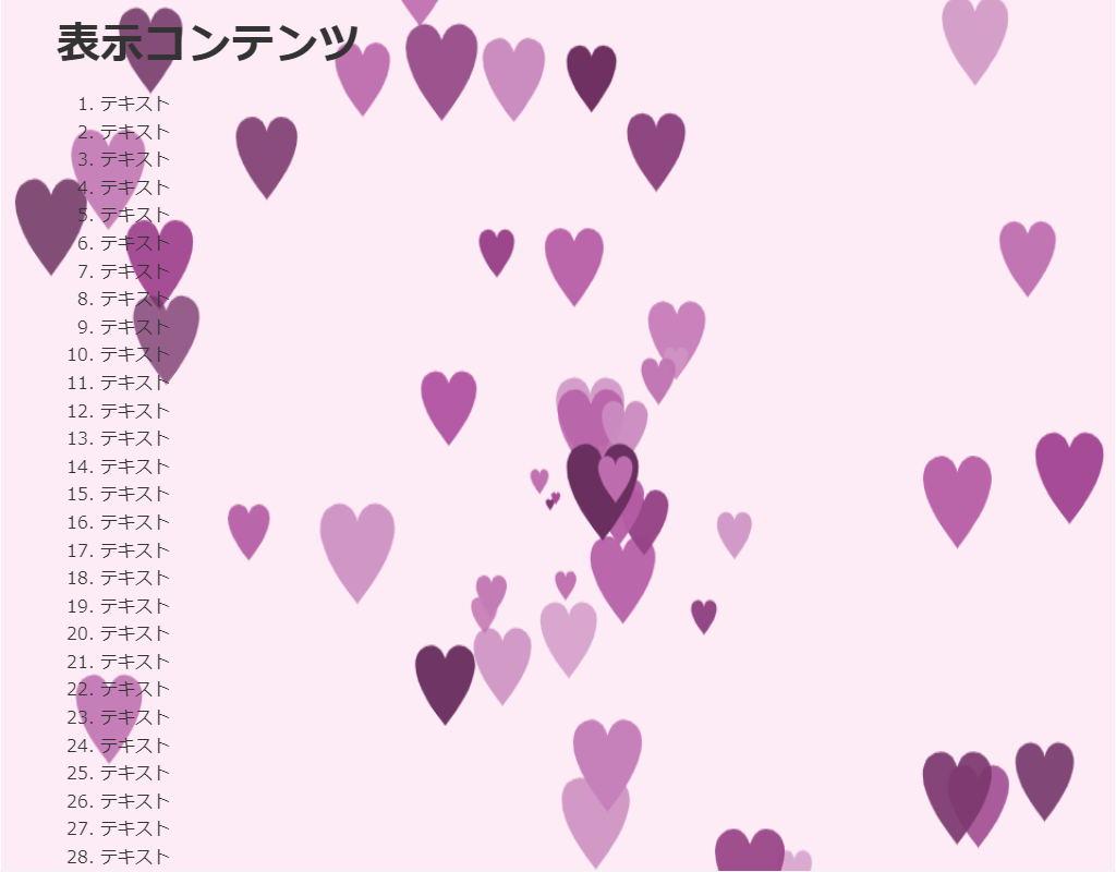
・ハートを生成します。
・カーソルを動かすとハートを生成する場所を移動できます。
・ParticleJSライブラリィを使用しています。
・Particle Devleop を使用すると生成するパーティクルを作成できます。
https://ics-creative.github.io/project-particle-develop/
-->
<head>
<meta charset="UTF-8">
<title>パーティクル(ParticleJS)のサンプル</title>
<meta name="viewport" content="width=device-width,initial-scale=1.0,viewport-fit=cover">
<style>
body,div,h1,h2,h3,h4,h5,h6,pre,p,a,select,header,nav,main,section,footer,ul,ol,li,label {
padding: 0;
margin: 0;
font-size: 16px;
line-height: 1.6;
word-wrap: break-word;
box-sizing: border-box;
}
body {
font-family: "Hiragino Sans W3", "Hiragino Kaku Gothic ProN", "ヒラギノ角ゴ ProN W3", "メイリオ", "Meiryo", "MS Pゴシック", "MS PGothic", sans-serif;
}
.container {
border: #fff 1px solid;
}
.wrapper {
max-width: 960px;
margin: 0 auto;
padding: 0 20px;
color: #333;
background: #00000000;
}
h1 {
font-size: 2.5rem;
padding: 10px 0;
}
ol {
margin-left: 40px;
}
/* ▼▼▼ CSS(ここから)(※2) ▼▼▼ */
/* パーティクル(ParticleJS)の設定 */
/* アニメーション枠指定 */
.back-container {
width: 100%;
height: 100vh;
overflow: hidden;
position: fixed;
top: 0;
left: 0;
z-index: -1;
}
.back-container canvas {
width: 100%;
height: 100%;
background-color: #fdebf5;
}
/* ▲▲▲ CSS(ここまで) ▲▲▲ */
</style>
</head>
<body>
<div class="container">
<div class="wrapper">
<h1>表示コンテンツ</h1>
<ol>
<li>テキスト</li><li>テキスト</li><li>テキスト</li><li>テキスト</li><li>テキスト</li> <!-- 01~05行 -->
<li>テキスト</li><li>テキスト</li><li>テキスト</li><li>テキスト</li><li>テキスト</li> <!-- 06~10行 -->
<li>テキスト</li><li>テキスト</li><li>テキスト</li><li>テキスト</li><li>テキスト</li> <!-- 11~15行 -->
<li>テキスト</li><li>テキスト</li><li>テキスト</li><li>テキスト</li><li>テキスト</li> <!-- 16~20行 -->
<li>テキスト</li><li>テキスト</li><li>テキスト</li><li>テキスト</li><li>テキスト</li> <!-- 21~25行 -->
<li>テキスト</li><li>テキスト</li><li>テキスト</li><li>テキスト</li><li>テキスト</li> <!-- 26~30行 -->
<li>テキスト</li><li>テキスト</li><li>テキスト</li><li>テキスト</li><li>テキスト</li> <!-- 31~35行 -->
<li>テキスト</li><li>テキスト</li><li>テキスト</li><li>テキスト</li><li>テキスト</li> <!-- 36~40行 -->
<li>テキスト</li><li>テキスト</li><li>テキスト</li><li>テキスト</li><li>テキスト</li> <!-- 41~45行 -->
<li>テキスト</li><li>テキスト</li><li>テキスト</li><li>テキスト</li><li>テキスト</li> <!-- 46~50行 -->
<li>テキスト</li><li>テキスト</li><li>テキスト</li><li>テキスト</li><li>テキスト</li> <!-- 51~55行 -->
<li>テキスト</li><li>テキスト</li><li>テキスト</li><li>テキスト</li><li>テキスト</li> <!-- 56~60行 -->
<li>テキスト</li><li>テキスト</li><li>テキスト</li><li>テキスト</li><li>テキスト</li> <!-- 61~65行 -->
<li>テキスト</li><li>テキスト</li><li>テキスト</li><li>テキスト</li><li>テキスト</li> <!-- 66~70行 -->
</ol>
</div>
<!-- ▼▼▼ HTML(ここから) ▼▼▼(※3) -->
<!-- パーティクル(ParticleJS)の定義 -->
<div class="back-container" id="back-container">
<canvas width="960" height="540" id="myCanvas"></canvas>
</div>
</canvas>
</div>
<!-- ▲▲▲ HTML(ここまで) ▲▲▲ -->
</div>
<!-- ▼▼▼ SCRIPT(ここから)(※4) ▼▼▼ -->
<!-- パーティクル(ParticleJS)の制御 -->
<script src="https://code.createjs.com/1.0.0/createjs.min.js"></script>
<script src="https://cdn.rawgit.com/ics-creative/ParticleJS/release/1.0.0/libs/particlejs.min.js"></script>
<script>
var particleSystem = null;
var stage = null;
window.addEventListener("load", function () {
stage = new createjs.Stage("myCanvas");
particleSystem = new particlejs.ParticleSystem();
stage.addChild(particleSystem.container);
// パーティクルパラメータJSONの作成は、Particle Devleop を使用
// https://ics-creative.github.io/project-particle-develop/
particleSystem.importFromJson(
// パラメーターJSONのコピー&ペースト ここから--
{
"bgColor": "#00000",
"width": 960,
"height": 540,
"emitFrequency": "60",
"startX": 524,
"startXVariance": "0",
"startY": 295,
"startYVariance": "0",
"initialDirection": "0",
"initialDirectionVariance": "360",
"initialSpeed": 6,
"initialSpeedVariance": "0",
"friction": "0",
"accelerationSpeed": "0",
"accelerationDirection": "0",
"startScale": "0.5",
"startScaleVariance": 1,
"finishScale": 1,
"finishScaleVariance": "0",
"lifeSpan": 66,
"lifeSpanVariance": 146,
"startAlpha": 1,
"startAlphaVariance": 0.5,
"finishAlpha": "1",
"finishAlphaVariance": 0.5,
"shapeIdList": [
"heart"
],
"startColor": {
"hue": 311,
"hueVariance": "0",
"saturation": 38,
"saturationVariance": 0,
"luminance": 50,
"luminanceVariance": 50
},
"blendMode": false,
"alphaCurveType": "0",
"VERSION": "1.0.0"
}
// パラメーターJSONのコピー&ペースト ここまで---
);
createjs.Ticker.framerate = 60;
createjs.Ticker.timingMode = createjs.Ticker.RAF;
createjs.Ticker.addEventListener("tick", handleTick);
});
function handleTick() {
if ((stage.mouseX != 0) || (stage.mouseY != 0)) {
particleSystem.startX = stage.mouseX;
particleSystem.startY = stage.mouseY;
}
particleSystem.update();
stage.update();
}
</script>
<!-- ▲▲▲ SCRIPT(ここまで) ▲▲▲ -->
</body>
</html>
HTML(index.html)
<!DOCTYPE html>
<html lang="ja">
<!-- 参考サイト
Webサイトに華やかな表現を!
HTML5用パーティクルライブラリ「ParticleJS」を公開
https://ics.media/entry/11172/
-->
<!--
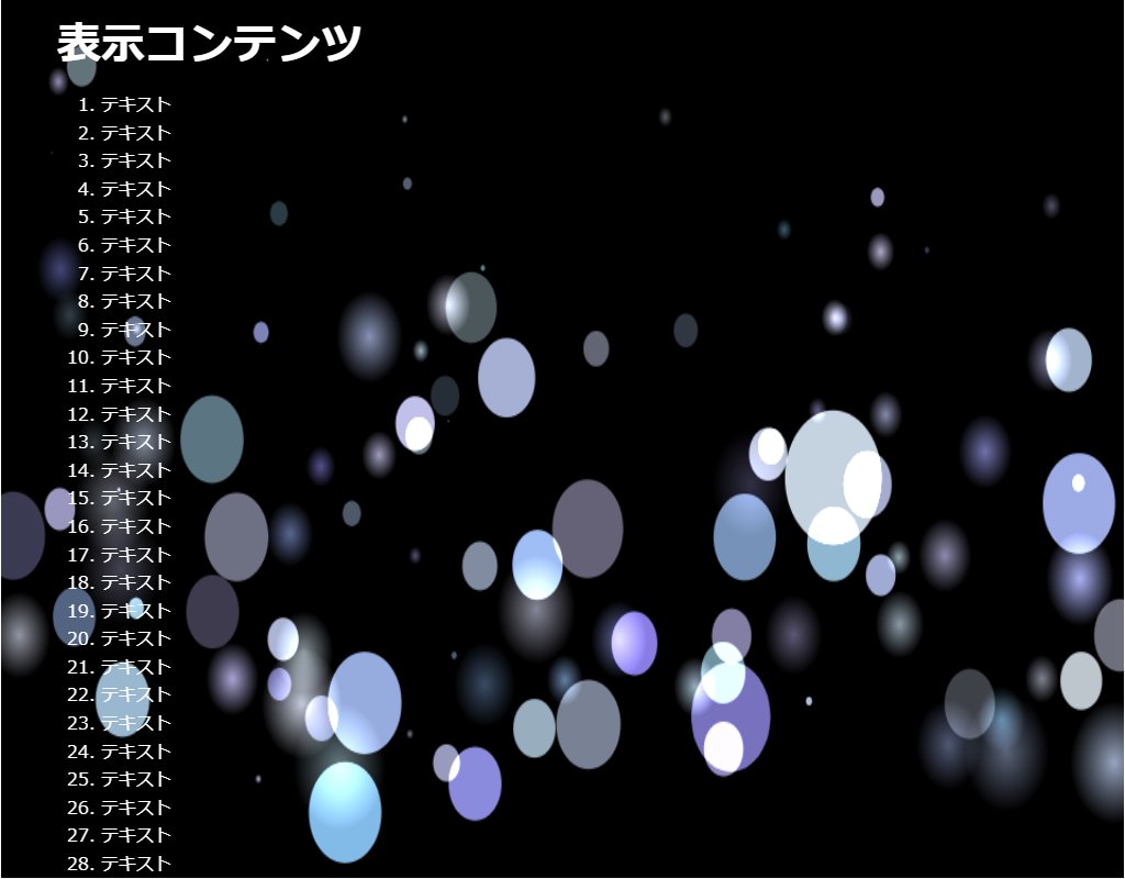
・光の玉を生成します。
・ParticleJSライブラリィを使用しています。
・Particle Devleop を使用すると生成するパーティクルを作成できます。
https://ics-creative.github.io/project-particle-develop/
-->
<head>
<meta charset="UTF-8">
<title>パーティクル(ParticleJS)のサンプル</title>
<meta name="viewport" content="width=device-width,initial-scale=1.0,viewport-fit=cover">
<style>
body,div,h1,h2,h3,h4,h5,h6,pre,p,a,select,header,nav,main,section,footer,ul,ol,li,label {
padding: 0;
margin: 0;
font-size: 16px;
line-height: 1.6;
word-wrap: break-word;
box-sizing: border-box;
}
body {
font-family: "Hiragino Sans W3", "Hiragino Kaku Gothic ProN", "ヒラギノ角ゴ ProN W3", "メイリオ", "Meiryo", "MS Pゴシック", "MS PGothic", sans-serif;
}
.container {
border: #fff 1px solid;
}
.wrapper {
max-width: 960px;
margin: 0 auto;
padding: 0 20px;
color: #fff;
background: #00000000;
}
h1 {
font-size: 2.5rem;
padding: 10px 0;
}
ol {
margin-left: 40px;
}
/* ▼▼▼ CSS(ここから)(※2) ▼▼▼ */
/* パーティクル(ParticleJS)の設定 */
/* アニメーション枠指定 */
.back-container {
width: 100%;
height: 100vh;
overflow: hidden;
position: fixed;
top: 0;
left: 0;
z-index: -1;
}
.back-container canvas {
width: 100%;
height: 100%;
background-color: #000;
}
/* ▲▲▲ CSS(ここまで) ▲▲▲ */
</style>
</head>
<body>
<div class="container">
<div class="wrapper">
<h1>表示コンテンツ</h1>
<ol>
<li>テキスト</li><li>テキスト</li><li>テキスト</li><li>テキスト</li><li>テキスト</li> <!-- 01~05行 -->
<li>テキスト</li><li>テキスト</li><li>テキスト</li><li>テキスト</li><li>テキスト</li> <!-- 06~10行 -->
<li>テキスト</li><li>テキスト</li><li>テキスト</li><li>テキスト</li><li>テキスト</li> <!-- 11~15行 -->
<li>テキスト</li><li>テキスト</li><li>テキスト</li><li>テキスト</li><li>テキスト</li> <!-- 16~20行 -->
<li>テキスト</li><li>テキスト</li><li>テキスト</li><li>テキスト</li><li>テキスト</li> <!-- 21~25行 -->
<li>テキスト</li><li>テキスト</li><li>テキスト</li><li>テキスト</li><li>テキスト</li> <!-- 26~30行 -->
<li>テキスト</li><li>テキスト</li><li>テキスト</li><li>テキスト</li><li>テキスト</li> <!-- 31~35行 -->
<li>テキスト</li><li>テキスト</li><li>テキスト</li><li>テキスト</li><li>テキスト</li> <!-- 36~40行 -->
<li>テキスト</li><li>テキスト</li><li>テキスト</li><li>テキスト</li><li>テキスト</li> <!-- 41~45行 -->
<li>テキスト</li><li>テキスト</li><li>テキスト</li><li>テキスト</li><li>テキスト</li> <!-- 46~50行 -->
<li>テキスト</li><li>テキスト</li><li>テキスト</li><li>テキスト</li><li>テキスト</li> <!-- 51~55行 -->
<li>テキスト</li><li>テキスト</li><li>テキスト</li><li>テキスト</li><li>テキスト</li> <!-- 56~60行 -->
<li>テキスト</li><li>テキスト</li><li>テキスト</li><li>テキスト</li><li>テキスト</li> <!-- 61~65行 -->
<li>テキスト</li><li>テキスト</li><li>テキスト</li><li>テキスト</li><li>テキスト</li> <!-- 66~70行 -->
</ol>
</div>
<!-- ▼▼▼ HTML(ここから) ▼▼▼(※3) -->
<!-- パーティクル(ParticleJS)の定義 -->
<div class="back-container" id="back-container">
<canvas width="960" height="540" id="myCanvas"></canvas>
</div>
</canvas>
</div>
<!-- ▲▲▲ HTML(ここまで) ▲▲▲ -->
</div>
<!-- ▼▼▼ SCRIPT(ここから)(※4) ▼▼▼ -->
<!-- パーティクル(ParticleJS)の制御 -->
<script src="https://code.createjs.com/1.0.0/createjs.min.js"></script>
<script src="https://cdn.rawgit.com/ics-creative/ParticleJS/release/1.0.0/libs/particlejs.min.js"></script>
<script>
var particleSystem = null;
var stage = null;
window.addEventListener("load", function () {
stage = new createjs.Stage("myCanvas");
particleSystem = new particlejs.ParticleSystem();
stage.addChild(particleSystem.container);
// パーティクルパラメータJSONの作成は、Particle Devleop を使用
// https://ics-creative.github.io/project-particle-develop/
particleSystem.importFromJson(
// パラメーターJSONのコピー&ペースト ここから--
{
"bgColor": "#00000",
"width": 960,
"height": 540,
"emitFrequency": "100",
"startX": 482,
"startXVariance": 960,
"startY": 396,
"startYVariance": "222",
"initialDirection": "0",
"initialDirectionVariance": "360",
"initialSpeed": "2",
"initialSpeedVariance": "3.7",
"friction": "0.038",
"accelerationSpeed": "0.13",
"accelerationDirection": "273.3",
"startScale": 1,
"startScaleVariance": 0.79,
"finishScale": "0",
"finishScaleVariance": "0",
"lifeSpan": "50",
"lifeSpanVariance": "196",
"startAlpha": "1",
"startAlphaVariance": "0",
"finishAlpha": "0.35",
"finishAlphaVariance": 0.5,
"shapeIdList": [
"blur_circle",
"circle"
],
"startColor": {
"hue": 222,
"hueVariance": "55",
"saturation": "71",
"saturationVariance": "78",
"luminance": "83",
"luminanceVariance": "16"
},
"blendMode": true,
"alphaCurveType": "1"
}
// パラメーターJSONのコピー&ペースト ここまで---
);
createjs.Ticker.framerate = 60;
createjs.Ticker.timingMode = createjs.Ticker.RAF;
createjs.Ticker.addEventListener("tick", handleTick);
});
function handleTick() {
particleSystem.update();
stage.update();
}
</script>
<!-- ▲▲▲ SCRIPT(ここまで) ▲▲▲ -->
</body>
</html>
HTML(index.html)
<!DOCTYPE html>
<html lang="ja">
<!-- 参考サイト
Webサイトに華やかな表現を!
HTML5用パーティクルライブラリ「ParticleJS」を公開
https://ics.media/entry/11172/
-->
<!--
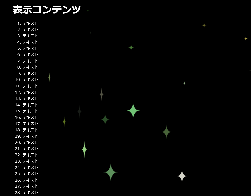
・星を生成します。
・ParticleJSライブラリィを使用しています。
・Particle Devleop を使用すると生成するパーティクルを作成できます。
https://ics-creative.github.io/project-particle-develop/
-->
<head>
<meta charset="UTF-8">
<title>パーティクル(ParticleJS)</title>
<meta name="viewport" content="width=device-width,initial-scale=1.0,viewport-fit=cover">
<style>
body,div,h1,h2,h3,h4,h5,h6,pre,p,a,select,header,nav,main,section,footer,ul,ol,li,label {
padding: 0;
margin: 0;
font-size: 16px;
line-height: 1.6;
word-wrap: break-word;
box-sizing: border-box;
}
body {
font-family: "Hiragino Sans W3", "Hiragino Kaku Gothic ProN", "ヒラギノ角ゴ ProN W3", "メイリオ", "Meiryo", "MS Pゴシック", "MS PGothic", sans-serif;
}
.container {
border: #fff 1px solid;
}
.wrapper {
max-width: 960px;
margin: 0 auto;
padding: 0 20px;
color: #fff;
background: #00000000;
}
h1 {
font-size: 2.5rem;
padding: 10px 0;
}
ol {
margin-left: 40px;
}
/* ▼▼▼ CSS(ここから)(※2) ▼▼▼ */
/* パーティクル(ParticleJS)の設定 */
/* アニメーション枠指定 */
.back-container {
width: 100%;
height: 100vh;
overflow: hidden;
position: fixed;
top: 0;
left: 0;
z-index: -1;
}
.back-container canvas {
width: 100%;
height: 100%;
background-color: #000;
}
/* ▲▲▲ CSS(ここまで) ▲▲▲ */
</style>
</head>
<body>
<div class="container">
<div class="wrapper">
<h1>表示コンテンツ</h1>
<ol>
<li>テキスト</li><li>テキスト</li><li>テキスト</li><li>テキスト</li><li>テキスト</li> <!-- 01~05行 -->
<li>テキスト</li><li>テキスト</li><li>テキスト</li><li>テキスト</li><li>テキスト</li> <!-- 06~10行 -->
<li>テキスト</li><li>テキスト</li><li>テキスト</li><li>テキスト</li><li>テキスト</li> <!-- 11~15行 -->
<li>テキスト</li><li>テキスト</li><li>テキスト</li><li>テキスト</li><li>テキスト</li> <!-- 16~20行 -->
<li>テキスト</li><li>テキスト</li><li>テキスト</li><li>テキスト</li><li>テキスト</li> <!-- 21~25行 -->
<li>テキスト</li><li>テキスト</li><li>テキスト</li><li>テキスト</li><li>テキスト</li> <!-- 26~30行 -->
<li>テキスト</li><li>テキスト</li><li>テキスト</li><li>テキスト</li><li>テキスト</li> <!-- 31~35行 -->
<li>テキスト</li><li>テキスト</li><li>テキスト</li><li>テキスト</li><li>テキスト</li> <!-- 36~40行 -->
<li>テキスト</li><li>テキスト</li><li>テキスト</li><li>テキスト</li><li>テキスト</li> <!-- 41~45行 -->
<li>テキスト</li><li>テキスト</li><li>テキスト</li><li>テキスト</li><li>テキスト</li> <!-- 46~50行 -->
<li>テキスト</li><li>テキスト</li><li>テキスト</li><li>テキスト</li><li>テキスト</li> <!-- 51~55行 -->
<li>テキスト</li><li>テキスト</li><li>テキスト</li><li>テキスト</li><li>テキスト</li> <!-- 56~60行 -->
<li>テキスト</li><li>テキスト</li><li>テキスト</li><li>テキスト</li><li>テキスト</li> <!-- 61~65行 -->
<li>テキスト</li><li>テキスト</li><li>テキスト</li><li>テキスト</li><li>テキスト</li> <!-- 66~70行 -->
</ol>
</div>
<!-- ▼▼▼ HTML(ここから) ▼▼▼(※3) -->
<!-- パーティクル(ParticleJS)の定義 -->
<div class="back-container" id="back-container">
<canvas width="960" height="540" id="myCanvas"></canvas>
</div>
</canvas>
</div>
<!-- ▲▲▲ HTML(ここまで) ▲▲▲ -->
</div>
<!-- ▼▼▼ SCRIPT(ここから)(※4) ▼▼▼ -->
<!-- パーティクル(ParticleJS)の制御 -->
<script src="https://code.createjs.com/1.0.0/createjs.min.js"></script>
<script src="https://cdn.rawgit.com/ics-creative/ParticleJS/release/1.0.0/libs/particlejs.min.js"></script>
<script>
var particleSystem = null;
var stage = null;
window.addEventListener("load", function () {
stage = new createjs.Stage("myCanvas");
particleSystem = new particlejs.ParticleSystem();
stage.addChild(particleSystem.container);
// パーティクルパラメータJSONの作成は、Particle Devleop を使用
// https://ics-creative.github.io/project-particle-develop/
particleSystem.importFromJson(
// パラメーターJSONのコピー&ペースト ここから--
{
"bgColor": "#00000",
"width": 960,
"height": 540,
"emitFrequency": 30,
"startX": 524,
"startXVariance": 960,
"startY": 295,
"startYVariance": 540,
"initialDirection": 0,
"initialDirectionVariance": 0,
"initialSpeed": 2,
"initialSpeedVariance": 7,
"friction": 0,
"accelerationSpeed": 0,
"accelerationDirection": "0",
"startScale": 0.5,
"startScaleVariance": 1,
"finishScale": 0.5,
"finishScaleVariance": 1,
"lifeSpan": 50,
"lifeSpanVariance": 250,
"startAlpha": 0.5,
"startAlphaVariance": 1,
"finishAlpha": "0.34",
"finishAlphaVariance": 0.5,
"shapeIdList": [
"kirakira2",
"kirakira"
],
"startColor": {
"hue": "88",
"hueVariance": 78,
"saturation": "76",
"saturationVariance": "0",
"luminance": "77",
"luminanceVariance": "46"
},
"blendMode": true,
"alphaCurveType": "1",
"VERSION": "1.0.0"
}
// パラメーターJSONのコピー&ペースト ここまで---
);
createjs.Ticker.framerate = 60;
createjs.Ticker.timingMode = createjs.Ticker.RAF;
createjs.Ticker.addEventListener("tick", handleTick);
});
function handleTick() {
particleSystem.update();
stage.update();
}
</script>
<!-- ▲▲▲ SCRIPT(ここまで) ▲▲▲ -->
</body>
</html>
HTML(index.html)
<!DOCTYPE html>
<html lang="ja">
<!-- 参考サイト
Webサイトに華やかな表現を!
HTML5用パーティクルライブラリ「ParticleJS」を公開
https://ics.media/entry/11172/
-->
<!--
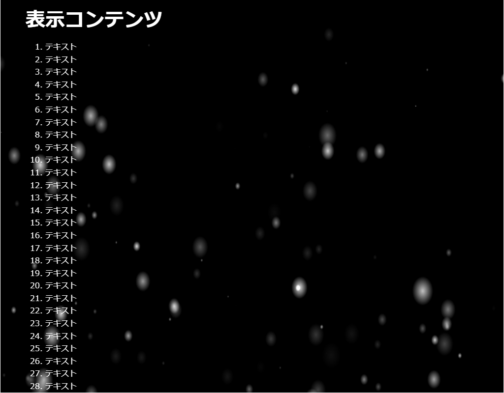
・雪を生成します。
・ParticleJSライブラリィを使用しています。
・Particle Devleop を使用すると生成するパーティクルを作成できます。
https://ics-creative.github.io/project-particle-develop/
-->
<head>
<meta charset="UTF-8">
<title>パーティクル(ParticleJS)のサンプル</title>
<meta name="viewport" content="width=device-width,initial-scale=1.0,viewport-fit=cover">
<style>
body,div,h1,h2,h3,h4,h5,h6,pre,p,a,select,header,nav,main,section,footer,ul,ol,li,label {
padding: 0;
margin: 0;
font-size: 16px;
line-height: 1.6;
word-wrap: break-word;
box-sizing: border-box;
}
body {
font-family: "Hiragino Sans W3", "Hiragino Kaku Gothic ProN", "ヒラギノ角ゴ ProN W3", "メイリオ", "Meiryo", "MS Pゴシック", "MS PGothic", sans-serif;
}
.container {
border: #fff 1px solid;
}
.wrapper {
max-width: 960px;
margin: 0 auto;
padding: 0 20px;
color: #fff;
background: #00000000;
}
h1 {
font-size: 2.5rem;
padding: 10px 0;
}
ol {
margin-left: 40px;
}
/* ▼▼▼ CSS(ここから)(※2) ▼▼▼ */
/* パーティクル(ParticleJS)の設定 */
/* アニメーション枠指定 */
.back-container {
width: 100%;
height: 100vh;
overflow: hidden;
position: fixed;
top: 0;
left: 0;
z-index: -1;
}
.back-container canvas {
width: 100%;
height: 100%;
background-color: #000;
}
/* ▲▲▲ CSS(ここまで) ▲▲▲ */
</style>
</head>
<body>
<div class="container">
<div class="wrapper">
<h1>表示コンテンツ</h1>
<ol>
<li>テキスト</li><li>テキスト</li><li>テキスト</li><li>テキスト</li><li>テキスト</li> <!-- 01~05行 -->
<li>テキスト</li><li>テキスト</li><li>テキスト</li><li>テキスト</li><li>テキスト</li> <!-- 06~10行 -->
<li>テキスト</li><li>テキスト</li><li>テキスト</li><li>テキスト</li><li>テキスト</li> <!-- 11~15行 -->
<li>テキスト</li><li>テキスト</li><li>テキスト</li><li>テキスト</li><li>テキスト</li> <!-- 16~20行 -->
<li>テキスト</li><li>テキスト</li><li>テキスト</li><li>テキスト</li><li>テキスト</li> <!-- 21~25行 -->
<li>テキスト</li><li>テキスト</li><li>テキスト</li><li>テキスト</li><li>テキスト</li> <!-- 26~30行 -->
<li>テキスト</li><li>テキスト</li><li>テキスト</li><li>テキスト</li><li>テキスト</li> <!-- 31~35行 -->
<li>テキスト</li><li>テキスト</li><li>テキスト</li><li>テキスト</li><li>テキスト</li> <!-- 36~40行 -->
<li>テキスト</li><li>テキスト</li><li>テキスト</li><li>テキスト</li><li>テキスト</li> <!-- 41~45行 -->
<li>テキスト</li><li>テキスト</li><li>テキスト</li><li>テキスト</li><li>テキスト</li> <!-- 46~50行 -->
<li>テキスト</li><li>テキスト</li><li>テキスト</li><li>テキスト</li><li>テキスト</li> <!-- 51~55行 -->
<li>テキスト</li><li>テキスト</li><li>テキスト</li><li>テキスト</li><li>テキスト</li> <!-- 56~60行 -->
<li>テキスト</li><li>テキスト</li><li>テキスト</li><li>テキスト</li><li>テキスト</li> <!-- 61~65行 -->
<li>テキスト</li><li>テキスト</li><li>テキスト</li><li>テキスト</li><li>テキスト</li> <!-- 66~70行 -->
</ol>
</div>
<!-- ▼▼▼ HTML(ここから) ▼▼▼(※3) -->
<!-- パーティクル(ParticleJS)の定義 -->
<div class="back-container" id="back-container">
<canvas width="960" height="540" id="myCanvas"></canvas>
</div>
</canvas>
</div>
<!-- ▲▲▲ HTML(ここまで) ▲▲▲ -->
</div>
<!-- ▼▼▼ SCRIPT(ここから)(※4) ▼▼▼ -->
<!-- パーティクル(ParticleJS)の制御 -->
<script src="https://code.createjs.com/1.0.0/createjs.min.js"></script>
<script src="https://cdn.rawgit.com/ics-creative/ParticleJS/release/1.0.0/libs/particlejs.min.js"></script>
<script>
var particleSystem = null;
var stage = null;
window.addEventListener("load", function () {
stage = new createjs.Stage("myCanvas");
particleSystem = new particlejs.ParticleSystem();
stage.addChild(particleSystem.container);
// パーティクルパラメータJSONの作成は、Particle Devleop を使用
// https://ics-creative.github.io/project-particle-develop/
particleSystem.importFromJson(
// パラメーターJSONのコピー&ペースト ここから--
{
"bgColor": "#000000",
"width": 960,
"height": 540,
"emitFrequency": 300,
"startX": 524,
"startXVariance": 960,
"startY": 295,
"startYVariance": 540,
"initialDirection": 124,
"initialDirectionVariance": "148.5",
"initialSpeed": "6.4",
"initialSpeedVariance": "0",
"friction": "0.0035",
"accelerationSpeed": "0.0695",
"accelerationDirection": "87.7",
"startScale": 0.14,
"startScaleVariance": 1,
"finishScale": "0",
"finishScaleVariance": "0",
"lifeSpan": "136",
"lifeSpanVariance": "500",
"startAlpha": "0.51",
"startAlphaVariance": "1",
"finishAlpha": "0",
"finishAlphaVariance": "0",
"shapeIdList": [
"blur_circle"
],
"startColor": {
"hue": "0",
"hueVariance": "0",
"saturation": "0",
"saturationVariance": 0,
"luminance": "100",
"luminanceVariance": "47"
},
"blendMode": true,
"alphaCurveType": "0",
"VERSION": "1.0.0"
}
// パラメーターJSONのコピー&ペースト ここまで---
);
createjs.Ticker.framerate = 60;
createjs.Ticker.timingMode = createjs.Ticker.RAF;
createjs.Ticker.addEventListener("tick", handleTick);
});
function handleTick() {
particleSystem.update();
stage.update();
}
</script>
<!-- ▲▲▲ SCRIPT(ここまで) ▲▲▲ -->
</body>
</html>
HTML(index.html)
<!DOCTYPE html>
<html lang="ja">
<!-- 参考サイト
背景にひと手間加えたい時に参考になりそうなスニペット集
https://try-m.co.jp/blog/web-create/6672/
-->
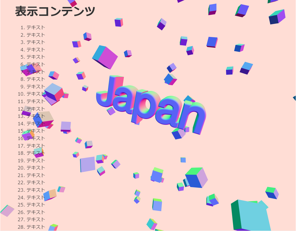
<!--
・三次元文字を生成します。
・カーソルを動かすと文字の拡大・縮小・回転ができます。
・threeライブラリィを使用しています。
-->
<head>
<meta charset="UTF-8">
<title>パーティクル(Three)のサンプル</title>
<meta name="viewport" content="width=device-width,initial-scale=1.0,viewport-fit=cover">
<style>
body,div,h1,h2,h3,h4,h5,h6,pre,p,a,select,header,nav,main,section,footer,ul,ol,li,label {
padding: 0;
margin: 0;
font-size: 16px;
line-height: 1.6;
word-wrap: break-word;
box-sizing: border-box;
}
body {
font-family: "Hiragino Sans W3", "Hiragino Kaku Gothic ProN", "ヒラギノ角ゴ ProN W3", "メイリオ", "Meiryo", "MS Pゴシック", "MS PGothic", sans-serif;
}
.container {
border: #fff 1px solid;
}
.wrapper {
max-width: 960px;
margin: 0 auto;
padding: 0 20px;
color: #333;
background: #00000000;
}
h1 {
font-size: 2.5rem;
padding: 10px 0;
}
ol {
margin-left: 40px;
}
/* ▼▼▼ CSS(ここから)(※2) ▼▼▼ */
/* パーティクル(Three)の設定 */
/* アニメーション枠指定 */
.back-container {
width: 100%;
height: 100vh;
overflow: hidden;
background: #333;
position: fixed;
top: 0;
left: 0;
z-index: -1;
}
/* ▲▲▲ CSS(ここまで) ▲▲▲ */
</style>
</head>
<body>
<div class="container">
<div class="wrapper">
<h1>表示コンテンツ</h1>
<ol>
<li>テキスト</li><li>テキスト</li><li>テキスト</li><li>テキスト</li><li>テキスト</li> <!-- 01~05行 -->
<li>テキスト</li><li>テキスト</li><li>テキスト</li><li>テキスト</li><li>テキスト</li> <!-- 06~10行 -->
<li>テキスト</li><li>テキスト</li><li>テキスト</li><li>テキスト</li><li>テキスト</li> <!-- 11~15行 -->
<li>テキスト</li><li>テキスト</li><li>テキスト</li><li>テキスト</li><li>テキスト</li> <!-- 16~20行 -->
<li>テキスト</li><li>テキスト</li><li>テキスト</li><li>テキスト</li><li>テキスト</li> <!-- 21~25行 -->
<li>テキスト</li><li>テキスト</li><li>テキスト</li><li>テキスト</li><li>テキスト</li> <!-- 26~30行 -->
<li>テキスト</li><li>テキスト</li><li>テキスト</li><li>テキスト</li><li>テキスト</li> <!-- 31~35行 -->
<li>テキスト</li><li>テキスト</li><li>テキスト</li><li>テキスト</li><li>テキスト</li> <!-- 36~40行 -->
<li>テキスト</li><li>テキスト</li><li>テキスト</li><li>テキスト</li><li>テキスト</li> <!-- 41~45行 -->
<li>テキスト</li><li>テキスト</li><li>テキスト</li><li>テキスト</li><li>テキスト</li> <!-- 46~50行 -->
<li>テキスト</li><li>テキスト</li><li>テキスト</li><li>テキスト</li><li>テキスト</li> <!-- 51~55行 -->
<li>テキスト</li><li>テキスト</li><li>テキスト</li><li>テキスト</li><li>テキスト</li> <!-- 56~60行 -->
<li>テキスト</li><li>テキスト</li><li>テキスト</li><li>テキスト</li><li>テキスト</li> <!-- 61~65行 -->
<li>テキスト</li><li>テキスト</li><li>テキスト</li><li>テキスト</li><li>テキスト</li> <!-- 66~70行 -->
</ol>
</div>
<!-- ▼▼▼ HTML(ここから) ▼▼▼(※3) -->
<!-- パーティクル(Three)の定義 -->
<div class="back-container" id="back-container"></div>
</div>
<!-- ▲▲▲ HTML(ここまで) ▲▲▲ -->
</div>
<!-- ▼▼▼ SCRIPT(ここから)(※4) ▼▼▼ -->
<!-- パーティクル(Three)の制御 -->
<script src='https://cdnjs.cloudflare.com/ajax/libs/three.js/108/three.min.js'></script>
<script id="rendered-js" >
/*
* 3D FLOATING TYPO
* Made with ThreeJS - Enjoy!
* https://threejs.org/
*
* Move the cursor to zoom in/out and float around the cubed space.
* On mobile touch + drag screen to zoom in/out and float.
*
* Inspired by one of the ThreeJS examples in documentation.
*
* #014 - #100DaysOfCode
* By ilithya | 2019
*/
const nearDist = 0.1;
const farDist = 10000;
const scene = new THREE.Scene();
const camera = new THREE.PerspectiveCamera(75, window.innerWidth / window.innerHeight, nearDist, farDist);
camera.position.x = farDist * -2;
camera.position.z = 500;
const renderer = new THREE.WebGLRenderer({ antialias: true });
// renderer.setClearColor("#4dd0e1"); // 背景色
renderer.setClearColor("#ffddd5"); // 背景色
renderer.setPixelRatio(window.devicePixelRatio); // For HiDPI devices to prevent bluring output canvas
renderer.setSize(window.innerWidth, window.innerHeight);
document.querySelector("#back-container").appendChild(renderer.domElement);
// CREATE CUBES
const cubeSize = 120;
const geometry = new THREE.BoxBufferGeometry(cubeSize, cubeSize, cubeSize);
// BufferAttribute allows for more efficient passing of data to the GPU
const material = new THREE.MeshNormalMaterial(); // Maps the normal vectors to RGB colors
const group = new THREE.Group();
for (let i = 0; i < 350; i++) { // キューブ数
const mesh = new THREE.Mesh(geometry, material);
const dist = farDist / 3;
const distDouble = dist * 2;
const tau = 2 * Math.PI; // One turn
mesh.position.x = Math.random() * distDouble - dist;
mesh.position.y = Math.random() * distDouble - dist;
mesh.position.z = Math.random() * distDouble - dist;
mesh.rotation.x = Math.random() * tau;
mesh.rotation.y = Math.random() * tau;
mesh.rotation.z = Math.random() * tau;
// Manually control when 3D transformations recalculation occurs for better performance
mesh.matrixAutoUpdate = false;
mesh.updateMatrix();
group.add(mesh);
}
scene.add(group);
// CREATE TYPOGRAPHY
const loader = new THREE.FontLoader();
const textMesh = new THREE.Mesh();
const createTypo = font => {
const word = "Japan"; // 表示文字
const typoProperties = {
font: font,
size: cubeSize,
height: cubeSize / 2,
curveSegments: 12,
bevelEnabled: true,
bevelThickness: 10,
bevelSize: 6,
bevelOffset: 1,
bevelSegments: 8
};
const text = new THREE.TextGeometry(word, typoProperties);
textMesh.geometry = text;
textMesh.material = material;
textMesh.position.x = cubeSize * -2;
textMesh.position.z = cubeSize * -1;
scene.add(textMesh);
};
loader.load("https://threejs.org/examples/fonts/helvetiker_regular.typeface.json", createTypo);
// CREATE PART OF THE MOUSE/TOUCH OVER EFFECT
let mouseX = 0;
let mouseY = 0;
const mouseFX = {
windowHalfX: window.innerWidth / 2,
windowHalfY: window.innerHeight / 2,
coordinates: function (coordX, coordY) {
mouseX = (coordX - mouseFX.windowHalfX) * 10;
mouseY = (coordY - mouseFX.windowHalfY) * 10;
},
onMouseMove: function (e) {
mouseFX.coordinates(e.clientX, e.clientY);
},
onTouchMove: function (e) {
mouseFX.coordinates(e.changedTouches[0].clientX, e.changedTouches[0].clientY);
} };
document.addEventListener("mousemove", mouseFX.onMouseMove, false);
document.addEventListener("touchmove", mouseFX.onTouchMove, false);
// RENDER 3D GRAPHIC
const render = () => {
requestAnimationFrame(render);
// Camera animation
// Works with onMouseMove and onTouchMove functions
camera.position.x += (mouseX - camera.position.x) * 0.05;
camera.position.y += (mouseY * -1 - camera.position.y) * 0.05;
camera.lookAt(scene.position); // Rotates the object to face a point in world space
const t = Date.now() * 0.001;
const rx = Math.sin(t * 0.7) * 0.5;
const ry = Math.sin(t * 0.3) * 0.5;
const rz = Math.sin(t * 0.2) * 0.5;
group.rotation.x = rx;
group.rotation.y = ry;
group.rotation.z = rz;
textMesh.rotation.x = rx;
textMesh.rotation.y = ry;
textMesh.rotation.z = rx; // Happy accident :)
renderer.render(scene, camera);
};
render();
// RESIZE CANVAS
// This is buggy in some iOS...
// const resizeCanvas = () => {
// camera.aspect = window.innerWidth / window.innerHeight;
// camera.updateProjectionMatrix();
// renderer.setSize(window.innerWidth, window.innerHeight);
// };
// window.addEventListener("resize", resizeCanvas, false);
</script>
<!-- ▲▲▲ SCRIPT(ここまで) ▲▲▲ -->
</body>
</html>
HTML(index.html)
<!DOCTYPE html>
<html lang="ja">
<!-- 参考サイト
背景にひと手間加えたい時に参考になりそうなスニペット集
https://try-m.co.jp/blog/web-create/6672/
-->
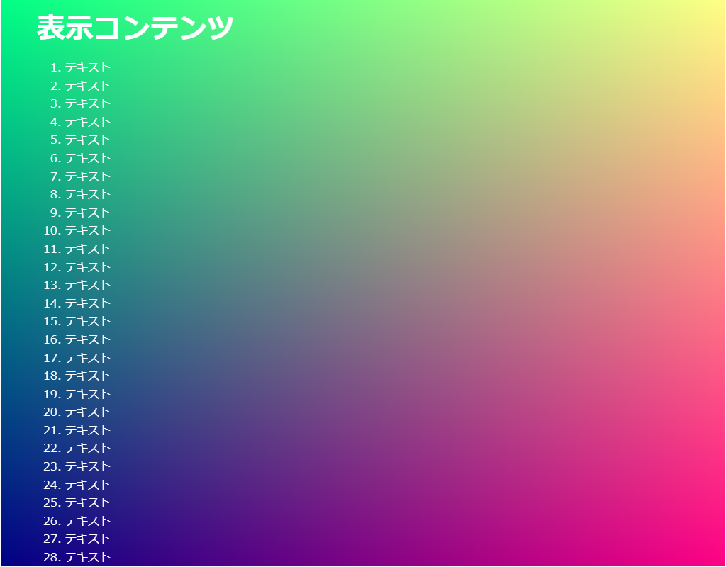
<!--
・色をグラデーション変化させます。
・Threeライブラリィを使用しています。
-->
<head>
<meta charset="UTF-8">
<title>パーティクル(Three)のサンプル</title>
<meta name="viewport" content="width=device-width,initial-scale=1.0,viewport-fit=cover">
<style>
body,div,h1,h2,h3,h4,h5,h6,pre,p,a,select,header,nav,main,section,footer,ul,ol,li,label {
padding: 0;
margin: 0;
font-size: 16px;
line-height: 1.6;
word-wrap: break-word;
box-sizing: border-box;
}
body {
font-family: "Hiragino Sans W3", "Hiragino Kaku Gothic ProN", "ヒラギノ角ゴ ProN W3", "メイリオ", "Meiryo", "MS Pゴシック", "MS PGothic", sans-serif;
}
.container {
border: #fff 1px solid;
}
.wrapper {
max-width: 960px;
margin: 0 auto;
padding: 0 20px;
color: #fff;
background: #00000000;
}
h1 {
font-size: 2.5rem;
padding: 10px 0;
}
ol {
margin-left: 40px;
}
/* ▼▼▼ CSS(ここから)(※2) ▼▼▼ */
/* パーティクル(Three)の設定 */
/* アニメーション枠指定 */
.back-container {
width: 100%;
height: 100vh;
overflow: hidden;
background: #333;
position: fixed;
top: 0;
left: 0;
z-index: -1;
}
/* ▲▲▲ CSS(ここまで) ▲▲▲ */
</style>
</head>
<body>
<div class="container">
<div class="wrapper">
<h1>表示コンテンツ</h1>
<ol>
<li>テキスト</li><li>テキスト</li><li>テキスト</li><li>テキスト</li><li>テキスト</li> <!-- 01~05行 -->
<li>テキスト</li><li>テキスト</li><li>テキスト</li><li>テキスト</li><li>テキスト</li> <!-- 06~10行 -->
<li>テキスト</li><li>テキスト</li><li>テキスト</li><li>テキスト</li><li>テキスト</li> <!-- 11~15行 -->
<li>テキスト</li><li>テキスト</li><li>テキスト</li><li>テキスト</li><li>テキスト</li> <!-- 16~20行 -->
<li>テキスト</li><li>テキスト</li><li>テキスト</li><li>テキスト</li><li>テキスト</li> <!-- 21~25行 -->
<li>テキスト</li><li>テキスト</li><li>テキスト</li><li>テキスト</li><li>テキスト</li> <!-- 26~30行 -->
<li>テキスト</li><li>テキスト</li><li>テキスト</li><li>テキスト</li><li>テキスト</li> <!-- 31~35行 -->
<li>テキスト</li><li>テキスト</li><li>テキスト</li><li>テキスト</li><li>テキスト</li> <!-- 36~40行 -->
<li>テキスト</li><li>テキスト</li><li>テキスト</li><li>テキスト</li><li>テキスト</li> <!-- 41~45行 -->
<li>テキスト</li><li>テキスト</li><li>テキスト</li><li>テキスト</li><li>テキスト</li> <!-- 46~50行 -->
<li>テキスト</li><li>テキスト</li><li>テキスト</li><li>テキスト</li><li>テキスト</li> <!-- 51~55行 -->
<li>テキスト</li><li>テキスト</li><li>テキスト</li><li>テキスト</li><li>テキスト</li> <!-- 56~60行 -->
<li>テキスト</li><li>テキスト</li><li>テキスト</li><li>テキスト</li><li>テキスト</li> <!-- 61~65行 -->
<li>テキスト</li><li>テキスト</li><li>テキスト</li><li>テキスト</li><li>テキスト</li> <!-- 66~70行 -->
</ol>
</div>
<!-- ▼▼▼ HTML(ここから) ▼▼▼(※3) -->
<!-- パーティクル(Three)の定義 -->
<div class="back-container">
<div id="back-container"></div>
</div>
<!-- ▲▲▲ HTML(ここまで) ▲▲▲ -->
</div>
<!-- ▼▼▼ SCRIPT(ここから)(※4) ▼▼▼ -->
<!-- パーティクル(Three)の制御 -->
<script src="https://cdnjs.cloudflare.com/ajax/libs/three.js/89/three.min.js"></script>
<script id="vertexShader" type="x-shader/x-vertex">
void main() {
gl_Position = vec4( position, 1.0 );
}
</script>
<script id="fragmentShader" type="x-shader/x-fragment">
uniform vec2 u_resolution; // 画面サイズ
uniform float u_time; // 時間
void main() {
vec2 st = gl_FragCoord.xy / u_resolution.xy;
float r = abs(sin(u_time * 0.1));
gl_FragColor = vec4(st.x, st.y, r, 1.0);
}
</script>
<script id="rendered-js">
var container;
var camera, scene, renderer;
var uniforms;
init();
animate();
function init() {
container = document.getElementById('back-container');
camera = new THREE.Camera();
camera.position.z = 1;
scene = new THREE.Scene();
var geometry = new THREE.PlaneBufferGeometry(2, 2);
uniforms = {
u_time: { type: "f", value: 1.0 },
u_resolution: { type: "v2", value: new THREE.Vector2() },
u_mouse: { type: "v2", value: new THREE.Vector2() }
};
var material = new THREE.ShaderMaterial({
uniforms: uniforms,
vertexShader: document.getElementById('vertexShader').textContent,
fragmentShader: document.getElementById('fragmentShader').textContent
});
var mesh = new THREE.Mesh(geometry, material);
scene.add(mesh);
renderer = new THREE.WebGLRenderer();
renderer.setPixelRatio(window.devicePixelRatio);
container.appendChild(renderer.domElement);
onWindowResize();
window.addEventListener('resize', onWindowResize, false);
document.onmousemove = function (e) {
uniforms.u_mouse.value.x = e.pageX;
uniforms.u_mouse.value.y = e.pageY;
};
}
function onWindowResize(event) {
renderer.setSize(window.innerWidth, window.innerHeight);
uniforms.u_resolution.value.x = renderer.domElement.width;
uniforms.u_resolution.value.y = renderer.domElement.height;
}
function animate() {
requestAnimationFrame(animate);
render();
}
function render() {
uniforms.u_time.value += 0.05;
renderer.render(scene, camera);
}
</script>
<!-- ▲▲▲ SCRIPT(ここまで) ▲▲▲ -->
</body>
</html>
HTML(index.html)
<!DOCTYPE html>
<html lang="ja">
<!-- 参考サイト
背景にひと手間加えたい時に参考になりそうなスニペット集
https://try-m.co.jp/blog/web-create/6672/
-->
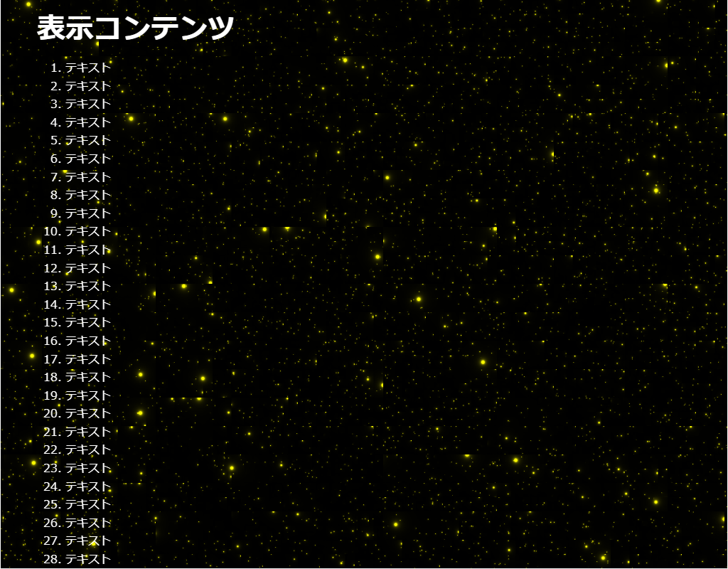
<!--
・宇宙空間の星を生成します。
・Threeライブラリィを使用しています。
-->
<head>
<meta charset="UTF-8">
<title>パーティクル(Three)のサンプル</title>
<meta name="viewport" content="width=device-width,initial-scale=1.0,viewport-fit=cover">
<style>
body,div,h1,h2,h3,h4,h5,h6,pre,p,a,select,header,nav,main,section,footer,ul,ol,li,label {
padding: 0;
margin: 0;
font-size: 16px;
line-height: 1.6;
word-wrap: break-word;
box-sizing: border-box;
}
body {
font-family: "Hiragino Sans W3", "Hiragino Kaku Gothic ProN", "ヒラギノ角ゴ ProN W3", "メイリオ", "Meiryo", "MS Pゴシック", "MS PGothic", sans-serif;
}
.container {
border: #fff 1px solid;
}
.wrapper {
max-width: 960px;
margin: 0 auto;
padding: 0 20px;
color: #fff;
background: #00000000;
}
h1 {
font-size: 2.5rem;
padding: 10px 0;
}
ol {
margin-left: 40px;
}
/* ▼▼▼ CSS(ここから)(※2) ▼▼▼ */
/* パーティクル(Three)の設定 */
/* アニメーション枠指定 */
.back-container {
width: 100%;
height: 100vh;
overflow: hidden;
position: fixed;
top: 0;
left: 0;
z-index: -1;
}
/* ▲▲▲ CSS(ここまで) ▲▲▲ */
</style>
</head>
<body>
<div class="container">
<div class="wrapper">
<h1>表示コンテンツ</h1>
<ol>
<li>テキスト</li><li>テキスト</li><li>テキスト</li><li>テキスト</li><li>テキスト</li> <!-- 01~05行 -->
<li>テキスト</li><li>テキスト</li><li>テキスト</li><li>テキスト</li><li>テキスト</li> <!-- 06~10行 -->
<li>テキスト</li><li>テキスト</li><li>テキスト</li><li>テキスト</li><li>テキスト</li> <!-- 11~15行 -->
<li>テキスト</li><li>テキスト</li><li>テキスト</li><li>テキスト</li><li>テキスト</li> <!-- 16~20行 -->
<li>テキスト</li><li>テキスト</li><li>テキスト</li><li>テキスト</li><li>テキスト</li> <!-- 21~25行 -->
<li>テキスト</li><li>テキスト</li><li>テキスト</li><li>テキスト</li><li>テキスト</li> <!-- 26~30行 -->
<li>テキスト</li><li>テキスト</li><li>テキスト</li><li>テキスト</li><li>テキスト</li> <!-- 31~35行 -->
<li>テキスト</li><li>テキスト</li><li>テキスト</li><li>テキスト</li><li>テキスト</li> <!-- 36~40行 -->
<li>テキスト</li><li>テキスト</li><li>テキスト</li><li>テキスト</li><li>テキスト</li> <!-- 41~45行 -->
<li>テキスト</li><li>テキスト</li><li>テキスト</li><li>テキスト</li><li>テキスト</li> <!-- 46~50行 -->
<li>テキスト</li><li>テキスト</li><li>テキスト</li><li>テキスト</li><li>テキスト</li> <!-- 51~55行 -->
<li>テキスト</li><li>テキスト</li><li>テキスト</li><li>テキスト</li><li>テキスト</li> <!-- 56~60行 -->
<li>テキスト</li><li>テキスト</li><li>テキスト</li><li>テキスト</li><li>テキスト</li> <!-- 61~65行 -->
<li>テキスト</li><li>テキスト</li><li>テキスト</li><li>テキスト</li><li>テキスト</li> <!-- 66~70行 -->
</ol>
</div>
<!-- ▼▼▼ HTML(ここから) ▼▼▼(※3) -->
<!-- パーティクル(Three)の定義 -->
<div class="back-container">
<div id="cvs-container"></div>
</div>
<!-- ▲▲▲ HTML(ここまで) ▲▲▲ -->
</div>
<!-- ▼▼▼ SCRIPT(ここから)(※4) ▼▼▼ -->
<!-- パーティクル(Three)の制御 -->
<script src="https://cdnjs.cloudflare.com/ajax/libs/three.js/89/three.min.js"></script>
<script id="vertexShader" type="x-shader/x-vertex">
void main() {
gl_Position = vec4( position, 1.0 );
}
</script>
<!-- 参考 http://glslsandbox.com/e#58290.6 -->
<script id="fragmentShader" type="x-shader/x-fragment">
#ifdef GL_ES
precision highp float;
#endif
#extension GL_OES_standard_derivatives : enable
uniform float time;
uniform vec2 mouse;
uniform vec2 resolution;
float snow(vec2 uv,float scale) {
float _t = time * 0.3;
uv.x +=_t / scale;
uv *= scale;
vec2 s=floor(uv);
vec2 f=fract(uv);
vec2 p;
float k = 40.;
float d;
p = sin(11. * fract(sin((s + p + scale) * mat2(7,3, 6,5)) * 5.)) - f;
d = length(p);
k = min(d, k);
k = smoothstep(0., k, sin(f.x + f.y) * 0.003); // particleの大きさ
return k;
}
void main(void) {
vec2 uv = (gl_FragCoord.xy * 2. - resolution.xy) / min(resolution.x, resolution.y);
float c = 0.0;
c += snow(uv, 5.);
c += snow(uv, 10.);
c += snow(uv, 20.);
c += snow(uv, 30.);
c += snow(uv, 40.);
// vec3 finalColor = (vec3(0.9, 0.8, 0.99)) * c * 30.0;
vec3 finalColor = (vec3(1, 1, 0)) * c * 30.0;
gl_FragColor = vec4(finalColor, 1);
}
</script>
<script>
var container;
var camera, scene, renderer;
var uniforms;
init();
animate();
function init() {
container = document.getElementById('cvs-container');
camera = new THREE.Camera();
camera.position.z = 1;
scene = new THREE.Scene();
var geometry = new THREE.PlaneBufferGeometry(2, 2);
uniforms = {
time: { type: "f", value: 1.0 },
resolution: { type: "v2", value: new THREE.Vector2() }
};
var material = new THREE.ShaderMaterial( {
uniforms: uniforms,
vertexShader: document.getElementById('vertexShader').textContent,
fragmentShader: document.getElementById('fragmentShader').textContent
});
var mesh = new THREE.Mesh( geometry, material );
scene.add(mesh);
renderer = new THREE.WebGLRenderer();
renderer.setPixelRatio(window.devicePixelRatio);
container.appendChild(renderer.domElement);
onWindowResize();
window.addEventListener('resize', onWindowResize, false);
}
function onWindowResize(event) {
renderer.setSize(window.innerWidth, window.innerHeight);
uniforms.resolution.value.x = renderer.domElement.width;
uniforms.resolution.value.y = renderer.domElement.height;
}
function animate() {
requestAnimationFrame(animate);
render();
}
function render() {
uniforms.time.value += 0.05;
renderer.render(scene, camera);
}
</script>
<!-- ▲▲▲ SCRIPT(ここまで) ▲▲▲ -->
</body>
</html>
HTML(index.html)
<!DOCTYPE html>
<html lang="ja">
<!-- 参考サイト
背景にひと手間加えたい時に参考になりそうなスニペット集
https://try-m.co.jp/blog/web-create/6672/
-->
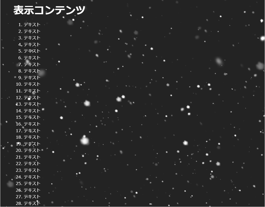
<!--
・雪を生成します。
・Threeライブラリィを使用しています。
-->
<head>
<meta charset="UTF-8">
<title>パーティクル(Three)のサンプル</title>
<meta name="viewport" content="width=device-width,initial-scale=1.0,viewport-fit=cover">
<style>
body,div,h1,h2,h3,h4,h5,h6,pre,p,a,select,header,nav,main,section,footer,ul,ol,li,label {
padding: 0;
margin: 0;
font-size: 16px;
line-height: 1.6;
word-wrap: break-word;
box-sizing: border-box;
}
body {
font-family: "Hiragino Sans W3", "Hiragino Kaku Gothic ProN", "ヒラギノ角ゴ ProN W3", "メイリオ", "Meiryo", "MS Pゴシック", "MS PGothic", sans-serif;
}
.container {
border: #fff 1px solid;
}
.wrapper {
max-width: 960px;
margin: 0 auto;
padding: 0 20px;
color: #fff;
background: #00000000;
}
h1 {
font-size: 2.5rem;
padding: 10px 0;
}
ol {
margin-left: 40px;
}
/* ▼▼▼ CSS(ここから)(※2) ▼▼▼ */
/* パーティクル(Three)の設定 */
/* アニメーション枠指定 */
.back-container {
width: 100%;
height: 100vh;
overflow: hidden;
background: #333;
position: fixed;
top: 0;
left: 0;
z-index: -1;
}
/* ▲▲▲ CSS(ここまで) ▲▲▲ */
</style>
</head>
<body>
<div class="container">
<div class="wrapper">
<h1>表示コンテンツ</h1>
<ol>
<li>テキスト</li><li>テキスト</li><li>テキスト</li><li>テキスト</li><li>テキスト</li> <!-- 01~05行 -->
<li>テキスト</li><li>テキスト</li><li>テキスト</li><li>テキスト</li><li>テキスト</li> <!-- 06~10行 -->
<li>テキスト</li><li>テキスト</li><li>テキスト</li><li>テキスト</li><li>テキスト</li> <!-- 11~15行 -->
<li>テキスト</li><li>テキスト</li><li>テキスト</li><li>テキスト</li><li>テキスト</li> <!-- 16~20行 -->
<li>テキスト</li><li>テキスト</li><li>テキスト</li><li>テキスト</li><li>テキスト</li> <!-- 21~25行 -->
<li>テキスト</li><li>テキスト</li><li>テキスト</li><li>テキスト</li><li>テキスト</li> <!-- 26~30行 -->
<li>テキスト</li><li>テキスト</li><li>テキスト</li><li>テキスト</li><li>テキスト</li> <!-- 31~35行 -->
<li>テキスト</li><li>テキスト</li><li>テキスト</li><li>テキスト</li><li>テキスト</li> <!-- 36~40行 -->
<li>テキスト</li><li>テキスト</li><li>テキスト</li><li>テキスト</li><li>テキスト</li> <!-- 41~45行 -->
<li>テキスト</li><li>テキスト</li><li>テキスト</li><li>テキスト</li><li>テキスト</li> <!-- 46~50行 -->
<li>テキスト</li><li>テキスト</li><li>テキスト</li><li>テキスト</li><li>テキスト</li> <!-- 51~55行 -->
<li>テキスト</li><li>テキスト</li><li>テキスト</li><li>テキスト</li><li>テキスト</li> <!-- 56~60行 -->
<li>テキスト</li><li>テキスト</li><li>テキスト</li><li>テキスト</li><li>テキスト</li> <!-- 61~65行 -->
<li>テキスト</li><li>テキスト</li><li>テキスト</li><li>テキスト</li><li>テキスト</li> <!-- 66~70行 -->
</ol>
</div>
<!-- ▼▼▼ HTML(ここから) ▼▼▼(※3) -->
<!-- パーティクル(Three)の定義 -->
<div class="back-container">
<canvas id="myCanvas""></canvas>
</div>
<!-- ▲▲▲ HTML(ここまで) ▲▲▲ -->
</div>
<!-- ▼▼▼ SCRIPT(ここから)(※4) ▼▼▼ -->
<!-- パーティクル(Three)の制御 -->
<script src="https://cdnjs.cloudflare.com/ajax/libs/three.js/89/three.min.js"></script>
<script id="rendered-js">
window.addEventListener('load', init);
function init() {
var frame = 5;
var meshList = [];
var renderer = new THREE.WebGLRenderer({ canvas: document.querySelector('#myCanvas') });
renderer.setPixelRatio(1);
renderer.setSize(window.innerWidth, window.innerHeight);
var camera = new THREE.PerspectiveCamera(45, window.innerWidth / window.innerHeight);
camera.position.set(0, 0, -10);
camera.lookAt(new THREE.Vector3(0, 0, 0));
var scene = new THREE.Scene();
scene.background = new THREE.Color(0x232323);
scene.fog = new THREE.Fog(0x999999, 0, 2000);
window.addEventListener('resize', function () {
onWindowResize(camera, renderer);
}, false);
tick();
function tick() {
var mesh = new SnowFlakes();
scene.add(mesh);
meshList.push(mesh);
for (var i = 0; i < meshList.length; i++) {
meshList[i].update();
}
renderer.render(scene, camera);
requestAnimationFrame(tick);
frame++;
if (frame % 2 == 0) {
return;
}
}
}
class SnowFlakes extends THREE.Object3D {
constructor() {
super();
this.snowList = [];
this.angle = 0;
var length = 10;
var geometry = new THREE.BufferGeometry();
var materials = [];
var textureLoader = new THREE.TextureLoader();
var sprite1 = textureLoader.load('data:image/png;base64,iVBORw0KGgoAAAANSUhEUgAAACgAAAAoCAYAAACM/rhtAAACt0lEQVRYhe2X25KjMBBDFcNM/v9zJwGzD4sqQnQbk/AYV7lsrj6obwb4tm/7tma7cbIsS3g+mN/svD64JKPPj8Fu/18/RteC+S3o3hRqwR7udhYyAszgisEV7CGrwVUD57tOQUYKOnCRUbsrSagKYBZovX4aUgEjX1PFhvV+zl1Fgs3r+UsgexUcBHCUY0Iq3Axgko+bEsiulgWJ+9oA4Mc61eSiBJvsHUggoyzQBeigVGpcwe4AfgWQ5qoAnmsvAB4GQMhTEd1rYpr1Z4W7r/NBFpvlvigNEa5gq2YTNgN0E6mC7HeDof9p8FBZTTszOs3bAlRQTTMMFJrY/VD9r1ofBJSq+Xga0B/SfEhYqlixD5oqoyrZ7YcZYKuGeuoZsFWaEBO2aWcQ4O5S2FJQX+JlTK8pGO+lGxBsFFiCFrySuX78BrJg3xxC/YiLEBgyetUpeOXLEdvE7rU9ivodoMvrcJP0J7aVQ32MjabXqqMu0QRjO/JBQtKPmIgf67OaLrLU4ZsNzhnNbtbNsQPqQhC4IoAPbJXge4o9V2XuG11XMM2LR0HCkaZ8AvjD1oeo8mDHjGJPLRHcqUoSqchdSVkBvVKwzBX7IEJqFgD2yqWtN1ET4hm8WOtwkfsZUB71EVzqh60gcZW4CS0rKK+7gmpmqqhRnv2zhO3IB93UwF49TUMaOFnuvPSfxEsQzen3cBulqUc/QIPF1fwI0CFrcI3nR7xKmJc+3Ty0TP0WYATs23cF9TTif3s9CqaJugXlkaaQGgj+S6rw6ovVrr+1H8xgHVIXiX7qo43H5Sb2qFYfc4ioSlS7R+HSlPOOggqri+v2PaoQ0X7y8iDRahD5ZQaoSkVzIAF9V0EHWmyeKRiNzfaJiYGtgp7QW7+W0eb4UkB9cQQSbaEOc17UPgXUBaII7302bf8AK4CD/00svIQAAAAASUVORK5CYII=');
var sprite2 = textureLoader.load('data:image/png;base64,iVBORw0KGgoAAAANSUhEUgAAACgAAAAoCAYAAACM/rhtAAADNUlEQVRYhe2YyZbaMBBFnzHdkP//2DSDcRbRa12VS0aQRTZd5+jIg4ZLTSoj/ciP/F+ZJGld16Fx6CmHnfGUFf3aeb6R4xtgfEa4QzImg4ltCv0wYIRzfwDclFxz/iMBe5TG+y5kDzBu5Pu5XM8Fyr3BDfrAfEK5LYBU6BvIDDCDM5TbocwlqIWmNqiB7qoaMyjHbSCfmdjNMLOkT1x/qNWkNUj/WtDukm5l3C1AvRQk9C3DHAF3LvcfajXJHyW1mjMcg4vBJLU+O0laI+CkrVkN8ol2Ku2I9zPW8CaGWwrcpcB94f2s6o/DQSK1/vVR2knSr9KfC+xR1Sfpv6uqWe8YR3iDHVS11w0SLm5/sgaPqlo7A/Kkqj3Pobnse1dVF1jCuwlzN5ocMbEDw9pzO6ua2eMojtibWr+0ye+Y9whjvvNiL80wQGxe+p61GIPEspbnd2xqf/QcWok/oknwe4C9KDakA4YRbLF/WTuGZSrivOw8l1RNnJ259CtrkanFmrM2GL0HVV8jREwv8fyOJu6eJFO4pjl4mrBRVrWWyPYYkdQH4wIxAfdaBGQ0szCI1QzneO/dsziTdLJas1oe6OMxx/sIrNA3J4kfRKBYIi2hNwzP4AjGM9hJO1Y0PciNBjPTcMOoBZ8QXDQeb9fSuxk2/sjhYoGqJwwXdwQ7Z7EOfGDctbQLrr2O1yUky64NYDyss0rkS21aWdUmaWubgJ53Aai1mUHuFguGtFa82VU19/0GXFYEWNtu1uBFtaKhFjM/7AISNNMGE/KivyfKjGc9DV7wjI3aS9NPpkFrL0JeEpCb9k2cQfFdBNzIMw26PLon7xa1/kizs8xigMVskKWbhmMP0P4UkzH9jFWJ1OZLQtzCdfb5mX7A99KMA2VWzfoRPCsUmJ4M0/vcZDrj3s1176+P+O8BSy9W2nzPBN9r2T8Lmea+r3uAPUhWNtlXnBendiKcwnWEa+5HigUGDL95/Yw/JjvD94AyzQx/1bGA2FQZ2mouLv7UfHtgI4A9yGzBZ2N6UM/e7frgZtzAs9GNn25oeadgfXmTN8dLGgeMm4x+U3DOW/IqYNw0873N/yv/In8AJT3tg+KFGroAAAAASUVORK5CYII=');
var sprite3 = textureLoader.load('data:image/png;base64,iVBORw0KGgoAAAANSUhEUgAAACgAAAAoCAYAAACM/rhtAAADEElEQVRYhe2Y27KiMBBFF94vM/P/HzrqQUHngd5mE0EEfZkquyoVCkNY6bvAV77ylf9bivzG7XZ763lg1AYPGxbtLRdT9yHB6Vpg15jfApVMASyAWcxzu74F3BWoY+3bkGMBBTcHljHmBlgBl1j7EcgpgILbAhtgFfeuwBn4iXEmafRmoKOAxwDK1xYB9wv4DaxptFoDZcCvgGNA1gZYM9JHx2pQ5l0D+wDcxn0BHIC/AVrSmPwacxVrqlchXwWU9mTeVYDtgV3sU8TLNzTaPZK0WGbz2cCfQg4BejpZkAJjGWDbmFckM+9JvniKUdr1KcALkgtMAnStzWjM6ppTBHs0SzYxtgF6jOfXsVYucbV5FGBuUm0ujSl69bJFDOXE2u7pgHNbAylg8ih/GXAWAPKpHY3mHHJpEBoFbdfwA3tSz32x0x+fmVgn3gXgn7jekcwtk+XaERS0K4yuz3FA+aenn0FA18AiIAS5p+1L0qDgZtle0uoyIFY2r2lrvVO6AKVm+aAHgvxxxaOPyXyQgqDI7uW+6H7rDcdd8hM7pEeZr/d67IDPWi/3wRzIu6IH6QOE1JVcSLW1oh1x7vh5YGBrfPaDd2rNpS9ItIkAVbLOJLPM6U8PXfc9WDxg3gKsAq6k0aI6F/fNRQbk2u0DV90e7HCepRltoh7vRCpp3hN2RaFrxzvtmnZ3kwfSg8mHarEgZd4fUnDkJU7BoufyDru2vZSch/x3MqBH8NzWetAJqCJZQXuUpICjD+4VwDxQPOd5eqlI/qmXOZw6mwNN4+CAvdobAtTpPNXkm+kAGxrtSKPSfE3S2iHGiZSyJjcLLuqGJe5HakC9cdABKtoa1NCz0rD/CxwN6BF4If1zq0jdSEm7aShIKepq6+vsWn8BvLMe1c04pDoNP7k0qNrsUezRq+Bxc+p5QfaaeOynD6+5qihuWu+UdTh/zlOP/4m6V5T808eUbzOet/Li7/XWGwF4rMUOdn/pJ77N+Am80exqCjT7b6P+yE/9eNSloWcv6mseBmUqYN+LP/457ivvyj+oIlupz86ZbQAAAABJRU5ErkJggg==');
var sprite4 = textureLoader.load('data:image/png;base64,iVBORw0KGgoAAAANSUhEUgAAACgAAAAoCAYAAACM/rhtAAABpElEQVRYhe2W7W6DMAxFDx+lXff+b7qtlIWyH/FVPLYVKDBpU65kpSkhOdixE8jKysrKyvrXKh55aRiGqfkKMz9wGPU/v1h8j1Ivx7sLVpoV1nqwm9ld0D0A5a3K7GDzCnQA3oFgrQfdHVBwtYEdgZO1tT3rgQ5ogatZbzYJuQbQwzXA2eDOBtgQvdgb1Csp7C3Ri0xBPgoouNLmOAFPZmczD6jf473YT0Gu9WBlizfEEAvwmehFhbgi7sETMdzBTKDjjN8MsHSQCqs82diYYJBKnoYY8oq0D3fxIKQQqz06O9iYgZTR/sMKZtThcmrAAlB5szarHMCNheVlC0BfgIeReSDVP9VChXwW7JoQKwsFEIgJ0JH2VwAupBoo0G4u5FrAmy2oAtzanMFBXog10IP6DIYdkkSloXeAb6RadyXVwA54sedvDnD3k0ST66QoXf8wAhSYwjz70rDFZaEnerO1BYMB+otCa6CL4LYA9KHWotp/ApQXfVL86nVLoEqYnq93Qf8Bi+rgFoD+LFXtK0bP1S6Cg209eK//039ZWVlZWX9dH7LguI6yCNZ8AAAAAElFTkSuQmCC');
var sprite5 = textureLoader.load('data:image/png;base64,iVBORw0KGgoAAAANSUhEUgAAACgAAAAoCAYAAACM/rhtAAACIElEQVRYhe2X7U7DMAxFT+nYGO//qgjWT37Ml9yGdstKkUCqJStbm6an146TwG677fa/rVq6MY5jaf8KmO1843p6uFpEAOBwb4AMRK17DjLMPHsXdMlKAB3sybyO1iEG89Ha1aClClYBVAPP4YdwQY5AN+MD0Mf9W+mwClBhrKPvEThFKxfkCLThF6CJtotrPfPh/xGgIKXcKfzF/Bj3CZgL8A58xDPvMUYTffKwrwaUeso5KXgMsFfgHMAC7OO/UqC2cQQmuCLI0hwUYE0K8zkgBVhxVfCZ77O8j3sK8yYKyvxlrqRC7QrqI6SUJkjPNcR1/C62EsDRXKAHpjNZgF56BtIEuTAN9yaAnit5qZDleeqlRHCtfYTXzR8DyjxMLSmX9NsVFIBmfEsKbf5hm02S0YBU2z645uGFpF5lreqm4N03C7HgVCJaUm3Ty/1lA6loD0zTweHVFqlYqiCkmfhmL+nNzwGvMDfhXYwhVeu4VmSldVATpeOqooBb84ZpydGq0pAmmKfD3E5oNaAG0otyQOXmC0nFzq639txDpeYRQEEqHzW7HfI1AFWsVQO1q/Gl7lcAHTLf/wlSKkJa4nzrtflStwQJUzV95fDJIqU761us5FpAh/SlUCD5yuGAUtLHWLRHD023xlg6Eji8djNfYb53aNoCMB/Hi/FkSGbCu+Wp7pblByMvKXN9im0rwNzmYFYfPXfbbbfddvvD9gl6XuAhzsNFLQAAAABJRU5ErkJggg==');
var vertices = [];
for (var i = 0; i < length; i++) {
var x = getRandom(0, 500);
var y = getRandom(0, 500);
var z = getRandom(0, 500);
vertices.push(x, y, z);
}
geometry.addAttribute('position', new THREE.Float32BufferAttribute(vertices, 3));
var parameters = [
["#FFFFFF", sprite2, getRandom(10, 10)],
["#FFFFFF", sprite3, getRandom(10, 15)],
["#FFFFFF", sprite1, getRandom(10, 15)],
["#FFFFFF", sprite5, getRandom(5, 10)],
["#FFFFFF", sprite4, getRandom(5, 10)]
];
for (var i = 0; i < parameters.length; i++) {
var sprite = parameters[i][1];
var size = parameters[i][2];
materials[i] = new THREE.PointsMaterial({
size: size,
map: sprite,
blending: THREE.AdditiveBlending,
depthTest: false,
transparent: true
});
var particles = new THREE.Points(geometry, materials[i]);
particles.rotation.x = Math.random() * 360;
particles.rotation.y = Math.random() * 360;
particles.rotation.z = Math.random() * 360;
particles.vx = 0;
particles.vy = 0;
particles.material.opacity = 0;
this.add(particles);
this.snowList.push(particles);
}
}
update() {
this.angle += 0.001;
for (var i = 0; i < this.snowList.length; i++) {
this.snowList[i].material.opacity += 0.01;
this.snowList[i].vy -= 1;
this.snowList[i].vx = Math.sin(this.angle) * Math.cos(this.angle) * 10;
this.snowList[i].vx *= 0.2;
this.snowList[i].vy *= 0.6;
this.snowList[i].position.x += this.snowList[i].vx;
this.snowList[i].position.y += this.snowList[i].vy;
if (this.snowList[i].position.y < -1000) {
this.snowList[i].material.opacity += 0.1;
this.remove(this.snowList[i]);
this.snowList.splice(i, 1);
i -= 1;
}
}
}
}
function onWindowResize(camera, renderer) {
camera.aspect = window.innerWidth / window.innerHeight;
camera.updateProjectionMatrix();
renderer.setSize(window.innerWidth, window.innerHeight);
}
function getRandom(min, max) {
return Math.random() * (max - min) + min;
}
</script>
<!-- ▲▲▲ SCRIPT(ここまで) ▲▲▲ -->
</body>
</html>
HTML(index.html)
<!DOCTYPE html>
<html lang="ja">
<!--	参考サイト
		背景の動き -星がキラキラ-
		https://coco-factory.jp/ugokuweb/move02/5-9/
-->
<!--
	・キラキラ星を生成します。
	・particlesライブラリィを使用しています。
-->
<head>
<meta charset="UTF-8">
<title>パーティクル(particles)</title>
<meta name="viewport" content="width=device-width,initial-scale=1.0,viewport-fit=cover">
<style>
body,div,h1,h2,h3,h4,h5,h6,pre,p,a,select,header,nav,main,section,footer,ul,ol,li,label {
	padding: 0;
	margin: 0;
	font-size: 16px;
	line-height: 1.6;
	word-wrap: break-word;
	box-sizing: border-box;
}
body {
	font-family: "Hiragino Sans W3", "Hiragino Kaku Gothic ProN", "ヒラギノ角ゴ ProN W3", "メイリオ", "Meiryo", "MS Pゴシック", "MS PGothic", sans-serif;
}
.container {
	border: #fff 1px solid;
}
.wrapper {
	max-width: 960px;
	margin: 0 auto;
	padding: 0 20px;
	color: #fff;
	background: #00000000;
}
h1 {
	font-size: 2.5rem;
	padding: 10px 0;
}
ol {
	margin-left: 40px;
}

/* ▼▼▼ CSS(ここから)(※2) ▼▼▼ */
/* パーティクル(particles)の設定 */

/* アニメーション枠指定 */
.back-container {
	width: 100%;
	height: 100vh;
	overflow: hidden;
	background: #020E34;
	position: fixed;
	top: 0;
	left: 0;
	z-index: -1;
}
.back-container #back-container {
	width: 100%;
	height: 100%;
}

/* ▲▲▲ CSS(ここまで) ▲▲▲ */
</style>
</head>

<body>

<div class="container">
	<div class="wrapper">
		<h1>表示コンテンツ</h1>
		<ol>
			<li>テキスト</li><li>テキスト</li><li>テキスト</li><li>テキスト</li><li>テキスト</li>	<!-- 01~05行 -->
			<li>テキスト</li><li>テキスト</li><li>テキスト</li><li>テキスト</li><li>テキスト</li>	<!-- 06~10行 -->
			<li>テキスト</li><li>テキスト</li><li>テキスト</li><li>テキスト</li><li>テキスト</li>	<!-- 11~15行 -->
			<li>テキスト</li><li>テキスト</li><li>テキスト</li><li>テキスト</li><li>テキスト</li>	<!-- 16~20行 -->
			<li>テキスト</li><li>テキスト</li><li>テキスト</li><li>テキスト</li><li>テキスト</li>	<!-- 21~25行 -->
			<li>テキスト</li><li>テキスト</li><li>テキスト</li><li>テキスト</li><li>テキスト</li>	<!-- 26~30行 -->
			<li>テキスト</li><li>テキスト</li><li>テキスト</li><li>テキスト</li><li>テキスト</li>	<!-- 31~35行 -->
			<li>テキスト</li><li>テキスト</li><li>テキスト</li><li>テキスト</li><li>テキスト</li>	<!-- 36~40行 -->
			<li>テキスト</li><li>テキスト</li><li>テキスト</li><li>テキスト</li><li>テキスト</li>	<!-- 41~45行 -->
			<li>テキスト</li><li>テキスト</li><li>テキスト</li><li>テキスト</li><li>テキスト</li>	<!-- 46~50行 -->
			<li>テキスト</li><li>テキスト</li><li>テキスト</li><li>テキスト</li><li>テキスト</li>	<!-- 51~55行 -->
			<li>テキスト</li><li>テキスト</li><li>テキスト</li><li>テキスト</li><li>テキスト</li>	<!-- 56~60行 -->
			<li>テキスト</li><li>テキスト</li><li>テキスト</li><li>テキスト</li><li>テキスト</li>	<!-- 61~65行 -->
			<li>テキスト</li><li>テキスト</li><li>テキスト</li><li>テキスト</li><li>テキスト</li>	<!-- 66~70行 -->
		</ol>
	</div>

<!-- ▼▼▼ HTML(ここから) ▼▼▼(※3) -->
<!-- パーティクル(particles)の定義 -->
	<div class="back-container">
		<div id="back-container"></div>
	</div>
<!-- ▲▲▲ HTML(ここまで) ▲▲▲ -->
</div>

<!-- ▼▼▼ SCRIPT(ここから)(※4) ▼▼▼ -->
<!-- パーティクル(particles)の制御 -->
<script src="https://cdn.jsdelivr.net/particles.js/2.0.0/particles.min.js"></script>
<script>

	particlesJS("back-container", {
		"particles": {
			"number": {
				"value":346,								// 星の数
				"density": {
					"enable":true,
					"value_area":800
				}
			},
			"color": {
				"value":"#ffffff"
			},
			"shape": {
				"type": "circle",							// 形状(circle)
				"stroke": {
					"width":0
				},
			},
			"opacity": {
				"value": 1,									// シェイプの透明度
				"random": true,								// シェイプの透明度をランダム
				"anim": {
					"enable": true,							// シェイプの透明度をアニメーション
					"speed": 3,								// シェイプの透明度をアニメーション
					"opacity_min": 0,						// 透明度の最小値
					"sync": false							// 全てを同時にアニメーションさせない
				}
			},
			"size": {
				"value": 2,
				"random": true,
				"anim": {
					"enable": false,
					"speed": 4,
					"size_min": 0.3,
					"sync": false
				}
			},
			"line_linked": {
				"enable": false,
			},
			"move": {
				"enable": true,
				"speed": 120,								// この数値を小さくするとゆっくりな動きになる
				"direction": "none",						// 方向指定
				"random": true,								// 動きはランダム
				"straight": true,							// 動きをとどめる
				"out_mode": "out",
				"bounce": false,
				"attract": {
					"enable": false,
					"rotateX": 600,
					"rotateY": 600
				}
			}
		},
		"interactivity": {
			"detect_on": "canvas",
			"events": {
				"onhover": {
					"enable": false,
				},
				"onclick": {
					"enable": false,
				},
				"resize": true
			}
		},
		"retina_detect": true
	});

</script>
<!-- ▲▲▲ SCRIPT(ここまで) ▲▲▲ -->

</body>
</html>
HTML(index.html)
<!DOCTYPE html>
<html lang="ja">
<!-- 参考サイト
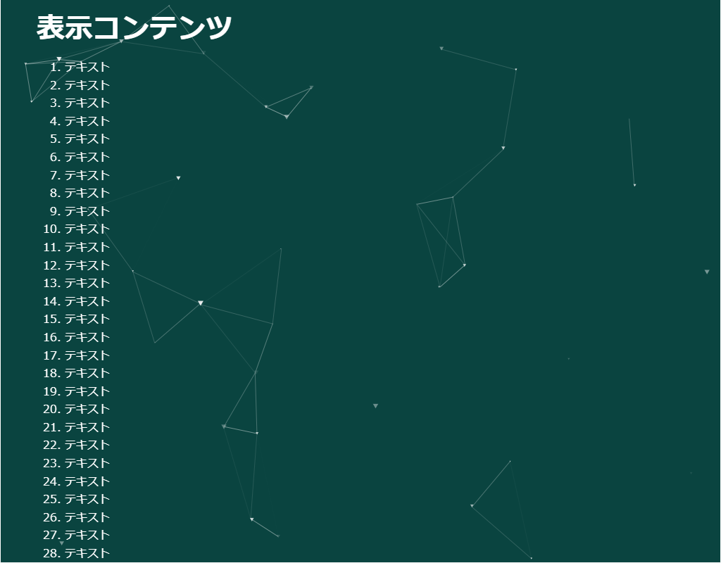
背景の動き-幾何学模様-
https://coco-factory.jp/ugokuweb/move02/5-4/
-->
<!--
・幾何学模様を生成します。
・threeライブラリィを使用しています。
-->
<head>
<meta charset="UTF-8">
<title>パーティクル(particles)のサンプル</title>
<meta name="viewport" content="width=device-width,initial-scale=1.0,viewport-fit=cover">
<style>
body,div,h1,h2,h3,h4,h5,h6,pre,p,a,select,header,nav,main,section,footer,ul,ol,li,label {
padding: 0;
margin: 0;
font-size: 16px;
line-height: 1.6;
word-wrap: break-word;
box-sizing: border-box;
}
body {
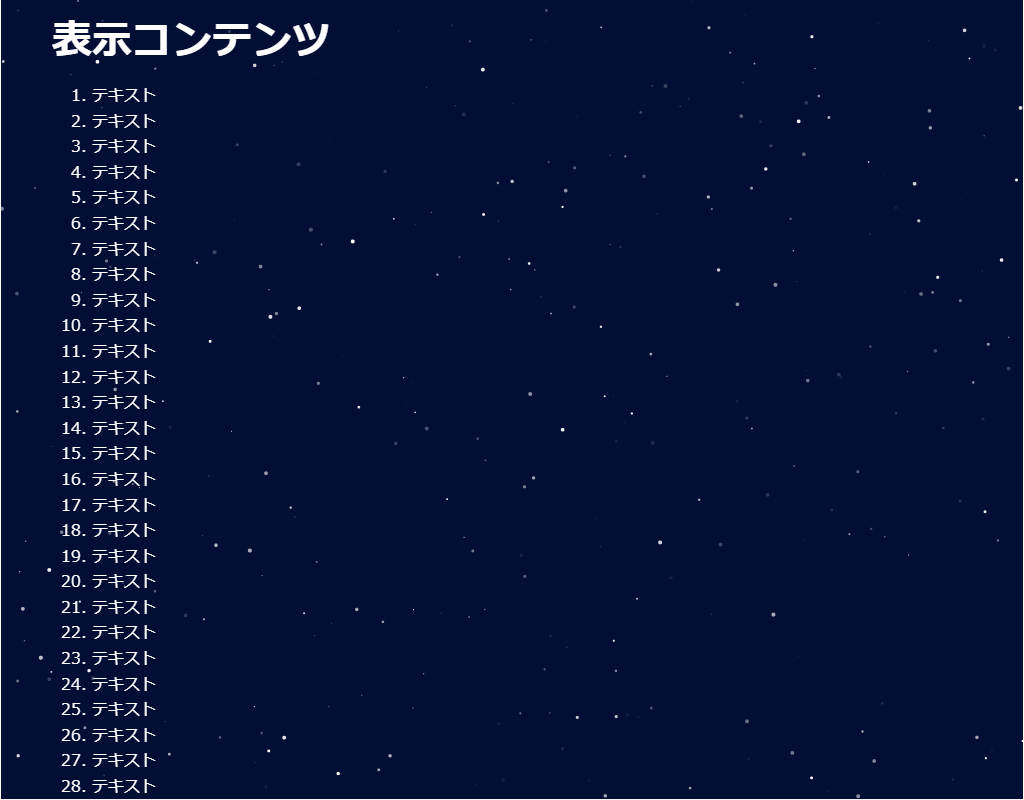
font-family: "Hiragino Sans W3", "Hiragino Kaku Gothic ProN", "ヒラギノ角ゴ ProN W3", "メイリオ", "Meiryo", "MS Pゴシック", "MS PGothic", sans-serif;
}
.container {
border: #fff 1px solid;
}
.wrapper {
max-width: 960px;
margin: 0 auto;
padding: 0 20px;
color: #fff;
background: #00000000;
}
h1 {
font-size: 2.5rem;
padding: 10px 0;
}
ol {
margin-left: 40px;
}
/* ▼▼▼ CSS(ここから)(※2) ▼▼▼ */
/* パーティクル(particles)の設定 */
/* アニメーション枠指定 */
.back-container {
width: 100%;
height: 100vh;
overflow: hidden;
position: fixed;
top: 0;
left: 0;
z-index: -1;
background-color: #0a4440;
}
/* ▲▲▲ CSS(ここまで) ▲▲▲ */
</style>
</head>
<body>
<div class="container">
<div class="wrapper">
<h1>表示コンテンツ</h1>
<ol>
<li>テキスト</li><li>テキスト</li><li>テキスト</li><li>テキスト</li><li>テキスト</li> <!-- 01~05行 -->
<li>テキスト</li><li>テキスト</li><li>テキスト</li><li>テキスト</li><li>テキスト</li> <!-- 06~10行 -->
<li>テキスト</li><li>テキスト</li><li>テキスト</li><li>テキスト</li><li>テキスト</li> <!-- 11~15行 -->
<li>テキスト</li><li>テキスト</li><li>テキスト</li><li>テキスト</li><li>テキスト</li> <!-- 16~20行 -->
<li>テキスト</li><li>テキスト</li><li>テキスト</li><li>テキスト</li><li>テキスト</li> <!-- 21~25行 -->
<li>テキスト</li><li>テキスト</li><li>テキスト</li><li>テキスト</li><li>テキスト</li> <!-- 26~30行 -->
<li>テキスト</li><li>テキスト</li><li>テキスト</li><li>テキスト</li><li>テキスト</li> <!-- 31~35行 -->
<li>テキスト</li><li>テキスト</li><li>テキスト</li><li>テキスト</li><li>テキスト</li> <!-- 36~40行 -->
<li>テキスト</li><li>テキスト</li><li>テキスト</li><li>テキスト</li><li>テキスト</li> <!-- 41~45行 -->
<li>テキスト</li><li>テキスト</li><li>テキスト</li><li>テキスト</li><li>テキスト</li> <!-- 46~50行 -->
<li>テキスト</li><li>テキスト</li><li>テキスト</li><li>テキスト</li><li>テキスト</li> <!-- 51~55行 -->
<li>テキスト</li><li>テキスト</li><li>テキスト</li><li>テキスト</li><li>テキスト</li> <!-- 56~60行 -->
<li>テキスト</li><li>テキスト</li><li>テキスト</li><li>テキスト</li><li>テキスト</li> <!-- 61~65行 -->
<li>テキスト</li><li>テキスト</li><li>テキスト</li><li>テキスト</li><li>テキスト</li> <!-- 66~70行 -->
</ol>
</div>
<!-- ▼▼▼ HTML(ここから) ▼▼▼(※3) -->
<!-- パーティクル(particles)の定義 -->
<div class="back-container" id="back-container"></div>
<!-- ▲▲▲ HTML(ここまで) ▲▲▲ -->
</div>
<!-- ▼▼▼ SCRIPT(ここから)(※4) ▼▼▼ -->
<!-- パーティクル(particles)の制御 -->
<script src="https://cdn.jsdelivr.net/particles.js/2.0.0/particles.min.js"></script>
<script>
particlesJS("back-container", {
"particles": {
"number": {
"value": 38, // 幾何学模様の数
"density": {
"enable": true,
"value_area": 800
}
},
"color": {
"value": "#ffffff" // 色
},
"shape": {
"type": "polygon", // 形状(polygon)
"stroke": {
"width": 0,
},
"polygon": {
"nb_sides": 3 // 多角形の角の数ー
},
"image": {
"width": 190,
"height": 100
}
},
"opacity": {
"value": 0.664994832269074,
"random": false,
"anim":{
"enable": true,
"speed": 2.2722661797524872,
"opacity_min": 0.08115236356258881,
"sync": false
}
},
"size": {
"value": 3,
"random": true,
"anim": {
"enable": false,
"speed": 40,
"size_min": 0.1,
"sync": false
}
},
"line_linked": {
"enable": true,
"distance": 150,
"color": "#ffffff",
"opacity": 0.6,
"width": 1
},
"move": {
"enable": true,
"speed": 6, // この数値を小さくするとゆっくりな動きになる
"direction": "none", // 方向指定なし
"random": false, // 動きはランダムにしない
"straight": false, // 動きをとどめない
"out_mode": "out", // 画面の外に出るように描写
"bounce": false, // 跳ね返りなし
"attract": {
"enable": false,
"rotateX": 600,
"rotateY": 961.4383117143238
}
}
},
"interactivity": {
"detect_on": "canvas",
"events": {
"onhover": {
"enable": false,
"mode":" repulse"
},
"onclick":{
"enable": false
},
"resize": true
}
},
"retina_detect": true
});
</script>
<!-- ▲▲▲ SCRIPT(ここまで) ▲▲▲ -->
</body>
</html>
HTML(index.html)
<!DOCTYPE html>
<html lang="ja">
<!-- 参考サイト
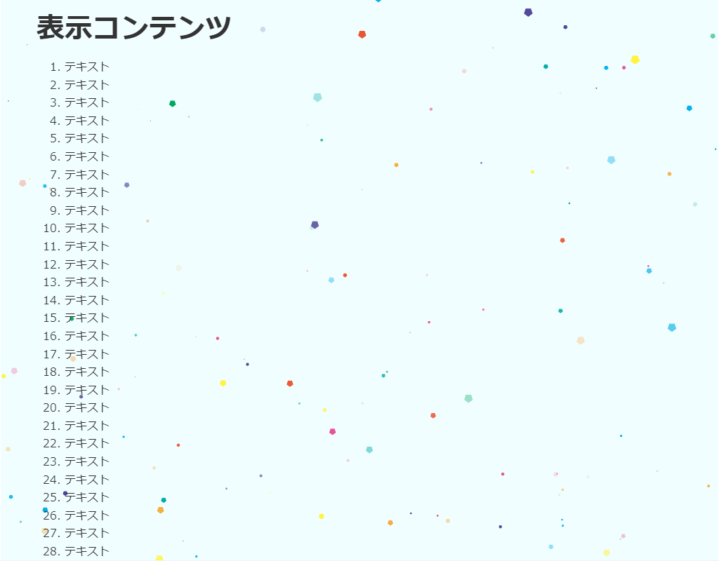
背景の動き -紙吹雪が舞う-
https://coco-factory.jp/ugokuweb/move02/5-8/
-->
<!--
・紙吹雪を生成します。
・particlesライブラリィを使用しています。
-->
<head>
<meta charset="UTF-8">
<title>パーティクル(particles)のサンプル</title>
<meta name="viewport" content="width=device-width,initial-scale=1.0,viewport-fit=cover">
<style>
body,div,h1,h2,h3,h4,h5,h6,pre,p,a,select,header,nav,main,section,footer,ul,ol,li,label {
padding: 0;
margin: 0;
font-size: 16px;
line-height: 1.6;
word-wrap: break-word;
box-sizing: border-box;
}
body {
font-family: "Hiragino Sans W3", "Hiragino Kaku Gothic ProN", "ヒラギノ角ゴ ProN W3", "メイリオ", "Meiryo", "MS Pゴシック", "MS PGothic", sans-serif;
}
.container {
border: #fff 1px solid;
}
.wrapper {
max-width: 960px;
margin: 0 auto;
padding: 0 20px;
color: #333;
background: #00000000;
}
h1 {
font-size: 2.5rem;
padding: 10px 0;
}
ol {
margin-left: 40px;
}
/* ▼▼▼ CSS(ここから)(※2) ▼▼▼ */
/* パーティクル(particles)の設定 */
/* アニメーション枠指定 */
.back-container {
width: 100%;
height: 100vh;
overflow: hidden;
background: #f1feff;
position: fixed;
top: 0;
left: 0;
z-index: -1;
}
/* ▲▲▲ CSS(ここまで) ▲▲▲ */
</style>
</head>
<body>
<div class="container">
<div class="wrapper">
<h1>表示コンテンツ</h1>
<ol>
<li>テキスト</li><li>テキスト</li><li>テキスト</li><li>テキスト</li><li>テキスト</li> <!-- 01~05行 -->
<li>テキスト</li><li>テキスト</li><li>テキスト</li><li>テキスト</li><li>テキスト</li> <!-- 06~10行 -->
<li>テキスト</li><li>テキスト</li><li>テキスト</li><li>テキスト</li><li>テキスト</li> <!-- 11~15行 -->
<li>テキスト</li><li>テキスト</li><li>テキスト</li><li>テキスト</li><li>テキスト</li> <!-- 16~20行 -->
<li>テキスト</li><li>テキスト</li><li>テキスト</li><li>テキスト</li><li>テキスト</li> <!-- 21~25行 -->
<li>テキスト</li><li>テキスト</li><li>テキスト</li><li>テキスト</li><li>テキスト</li> <!-- 26~30行 -->
<li>テキスト</li><li>テキスト</li><li>テキスト</li><li>テキスト</li><li>テキスト</li> <!-- 31~35行 -->
<li>テキスト</li><li>テキスト</li><li>テキスト</li><li>テキスト</li><li>テキスト</li> <!-- 36~40行 -->
<li>テキスト</li><li>テキスト</li><li>テキスト</li><li>テキスト</li><li>テキスト</li> <!-- 41~45行 -->
<li>テキスト</li><li>テキスト</li><li>テキスト</li><li>テキスト</li><li>テキスト</li> <!-- 46~50行 -->
<li>テキスト</li><li>テキスト</li><li>テキスト</li><li>テキスト</li><li>テキスト</li> <!-- 51~55行 -->
<li>テキスト</li><li>テキスト</li><li>テキスト</li><li>テキスト</li><li>テキスト</li> <!-- 56~60行 -->
<li>テキスト</li><li>テキスト</li><li>テキスト</li><li>テキスト</li><li>テキスト</li> <!-- 61~65行 -->
<li>テキスト</li><li>テキスト</li><li>テキスト</li><li>テキスト</li><li>テキスト</li> <!-- 66~70行 -->
</ol>
</div>
<!-- ▼▼▼ HTML(ここから) ▼▼▼(※3) -->
<!-- パーティクル(particles)の定義 -->
<div class="back-container" id="back-container"></div>
<!-- ▲▲▲ HTML(ここまで) ▲▲▲ -->
</div>
<!-- ▼▼▼ SCRIPT(ここから)(※4) ▼▼▼ -->
<!-- パーティクル(particles)の制御 -->
<script src="https://cdn.jsdelivr.net/particles.js/2.0.0/particles.min.js"></script>
<script>
particlesJS("back-container", {
"particles":{
"number":{
"value": 125, // この数値を変更すると紙吹雪の数が増減できる
"density":{
"enable":false,
"value_area":400
}
},
"color": { // 紙吹雪の色の数を増やすことが出来る
"value": [
"#EA5532",
"#F6AD3C",
"#FFF33F",
"#00A95F",
"#00ADA9",
"#00AFEC",
"#4D4398",
"#E85298"
]
},
"shape": {
"type": "polygon", // 形状はpolygonを指定
"stroke": {
"width": 0,
},
"polygon": {
"nb_sides": 5 // 多角形の角の数
}
},
"opacity": {
"value": 1,
"random": false,
"anim": {
"enable": true,
"speed": 20,
"opacity_min": 0,
"sync": false
}
},
"size": {
"value": 5.305992965476349,
"random": true, // サイズをランダムに
"anim": {
"enable": true,
"speed": 1.345709068776642,
"size_min": 0.8,
"sync": false
}
},
"line_linked": {
"enable": false,
},
"move": {
"enable": true,
"speed": 10, // この数値を小さくするとゆっくりな動きになる
"direction": "bottom", // 下に向かって落ちる
"random": false, // 動きはランダムにならないように
"straight": false, // 動きをとどめない
"out_mode": "out", // 画面の外に出るように描写
"bounce": false, // 跳ね返りなし
"attract": {
"enable": false,
"rotateX": 600,
"rotateY": 1200
}
}
},
"interactivity":{
"detect_on": "canvas",
"events": {
"onhover": {
"enable": false,
},
"onclick": {
"enable": false,
},
"resize": true
},
},
"retina_detect": true
});
</script>
<!-- ▲▲▲ SCRIPT(ここまで) ▲▲▲ -->
</body>
</html>
 (snow.png:雪画像)
HTML(index.html)
<!DOCTYPE html>
<html lang="ja">
<!--	参考サイト
		背景の動き -雪が降る-
		https://coco-factory.jp/ugokuweb/move02/5-5/
-->
<!--
	・雪を生成します。
	・particlesライブラリィを使用しています。
-->
<head>
<meta charset="UTF-8">
<title>パーティクル(雪)のサンプル</title>
<meta name="viewport" content="width=device-width,initial-scale=1.0,viewport-fit=cover">
<style>
body,div,h1,h2,h3,h4,h5,h6,pre,p,a,select,header,nav,main,section,footer,ul,ol,li,label {
	padding: 0;
	margin: 0;
	font-size: 16px;
	line-height: 1.6;
	word-wrap: break-word;
	box-sizing: border-box;
}
body {
	font-family: "Hiragino Sans W3", "Hiragino Kaku Gothic ProN", "ヒラギノ角ゴ ProN W3", "メイリオ", "Meiryo", "MS Pゴシック", "MS PGothic", sans-serif;
}
.container {
	border: #fff 1px solid;
}
.wrapper {
	max-width: 960px;
	margin: 0 auto;
	padding: 0 20px;
	color: #fff;
	background: #00000000;
}
h1 {
	font-size: 2.5rem;
	padding: 10px 0;
}
ol {
	margin-left: 40px;
}

/* ▼▼▼ CSS(ここから)(※2) ▼▼▼ */
/* パーティクル(雪)の設定 */

/* アニメーション枠指定 */
.back-container {
	width: 100%;
	height: 100vh;
	overflow: hidden;
	background: #333;
	position: fixed;
	top: 0;
	left: 0;
	z-index: -1;
}
/* ▲▲▲ CSS(ここまで) ▲▲▲ */
</style>
</head>

<body>

<div class="container">
	<div class="wrapper">
		<h1>表示コンテンツ</h1>
		<ol>
			<li>テキスト</li><li>テキスト</li><li>テキスト</li><li>テキスト</li><li>テキスト</li>	<!-- 01~05行 -->
			<li>テキスト</li><li>テキスト</li><li>テキスト</li><li>テキスト</li><li>テキスト</li>	<!-- 06~10行 -->
			<li>テキスト</li><li>テキスト</li><li>テキスト</li><li>テキスト</li><li>テキスト</li>	<!-- 11~15行 -->
			<li>テキスト</li><li>テキスト</li><li>テキスト</li><li>テキスト</li><li>テキスト</li>	<!-- 16~20行 -->
			<li>テキスト</li><li>テキスト</li><li>テキスト</li><li>テキスト</li><li>テキスト</li>	<!-- 21~25行 -->
			<li>テキスト</li><li>テキスト</li><li>テキスト</li><li>テキスト</li><li>テキスト</li>	<!-- 26~30行 -->
			<li>テキスト</li><li>テキスト</li><li>テキスト</li><li>テキスト</li><li>テキスト</li>	<!-- 31~35行 -->
			<li>テキスト</li><li>テキスト</li><li>テキスト</li><li>テキスト</li><li>テキスト</li>	<!-- 36~40行 -->
			<li>テキスト</li><li>テキスト</li><li>テキスト</li><li>テキスト</li><li>テキスト</li>	<!-- 41~45行 -->
			<li>テキスト</li><li>テキスト</li><li>テキスト</li><li>テキスト</li><li>テキスト</li>	<!-- 46~50行 -->
			<li>テキスト</li><li>テキスト</li><li>テキスト</li><li>テキスト</li><li>テキスト</li>	<!-- 51~55行 -->
			<li>テキスト</li><li>テキスト</li><li>テキスト</li><li>テキスト</li><li>テキスト</li>	<!-- 56~60行 -->
			<li>テキスト</li><li>テキスト</li><li>テキスト</li><li>テキスト</li><li>テキスト</li>	<!-- 61~65行 -->
			<li>テキスト</li><li>テキスト</li><li>テキスト</li><li>テキスト</li><li>テキスト</li>	<!-- 66~70行 -->
		</ol>
	</div>

<!-- ▼▼▼ HTML(ここから) ▼▼▼(※3) -->
<!-- パーティクル(雪)の定義 -->
	<div class="back-container" id="back-container"></div>
<!-- ▲▲▲ HTML(ここまで) ▲▲▲ -->
</div>

<!-- ▼▼▼ SCRIPT(ここから)(※4) ▼▼▼ -->
<!-- パーティクル(雪)の制御 -->
<script src="https://cdn.jsdelivr.net/particles.js/2.0.0/particles.min.js"></script>
<script>

	particlesJS("back-container", {
		"particles": {
			"number": {
				"value": 100,								// 雪の数が増減できる
				"density": {
					"enable": true,
					"value_area": 800
				}
			},
			"color": {
				"value": "#ffffff"
			},
			"shape": {
				"type": "image",							// 形状は画像を指定
				"stroke": {
					"width": 3,
					"color": "#fff"
				},
				"image": {
					"src": "images/snow.png",				// 画像を指定
					"width": 120,
					"height": 120
				}
			},
			"opacity": {
				"value": 0.7,
				"random": false,
				"anim": {
					"enable": false,
					"speed": 1,
					"opacity_min": 0.1,
					"sync": false
				}
			},
			"size": {
				"value": 5,
				"random": true,
				"anim": {
					"enable": false,
					"speed": 20,
					"size_min": 0.1,
					"sync": false
				}
			},
			"line_linked": {
				"enable": false,
			},
			"move": {
				"enable": true,
				"speed": 3,									// この数値を小さくするとゆっくりな動きになる
				"direction": "bottom",						// 下に向かって落ちる
				"random": true,								// 動きはランダム
				"straight": false,							// 動きをとどめない
				"out_mode": "out",							// 画面の外に出るように描写
				"bounce": false,							// 跳ね返りなし
				"attract": {
					"enable": true,
					"rotateX": 300,
					"rotateY": 1200
				}
			}
		},
		"interactivity": {
			"detect_on": "canvas",
			"events": {
				"onhover": {
					"enable": false,
				},
				"onclick": {
					"enable": false,
				},
				"resize": true
			}
		},
		"retina_detect": true
	});

</script>
<!-- ▲▲▲ SCRIPT(ここまで) ▲▲▲ -->

</body>
</html>
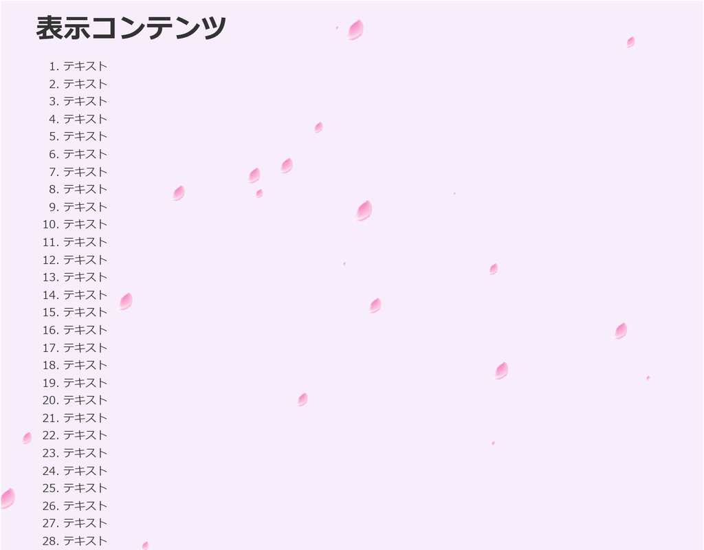
 (flower.png:桜画像)
HTML(index.html)
<!DOCTYPE html>
<html lang="ja">
<!--	参考サイト
		背景の動き -桜が散る-
		https://coco-factory.jp/ugokuweb/move02/5-6/
-->
<!--
	・散る桜を生成します。
	・particlesライブラリィを使用しています。
-->
<head>
<meta charset="UTF-8">
<title>パーティクル(散る桜)のサンプル</title>
<meta name="viewport" content="width=device-width,initial-scale=1.0,viewport-fit=cover">
<style>
body,div,h1,h2,h3,h4,h5,h6,pre,p,a,select,header,nav,main,section,footer,ul,ol,li,label {
	padding: 0;
	margin: 0;
	font-size: 16px;
	line-height: 1.6;
	word-wrap: break-word;
	box-sizing: border-box;
}
body {
	font-family: "Hiragino Sans W3", "Hiragino Kaku Gothic ProN", "ヒラギノ角ゴ ProN W3", "メイリオ", "Meiryo", "MS Pゴシック", "MS PGothic", sans-serif;
}
.container {
	border: #fff 1px solid;
}
.wrapper {
	max-width: 960px;
	margin: 0 auto;
	padding: 0 20px;
	color: #333;
	background: #00000000;
}
h1 {
	font-size: 2.5rem;
	padding: 10px 0;
}
ol {
	margin-left: 40px;
}

/* ▼▼▼ CSS(ここから)(※2) ▼▼▼ */
/* パーティクル(散る桜)の設定 */

/* アニメーション枠指定 */
.back-container {
	width: 100%;
	height: 100vh;
	overflow: hidden;
	background: #faeffd;
	position: fixed;
	top: 0;
	left: 0;
	z-index: -1;
}
/* ▲▲▲ CSS(ここまで) ▲▲▲ */
</style>
</head>

<body>

<div class="container">
	<div class="wrapper">
		<h1>表示コンテンツ</h1>
		<ol>
			<li>テキスト</li><li>テキスト</li><li>テキスト</li><li>テキスト</li><li>テキスト</li>	<!-- 01~05行 -->
			<li>テキスト</li><li>テキスト</li><li>テキスト</li><li>テキスト</li><li>テキスト</li>	<!-- 06~10行 -->
			<li>テキスト</li><li>テキスト</li><li>テキスト</li><li>テキスト</li><li>テキスト</li>	<!-- 11~15行 -->
			<li>テキスト</li><li>テキスト</li><li>テキスト</li><li>テキスト</li><li>テキスト</li>	<!-- 16~20行 -->
			<li>テキスト</li><li>テキスト</li><li>テキスト</li><li>テキスト</li><li>テキスト</li>	<!-- 21~25行 -->
			<li>テキスト</li><li>テキスト</li><li>テキスト</li><li>テキスト</li><li>テキスト</li>	<!-- 26~30行 -->
			<li>テキスト</li><li>テキスト</li><li>テキスト</li><li>テキスト</li><li>テキスト</li>	<!-- 31~35行 -->
			<li>テキスト</li><li>テキスト</li><li>テキスト</li><li>テキスト</li><li>テキスト</li>	<!-- 36~40行 -->
			<li>テキスト</li><li>テキスト</li><li>テキスト</li><li>テキスト</li><li>テキスト</li>	<!-- 41~45行 -->
			<li>テキスト</li><li>テキスト</li><li>テキスト</li><li>テキスト</li><li>テキスト</li>	<!-- 46~50行 -->
			<li>テキスト</li><li>テキスト</li><li>テキスト</li><li>テキスト</li><li>テキスト</li>	<!-- 51~55行 -->
			<li>テキスト</li><li>テキスト</li><li>テキスト</li><li>テキスト</li><li>テキスト</li>	<!-- 56~60行 -->
			<li>テキスト</li><li>テキスト</li><li>テキスト</li><li>テキスト</li><li>テキスト</li>	<!-- 61~65行 -->
			<li>テキスト</li><li>テキスト</li><li>テキスト</li><li>テキスト</li><li>テキスト</li>	<!-- 66~70行 -->
		</ol>
	</div>

<!-- ▼▼▼ HTML(ここから) ▼▼▼(※3) -->
<!-- パーティクル(散る桜)の定義 -->
	<div class="back-container" id="back-container"></div>
<!-- ▲▲▲ HTML(ここまで) ▲▲▲ -->
</div>

<!-- ▼▼▼ SCRIPT(ここから)(※4) ▼▼▼ -->
<!-- パーティクル(散る桜)の制御 -->
<script src="https://cdn.jsdelivr.net/particles.js/2.0.0/particles.min.js"></script>
<script>

	particlesJS("back-container", {
		"particles": {
			"number": {
				"value": 30,					// 桜の数
				"density": {
					"enable": true,
					"value_area": 1121.6780303333778
				}
			},
			"color": {
				"value": "#fff"
			},
			"shape": {
				"type": "image",				// 桜の画像
				"stroke": {
					"width": 0,
				},
				"image": {
					"src": "images/flower.png",
					"width": 120,
					"height": 120
				}
			},
			"opacity": {
				"value": 0.06409588744762158,
				"random": true,
				"anim": {
					"enable": false,
					"speed": 1,
					"opacity_min": 0.1,
					"sync": false
				}
			},
			"size": {
				"value": 16,
				"random": true,					// サイズをランダム
				"anim": {
					"enable": false,
					"speed": 4,
					"size_min": 0.1,
					"sync": false
				}
			},
			"line_linked": {
				"enable": false,
			},
			"move": {
				"enable": true,
				"speed": 7,						// スピード
				"direction": "bottom-right",	// 散る方向
				"random": false,				// 動きは非ランダム
				"straight": false,				// 動きをとどめない
				"out_mode": "out",				// 画面の外に出るように描画
				"bounce": false,				// 跳ね返りなし
				"attract": {
					"enable": false,
					"rotateX": 281.9177489524316,
					"rotateY": 127.670995809726
				}
			}
		},
		"interactivity": {
			"detect_on": "canvas",
			"events": {
				"onhover": {
					"enable": false,
				},
				"onclick": {
					"enable": false,
				},
				"resize": true
			}
		},
		"retina_detect": false
	});

</script>
<!-- ▲▲▲ SCRIPT(ここまで) ▲▲▲ -->

</body>
</html>
HTML(index.html)
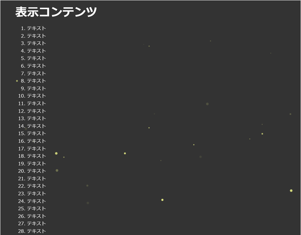
<!DOCTYPE html>
<html lang="ja">
<!--	参考サイト
		背景の動き -ホタルが舞う-
		https://coco-factory.jp/ugokuweb/move02/5-7/
-->
<!--
	・蛍の光を生成します。
	・particlesライブラリィを使用しています。
-->
<head>
<meta charset="UTF-8">
<title>パーティクル(ホタル)のサンプル</title>
<meta name="viewport" content="width=device-width,initial-scale=1.0,viewport-fit=cover">
<style>
body,div,h1,h2,h3,h4,h5,h6,pre,p,a,select,header,nav,main,section,footer,ul,ol,li,label {
	padding: 0;
	margin: 0;
	font-size: 16px;
	line-height: 1.6;
	word-wrap: break-word;
	box-sizing: border-box;
}
body {
	font-family: "Hiragino Sans W3", "Hiragino Kaku Gothic ProN", "ヒラギノ角ゴ ProN W3", "メイリオ", "Meiryo", "MS Pゴシック", "MS PGothic", sans-serif;
}
.container {
	border: #fff 1px solid;
}
.wrapper {
	max-width: 960px;
	margin: 0 auto;
	padding: 0 20px;
	color: #fff;
	background: #00000000;
}
h1 {
	font-size: 2.5rem;
	padding: 10px 0;
}
ol {
	margin-left: 40px;
}

/* ▼▼▼ CSS(ここから)(※2) ▼▼▼ */
/* パーティクル(蛍の光)の設定 */

/* アニメーション枠指定 */
.back-container {
	width: 100%;
	height: 100vh;
	overflow: hidden;
	background: #333333;
	position: fixed;
	top: 0;
	left: 0;
	z-index: -1;
}
/* ▲▲▲ CSS(ここまで) ▲▲▲ */
</style>
</head>

<body>

<div class="container">
	<div class="wrapper">
		<h1>表示コンテンツ</h1>
		<ol>
			<li>テキスト</li><li>テキスト</li><li>テキスト</li><li>テキスト</li><li>テキスト</li>	<!-- 01~05行 -->
			<li>テキスト</li><li>テキスト</li><li>テキスト</li><li>テキスト</li><li>テキスト</li>	<!-- 06~10行 -->
			<li>テキスト</li><li>テキスト</li><li>テキスト</li><li>テキスト</li><li>テキスト</li>	<!-- 11~15行 -->
			<li>テキスト</li><li>テキスト</li><li>テキスト</li><li>テキスト</li><li>テキスト</li>	<!-- 16~20行 -->
			<li>テキスト</li><li>テキスト</li><li>テキスト</li><li>テキスト</li><li>テキスト</li>	<!-- 21~25行 -->
			<li>テキスト</li><li>テキスト</li><li>テキスト</li><li>テキスト</li><li>テキスト</li>	<!-- 26~30行 -->
			<li>テキスト</li><li>テキスト</li><li>テキスト</li><li>テキスト</li><li>テキスト</li>	<!-- 31~35行 -->
			<li>テキスト</li><li>テキスト</li><li>テキスト</li><li>テキスト</li><li>テキスト</li>	<!-- 36~40行 -->
			<li>テキスト</li><li>テキスト</li><li>テキスト</li><li>テキスト</li><li>テキスト</li>	<!-- 41~45行 -->
			<li>テキスト</li><li>テキスト</li><li>テキスト</li><li>テキスト</li><li>テキスト</li>	<!-- 46~50行 -->
			<li>テキスト</li><li>テキスト</li><li>テキスト</li><li>テキスト</li><li>テキスト</li>	<!-- 51~55行 -->
			<li>テキスト</li><li>テキスト</li><li>テキスト</li><li>テキスト</li><li>テキスト</li>	<!-- 56~60行 -->
			<li>テキスト</li><li>テキスト</li><li>テキスト</li><li>テキスト</li><li>テキスト</li>	<!-- 61~65行 -->
			<li>テキスト</li><li>テキスト</li><li>テキスト</li><li>テキスト</li><li>テキスト</li>	<!-- 66~70行 -->
		</ol>
	</div>

<!-- ▼▼▼ HTML(ここから) ▼▼▼(※3) -->
<!-- パーティクル(蛍の光)の定義 -->
	<div class="back-container" id="back-container"></div>
<!-- ▲▲▲ HTML(ここまで) ▲▲▲ -->
</div>

<!-- ▼▼▼ SCRIPT(ここから)(※4) ▼▼▼ -->
<!-- パーティクル(蛍の光)の制御 -->
<script src="https://cdn.jsdelivr.net/particles.js/2.0.0/particles.min.js"></script>
<script>

	particlesJS("back-container", {
		"particles": {
			"number": {
				"value": 50,					// ホタルの数
				"density": {
					"enable": true,
					"value_area": 1602.3971861905397
				}
			},
			"color": {
				"value": "#f3fa8b"				// 色
			},
			"shape": {
				"type": "circle",				// 形状
				"stroke": {
					"width": 0,
				}
			},
			"opacity": {
				"value": 1,
				"random": true,					// 透過はランダム
				"anim": {
					"enable": false,
					"speed": 1.10115236356258881,
					"opacity_min": 0,
					"sync": false
				}
			},
			"size": {
				"value": 4.005992965476349,
//				"value": 10,					// 大きなホタルにしても面白い (^^)
				"random": true,					// サイズはランダム
				"anim": {
					"enable": true,
					"speed": 24.345709068776642,
					"size_min": 0.1,
					"sync": false
				}
			},
			"line_linked": {
				"enable": false,
			},
			"move": {
				"enable": true,
				"speed": 6,						// 動作スピード
				"direction": "none",			// 方向性なし
				"random": true,					// 動きはランダム
				"straight": false,				// 動きをとどめない
				"out_mode": "out",				// 画面の外に出るように描画
				"bounce": false,				// 跳ね返りなし
				"attract": {
					"enable": false,
					"rotateX": 600,
					"rotateY": 600
				}
			}
		},
		"interactivity": {
			"detect_on": "canvas",
			"events": {
				"onhover": {
					"enable": false
				},
				"onclick": {
					"enable": false
				},
				"resize": true
			}
		},
		"retina_detect": true
	});

</script>
<!-- ▲▲▲ SCRIPT(ここまで) ▲▲▲ -->

</body>
</html>
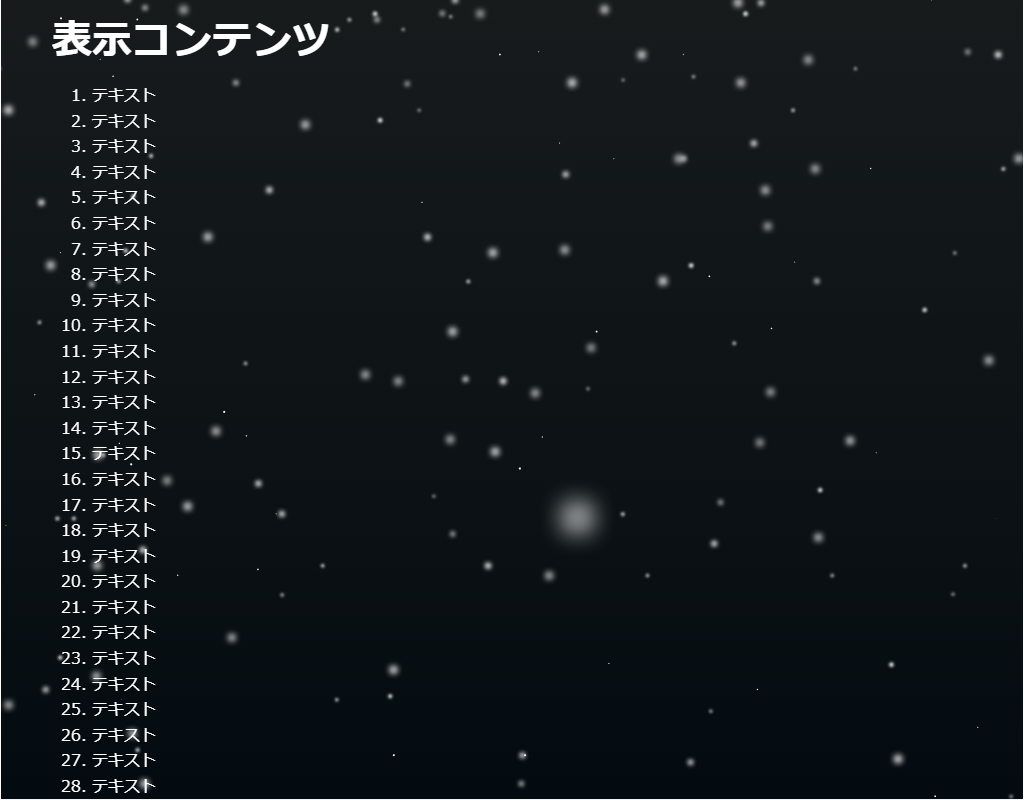
HTML(index.html)
<!DOCTYPE html>
<html lang="ja">
<!--	参考サイト
		背景にひと手間加えたい時に参考になりそうなスニペット集
		https://try-m.co.jp/blog/web-create/6672/
-->
<!--
	・雪を生成します。
	・カーソルを動かすと風向きを変更できます。
	・createjsライブラリィを使用しています。
-->
<head>
<meta charset="UTF-8">
<title>パーティクル(createjs)のサンプル</title>
<meta name="viewport" content="width=device-width,initial-scale=1.0,viewport-fit=cover">
<style>
body,div,h1,h2,h3,h4,h5,h6,pre,p,a,select,header,nav,main,section,footer,ul,ol,li,label {
	padding: 0;
	margin: 0;
	font-size: 16px;
	line-height: 1.6;
	word-wrap: break-word;
	box-sizing: border-box;
}
body {
	font-family: "Hiragino Sans W3", "Hiragino Kaku Gothic ProN", "ヒラギノ角ゴ ProN W3", "メイリオ", "Meiryo", "MS Pゴシック", "MS PGothic", sans-serif;
}
.container {
	border: #fff 1px solid;
}
.wrapper {
	max-width: 960px;
	margin: 0 auto;
	padding: 0 20px;
	color: #fff;
	background: #00000000;
}
h1 {
	font-size: 2.5rem;
	padding: 10px 0;
}
ol {
	margin-left: 40px;
}

/* ▼▼▼ CSS(ここから)(※2) ▼▼▼ */
/* パーティクル(createjs)の設定 */

/* アニメーション枠指定 */
.back-container {
	width: 100%;
	height: 100vh;
	overflow: hidden;
	background: #333;
	position: fixed;
	top: 0;
	left: 0;
	z-index: -1;
}
canvas#myCanvas{
	background: linear-gradient(#171b1c, #040b10);
	display: block;
	position: absolute;
	top: 0;
	left: 0;
	width: 100%;
	height: 100%;
}
/* ▲▲▲ CSS(ここまで) ▲▲▲ */
</style>
</head>

<body>

<div class="container">
	<div class="wrapper">
		<h1>表示コンテンツ</h1>
		<ol>
			<li>テキスト</li><li>テキスト</li><li>テキスト</li><li>テキスト</li><li>テキスト</li>	<!-- 01~05行 -->
			<li>テキスト</li><li>テキスト</li><li>テキスト</li><li>テキスト</li><li>テキスト</li>	<!-- 06~10行 -->
			<li>テキスト</li><li>テキスト</li><li>テキスト</li><li>テキスト</li><li>テキスト</li>	<!-- 11~15行 -->
			<li>テキスト</li><li>テキスト</li><li>テキスト</li><li>テキスト</li><li>テキスト</li>	<!-- 16~20行 -->
			<li>テキスト</li><li>テキスト</li><li>テキスト</li><li>テキスト</li><li>テキスト</li>	<!-- 21~25行 -->
			<li>テキスト</li><li>テキスト</li><li>テキスト</li><li>テキスト</li><li>テキスト</li>	<!-- 26~30行 -->
			<li>テキスト</li><li>テキスト</li><li>テキスト</li><li>テキスト</li><li>テキスト</li>	<!-- 31~35行 -->
			<li>テキスト</li><li>テキスト</li><li>テキスト</li><li>テキスト</li><li>テキスト</li>	<!-- 36~40行 -->
			<li>テキスト</li><li>テキスト</li><li>テキスト</li><li>テキスト</li><li>テキスト</li>	<!-- 41~45行 -->
			<li>テキスト</li><li>テキスト</li><li>テキスト</li><li>テキスト</li><li>テキスト</li>	<!-- 46~50行 -->
			<li>テキスト</li><li>テキスト</li><li>テキスト</li><li>テキスト</li><li>テキスト</li>	<!-- 51~55行 -->
			<li>テキスト</li><li>テキスト</li><li>テキスト</li><li>テキスト</li><li>テキスト</li>	<!-- 56~60行 -->
			<li>テキスト</li><li>テキスト</li><li>テキスト</li><li>テキスト</li><li>テキスト</li>	<!-- 61~65行 -->
			<li>テキスト</li><li>テキスト</li><li>テキスト</li><li>テキスト</li><li>テキスト</li>	<!-- 66~70行 -->
		</ol>
	</div>

<!-- ▼▼▼ HTML(ここから) ▼▼▼(※3) -->
<!-- パーティクル(createjs)の定義 -->
	<div class="back-container">
		<canvas id="myCanvas""></canvas>
	</div>
<!-- ▲▲▲ HTML(ここまで) ▲▲▲ -->
</div>

<!-- ▼▼▼ SCRIPT(ここから)(※4) ▼▼▼ -->
<!-- パーティクル(createjs)の制御 -->
<script src="https://code.createjs.com/1.0.0/createjs.min.js"></script>
<script id="rendered-js">
	init();
	var stage, stageWidth, stageHeight;	// 画面サイズ
	var snow;							// 雪
	var snowArray = [];					// 雪の配列
	var bigSnow;						// 至近距離の雪
	var bigSnowArray = [];				// 至近距離の雪の配列
	var snowfall = 10;					// 降雪量
	var wind = 0;						// 風向き
	var count = 0;						// カウンター
	var mx;								// マウスのx座標
	var vx = 0;							// 速度x軸
	var vy = 0;							// 速度y軸

	function init() {
		stage = new createjs.Stage("myCanvas");
		window.addEventListener("resize", handleResize);
		handleResize();
		//スマホセンサー
		window.addEventListener("deviceorientation", deviceorientationHandler);
		if (createjs.Touch.isSupported() === true) {
			createjs.Touch.enable(stage);	// タッチ操作を有効にする
		}
		//tickイベント
		createjs.Ticker.timingMode = createjs.Ticker.RAF;
		createjs.Ticker.addEventListener("tick", handleTick);
	}

	//画面のリサイズ処理
	function handleResize(event) {
		// 画面幅・高さを取得
		var stageWidth = window.innerWidth;
		var stageHeight = window.innerHeight;
		// Canvas要素の大きさを画面幅・高さに合わせる
		stage.canvas.width = stageWidth;
		stage.canvas.height = stageHeight;
		stage.update();					// 画面更新する
	}

	//ジャイロセンサー感知
	function deviceorientationHandler(event) {
		var gamma = event.gamma;		// Y軸
		wind = gamma * 0.01;			//風向きに反映
	}

	function handleTick(event) {
		count += 1;						// フレームを増やす
		discrimination();				// デバイスの判別
		emitSnow();						// 雪の描写
		fallSnow();
		emitBigSnow();					// 至近距離の雪の描写
		fallBigSnow();
		stage.update();
	}

	//デバイスの判別
	function discrimination() {
		var ua = navigator.userAgent.toLowerCase();
		var isiPhone = (ua.indexOf('iphone') > -1);											// iPhone
		var isiPad = (ua.indexOf('ipad') > -1);												// iPad
		var isAndroid = (ua.indexOf('android') > -1) && (ua.indexOf('mobile') > -1);		// Android
		var isAndroidTablet = (ua.indexOf('android') > -1) && (ua.indexOf('mobile') == -1);	// Android Tablet
		var desktop = isiPhone || isiPad || isAndroid || isAndroidTablet;
		if(!desktop){
			mx = stage.mouseX;//風向きをマウスの位置によって変える
			if (mx < stage.canvas.width / 2) {
				wind = -0.1;
			}
			else {
				wind = 0.1;
			}
		}
	}

	//雪の量を調節
	function emitSnow() {
		for(var i = 0; i < snowfall; i++) {
			if (count % (Math.floor(50 / snowfall)) === 0) {
				drawSnow();
			}
		}
	}

	//雪の描写
	function drawSnow() {
		var size = Math.random() * 4;
		snow = new createjs.Shape();
		snow.graphics
			.beginFill("#FFFFFF")
			.drawCircle(0, 0, size);
		snow.x = Math.random() * ((stage.canvas.width * 3) / 2 - (-stage.canvas.width / 2)) + (-stage.canvas.width / 2);
		snow.y = 0;
		snow.vx = 0;
		snow.vy = 0;
		snow.angle = 0;
		snow.type = Math.random();		//雪の種類にタイプをつける
		var blurStrong = size * 2;		//雪をぼかす
		var blurFilter = new createjs.BlurFilter(blurStrong, blurStrong, 2);
		snow.filters = [blurFilter];
		if (size > 1) {					//1より大きいサイズの雪にぼかしを入れる
			snow.cache(-size, -size, size * 2, size * 2);
		}
		stage.addChild(snow);
		snowArray.push(snow);
	}

	//雪を落とす
	function fallSnow() {
		for(var i = 0; i < snowArray.length; i++){
			var snow = snowArray[i];
			// typeAの雪
			if (snow.type < 0.3) {
				snow.vy += 0.2;				// 速度
				snow.vx += wind + 0.005;
			}
			//typeBの雪
			else if (0.3 <= snow.type && snow.type < 0.6) {
				snow.vy += 0.4;				//速度
				snow.vx += wind;
			}
			//typeCの雪
			else if (0.6 <= snow.type && snow.type < 1) {
				snow.vy += 0.8;//速度
				snow.vx += wind - 0.005;
			}
			// 摩擦
			snow.vy *= 0.95;
			snow.vy *= 0.99;
			//反映
			snow.x += snow.vx;
			snow.y += snow.vy;
			//キャンバスから消えたら消す
			var rule = snow.x > stage.canvas.width || snow.y > stage.canvas.height || snow.x < -stage.canvas.width;
			if (rule) {
				stage.removeChild(snow);
				snowArray.splice(i , 1);
			}
		}
	}

	//至近距離の雪の調節
	function emitBigSnow() {
		for(var i = 0; i < 1; i++){
			if(count % (Math.floor(100 / snowfall)) === 0) {
				drawBigSnow(i);
			}
		}
	}

	//至近距離の雪の描写
	function drawBigSnow(){
		var size = 12 * Math.random() + 10;
		bigSnow = new createjs.Shape();
		bigSnow.graphics
			.beginFill("#FFFFFF")
			.drawCircle(0, 0, size);
		bigSnow.x = Math.random() * ((stage.canvas.width * 3) / 2 - (-stage.canvas.width / 2)) + (-stage.canvas.width / 2);
		bigSnow.y = 0;
		bigSnow.vx = 0;
		bigSnow.vy = 0;
		bigSnow.angle = 0;
		bigSnow.type = Math.random();	//雪の種類にタイプをつける
		var blurStrong = size * 2;		//ぼかす
		var blurFilter = new createjs.BlurFilter(blurStrong, blurStrong, 2);
		bigSnow.filters = [blurFilter];
		bigSnow.cache(-size, -size, size * 2, size * 2);
		stage.addChild(bigSnow);
		bigSnowArray.push(bigSnow);
	}

	//至近距離の雪を落とす
	function fallBigSnow(){
		for (var i = 0; i < bigSnowArray.length; i++) {
			var bigSnow = bigSnowArray[i];
			bigSnow.vx += wind*10;		//速度
			bigSnow.vy += 1;
			bigSnow.vx *= 0.99;			//摩擦
			bigSnow.vy *= 1.01;
			bigSnow.x += bigSnow.vx;	//反映
			bigSnow.y += bigSnow.vy;
			//キャンバスから消えたら消す
			var rule = bigSnow.x > stage.canvas.width || bigSnow.y > stage.canvas.height || bigSnow.x < 0;
			if(rule){
				stage.removeChild(bigSnow);
				bigSnowArray.splice(i , 1);
			}
		}
	}
</script>
<!-- ▲▲▲ SCRIPT(ここまで) ▲▲▲ -->

</body>
</html>
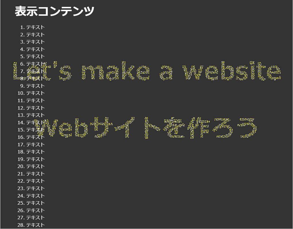
HTML(index.html)
<!DOCTYPE html>
<html lang="ja">
<!--	参考サイト
		■背景の動き -粒子が集まってタイポグラフィーを形成する-
		 https://coco-factory.jp/ugokuweb/move02/5-17/
		■パーティクルで文字を描画
		 https://github.com/39Isao2/particleText.js
-->
<!--
	・粒子で文字を生成します。
	・jQueryを使用しています。
-->
<head>
<meta charset="UTF-8">
<title>パーティクル(jQuery)のサンプル</title>
<meta name="viewport" content="width=device-width,initial-scale=1.0,viewport-fit=cover">
<style>
body,div,h1,h2,h3,h4,h5,h6,pre,p,a,select,header,nav,main,section,footer,ul,ol,li,label {
	padding: 0;
	margin: 0;
	font-size: 16px;
	line-height: 1.6;
	word-wrap: break-word;
	box-sizing: border-box;
}
body {
	font-family: "Hiragino Sans W3", "Hiragino Kaku Gothic ProN", "ヒラギノ角ゴ ProN W3", "メイリオ", "Meiryo", "MS Pゴシック", "MS PGothic", sans-serif;
}
.container {
	border: #fff 1px solid;
}
.wrapper {
	max-width: 960px;
	margin: 0 auto;
	padding: 0 20px;
	color: #fff;
	background: #00000000;
}
h1 {
	font-size: 2.5rem;
	padding: 10px 0;
}
ol {
	margin-left: 40px;
}

/* ▼▼▼ CSS(ここから)(※2) ▼▼▼ */
/* パーティクル(jQuery)の設定 */

/* アニメーション枠指定 */
.back-container {
	width: 100%;
	height: 100vh;
	overflow: hidden;
	background: #333;
	position: fixed;
	top: 0;
	left: 0;
	z-index: -1;
}
#back-wrapper {
	width: 100%;
	height: 100%;
	position: relative;
}
/* ▲▲▲ CSS(ここまで) ▲▲▲ */
</style>
</head>

<body>

<div class="container">
	<div class="wrapper">
		<h1>表示コンテンツ</h1>
		<ol>
			<li>テキスト</li><li>テキスト</li><li>テキスト</li><li>テキスト</li><li>テキスト</li>	<!-- 01~05行 -->
			<li>テキスト</li><li>テキスト</li><li>テキスト</li><li>テキスト</li><li>テキスト</li>	<!-- 06~10行 -->
			<li>テキスト</li><li>テキスト</li><li>テキスト</li><li>テキスト</li><li>テキスト</li>	<!-- 11~15行 -->
			<li>テキスト</li><li>テキスト</li><li>テキスト</li><li>テキスト</li><li>テキスト</li>	<!-- 16~20行 -->
			<li>テキスト</li><li>テキスト</li><li>テキスト</li><li>テキスト</li><li>テキスト</li>	<!-- 21~25行 -->
			<li>テキスト</li><li>テキスト</li><li>テキスト</li><li>テキスト</li><li>テキスト</li>	<!-- 26~30行 -->
			<li>テキスト</li><li>テキスト</li><li>テキスト</li><li>テキスト</li><li>テキスト</li>	<!-- 31~35行 -->
			<li>テキスト</li><li>テキスト</li><li>テキスト</li><li>テキスト</li><li>テキスト</li>	<!-- 36~40行 -->
			<li>テキスト</li><li>テキスト</li><li>テキスト</li><li>テキスト</li><li>テキスト</li>	<!-- 41~45行 -->
			<li>テキスト</li><li>テキスト</li><li>テキスト</li><li>テキスト</li><li>テキスト</li>	<!-- 46~50行 -->
			<li>テキスト</li><li>テキスト</li><li>テキスト</li><li>テキスト</li><li>テキスト</li>	<!-- 51~55行 -->
			<li>テキスト</li><li>テキスト</li><li>テキスト</li><li>テキスト</li><li>テキスト</li>	<!-- 56~60行 -->
			<li>テキスト</li><li>テキスト</li><li>テキスト</li><li>テキスト</li><li>テキスト</li>	<!-- 61~65行 -->
			<li>テキスト</li><li>テキスト</li><li>テキスト</li><li>テキスト</li><li>テキスト</li>	<!-- 66~70行 -->
		</ol>
	</div>

<!-- ▼▼▼ HTML(ここから) ▼▼▼(※3) -->
<!-- パーティクル(jQuery)の定義 -->
	<div class="back-container" id="back-container">
		<canvas id="back-wrapper"></canvas>
	</div>
<!-- ▲▲▲ HTML(ここまで) ▲▲▲ -->
</div>

<!-- ▼▼▼ SCRIPT(ここから)(※4) ▼▼▼ -->
<!-- パーティクル(jQuery)の制御 -->
<script src="https://code.jquery.com/jquery-3.6.0.min.js"></script>
<script>

	(function (a) {
		a.fn.particleText = function (p) {
			var k = "";
			if (this[0].className) {
				k = "." + this[0].className
			}
			if (this[0].id) {
				k = "#" + this[0].id
			}
			var f = document.querySelector(k);
			var o = f.getContext("2d");
			var i = f.width = f.clientWidth;
			var c = f.height = f.clientHeight;
			var m = "";
			var l = 0.09;
			if (p.speed) {
				if (p.speed == "middle") {
					l = 0.07
				}
				else {
					if (p.speed == "slow") {
						l = 0.04
					}
					else {
						if (p.speed == "high") {
							l = 0.09
						}
					}
				}
			}
			if (p.text) {
				m = p.text
			}
			else {
				m = p
			}
			var b = ["#F54064", "#F5D940", "#18EBF2"];
			if (p.colors) {
				b = p.colors
			}
			var e = false;
			if (m.indexOf("<br>") != -1) {
				e = true
			}
			var n = [];
			var j = 0;

			function g(r, q) {
				this.x = Math.random() * i;
				this.y = Math.random() * c;
				this.goal = {
					x: r,
					y: q
				};
				this.r = f.clientWidth / 2.5 * 0.003;
				this.color = b[Math.floor(Math.random() * b.length)]
			}
			g.prototype.render = function () {
				this.x += (this.goal.x - this.x) * l;
				this.y += (this.goal.y - this.y) * l;
				o.fillStyle = this.color;
				o.beginPath();
				o.arc(this.x, this.y, this.r, Math.PI * 2, false);
				o.fill()
			};

			function h() {
				var x = f.width = f.clientWidth;
				var r = f.height = f.clientHeight;
				o.clearRect(0, 0, f.width, f.height);
				var w = 12;
				o.font = "bold " + (x / w) + "px sans-serif";
				o.textAlign = "center";
				if (! e) {
					v()
				}
				else {
					q()
				}

				function v() {
					var y = 2;
					if (f.height<=300&&f.width> 768) {
						y = 1.5
					}
					o.fillText(m, x / 2, r / y)
				}

				function q() {
					var D = m;
					var C = "<br>";
					var A = D.split("<br>");
					var y = r / A.length;
					var z = A.length;
					var F = 768;
					if (z == 2) {
						if (f.width <= F) {
							var E = 0.6;
							for (var B = 0; B < A.length; B++) {
								o.fillText(A[B], x / 2, y * E);
								E += 0.3
							}
						}
						else {
							var E = 0.7;
							for (var B = 0; B < A.length; B++) {
								o.fillText(A[B], x / 2, y * E);
								E += 0.5
							}
						}
					}
					if (z == 3) {
						if (f.width <= F) {
							var E = 0.8;
							for (var B = 0; B < A.length; B++) {
								o.fillText(A[B], x / 2, y * E);
								E += 0.4
							}
						}
						else {
							var E = 0.9;
							for (var B = 0; B < A.length; B++) {
								o.fillText(A[B], x / 2, y * E);
								E += 0.7
							}
						}
					}
					if (z == 4) {
						if (f.width <= F) {
							var E = 1;
							for (var B = 0; B < A.length; B++) {
								o.fillText(A[B], x / 2, y * E);
								E += 0.5
							}
						}
						else {
							var E = 1;
							for (var B = 0; B < A.length; B++) {
								o.fillText(A[B], x / 2, y * E);
								E += 0.8
							}
						}
					}
					if (z >= 5) {
						var E = 1;
						for (var B = 0; B < A.length; B++) {
							o.fillText(A[B], x / 2, y * E);
							E += 0.8
						}
					}
				}
				var u = o.getImageData(0, 0, x, r).data;
				o.clearRect(0, 0, f.width, f.height);
				o.globalCompositeOperation = "source-over";
				n = [];
				for (var t = 0; t < x; t += Math.round(x / 250)) {
					for (var s = 0; s < r; s += Math.round(x / 250)) {
						if (u[((t + s * x) * 4) + 3] > 150) {
							n.push(new g(t, s))
						}
					}
				}
				j = n.length
			}

			function d(q) {
				requestAnimationFrame(d);
				o.clearRect(0, 0, f.width, f.height);
				for (var r = 0; r < j; r++) {
					n[r].render()
				}
			}
			window.addEventListener("resize", h);
			h();
			requestAnimationFrame(d)
		}
	})(jQuery);

	$("#back-wrapper").particleText({
		text: "Let's make a website<br>Webサイトを作ろう",	// 表示させたいテキスト。改行の場合は<br>追加
		colors:["#fffed5","#f7f47e", "#fdf845"],			// パーティクルの色を複数指定可能
		speed: "high",										// slow, middle, high の3つから粒子が集まる速さを選択
	});

</script>
<!-- ▲▲▲ SCRIPT(ここまで) ▲▲▲ -->

</body>
</html>
HTML(index.html)
<!DOCTYPE html>
<html lang="ja">
<!--	参考サイト
		■背景の動き -水滴が落ちる-
		 https://coco-factory.jp/ugokuweb/move02/5-16/
		■JUST A DROP IN THE OCEAN
		 https://daniellaharel.com/raindrops/
-->
<!--
	・水滴が落ちた時の波紋を生成します。
	・jQueryライブラリィを使用しています。
-->
<head>
<meta charset="UTF-8">
<title>パーティクル(jQuery)のサンプル</title>
<meta name="viewport" content="width=device-width,initial-scale=1.0,viewport-fit=cover">
<style>
body,div,h1,h2,h3,h4,h5,h6,pre,p,a,select,header,nav,main,section,footer,ul,ol,li,label {
	padding: 0;
	margin: 0;
	font-size: 16px;
	line-height: 1.6;
	word-wrap: break-word;
	box-sizing: border-box;
}
body {
	font-family: "Hiragino Sans W3", "Hiragino Kaku Gothic ProN", "ヒラギノ角ゴ ProN W3", "メイリオ", "Meiryo", "MS Pゴシック", "MS PGothic", sans-serif;
}
.container {
	border: #fff 1px solid;
}
.wrapper {
	max-width: 960px;
	margin: 0 auto;
	padding: 0 20px;
	color: #333;
	background: #00000000;
}
h1 {
	font-size: 2.5rem;
	padding: 10px 0;
}
ol {
	margin-left: 40px;
}

/* ▼▼▼ CSS(ここから)(※2) ▼▼▼ */
/* パーティクル(jQuery)の設定 */

/* アニメーション枠指定 */
.back-container {
	width: 100%;
	height: 100vh;
	overflow: hidden;
	background: #fff;
	position: fixed;
	top: 0;
	left: 0;
	z-index: -1;
}
#back-wrapper {
	width: 100%;
	height: 100%;
	position: relative;
}
#back-wrapper canvas {
	width: 101%;
	height: 300px;
}
/* ▲▲▲ CSS(ここまで) ▲▲▲ */
</style>
</head>

<body>

<div class="container">
	<div class="wrapper">
		<h1>表示コンテンツ</h1>
		<ol>
			<li>テキスト</li><li>テキスト</li><li>テキスト</li><li>テキスト</li><li>テキスト</li>	<!-- 01~05行 -->
			<li>テキスト</li><li>テキスト</li><li>テキスト</li><li>テキスト</li><li>テキスト</li>	<!-- 06~10行 -->
			<li>テキスト</li><li>テキスト</li><li>テキスト</li><li>テキスト</li><li>テキスト</li>	<!-- 11~15行 -->
			<li>テキスト</li><li>テキスト</li><li>テキスト</li><li>テキスト</li><li>テキスト</li>	<!-- 16~20行 -->
			<li>テキスト</li><li>テキスト</li><li>テキスト</li><li>テキスト</li><li>テキスト</li>	<!-- 21~25行 -->
			<li>テキスト</li><li>テキスト</li><li>テキスト</li><li>テキスト</li><li>テキスト</li>	<!-- 26~30行 -->
			<li>テキスト</li><li>テキスト</li><li>テキスト</li><li>テキスト</li><li>テキスト</li>	<!-- 31~35行 -->
			<li>テキスト</li><li>テキスト</li><li>テキスト</li><li>テキスト</li><li>テキスト</li>	<!-- 36~40行 -->
			<li>テキスト</li><li>テキスト</li><li>テキスト</li><li>テキスト</li><li>テキスト</li>	<!-- 41~45行 -->
			<li>テキスト</li><li>テキスト</li><li>テキスト</li><li>テキスト</li><li>テキスト</li>	<!-- 46~50行 -->
			<li>テキスト</li><li>テキスト</li><li>テキスト</li><li>テキスト</li><li>テキスト</li>	<!-- 51~55行 -->
			<li>テキスト</li><li>テキスト</li><li>テキスト</li><li>テキスト</li><li>テキスト</li>	<!-- 56~60行 -->
			<li>テキスト</li><li>テキスト</li><li>テキスト</li><li>テキスト</li><li>テキスト</li>	<!-- 61~65行 -->
			<li>テキスト</li><li>テキスト</li><li>テキスト</li><li>テキスト</li><li>テキスト</li>	<!-- 66~70行 -->
		</ol>
	</div>

<!-- ▼▼▼ HTML(ここから) ▼▼▼(※3) -->
<!-- パーティクル(jQuery)の定義 -->
	<div class="back-container" id="back-container">
		<div id="back-wrapper"></div>
	</div>
<!-- ▲▲▲ HTML(ここまで) ▲▲▲ -->
</div>

<!-- ▼▼▼ SCRIPT(ここから)(※4) ▼▼▼ -->
<!-- パーティクル(jQuery)の制御 -->
<script src="https://code.jquery.com/jquery-3.6.0.min.js"></script>
<script src="https://code.jquery.com/ui/1.12.1/jquery-ui.js"></script>
<script>

/*
 *  Query UI plugin for raindrops on water effect.
 *  https://github.com/d-harel/raindrops.git
 */
	$.widget("water.raindrops", {
		options: {
			waveLength: 340,    // Wave Length. A numeric value. The higher the number, the smaller the wave length.
			canvasWidth: 0,     // Width of the  water. Default is 100% of the parent's width
			canvasHeight: 0,    // Height of the water. Default is 50% of the parent's height
			color: '#00aeef',   // Water Color
			frequency: 3,       // Raindrops frequency. Higher number means more frequent raindrops.
			waveHeight: 100 ,   // Wave height. Higher number means higher waves created by raindrops.
			density: 0.02,      // Water density. Higher number means shorter ripples.
			rippleSpeed:  0.1,  // Speed of the ripple effect. Higher number means faster ripples.
			rightPadding: 20,    // To cover unwanted gaps created by the animation.
			position:'absolute',
			positionBottom:0,
			positionLeft:0
		},
		_create: function () {
			var canvas = window.document.createElement('canvas');
			if (!this.options.canvasHeight) {
				this.options.canvasHeight = this.element.height() / 2;
			}
			if (!this.options.canvasWidth) {
				this.options.canvasWidth = this.element.width();
			}
			this.options.realWidth = this.options.canvasWidth + this.options.rightPadding;
			canvas.height = this.options.canvasHeight;
			canvas.width = this.options.realWidth;

			this.ctx = canvas.getContext('2d');
			this.ctx.fillStyle = this.options.color;
			this.element.append(canvas);
			canvas.parentElement.style.overflow = 'hidden';
			canvas.parentElement.style.position = 'relative';
			canvas.style.position = this.options.position;
			canvas.style.bottom = this.options.positionBottom;
			canvas.style.left = this.options.positionLeft;

			this.springs = [];
			for (var i = 0; i < this.options.waveLength; i++) {
				this.springs[i] = new this.Spring();
			}

			raindropsAnimationTick(this);
		},
		Spring: function () {
			this.p = 0;
			this.v = 0;
			//this.update = function (damp, tens)
			this.update = function (density, rippleSpeed) {
				//this.v += (-tens * this.p - damp * this.v);
				this.v += (-rippleSpeed * this.p - density * this.v);
				this.p += this.v;
			};
		},
		updateSprings: function (spread) {
			var i;
			for (i = 0; i < this.options.waveLength; i++) {
				//this.springs[i].update(0.02, 0.1);
				this.springs[i].update(this.options.density, this.options.rippleSpeed);
			}

			var leftDeltas = [];
			var rightDeltas = [];

			for (var t = 0; t < 8; t++) {
				for (i = 0; i < this.options.waveLength; i++) {
					if (i > 0) {
						leftDeltas[i] = spread * (this.springs[i].p - this.springs[i - 1].p);
						this.springs[i - 1].v += leftDeltas[i];
					}
					if (i < this.options.waveLength - 1) {
						rightDeltas[i] = spread * (this.springs[i].p - this.springs[i + 1].p);
						this.springs[i + 1].v += rightDeltas[i];
					}
				}

				for (i = 0; i < this.options.waveLength; i++) {
					if (i > 0) {
						this.springs[i - 1].p += leftDeltas[i];
					}
					if (i < this.options.waveLength - 1) {
						this.springs[i + 1].p += rightDeltas[i];
					}
				}
			}

		},
		renderWaves: function () {
			var i;
			this.ctx.beginPath();
			this.ctx.moveTo(0, this.options.canvasHeight);
			for (i = 0; i < this.options.waveLength; i++) {
				this.ctx.lineTo(i * (this.options.realWidth / this.options.waveLength), (this.options.canvasHeight / 2) + this.springs[i].p);
			}
			this.ctx.lineTo(this.options.realWidth, this.options.canvasHeight);
			this.ctx.fill();
		}
	});

	function raindropsAnimationTick(drop) {
		if ((Math.random() * 100) < drop.options.frequency) {
			drop.springs[Math.floor(Math.random() * drop.options.waveLength)].p = drop.options.waveHeight;
		}
		drop.ctx.clearRect(0, 0, drop.options.realWidth, drop.options.canvasHeight);
		drop.updateSprings(0.1);
		drop.renderWaves();
		requestAnimationFrame(function () {
			raindropsAnimationTick(drop);
		});
	};

	$('#back-wrapper').raindrops({
		color: '#6facf9',				// 水の色を指定
		canvasHeight: 300,				// canvasの高さを指定(初期値は親の高さの50%)
		waveLength: 100,				// 波の長さ(広がり)を指定(数値が大きいほど長さは小さくなる/初期値は340)
		waveHeight: 200,				// 波の高さを指定(数値が大きいほど高さは高くなる/初期値は100)
		rippleSpeed: 0.05,				// 波紋のスピードを指定(数値が大きいほど波紋は速くなる/初期値は0.1)
		density: 0.04,					// 水の波紋の量を指定(数値が大きいほど波紋は小さくなる/初期値は0.02)
		frequency: 5					// 雨粒の落ちる頻度を指定(数値が大きいほど頻度は多くなる/初期値は3)
	});

</script>
<!-- ▲▲▲ SCRIPT(ここまで) ▲▲▲ -->

</body>
</html>
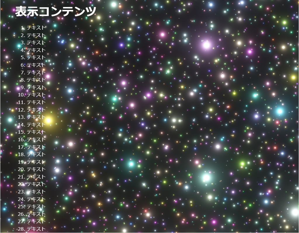
HTML(index.html)
<!DOCTYPE html>
<html lang="ja">
<!--	参考サイト
		背景にひと手間加えたい時に参考になりそうなスニペット集
		https://try-m.co.jp/blog/web-create/6672/
-->
<!--
	・ライトを生成します。
	・JavaScriptを使用しています。
-->
<head>
<meta charset="UTF-8">
<title>パーティクル(JavaScript)のサンプル</title>
<meta name="viewport" content="width=device-width,initial-scale=1.0,viewport-fit=cover">
<style>
body,div,h1,h2,h3,h4,h5,h6,pre,p,a,select,header,nav,main,section,footer,ul,ol,li,label {
	padding: 0;
	margin: 0;
	font-size: 16px;
	line-height: 1.6;
	word-wrap: break-word;
	box-sizing: border-box;
}
body {
	font-family: "Hiragino Sans W3", "Hiragino Kaku Gothic ProN", "ヒラギノ角ゴ ProN W3", "メイリオ", "Meiryo", "MS Pゴシック", "MS PGothic", sans-serif;
}
.container {
	border: #fff 1px solid;
}
.wrapper {
	max-width: 960px;
	margin: 0 auto;
	padding: 0 20px;
	color: #fff;
	background: #00000000;
}
h1 {
	font-size: 2.5rem;
	padding: 10px 0;
}
ol {
	margin-left: 40px;
}

/* ▼▼▼ CSS(ここから)(※2) ▼▼▼ */
/* パーティクル(JavaScript)の設定 */

/* アニメーション枠指定 */
.back-container {
	width: 100%;
	height: 100vh;
	overflow: hidden;
	background: #333;
	position: fixed;
	top: 0;
	left: 0;
	z-index: -1;
}
/* ▲▲▲ CSS(ここまで) ▲▲▲ */
</style>
</head>

<body>

<div class="container">
	<div class="wrapper">
		<h1>表示コンテンツ</h1>
		<ol>
			<li>テキスト</li><li>テキスト</li><li>テキスト</li><li>テキスト</li><li>テキスト</li>	<!-- 01~05行 -->
			<li>テキスト</li><li>テキスト</li><li>テキスト</li><li>テキスト</li><li>テキスト</li>	<!-- 06~10行 -->
			<li>テキスト</li><li>テキスト</li><li>テキスト</li><li>テキスト</li><li>テキスト</li>	<!-- 11~15行 -->
			<li>テキスト</li><li>テキスト</li><li>テキスト</li><li>テキスト</li><li>テキスト</li>	<!-- 16~20行 -->
			<li>テキスト</li><li>テキスト</li><li>テキスト</li><li>テキスト</li><li>テキスト</li>	<!-- 21~25行 -->
			<li>テキスト</li><li>テキスト</li><li>テキスト</li><li>テキスト</li><li>テキスト</li>	<!-- 26~30行 -->
			<li>テキスト</li><li>テキスト</li><li>テキスト</li><li>テキスト</li><li>テキスト</li>	<!-- 31~35行 -->
			<li>テキスト</li><li>テキスト</li><li>テキスト</li><li>テキスト</li><li>テキスト</li>	<!-- 36~40行 -->
			<li>テキスト</li><li>テキスト</li><li>テキスト</li><li>テキスト</li><li>テキスト</li>	<!-- 41~45行 -->
			<li>テキスト</li><li>テキスト</li><li>テキスト</li><li>テキスト</li><li>テキスト</li>	<!-- 46~50行 -->
			<li>テキスト</li><li>テキスト</li><li>テキスト</li><li>テキスト</li><li>テキスト</li>	<!-- 51~55行 -->
			<li>テキスト</li><li>テキスト</li><li>テキスト</li><li>テキスト</li><li>テキスト</li>	<!-- 56~60行 -->
			<li>テキスト</li><li>テキスト</li><li>テキスト</li><li>テキスト</li><li>テキスト</li>	<!-- 61~65行 -->
			<li>テキスト</li><li>テキスト</li><li>テキスト</li><li>テキスト</li><li>テキスト</li>	<!-- 66~70行 -->
		</ol>
	</div>

<!-- ▼▼▼ HTML(ここから) ▼▼▼(※3) -->
<!-- パーティクル(JavaScript)の定義 -->
	<div class="back-container">
		<canvas id="canvas""></canvas>
	</div>
<!-- ▲▲▲ HTML(ここまで) ▲▲▲ -->
</div>

<!-- ▼▼▼ SCRIPT(ここから)(※4) ▼▼▼ -->
<!-- パーティクル(JavaScript)の制御 -->
<script id="rendered-js">
// Based on https://www.youtube.com/watch?v=3CycKKJiwis

	var canvas = document.getElementById("canvas");

	const mobile = navigator.userAgent.match(/Android/i) ||
					navigator.userAgent.match(/webOS/i) ||
					navigator.userAgent.match(/iPhone/i) ||
					navigator.userAgent.match(/BlackBerry/i) ||
					navigator.userAgent.match(/Windows Phone/i);

	canvas.width = window.innerWidth;
	canvas.height = window.innerHeight;

	// Initialize the GL context
	var gl = canvas.getContext('webgl');
	if (!gl) {
		console.error("Unable to initialize WebGL.");
	}
	var layers_ = 10;
	if (mobile) {
		layers_ = 6;
	}
	//Time
	var time = 0.0;

	//************** Shader sources **************
	var vertexSource = `attribute vec2 position;
		void main() {
			gl_Position = vec4(position, 0.0, 1.0);
		}
		`;

	var fragmentSource = `
		precision highp float;

		uniform float width;
		uniform float height;
		vec2 resolution = vec2(width, height);

		uniform float time;
		float random(vec2 par) {
			return fract(sin(dot(par.xy, vec2(12.9898, 78.233))) * 43758.5453);
		}

		vec2 random2(vec2 par) {
			float rand = random(par);
			return vec2(rand, random(par + rand));
		}

		//https://www.shadertoy.com/view/3s3GDn
		float getGlow(float dist, float radius, float intensity) {
			return pow(radius / dist, intensity);
		}

		void main(){

			float t = 1.0 + time * 0.05;
			const float layers = float(` + layers_ + `);
//			float scale = 32.0;
			float scale = 32.0;			// layers単位の光の数
			float depth;
			float phase;
			float rotationAngle = time * -0.1;
			float size;
			float glow;
			//Iteration step size for outermost loop
			const float del = 1.0/layers;

			vec2 uv;
			//Value of floor(uv)
			vec2 fl;
			vec2 local_uv;
			vec2 index;
			vec2 pos;
			//Seed for random values
			vec2 seed;
			vec2 centre;
			//The indices of 3x3 cells surrounding the fragment
			vec2 cell;
			//To move the focus of the camera in a circle
			vec2 rot = vec2(cos(t), sin(t));

			//To rotate layers
			mat2 rotation = mat2(cos(rotationAngle), -sin(rotationAngle), sin(rotationAngle),  cos(rotationAngle));
			vec3 col = vec3(0);
			vec3 tone;

			//For all layers
			for(float i = 0.0; i <= 1.0; i+=del) {
				//Find depth from layer index and move it in time
				depth = fract(i + t);
				//Move centre in a circle depending on the depth of the layer
				centre = rot * 0.2 * depth + 0.5;
				//Get uv from the fragment coordinates, rotation and depth
				uv = centre-gl_FragCoord.xy/resolution.x;
				uv *= rotation;
				uv *= mix(scale, 0.0, depth);
				fl = floor(uv);
				//The local cell coordinates. uv-fl == frac(uv)
				local_uv = uv - fl - 0.5;
			    //For a 3x3 group of cells around the fragment, find the
					//distance from the points of each to the current fragment
					//and draw an accumulative glow accordingly
			    for(float j = -1.0; j <= 1.0; j++) {
			    	for(float k = -1.0; k <= 1.0; k++) {
						cell = vec2(j,k);
						index = fl + cell;
						//Cell seed
						seed = 128.0 * i + index;
						//Get a random position in relation to the considered cell
						pos = cell + 0.9 * (random2(seed) - 0.5);
						//Get a random phase
						phase = 128.0 * random(seed);
						//Get colour from cell information
						tone = vec3(random(seed), random(seed + 1.0), random(seed + 2.0));
						//Get distance to the generated point, fade distant points
						//and make glow radius pulse in time
						size = (0.1 + 0.5 + 0.5 * sin(phase * t)) * depth;
						glow = size * getGlow(length(local_uv-pos), 0.07, 2.5);
						//Add white core and glow
						col += 3.0 * vec3(0.02 * glow) + tone * glow;
	    			}
	  			}
			}
			//Tone mapping
			col = 1.0 - exp(-col);
			//Gamma
			col = pow(col, vec3(0.4545));
			//Output to screen
			gl_FragColor = vec4(col,1.0);
		}
	`;

	//************** Utility functions **************

	window.addEventListener('resize', onWindowResize, false);

	function onWindowResize() {
		canvas.width = window.innerWidth;
		canvas.height = window.innerHeight;
		gl.viewport(0, 0, canvas.width, canvas.height);
		gl.uniform1f(widthHandle, window.innerWidth);
		gl.uniform1f(heightHandle, window.innerHeight);
	}

	//Compile shader and combine with source
	function compileShader(shaderSource, shaderType) {
		var shader = gl.createShader(shaderType);
		gl.shaderSource(shader, shaderSource);
		gl.compileShader(shader);
		if (!gl.getShaderParameter(shader, gl.COMPILE_STATUS)) {
			throw "Shader compile failed with: " + gl.getShaderInfoLog(shader);
		}
		return shader;
	}

	//From https://codepen.io/jlfwong/pen/GqmroZ
	//Utility to complain loudly if we fail to find the attribute/uniform
	function getAttribLocation(program, name) {
		var attributeLocation = gl.getAttribLocation(program, name);
		if (attributeLocation === -1) {
			throw 'Cannot find attribute ' + name + '.';
		}
		return attributeLocation;
	}

	function getUniformLocation(program, name) {
		var attributeLocation = gl.getUniformLocation(program, name);
		if (attributeLocation === -1) {
			throw 'Cannot find uniform ' + name + '.';
		}
		return attributeLocation;
	}

	//************** Create shaders **************

	//Create vertex and fragment shaders
	var vertexShader = compileShader(vertexSource, gl.VERTEX_SHADER);
	var fragmentShader = compileShader(fragmentSource, gl.FRAGMENT_SHADER);

	//Create shader programs
	var program = gl.createProgram();
	gl.attachShader(program, vertexShader);
	gl.attachShader(program, fragmentShader);
	gl.linkProgram(program);

	gl.useProgram(program);

	//Set up rectangle covering entire canvas
	var vertexData = new Float32Array([
		-1.0, 1.0,						// top left
		-1.0, -1.0,						// bottom left
		1.0, 1.0,						// top right
		1.0, -1.0						// bottom right
	]);

	//Create vertex buffer
	var vertexDataBuffer = gl.createBuffer();
	gl.bindBuffer(gl.ARRAY_BUFFER, vertexDataBuffer);
	gl.bufferData(gl.ARRAY_BUFFER, vertexData, gl.STATIC_DRAW);

	// Layout of our data in the vertex buffer
	var positionHandle = getAttribLocation(program, 'position');

	gl.enableVertexAttribArray(positionHandle);
	gl.vertexAttribPointer(positionHandle,
		2,								// position is a vec2 (2 values per component)
		gl.FLOAT,						// each component is a float
		false, 							// don't normalize values
		2 * 4, 							// two 4 byte float components per vertex (32 bit float is 4 bytes)
		0 								// how many bytes inside the buffer to start from
	);

	//Set uniform handle
	var timeHandle = getUniformLocation(program, 'time');
	var widthHandle = getUniformLocation(program, 'width');
	var heightHandle = getUniformLocation(program, 'height');

	gl.uniform1f(widthHandle, window.innerWidth);
	gl.uniform1f(heightHandle, window.innerHeight);

	var lastFrame = Date.now();
	var thisFrame;

	function draw() {
		//Update time
		thisFrame = Date.now();
		time += (thisFrame - lastFrame) / 1000;
		lastFrame = thisFrame;
		//Send uniforms to program
		gl.uniform1f(timeHandle, time);
		//Draw a triangle strip connecting vertices 0-4
		gl.drawArrays(gl.TRIANGLE_STRIP, 0, 4);
		requestAnimationFrame(draw);
	}

	draw();

</script>
<!-- ▲▲▲ SCRIPT(ここまで) ▲▲▲ -->

</body>
</html>
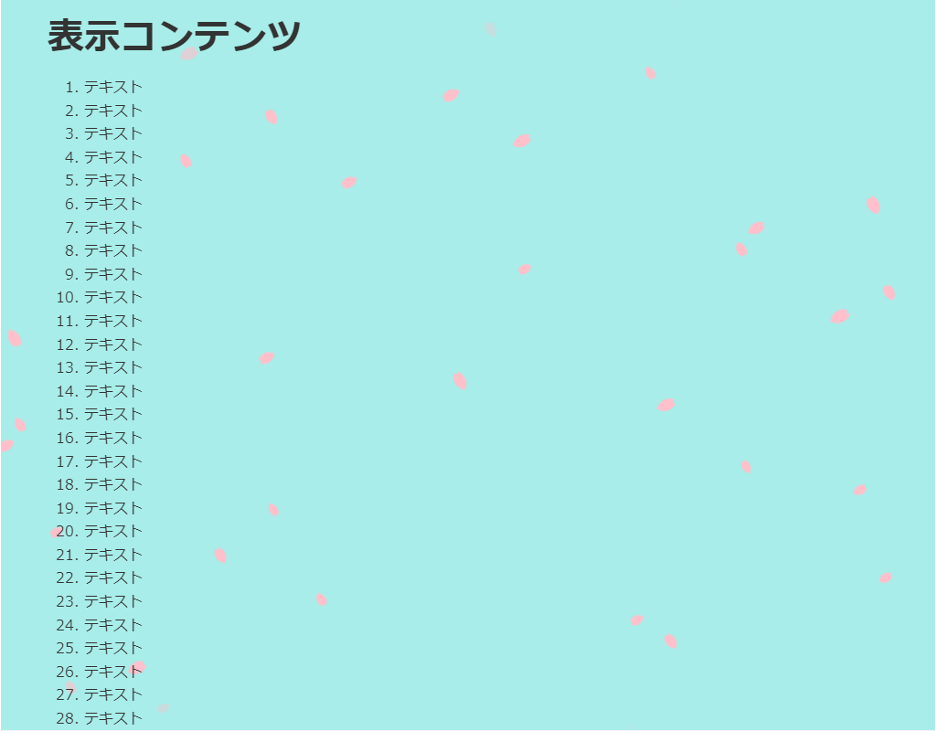
HTML(index.html)
<!DOCTYPE html>
<html lang="ja">
<!--	参考サイト
		JSとCSSで桜を降らせるエフェクトを実装する方法
		https://web-dev.tech/front-end/javascript/cherry-blossom-petal-falling-effect/
-->
<!--
	・散る桜を生成します。
	・JavaScriptを使用しています。
-->
<head>
<meta charset="UTF-8">
<title>パーティクル(JavaScript)のサンプル</title>
<meta name="viewport" content="width=device-width,initial-scale=1.0,viewport-fit=cover">
<style>
body,div,h1,h2,h3,h4,h5,h6,pre,p,a,select,header,nav,main,section,footer,ul,ol,li,label {
	padding: 0;
	margin: 0;
	font-size: 16px;
	line-height: 1.6;
	word-wrap: break-word;
	box-sizing: border-box;
}
body {
	font-family: "Hiragino Sans W3", "Hiragino Kaku Gothic ProN", "ヒラギノ角ゴ ProN W3", "メイリオ", "Meiryo", "MS Pゴシック", "MS PGothic", sans-serif;
}
.container {
	border: #fff 1px solid;
}
.wrapper {
	max-width: 960px;
	margin: 0 auto;
	padding: 0 20px;
	color: #333;
	background: #00000000;
}
h1 {
	font-size: 2.5rem;
	padding: 10px 0;
}
ol {
	margin-left: 40px;
}

/* ▼▼▼ CSS(ここから)(※2) ▼▼▼ */
/* パーティクル(JavaScript)の設定 */

/* アニメーション枠指定 */
.back-container {
	width: 100%;
	height: 100vh;
	overflow: hidden;
	background: #a8ede9;
	position: fixed;
	top: 0;
	left: 0;
	z-index: -1;
}

/* 桜の花びらのスタイル */
.petal {
	position: absolute;
	background-color: #ffc0cb;
	border-radius: 150% 0 150% 0;
	animation: animate-petal 10s linear;
}
.petal::after {
	content: "";
	position: absolute;
	top: -14%;
	left: -10%;
	display: block;
	width: 100%;
	height: 100%;
	background-color: #ffc0cb;
	border-radius: 150% 0 150% 0;
	transform: rotate(15deg);
}

/* 花びらが降るアニメーション */
@keyframes animate-petal {
	0% {
		top: 0;
		opacity: 0;
		transform: rotate(0deg);
	}
	10% {
		opacity: 1;
	}
	90% {
		opacity: 1;
	}
	100% {
		opacity: 0;
		top: 100vh;
		transform: rotate(3000deg);
	}
}

/* ▲▲▲ CSS(ここまで) ▲▲▲ */
</style>
</head>

<body>

<div class="container">
	<div class="wrapper">
		<h1>表示コンテンツ</h1>
		<ol>
			<li>テキスト</li><li>テキスト</li><li>テキスト</li><li>テキスト</li><li>テキスト</li>	<!-- 01~05行 -->
			<li>テキスト</li><li>テキスト</li><li>テキスト</li><li>テキスト</li><li>テキスト</li>	<!-- 06~10行 -->
			<li>テキスト</li><li>テキスト</li><li>テキスト</li><li>テキスト</li><li>テキスト</li>	<!-- 11~15行 -->
			<li>テキスト</li><li>テキスト</li><li>テキスト</li><li>テキスト</li><li>テキスト</li>	<!-- 16~20行 -->
			<li>テキスト</li><li>テキスト</li><li>テキスト</li><li>テキスト</li><li>テキスト</li>	<!-- 21~25行 -->
			<li>テキスト</li><li>テキスト</li><li>テキスト</li><li>テキスト</li><li>テキスト</li>	<!-- 26~30行 -->
			<li>テキスト</li><li>テキスト</li><li>テキスト</li><li>テキスト</li><li>テキスト</li>	<!-- 31~35行 -->
			<li>テキスト</li><li>テキスト</li><li>テキスト</li><li>テキスト</li><li>テキスト</li>	<!-- 36~40行 -->
			<li>テキスト</li><li>テキスト</li><li>テキスト</li><li>テキスト</li><li>テキスト</li>	<!-- 41~45行 -->
			<li>テキスト</li><li>テキスト</li><li>テキスト</li><li>テキスト</li><li>テキスト</li>	<!-- 46~50行 -->
			<li>テキスト</li><li>テキスト</li><li>テキスト</li><li>テキスト</li><li>テキスト</li>	<!-- 51~55行 -->
			<li>テキスト</li><li>テキスト</li><li>テキスト</li><li>テキスト</li><li>テキスト</li>	<!-- 56~60行 -->
			<li>テキスト</li><li>テキスト</li><li>テキスト</li><li>テキスト</li><li>テキスト</li>	<!-- 61~65行 -->
			<li>テキスト</li><li>テキスト</li><li>テキスト</li><li>テキスト</li><li>テキスト</li>	<!-- 66~70行 -->
		</ol>
	</div>

<!-- ▼▼▼ HTML(ここから) ▼▼▼(※3) -->
<!-- パーティクル(JavaScript)の定義 -->
	<div class="back-container"></div>
<!-- ▲▲▲ HTML(ここまで) ▲▲▲ -->
</div>

<!-- ▼▼▼ SCRIPT(ここから)(※4) ▼▼▼ -->
<!-- パーティクル(JavaScript)の制御 -->
<script>

	window.addEventListener('DOMContentLoaded', () => {
		// コンテナを指定
		const section = document.querySelector('.back-container');
		// 花びらを生成する関数
		const createPetal = () => {
			const petalEl = document.createElement('span');
			petalEl.className = 'petal';
			const minSize = 10;
			const maxSize = 15;
			const size = Math.random() * (maxSize + 1 - minSize) + minSize;
			petalEl.style.width = `${size}px`;
			petalEl.style.height = `${size}px`;
			petalEl.style.left = Math.random() * innerWidth + 'px';
			section.appendChild(petalEl);
			// 一定時間が経てば花びらを消す
			setTimeout(() => {
				petalEl.remove();
			}, 10000);
		}
		// 花びらを生成する間隔をミリ秒で指定
		setInterval(createPetal, 300);
	});

</script>
<!-- ▲▲▲ SCRIPT(ここまで) ▲▲▲ -->

</body>
</html>
HTML(index.html)
<!DOCTYPE html>
<html lang="ja">
<!--	参考サイト
		背景の動き -波打つ(1つ/重なりなし)-
		https://coco-factory.jp/ugokuweb/move02/5-10/
-->
<!--
	・三つの重なる波を生成します。
	・JavaScriptを使用しています。
-->
<head>
<meta charset="UTF-8">
<title>パーティクル(JavaScript)のサンプル</title>
<meta name="viewport" content="width=device-width,initial-scale=1.0,viewport-fit=cover">
<style>
body,div,h1,h2,h3,h4,h5,h6,pre,p,a,select,header,nav,main,section,footer,ul,ol,li,label {
	padding: 0;
	margin: 0;
	font-size: 16px;
	line-height: 1.6;
	word-wrap: break-word;
	box-sizing: border-box;
}
body {
	font-family: "Hiragino Sans W3", "Hiragino Kaku Gothic ProN", "ヒラギノ角ゴ ProN W3", "メイリオ", "Meiryo", "MS Pゴシック", "MS PGothic", sans-serif;
}
.container {
	border: #fff 1px solid;
}
.wrapper {
	max-width: 960px;
	margin: 0 auto;
	padding: 0 20px;
	color: #333;
	background: #00000000;
}
h1 {
	font-size: 2.5rem;
	padding: 10px 0;
}
ol {
	margin-left: 40px;
}

/* ▼▼▼ CSS(ここから)(※2) ▼▼▼ */
/* パーティクル(JavaScript)の設定 */

/* アニメーション枠指定 */
.back-container {
	width: 100%;
	height: 100vh;
	overflow: hidden;
	background: #fff;
	position: fixed;
	top: 0;
	left: 0;
	z-index: -1;
}
.back-wrapper {
	width: 100%;
	height: 100%;
	position: relative;
}
#waveCanvas {
	width: 100%;
	position: absolute;
	bottom: 0;
	left: 0;
}
/* ▲▲▲ CSS(ここまで) ▲▲▲ */
</style>
</head>

<body>

<div class="container">
	<div class="wrapper">
		<h1>表示コンテンツ</h1>
		<ol>
			<li>テキスト</li><li>テキスト</li><li>テキスト</li><li>テキスト</li><li>テキスト</li>	<!-- 01~05行 -->
			<li>テキスト</li><li>テキスト</li><li>テキスト</li><li>テキスト</li><li>テキスト</li>	<!-- 06~10行 -->
			<li>テキスト</li><li>テキスト</li><li>テキスト</li><li>テキスト</li><li>テキスト</li>	<!-- 11~15行 -->
			<li>テキスト</li><li>テキスト</li><li>テキスト</li><li>テキスト</li><li>テキスト</li>	<!-- 16~20行 -->
			<li>テキスト</li><li>テキスト</li><li>テキスト</li><li>テキスト</li><li>テキスト</li>	<!-- 21~25行 -->
			<li>テキスト</li><li>テキスト</li><li>テキスト</li><li>テキスト</li><li>テキスト</li>	<!-- 26~30行 -->
			<li>テキスト</li><li>テキスト</li><li>テキスト</li><li>テキスト</li><li>テキスト</li>	<!-- 31~35行 -->
			<li>テキスト</li><li>テキスト</li><li>テキスト</li><li>テキスト</li><li>テキスト</li>	<!-- 36~40行 -->
			<li>テキスト</li><li>テキスト</li><li>テキスト</li><li>テキスト</li><li>テキスト</li>	<!-- 41~45行 -->
			<li>テキスト</li><li>テキスト</li><li>テキスト</li><li>テキスト</li><li>テキスト</li>	<!-- 46~50行 -->
			<li>テキスト</li><li>テキスト</li><li>テキスト</li><li>テキスト</li><li>テキスト</li>	<!-- 51~55行 -->
			<li>テキスト</li><li>テキスト</li><li>テキスト</li><li>テキスト</li><li>テキスト</li>	<!-- 56~60行 -->
			<li>テキスト</li><li>テキスト</li><li>テキスト</li><li>テキスト</li><li>テキスト</li>	<!-- 61~65行 -->
			<li>テキスト</li><li>テキスト</li><li>テキスト</li><li>テキスト</li><li>テキスト</li>	<!-- 66~70行 -->
		</ol>
	</div>

<!-- ▼▼▼ HTML(ここから) ▼▼▼(※3) -->
<!-- パーティクル(JavaScript)の定義 -->
	<div class="back-container" id="back-container">
		<div class="back-wrapper">
			<canvas id="waveCanvas"></canvas>
		</div>
	</div>
<!-- ▲▲▲ HTML(ここまで) ▲▲▲ -->
</div>

<!-- ▼▼▼ SCRIPT(ここから)(※4) ▼▼▼ -->
<!-- パーティクル(JavaScript)の制御 -->
<script>

	var unit = 100;
	var canvasList;											// キャンバスの配列
	var info = {};											// 全キャンバス共通の描画情報
	var colorList;											// 各キャンバスの色情報

	/*
	 * Init function.
	 *
	 * Initialize variables and begin the animation.
	 */
	function init() {
		info.seconds = 0;
		info.t = 0;
		canvasList = [];
		colorList = [];
		canvasList.push(document.getElementById("waveCanvas"));
		colorList.push(['#f5367d', '#54f536', '#365ff5']);	// 重ねる波の色設定
		for(var canvasIndex in canvasList) {
			var canvas = canvasList[canvasIndex];
			canvas.width = document.documentElement.clientWidth;
			canvas.height = 300;//波の高さ
			canvas.contextCache = canvas.getContext("2d");
		}
		update();
	}

	function update() {
		for(var canvasIndex in canvasList) {
			var canvas = canvasList[canvasIndex];
			draw(canvas, colorList[canvasIndex]);
		}
		info.seconds = info.seconds + .014;
		info.t = info.seconds*Math.PI;
		setTimeout(update, 35);
	}

	/**
	 * Draw animation function.
	 *
	 * This function draws one frame of the animation, waits 20ms, and then calls
	 * itself again.
	 */
	function draw(canvas, color) {
		var context = canvas.contextCache;
		context.clearRect(0, 0, canvas.width, canvas.height);
		//波の重なりを描画 drawWave(canvas, color[数字(波の数を0から数えて指定)], 透過, 波の幅のzoom,波の開始位置の遅れ )
		drawWave(canvas, color[0], 0.5, 3, 0);				// 0.5⇒透過具合50%、3⇒数字が大きいほど波がなだらか
		drawWave(canvas, color[1], 0.4, 2, 250);
		drawWave(canvas, color[2], 0.2, 1.6, 100);
	}

	/**
	 * 波を描画
	 * drawWave(色, 不透明度, 波の幅のzoom, 波の開始位置の遅れ)
	 */
	function drawWave(canvas, color, alpha, zoom, delay) {
		var context = canvas.contextCache;
		context.fillStyle = color;							// 塗りの色
		context.globalAlpha = alpha;
		context.beginPath();								// パスの開始
		drawSine(canvas, info.t / 0.5, zoom, delay);
		context.lineTo(canvas.width + 10, canvas.height);	// パスをCanvasの右下へ
		context.lineTo(0, canvas.height);					// パスをCanvasの左下へ
		context.closePath();								// パスを閉じる
		context.fill();										// 波を塗りつぶす
	}

	/**
	* Function to draw sine
	*
	* The sine curve is drawn in 10px segments starting at the origin.
	* drawSine(時間, 波の幅のzoom, 波の開始位置の遅れ)
	*/
	function drawSine(canvas, t, zoom, delay) {
		var xAxis = Math.floor(canvas.height / 2);
		var yAxis = 0;
		var context = canvas.contextCache;
		// Set the initial x and y, starting at 0,0 and translating to the origin on
		// the canvas.
		var x = t;											// 時間を横の位置とする
		var y = Math.sin(x) / zoom;
		context.moveTo(yAxis, unit*y+xAxis);				//スタート位置にパスを置く
		// Loop to draw segments (横幅の分、波を描画)
		for (i = yAxis; i <= canvas.width + 10; i += 10) {
			x = t + (-yAxis + i) / unit / zoom;
			y = Math.sin(x - delay) / 3;
			context.lineTo(i, unit * y + xAxis);
		}
	}

	init();

</script>
<!-- ▲▲▲ SCRIPT(ここまで) ▲▲▲ -->

</body>
</html>
HTML(index.html)
<!DOCTYPE html>
<html lang="ja">
<!--	参考サイト
		背景の動き -波打つ(1つ/重なりなし)-
		https://coco-factory.jp/ugokuweb/move02/5-10/
-->
<!--
	・一つの重なりのない波を生成します。
	・JavaScriptを使用しています。
-->
<head>
<meta charset="UTF-8">
<title>パーティクル(JavaScript)のサンプル</title>
<meta name="viewport" content="width=device-width,initial-scale=1.0,viewport-fit=cover">
<style>
body,div,h1,h2,h3,h4,h5,h6,pre,p,a,select,header,nav,main,section,footer,ul,ol,li,label {
	padding: 0;
	margin: 0;
	font-size: 16px;
	line-height: 1.6;
	word-wrap: break-word;
	box-sizing: border-box;
}
body {
	font-family: "Hiragino Sans W3", "Hiragino Kaku Gothic ProN", "ヒラギノ角ゴ ProN W3", "メイリオ", "Meiryo", "MS Pゴシック", "MS PGothic", sans-serif;
}
.container {
	border: #fff 1px solid;
}
.wrapper {
	max-width: 960px;
	margin: 0 auto;
	padding: 0 20px;
	color: #333;
	background: #00000000;
}
h1 {
	font-size: 2.5rem;
	padding: 10px 0;
}
ol {
	margin-left: 40px;
}

/* ▼▼▼ CSS(ここから)(※2) ▼▼▼ */
/* パーティクル(JavaScript)の設定 */

/* アニメーション枠指定 */
.back-container {
	width: 100%;
	height: 100vh;
	overflow: hidden;
	background: #fdf6a4;
	position: fixed;
	top: 0;
	left: 0;
	z-index: -1;
}
.back-wrapper {
	width: 100%;
	height: 100%;
	position: relative;
}
#waveCanvas {
	width: 100%;
	position: absolute;
	bottom: 0;
	left: 0;
}
/* ▲▲▲ CSS(ここまで) ▲▲▲ */
</style>
</head>

<body>

<div class="container">
	<div class="wrapper">
		<h1>表示コンテンツ</h1>
		<ol>
			<li>テキスト</li><li>テキスト</li><li>テキスト</li><li>テキスト</li><li>テキスト</li>	<!-- 01~05行 -->
			<li>テキスト</li><li>テキスト</li><li>テキスト</li><li>テキスト</li><li>テキスト</li>	<!-- 06~10行 -->
			<li>テキスト</li><li>テキスト</li><li>テキスト</li><li>テキスト</li><li>テキスト</li>	<!-- 11~15行 -->
			<li>テキスト</li><li>テキスト</li><li>テキスト</li><li>テキスト</li><li>テキスト</li>	<!-- 16~20行 -->
			<li>テキスト</li><li>テキスト</li><li>テキスト</li><li>テキスト</li><li>テキスト</li>	<!-- 21~25行 -->
			<li>テキスト</li><li>テキスト</li><li>テキスト</li><li>テキスト</li><li>テキスト</li>	<!-- 26~30行 -->
			<li>テキスト</li><li>テキスト</li><li>テキスト</li><li>テキスト</li><li>テキスト</li>	<!-- 31~35行 -->
			<li>テキスト</li><li>テキスト</li><li>テキスト</li><li>テキスト</li><li>テキスト</li>	<!-- 36~40行 -->
			<li>テキスト</li><li>テキスト</li><li>テキスト</li><li>テキスト</li><li>テキスト</li>	<!-- 41~45行 -->
			<li>テキスト</li><li>テキスト</li><li>テキスト</li><li>テキスト</li><li>テキスト</li>	<!-- 46~50行 -->
			<li>テキスト</li><li>テキスト</li><li>テキスト</li><li>テキスト</li><li>テキスト</li>	<!-- 51~55行 -->
			<li>テキスト</li><li>テキスト</li><li>テキスト</li><li>テキスト</li><li>テキスト</li>	<!-- 56~60行 -->
			<li>テキスト</li><li>テキスト</li><li>テキスト</li><li>テキスト</li><li>テキスト</li>	<!-- 61~65行 -->
			<li>テキスト</li><li>テキスト</li><li>テキスト</li><li>テキスト</li><li>テキスト</li>	<!-- 66~70行 -->
		</ol>
	</div>

<!-- ▼▼▼ HTML(ここから) ▼▼▼(※3) -->
<!-- パーティクル(JavaScript)の定義 -->
	<div class="back-container" id="back-container">
		<div class="back-wrapper">
			<canvas id="waveCanvas"></canvas>
		</div>
	</div>
<!-- ▲▲▲ HTML(ここまで) ▲▲▲ -->
</div>

<!-- ▼▼▼ SCRIPT(ここから)(※4) ▼▼▼ -->
<!-- パーティクル(JavaScript)の制御 -->
<script>

	var unit = 100;
	var canvasList;											// キャンバスの配列
	var info = {};											// 全キャンバス共通の描画情報
	var colorList;											// 各キャンバスの色情報

	/*
	 * Init function.
	 *
	 * Initialize variables and begin the animation.
	 */
	function init() {
		info.seconds = 0;
		info.t = 0;
		canvasList = [];
		colorList = [];
		canvasList.push(document.getElementById("waveCanvas"));
		colorList.push(['#00b9ff']);						// canvas1個めの色指定
		for (var canvasIndex in canvasList) {
			var canvas = canvasList[canvasIndex];
			canvas.width = document.documentElement.clientWidth;
			canvas.height = 400;							//波の高さ
			canvas.contextCache = canvas.getContext("2d");
		}
		update();
	}

	function update() {
		for (var canvasIndex in canvasList) {
			var canvas = canvasList[canvasIndex];
			draw(canvas, colorList[canvasIndex]);
		}
		info.seconds = info.seconds + .014;
		info.t = info.seconds*Math.PI;
		setTimeout(update, 35);
	}

	/**
	 * Draw animation function.
	 *
	 * This function draws one frame of the animation, waits 20ms, and then calls
	 * itself again.
	 */
	function draw(canvas, color) {
		var context = canvas.contextCache;
		context.clearRect(0, 0, canvas.width, canvas.height);
		//波を描画 drawWave(canvas, color[数字(波の数を0から数えて指定)], 透過, 波の幅のzoom,波の開始位置の遅れ )
		drawWave(canvas, color[0], 1, 3, 0);				// drawWave(canvas, color[0], 0.5, 3, 0);とすると透過50%の波が出来る
	}

	/**
	 * 波を描画
	 * drawWave(色, 不透明度, 波の幅のzoom, 波の開始位置の遅れ)
	 */
	function drawWave(canvas, color, alpha, zoom, delay) {
		var context = canvas.contextCache;
		context.fillStyle = color;							// 塗りの色
		context.globalAlpha = alpha;
		context.beginPath();								// パスの開始
		drawSine(canvas, info.t / 0.5, zoom, delay);
		context.lineTo(canvas.width + 10, canvas.height);	// パスをCanvasの右下へ
		context.lineTo(0, canvas.height);					// パスをCanvasの左下へ
		context.closePath();								// パスを閉じる
		context.fill();										// 波を塗りつぶす
	}

	/**
	 * Function to draw sine
	 *
	 * The sine curve is drawn in 10px segments starting at the origin.
	 * drawSine(時間, 波の幅のzoom, 波の開始位置の遅れ)
	 */
	function drawSine(canvas, t, zoom, delay) {
		var xAxis = Math.floor(canvas.height / 2);
		var yAxis = 0;
		var context = canvas.contextCache;
		// Set the initial x and y, starting at 0,0 and translating to the origin on
		// the canvas.
		var x = t;												//時間を横の位置とする
		var y = Math.sin(x) / zoom;
		context.moveTo(yAxis, unit * y + xAxis);				//スタート位置にパスを置く
		// Loop to draw segments (横幅の分、波を描画)
		for (i = yAxis; i <= canvas.width + 10; i += 10) {
			x = t + (-yAxis + i) / unit / zoom;
			y = Math.sin(x - delay) / 3;
			context.lineTo(i, unit * y + xAxis);
		}
	}

	init();

</script>
<!-- ▲▲▲ SCRIPT(ここまで) ▲▲▲ -->

</body>
</html>
HTML(index.html)
<!DOCTYPE html>
<html lang="ja">
<!--	参考サイト
		背景の動き -波線(1つ)-
		https://coco-factory.jp/ugokuweb/move02/5-14/
-->
<!--
	・四つの重なる線分の波を生成します。
	・JavaScriptを使用しています。
-->
<head>
<meta charset="UTF-8">
<title>パーティクル(JavaScript)のサンプル</title>
<meta name="viewport" content="width=device-width,initial-scale=1.0,viewport-fit=cover">
<style>
body,div,h1,h2,h3,h4,h5,h6,pre,p,a,select,header,nav,main,section,footer,ul,ol,li,label {
	padding: 0;
	margin: 0;
	font-size: 16px;
	line-height: 1.6;
	word-wrap: break-word;
	box-sizing: border-box;
}
body {
	font-family: "Hiragino Sans W3", "Hiragino Kaku Gothic ProN", "ヒラギノ角ゴ ProN W3", "メイリオ", "Meiryo", "MS Pゴシック", "MS PGothic", sans-serif;
}
.container {
	border: #fff 1px solid;
}
.wrapper {
	max-width: 960px;
	margin: 0 auto;
	padding: 0 20px;
	color: #333;
	background: #00000000;
}
h1 {
	font-size: 2.5rem;
	padding: 10px 0;
}
ol {
	margin-left: 40px;
}

/* ▼▼▼ CSS(ここから)(※2) ▼▼▼ */
/* パーティクル(JavaScript)の設定 */

/* アニメーション枠指定 */
.back-container {
	width: 100%;
	height: 100vh;
	overflow: hidden;
	background: #fff;
	position: fixed;
	top: 0;
	left: 0;
	z-index: -1;
}
.back-wrapper {
	width: 100%;
	height: 100%;
	position: relative;
}
#waveCanvas {
	width: 100%;
	position: absolute;
	bottom: 0;
	left: 0;
}
/* ▲▲▲ CSS(ここまで) ▲▲▲ */
</style>
</head>

<body>

<div class="container">
	<div class="wrapper">
		<h1>表示コンテンツ</h1>
		<ol>
			<li>テキスト</li><li>テキスト</li><li>テキスト</li><li>テキスト</li><li>テキスト</li>	<!-- 01~05行 -->
			<li>テキスト</li><li>テキスト</li><li>テキスト</li><li>テキスト</li><li>テキスト</li>	<!-- 06~10行 -->
			<li>テキスト</li><li>テキスト</li><li>テキスト</li><li>テキスト</li><li>テキスト</li>	<!-- 11~15行 -->
			<li>テキスト</li><li>テキスト</li><li>テキスト</li><li>テキスト</li><li>テキスト</li>	<!-- 16~20行 -->
			<li>テキスト</li><li>テキスト</li><li>テキスト</li><li>テキスト</li><li>テキスト</li>	<!-- 21~25行 -->
			<li>テキスト</li><li>テキスト</li><li>テキスト</li><li>テキスト</li><li>テキスト</li>	<!-- 26~30行 -->
			<li>テキスト</li><li>テキスト</li><li>テキスト</li><li>テキスト</li><li>テキスト</li>	<!-- 31~35行 -->
			<li>テキスト</li><li>テキスト</li><li>テキスト</li><li>テキスト</li><li>テキスト</li>	<!-- 36~40行 -->
			<li>テキスト</li><li>テキスト</li><li>テキスト</li><li>テキスト</li><li>テキスト</li>	<!-- 41~45行 -->
			<li>テキスト</li><li>テキスト</li><li>テキスト</li><li>テキスト</li><li>テキスト</li>	<!-- 46~50行 -->
			<li>テキスト</li><li>テキスト</li><li>テキスト</li><li>テキスト</li><li>テキスト</li>	<!-- 51~55行 -->
			<li>テキスト</li><li>テキスト</li><li>テキスト</li><li>テキスト</li><li>テキスト</li>	<!-- 56~60行 -->
			<li>テキスト</li><li>テキスト</li><li>テキスト</li><li>テキスト</li><li>テキスト</li>	<!-- 61~65行 -->
			<li>テキスト</li><li>テキスト</li><li>テキスト</li><li>テキスト</li><li>テキスト</li>	<!-- 66~70行 -->
		</ol>
	</div>

<!-- ▼▼▼ HTML(ここから) ▼▼▼(※3) -->
<!-- パーティクル(JavaScript)の定義 -->
	<div class="back-container" id="back-container">
		<div class="back-wrapper">
			<canvas id="waveCanvas"></canvas>
		</div>
	</div>
<!-- ▲▲▲ HTML(ここまで) ▲▲▲ -->
</div>

<!-- ▼▼▼ SCRIPT(ここから)(※4) ▼▼▼ -->
<!-- パーティクル(JavaScript)の制御 -->
<script>

	var unit = 100;
	var canvasList;											// キャンバスの配列
	var info = {};											// 全キャンバス共通の描画情報
	var colorList;											// 各キャンバスの色情報

	/**
	 * Init function.
	 *
	 * Initialize variables and begin the animation.
	 */
	function init() {
		info.seconds = 0;
		info.t = 0;
		canvasList = [];
		colorList = [];
		canvasList.push(document.getElementById("waveCanvas"));
		colorList.push(['#0ff', '#ff0', '#f00', '#00f', '#f0f']);	//重ねる波線の色設定
		for (var canvasIndex in canvasList) {
			var canvas = canvasList[canvasIndex];
			canvas.width = document.documentElement.clientWidth; //Canvasのwidthをウィンドウの幅に合わせる
			canvas.height = 300;//波の高さ
			canvas.contextCache = canvas.getContext("2d");
		}
		update();
	}

	function update() {
		for(var canvasIndex in canvasList) {
			var canvas = canvasList[canvasIndex];
			draw(canvas, colorList[canvasIndex]);
		}
		info.seconds = info.seconds + .014;
		info.t = info.seconds*Math.PI;
		setTimeout(update, 35);
	}

	/*
	 * Draw animation function.
	 *
	 * This function draws one frame of the animation, waits 20ms, and then calls
	 * itself again.
	 */
	function draw(canvas, color) {
		var context = canvas.contextCache;
		context.clearRect(0, 0, canvas.width, canvas.height);
		//波線を描画 drawWave(canvas, color[数字(波の数を0から数えて指定)], 透過, 波の幅のzoom,波の開始位置の遅れ )
		drawWave(canvas, color[0], 0.8, 3, 0);
		drawWave(canvas, color[1], 0.5, 4, 0);
		drawWave(canvas, color[2], 0.3, 1.6, 0);
		drawWave(canvas, color[3], 0.2, 3, 100);
		drawWave(canvas, color[4], 0.5, 1.6, 250);
	}

	/*
	 * 波を描画
	 * drawWave(色, 不透明度, 波の幅のzoom, 波の開始位置の遅れ)
	 */
	function drawWave(canvas, color, alpha, zoom, delay) {
		var context = canvas.contextCache;
		context.strokeStyle = color;						// 線の色
		context.lineWidth = 1;								// 線の幅
		context.globalAlpha = alpha;
		context.beginPath(); 								// パスの開始
		drawSine(canvas, info.t / 0.5, zoom, delay);
		context.stroke();									// 線
	}

	/**
	 * Function to draw sine
	 *
	 * The sine curve is drawn in 10px segments starting at the origin.
	 * drawSine(時間, 波の幅のzoom, 波の開始位置の遅れ)
	 */
	function drawSine(canvas, t, zoom, delay) {
		var xAxis = Math.floor(canvas.height / 2);
		var yAxis = 0;
		var context = canvas.contextCache;
		// Set the initial x and y, starting at 0,0 and translating to the origin on
		// the canvas.
		var x = t;											// 時間を横の位置とする
		var y = Math.sin(x) / zoom;
		context.moveTo(yAxis, unit * y + xAxis);			// スタート位置にパスを置く
		// Loop to draw segments (横幅の分、波を描画)
		for (i = yAxis; i <= canvas.width + 10; i += 10) {
			x = t + (-yAxis + i) / unit/zoom;
			y = Math.sin(x - delay) / 3;
			context.lineTo(i, unit * y + xAxis);
		}
	}

	init();

</script>
<!-- ▲▲▲ SCRIPT(ここまで) ▲▲▲ -->

</body>
</html>
HTML(index.html)
<!DOCTYPE html>
<html lang="ja">
<!-- 参考サイト
背景にひと手間加えたい時に参考になりそうなスニペット集
https://try-m.co.jp/blog/web-create/6672/
-->
<!--
・波紋を生成します。
・マウスでクリックすると波紋を追加することができます。
・JavaScriptを使用しています。
-->
<head>
<meta charset="UTF-8">
<title>パーティクル(JavaScript)のサンプル</title>
<meta name="viewport" content="width=device-width,initial-scale=1.0,viewport-fit=cover">
<style>
body,div,h1,h2,h3,h4,h5,h6,pre,p,a,select,header,nav,main,section,footer,ul,ol,li,label {
padding: 0;
margin: 0;
font-size: 16px;
line-height: 1.6;
word-wrap: break-word;
box-sizing: border-box;
}
body {
font-family: "Hiragino Sans W3", "Hiragino Kaku Gothic ProN", "ヒラギノ角ゴ ProN W3", "メイリオ", "Meiryo", "MS Pゴシック", "MS PGothic", sans-serif;
}
.container {
border: #fff 1px solid;
}
.wrapper {
max-width: 960px;
margin: 0 auto;
padding: 0 20px;
color: #333;
background: #00000000;
}
h1 {
font-size: 2.5rem;
padding: 10px 0;
}
ol {
margin-left: 40px;
}
/* ▼▼▼ CSS(ここから)(※2) ▼▼▼ */
/* パーティクル(JavaScript)の設定 */
/* アニメーション枠指定 */
.back-container {
width: 100%;
height: 100vh;
overflow: hidden;
background: #333;
position: fixed;
top: 0;
left: 0;
z-index: -1;
}
.back-container #back-container {
width: 100%;
height: 100%;
background: #DADCE8;
position: reletive;
}
.back-container .drop {
position: relative;
position: absolute;
transform-origin: 50% 50%;
transform: translate(-50%, -50%);
width: 50vmin;
height: 50vmin;
border-radius: 50%;
filter: blur(1vmin);
box-shadow: -5vmin -5vmin 5vmin #eaebf2, 5vmin 5vmin 5vmin #bbbed4, inset -5vmin -5vmin 5vmin #eaebf2, inset 5vmin 5vmin 5vmin #bbbed4;
border: 0 solid #DADCE8;
-webkit-animation: expand 4s cubic-bezier(0.165, 0.84, 0.44, 1) infinite;
animation: expand 4s cubic-bezier(0.165, 0.84, 0.44, 1) infinite;
}
@-webkit-keyframes expand {
0% {
width: 0;
height: 0;
box-shadow: -5vmin -5vmin 5vmin #eaebf2, 5vmin 5vmin 5vmin #bbbed4, inset -5vmin -5vmin 5vmin #eaebf2, inset 5vmin 5vmin 5vmin #bbbed4;
border: 0 solid rgba(218, 220, 232, 0.5);
}
5% {
box-shadow: -5vmin -5vmin 5vmin #eaebf2, 5vmin 5vmin 5vmin #bbbed4, inset -5vmin -5vmin 5vmin #eaebf2, inset 5vmin 5vmin 5vmin #bbbed4;
border: 2vmin solid rgba(218, 220, 232, 0.5);
}
90% {
box-shadow: none;
border: 2vmin solid rgba(218, 220, 232, 0.5);
}
100% {
width: 100vmin;
height: 100vmin;
box-shadow: none;
border: 0 solid rgba(218, 220, 232, 0.5);
}
}
@keyframes expand {
0% {
width: 0;
height: 0;
box-shadow: -5vmin -5vmin 5vmin #eaebf2, 5vmin 5vmin 5vmin #bbbed4, inset -5vmin -5vmin 5vmin #eaebf2, inset 5vmin 5vmin 5vmin #bbbed4;
border: 0 solid rgba(218, 220, 232, 0.5);
}
5% {
box-shadow: -5vmin -5vmin 5vmin #eaebf2, 5vmin 5vmin 5vmin #bbbed4, inset -5vmin -5vmin 5vmin #eaebf2, inset 5vmin 5vmin 5vmin #bbbed4;
border: 2vmin solid rgba(218, 220, 232, 0.5);
}
90% {
box-shadow: none;
border: 2vmin solid rgba(218, 220, 232, 0.5);
}
100% {
width: 100vmin;
height: 100vmin;
box-shadow: none;
border: 0 solid rgba(218, 220, 232, 0.5);
}
}
.back-container .drop:before {
content: "";
position: absolute;
margin: auto;
left: 0;
top: 0;
right: 0;
bottom: 0;
width: 0%;
height: 0%;
border-radius: 50%;
-webkit-animation: expand1 4s cubic-bezier(0.165, 0.84, 0.44, 1) infinite;
animation: expand1 4s cubic-bezier(0.165, 0.84, 0.44, 1) infinite;
box-shadow: -5vmin -5vmin 5vmin #eaebf2, 5vmin 5vmin 5vmin #bbbed4, inset -5vmin -5vmin 5vmin #eaebf2, inset 5vmin 5vmin 5vmin #bbbed4;
}
@-webkit-keyframes expand1 {
0% {
width: 0%;
height: 0%;
box-shadow: -5vmin -5vmin 5vmin #eaebf2, 5vmin 5vmin 5vmin #bbbed4, inset -5vmin -5vmin 5vmin #eaebf2, inset 5vmin 5vmin 5vmin #bbbed4;
border: 0 solid #DADCE8;
}
20% {
box-shadow: -5vmin -5vmin 5vmin #eaebf2, 5vmin 5vmin 5vmin #bbbed4, inset -5vmin -5vmin 5vmin #eaebf2, inset 5vmin 5vmin 5vmin #bbbed4;
}
100% {
width: 60%;
height: 60%;
box-shadow: none;
border: 1vmin solid #DADCE8;
}
}
@keyframes expand1 {
0% {
width: 0%;
height: 0%;
box-shadow: -5vmin -5vmin 5vmin #eaebf2, 5vmin 5vmin 5vmin #bbbed4, inset -5vmin -5vmin 5vmin #eaebf2, inset 5vmin 5vmin 5vmin #bbbed4;
border: 0 solid #DADCE8;
}
20% {
box-shadow: -5vmin -5vmin 5vmin #eaebf2, 5vmin 5vmin 5vmin #bbbed4, inset -5vmin -5vmin 5vmin #eaebf2, inset 5vmin 5vmin 5vmin #bbbed4;
}
100% {
width: 60%;
height: 60%;
box-shadow: none;
border: 1vmin solid #DADCE8;
}
}
/* ▲▲▲ CSS(ここまで) ▲▲▲ */
</style>
</head>
<body>
<div class="container">
<div class="wrapper">
<h1>表示コンテンツ</h1>
<ol>
<li>テキスト</li><li>テキスト</li><li>テキスト</li><li>テキスト</li><li>テキスト</li> <!-- 01~05行 -->
<li>テキスト</li><li>テキスト</li><li>テキスト</li><li>テキスト</li><li>テキスト</li> <!-- 06~10行 -->
<li>テキスト</li><li>テキスト</li><li>テキスト</li><li>テキスト</li><li>テキスト</li> <!-- 11~15行 -->
<li>テキスト</li><li>テキスト</li><li>テキスト</li><li>テキスト</li><li>テキスト</li> <!-- 16~20行 -->
<li>テキスト</li><li>テキスト</li><li>テキスト</li><li>テキスト</li><li>テキスト</li> <!-- 21~25行 -->
<li>テキスト</li><li>テキスト</li><li>テキスト</li><li>テキスト</li><li>テキスト</li> <!-- 26~30行 -->
<li>テキスト</li><li>テキスト</li><li>テキスト</li><li>テキスト</li><li>テキスト</li> <!-- 31~35行 -->
<li>テキスト</li><li>テキスト</li><li>テキスト</li><li>テキスト</li><li>テキスト</li> <!-- 36~40行 -->
<li>テキスト</li><li>テキスト</li><li>テキスト</li><li>テキスト</li><li>テキスト</li> <!-- 41~45行 -->
<li>テキスト</li><li>テキスト</li><li>テキスト</li><li>テキスト</li><li>テキスト</li> <!-- 46~50行 -->
<li>テキスト</li><li>テキスト</li><li>テキスト</li><li>テキスト</li><li>テキスト</li> <!-- 51~55行 -->
<li>テキスト</li><li>テキスト</li><li>テキスト</li><li>テキスト</li><li>テキスト</li> <!-- 56~60行 -->
<li>テキスト</li><li>テキスト</li><li>テキスト</li><li>テキスト</li><li>テキスト</li> <!-- 61~65行 -->
<li>テキスト</li><li>テキスト</li><li>テキスト</li><li>テキスト</li><li>テキスト</li> <!-- 66~70行 -->
</ol>
</div>
<!-- ▼▼▼ HTML(ここから) ▼▼▼(※3) -->
<!-- パーティクル(JavaScript)の定義 -->
<div class="back-container">
<div id="back-container">
</div>
</div>
<!-- ▲▲▲ HTML(ここまで) ▲▲▲ -->
</div>
<!-- ▼▼▼ SCRIPT(ここから)(※4) ▼▼▼ -->
<!-- パーティクル(JavaScript)の制御 -->
<script id="rendered-js">
// click to add more drops
class Drop {
constructor(x, y) {
this.x = x;
this.y = y;
this.create();
}
create() {
let dropEl = document.createElement('div');
dropEl.classList.add('drop');
dropEl.style.left = `${this.x}px`;
dropEl.style.top = `${this.y}px`;
let container = document.getElementById('back-container');
container.appendChild(dropEl);
}
}
const createDrop = e => {
let xPos = e.clientX,
yPos = e.clientY;
let drop = new Drop(xPos, yPos);
};
document.addEventListener('click', createDrop);
document.addEventListener('DOMContentLoaded', function () {
new Drop(window.innerWidth / 2, window.innerHeight / 2);
});
</script>
<!-- ▲▲▲ SCRIPT(ここまで) ▲▲▲ -->
</body>
</html>
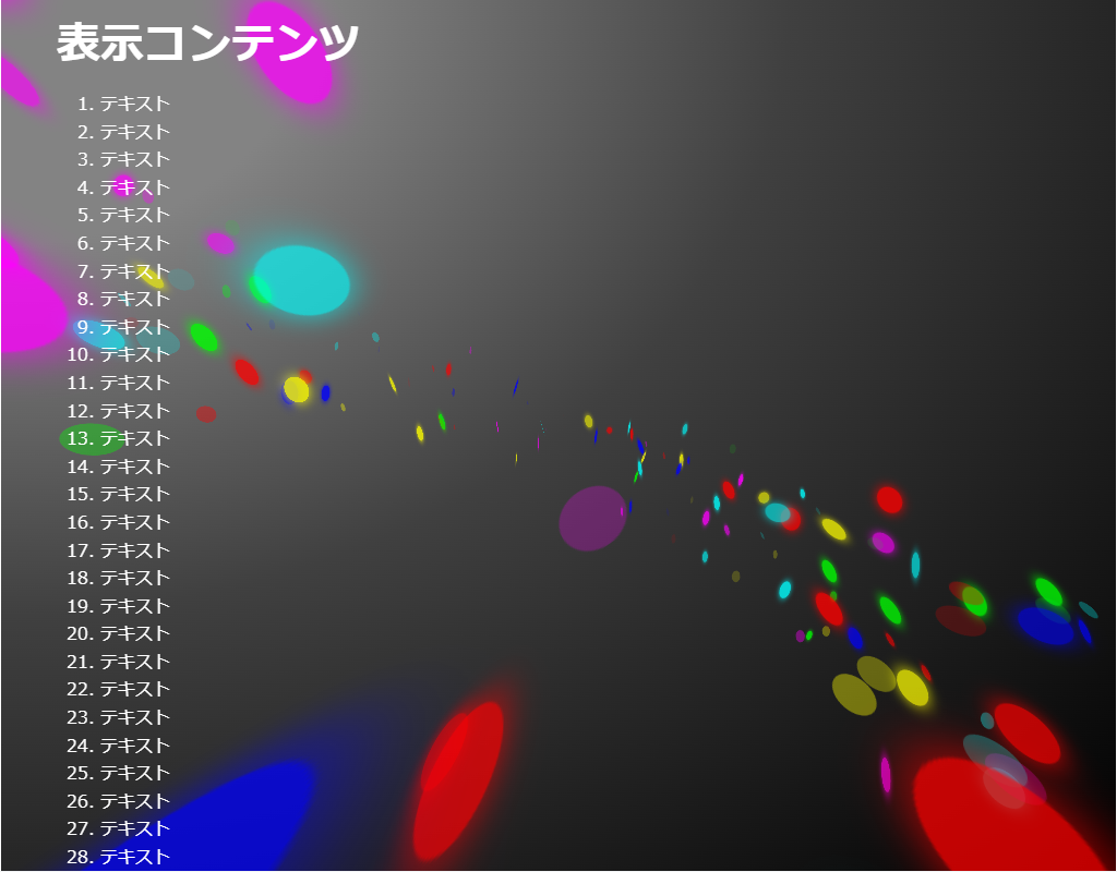
HTML(index.html)
<!DOCTYPE html>
<html lang="ja">
<!--	参考サイト
		背景にひと手間加えたい時に参考になりそうなスニペット集
		https://try-m.co.jp/blog/web-create/6672/
-->
<!--
	・回るカラー円を表示させます。
	・CSSだけで実現しています。
-->
<head>
<meta charset="UTF-8">
<title>パーティクル(CSS)のサンプル</title>
<meta name="viewport" content="width=device-width,initial-scale=1.0,viewport-fit=cover">
<style>
body,div,h1,h2,h3,h4,h5,h6,pre,p,a,select,header,nav,main,section,footer,ul,ol,li,label {
	padding: 0;
	margin: 0;
	font-size: 16px;
	line-height: 1.6;
	word-wrap: break-word;
	box-sizing: border-box;
}
body {
	font-family: "Hiragino Sans W3", "Hiragino Kaku Gothic ProN", "ヒラギノ角ゴ ProN W3", "メイリオ", "Meiryo", "MS Pゴシック", "MS PGothic", sans-serif;
}
.container {
	border: #fff 1px solid;
}
.wrapper {
	max-width: 960px;
	margin: 0 auto;
	padding: 0 20px;
	color: #fff;
	background: #00000000;
}
h1 {
	font-size: 2.5rem;
	padding: 10px 0;
}
ol {
	margin-left: 40px;
}

/* ▼▼▼ CSS(ここから)(※2) ▼▼▼ */
/* パーティクル(CSS)の設定 */

/* アニメーション枠指定 */
.back-container {
	width: 100%;
	height: 100vh;
	position: fixed;
	top: 0;
	left: 0;
	z-index: -1;
}
.back-container .back-container2 {
	width: 100%;
	height: 100vh;
	display: flex;
	justify-content: center;
	align-items: center;
	background: radial-gradient(ellipse at left top, #838383 20%, #404040 50%, #000000);
	overflow: hidden;
	position: relative;
}
.back-container .back-container2 div {
	transform-style: preserve-3d;
}
.back-container .back-container3 {
	perspective: 280px;
	transform: rotate(24deg);
}
.back-container .flip {
	position: absolute;
	top: -280px;
	width: 24px;
	height: 24px;
	border-radius: 50%;
}

/* アニメーション動作指定 */
@keyframes rotation {
	0% {
		transform: rotateY(0deg);
	}
	100% {
		transform: rotateY(360deg);
	}
}
@keyframes rotate01 {
	0% {
		transform: scale3d(0.5, 0.5, 0.5) rotateY(0);
		opacity: 0.8;
	}
	25% {
		opacity: 0.6;
	}
	50% {
		transform: rotateY(180deg);
		opacity: 0.8;
	}
	100% {
		transform: scale3d(0.5, 0.5, 0.5) rotateY(180deg);
		opacity: 0.6;
	}
}
@keyframes rotate02 {
	0% {
		transform: scale3d(0.5, 0.5, 0.5) rotateY(0);
		opacity: 0.4;
	}
	25% {
		opacity: 0.1;
	}
	50% {
		transform: scale3d(0.5, 0.5, 0.5) rotateY(180deg);
		opacity: 0.4;
	}
	100% {
		transform: scale3d(0.5, 0.5, 0.5) rotateY(180deg);
		opacity: 0.1;
	}
}

/* 色指定 */
.back-container .rotate.s01 .flip {
	background-color: red;
	box-shadow: 0px 0px 10px 1px red;
}
.back-container .rotate.s02 .flip {
	background-color: magenta;
	box-shadow: 0px 0px 10px 1px magenta;
}
.back-container .rotate.s03 .flip {
	background-color: lime;
	box-shadow: 0px 0px 10px 1px lime;
}
.back-container .rotate.s04 .flip {
	background-color: yellow;
	box-shadow: 0px 0px 10px 1px yellow;
}
.back-container .rotate.s05 .flip {
	background-color: blue;
	box-shadow: 0px 0px 10px 1px blue;
}
.back-container .rotate.s06 .flip {
	background-color: cyan;
	box-shadow: 0px 0px 10px 1px cyan;
}
.back-container .rotate.c01 .flip {
	background-color: red;
}
.back-container .rotate.c02 .flip {
	background-color: magenta;
}
.back-container .rotate.c03 .flip {
	background-color: lime;
}
.back-container .rotate.c04 .flip {
	background-color: yellow;
}
.back-container .rotate.c05 .flip {
	background-color: blue;
}
.back-container .rotate.c06 .flip {
	background-color: cyan;
}

/* 位置指定 */
.back-container .rotate.r001 {
	animation: rotation linear infinite reverse;
	animation-delay: -47179ms;
	animation-duration: 49986ms;
}
.back-container .rotate.r001 .flip_rotate {
	transform: rotateX(21deg);
}
.back-container .rotate.r001 .flip_pos {
	transform: translateY(305px);
}
.back-container .rotate.r001 .flip {
	left: calc(30% + 235px);
}
.back-container .rotate.r002 {
	animation: rotation linear infinite reverse;
	animation-delay: -41360ms;
	animation-duration: 30592ms;
}
.back-container .rotate.r002 .flip_rotate {
	transform: rotateX(25deg);
}
.back-container .rotate.r002 .flip_pos {
	transform: translateY(297px);
}
.back-container .rotate.r002 .flip {
	left: calc(30% + 261px);
}
.back-container .rotate.r003 {
	animation: rotation linear infinite reverse;
	animation-delay: -43356ms;
	animation-duration: 57070ms;
}
.back-container .rotate.r003 .flip_rotate {
	transform: rotateX(33deg);
}
.back-container .rotate.r003 .flip_pos {
	transform: translateY(288px);
}

.back-container .rotate.r003 .flip {
	left: calc(30% + 353px);
}
.back-container .rotate.r004 {
	animation: rotation linear infinite reverse;
	animation-delay: -43534ms;
	animation-duration: 43827ms;
}
.back-container .rotate.r004 .flip_rotate {
	transform: rotateX(22deg);
}
.back-container .rotate.r004 .flip_pos {
	transform: translateY(324px);
}
.back-container .rotate.r004 .flip {
	left: calc(30% + 426px);
}
.back-container .rotate.r005 {
	animation: rotation linear infinite reverse;
	animation-delay: -49650ms;
	animation-duration: 44111ms;
}
.back-container .rotate.r005 .flip_rotate {
	transform: rotateX(44deg);
}
.back-container .rotate.r005 .flip_pos {
	transform: translateY(340px);
}
.back-container .rotate.r005 .flip {
	left: calc(30% + 296px);
}
.back-container .rotate.r006 {
	animation: rotation linear infinite reverse;
	animation-delay: -41880ms;
	animation-duration: 28423ms;
}
.back-container .rotate.r006 .flip_rotate {
	transform: rotateX(5deg);
}

.back-container .rotate.r006 .flip_pos {
	transform: translateY(183px);
}

.back-container .rotate.r006 .flip {
	left: calc(30% + 233px);
}

.back-container .rotate.r007 {
	animation: rotation linear infinite reverse;
	animation-delay: -40288ms;
	animation-duration: 34960ms;
}
.back-container .rotate.r007 .flip_rotate {
	transform: rotateX(30deg);
}
.back-container .rotate.r007 .flip_pos {
	transform: translateY(342px);
}
.back-container .rotate.r007 .flip {
	left: calc(30% + 271px);
}
.back-container .rotate.r008 {
	animation: rotation linear infinite reverse;
	animation-delay: -48985ms;
	animation-duration: 58169ms;
}
.back-container .rotate.r008 .flip_rotate {
	transform: rotateX(29deg);
}
.back-container .rotate.r008 .flip_pos {
	transform: translateY(378px);
}
.back-container .rotate.r008 .flip {
	left: calc(30% + 246px);
}
.back-container .rotate.r009 {
	animation: rotation linear infinite reverse;
	animation-delay: -41169ms;
	animation-duration: 26870ms;
}
.back-container .rotate.r009 .flip_rotate {
	transform: rotateX(12deg);
}
.back-container .rotate.r009 .flip_pos {
	transform: translateY(313px);
}
.back-container .rotate.r009 .flip {
	left: calc(30% + 388px);
}
.back-container .rotate.r010 {
	animation: rotation linear infinite reverse;
	animation-delay: -48924ms;
	animation-duration: 35277ms;
}
.back-container .rotate.r010 .flip_rotate {
	transform: rotateX(18deg);
}
.back-container .rotate.r010 .flip_pos {
	transform: translateY(353px);
}
.back-container .rotate.r010 .flip {
	left: calc(30% + 341px);
}
.back-container .rotate.r011 {
	animation: rotation linear infinite reverse;
	animation-delay: -44091ms;
	animation-duration: 26330ms;
}
.back-container .rotate.r011 .flip_rotate {
	transform: rotateX(6deg);
}
.back-container .rotate.r011 .flip_pos {
	transform: translateY(259px);
}
.back-container .rotate.r011 .flip {
	left: calc(30% + 246px);
}
.back-container .rotate.r012 {
	animation: rotation linear infinite reverse;
	animation-delay: -47865ms;
	animation-duration: 45853ms;
}
.back-container .rotate.r012 .flip_rotate {
	transform: rotateX(28deg);
}
.back-container .rotate.r012 .flip_pos {
	transform: translateY(260px);
}
.back-container .rotate.r012 .flip {
	left: calc(30% + 215px);
}
.back-container .rotate.r013 {
	animation: rotation linear infinite reverse;
	animation-delay: -46823ms;
	animation-duration: 23311ms;
}
.back-container .rotate.r013 .flip_rotate {
	transform: rotateX(19deg);
}
.back-container .rotate.r013 .flip_pos {
	transform: translateY(319px);
}
.back-container .rotate.r013 .flip {
	left: calc(30% + 235px);
}
.back-container .rotate.r014 {
	animation: rotation linear infinite reverse;
	animation-delay: -44497ms;
	animation-duration: 45250ms;
}
.back-container .rotate.r014 .flip_rotate {
	transform: rotateX(20deg);
}
.back-container .rotate.r014 .flip_pos {
	transform: translateY(229px);
}
.back-container .rotate.r014 .flip {
	left: calc(30% + 436px);
}
.back-container .rotate.r015 {
	animation: rotation linear infinite reverse;
	animation-delay: -45859ms;
	animation-duration: 69883ms;
}
.back-container .rotate.r015 .flip_rotate {
	transform: rotateX(8deg);
}
.back-container .rotate.r015 .flip_pos {
	transform: translateY(284px);
}
.back-container .rotate.r015 .flip {
	left: calc(30% + 461px);
}
.back-container .rotate.r016 {
	animation: rotation linear infinite reverse;
	animation-delay: -40038ms;
	animation-duration: 43287ms;
}
.back-container .rotate.r016 .flip_rotate {
	transform: rotateX(7deg);
}
.back-container .rotate.r016 .flip_pos {
	transform: translateY(330px);
}
.back-container .rotate.r016 .flip {
	left: calc(30% + 328px);
}
.back-container .rotate.r017 {
	animation: rotation linear infinite reverse;
	animation-delay: -40827ms;
	animation-duration: 65664ms;
}
.back-container .rotate.r017 .flip_rotate {
	transform: rotateX(16deg);
}
.back-container .rotate.r017 .flip_pos {
	transform: translateY(245px);
}
.back-container .rotate.r017 .flip {
	left: calc(30% + 205px);
}
.back-container .rotate.r018 {
	animation: rotation linear infinite reverse;
	animation-delay: -47411ms;
	animation-duration: 52433ms;
}
.back-container .rotate.r018 .flip_rotate {
	transform: rotateX(37deg);
}
.back-container .rotate.r018 .flip_pos {
	transform: translateY(212px);
}
.back-container .rotate.r018 .flip {
	left: calc(30% + 339px);
}
.back-container .rotate.r019 {
	animation: rotation linear infinite reverse;
	animation-delay: -45903ms;
	animation-duration: 48081ms;
}
.back-container .rotate.r019 .flip_rotate {
	transform: rotateX(41deg);
}
.back-container .rotate.r019 .flip_pos {
	transform: translateY(295px);
}
.back-container .rotate.r019 .flip {
	left: calc(30% + 475px);
}
.back-container .rotate.r020 {
	animation: rotation linear infinite reverse;
	animation-delay: -48385ms;
	animation-duration: 44793ms;
}
.back-container .rotate.r020 .flip_rotate {
	transform: rotateX(8deg);
}
.back-container .rotate.r020 .flip_pos {
	transform: translateY(294px);
}
.back-container .rotate.r020 .flip {
	left: calc(30% + 238px);
}
.back-container .rotate.r021 {
	animation: rotation linear infinite reverse;
	animation-delay: -40714ms;
	animation-duration: 50695ms;
}
.back-container .rotate.r021 .flip_rotate {
	transform: rotateX(44deg);
}
.back-container .rotate.r021 .flip_pos {
	transform: translateY(255px);
}
.back-container .rotate.r021 .flip {
	left: calc(30% + 486px);
}
.back-container .rotate.r022 {
	animation: rotation linear infinite reverse;
	animation-delay: -42370ms;
	animation-duration: 68170ms;
}
.back-container .rotate.r022 .flip_rotate {
	transform: rotateX(30deg);
}
.back-container .rotate.r022 .flip_pos {
	transform: translateY(218px);
}
.back-container .rotate.r022 .flip {
	left: calc(30% + 245px);
}
.back-container .rotate.r023 {
	animation: rotation linear infinite reverse;
	animation-delay: -48216ms;
	animation-duration: 48230ms;
}
.back-container .rotate.r023 .flip_rotate {
	transform: rotateX(45deg);
}
.back-container .rotate.r023 .flip_pos {
	transform: translateY(316px);
}
.back-container .rotate.r023 .flip {
	left: calc(30% + 253px);
}
.back-container .rotate.r024 {
	animation: rotation linear infinite reverse;
	animation-delay: -44651ms;
	animation-duration: 59390ms;
}
.back-container .rotate.r024 .flip_rotate {
	transform: rotateX(19deg);
}
.back-container .rotate.r024 .flip_pos {
	transform: translateY(200px);
}
.back-container .rotate.r024 .flip {
	left: calc(30% + 365px);
}
.back-container .rotate.r025 {
	animation: rotation linear infinite reverse;
	animation-delay: -41252ms;
	animation-duration: 69446ms;
}
.back-container .rotate.r025 .flip_rotate {
	transform: rotateX(29deg);
}
.back-container .rotate.r025 .flip_pos {
	transform: translateY(240px);
}
.back-container .rotate.r025 .flip {
	left: calc(30% + 211px);
}
.back-container .rotate.r026 {
	animation: rotation linear infinite reverse;
	animation-delay: -44607ms;
	animation-duration: 48450ms;
}
.back-container .rotate.r026 .flip_rotate {
	transform: rotateX(32deg);
}
.back-container .rotate.r026 .flip_pos {
	transform: translateY(192px);
}
.back-container .rotate.r026 .flip {
	left: calc(30% + 380px);
}
.back-container .rotate.r027 {
	animation: rotation linear infinite reverse;
	animation-delay: -46296ms;
	animation-duration: 23060ms;
}
.back-container .rotate.r027 .flip_rotate {
	transform: rotateX(30deg);
}
.back-container .rotate.r027 .flip_pos {
	transform: translateY(256px);
}
.back-container .rotate.r027 .flip {
	left: calc(30% + 294px);
}
.back-container .rotate.r028 {
	animation: rotation linear infinite reverse;
	animation-delay: -49151ms;
	animation-duration: 61083ms;
}
.back-container .rotate.r028 .flip_rotate {
	transform: rotateX(44deg);
}
.back-container .rotate.r028 .flip_pos {
	transform: translateY(230px);
}
.back-container .rotate.r028 .flip {
	left: calc(30% + 295px);
}
.back-container .rotate.r029 {
	animation: rotation linear infinite reverse;
	animation-delay: -46770ms;
	animation-duration: 49225ms;
}
.back-container .rotate.r029 .flip_rotate {
	transform: rotateX(18deg);
}
.back-container .rotate.r029 .flip_pos {
	transform: translateY(242px);
}
.back-container .rotate.r029 .flip {
	left: calc(30% + 252px);
}
.back-container .rotate.r030 {
	animation: rotation linear infinite reverse;
	animation-delay: -44322ms;
	animation-duration: 38851ms;
}
.back-container .rotate.r030 .flip_rotate {
	transform: rotateX(41deg);
}
.back-container .rotate.r030 .flip_pos {
	transform: translateY(201px);
}
.back-container .rotate.r030 .flip {
	left: calc(30% + 405px);
}
.back-container .rotate.r031 {
	animation: rotation linear infinite reverse;
	animation-delay: -43983ms;
	animation-duration: 69620ms;
}
.back-container .rotate.r031 .flip_rotate {
	transform: rotateX(28deg);
}
.back-container .rotate.r031 .flip_pos {
	transform: translateY(196px);
}
.back-container .rotate.r031 .flip {
	left: calc(30% + 499px);
}
.back-container .rotate.r032 {
	animation: rotation linear infinite reverse;
	animation-delay: -49498ms;
	animation-duration: 66750ms;
}
.back-container .rotate.r032 .flip_rotate {
	transform: rotateX(31deg);
}
.back-container .rotate.r032 .flip_pos {
	transform: translateY(298px);
}
.back-container .rotate.r032 .flip {
	left: calc(30% + 292px);
}
.back-container .rotate.r033 {
	animation: rotation linear infinite reverse;
	animation-delay: -44046ms;
	animation-duration: 41073ms;
}
.back-container .rotate.r033 .flip_rotate {
	transform: rotateX(45deg);
}
.back-container .rotate.r033 .flip_pos {
	transform: translateY(249px);
}
.back-container .rotate.r033 .flip {
	left: calc(30% + 287px);
}
.back-container .rotate.r034 {
	animation: rotation linear infinite reverse;
	animation-delay: -47617ms;
	animation-duration: 50979ms;
}
.back-container .rotate.r034 .flip_rotate {
	transform: rotateX(40deg);
}
.back-container .rotate.r034 .flip_pos {
	transform: translateY(353px);
}
.back-container .rotate.r034 .flip {
	left: calc(30% + 376px);
}
.back-container .rotate.r035 {
	animation: rotation linear infinite reverse;
	animation-delay: -41800ms;
	animation-duration: 47233ms;
}
.back-container .rotate.r035 .flip_rotate {
	transform: rotateX(11deg);
}
.back-container .rotate.r035 .flip_pos {
	transform: translateY(228px);
}
.back-container .rotate.r035 .flip {
	left: calc(30% + 366px);
}
.back-container .rotate.r036 {
	animation: rotation linear infinite reverse;
	animation-delay: -45836ms;
	animation-duration: 68160ms;
}
.back-container .rotate.r036 .flip_rotate {
	transform: rotateX(29deg);
}
.back-container .rotate.r036 .flip_pos {
	transform: translateY(263px);
}
.back-container .rotate.r036 .flip {
	left: calc(30% + 270px);
}
.back-container .rotate.r037 {
	animation: rotation linear infinite reverse;
	animation-delay: -47713ms;
	animation-duration: 58709ms;
}
.back-container .rotate.r037 .flip_rotate {
	transform: rotateX(11deg);
}
.back-container .rotate.r037 .flip_pos {
	transform: translateY(198px);
}
.back-container .rotate.r037 .flip {
	left: calc(30% + 288px);
}
.back-container .rotate.r038 {
	animation: rotation linear infinite reverse;
	animation-delay: -48721ms;
	animation-duration: 45244ms;
}
.back-container .rotate.r038 .flip_rotate {
	transform: rotateX(40deg);
}
.back-container .rotate.r038 .flip_pos {
	transform: translateY(375px);
}
.back-container .rotate.r038 .flip {
	left: calc(30% + 383px);
}
.back-container .rotate.r039 {
	animation: rotation linear infinite reverse;
	animation-delay: -45003ms;
	animation-duration: 48546ms;
}
.back-container .rotate.r039 .flip_rotate {
	transform: rotateX(42deg);
}
.back-container .rotate.r039 .flip_pos {
	transform: translateY(306px);
}
.back-container .rotate.r039 .flip {
	left: calc(30% + 321px);
}
.back-container .rotate.r040 {
	animation: rotation linear infinite reverse;
	animation-delay: -49733ms;
	animation-duration: 23481ms;
}
.back-container .rotate.r040 .flip_rotate {
	transform: rotateX(26deg);
}
.back-container .rotate.r040 .flip_pos {
	transform: translateY(368px);
}
.back-container .rotate.r040 .flip {
	left: calc(30% + 285px);
}
.back-container .rotate.r041 {
	animation: rotation linear infinite reverse;
	animation-delay: -49943ms;
	animation-duration: 25214ms;
}
.back-container .rotate.r041 .flip_rotate {
	transform: rotateX(43deg);
}
.back-container .rotate.r041 .flip_pos {
	transform: translateY(245px);
}
.back-container .rotate.r041 .flip {
	left: calc(30% + 485px);
}
.back-container .rotate.r042 {
	animation: rotation linear infinite reverse;
	animation-delay: -48815ms;
	animation-duration: 20860ms;
}
.back-container .rotate.r042 .flip_rotate {
	transform: rotateX(23deg);
}
.back-container .rotate.r042 .flip_pos {
	transform: translateY(264px);
}
.back-container .rotate.r042 .flip {
	left: calc(30% + 383px);
}
.back-container .rotate.r043 {
	animation: rotation linear infinite reverse;
	animation-delay: -41633ms;
	animation-duration: 55403ms;
}
.back-container .rotate.r043 .flip_rotate {
	transform: rotateX(38deg);
}
.back-container .rotate.r043 .flip_pos {
	transform: translateY(367px);
}
.back-container .rotate.r043 .flip {
	left: calc(30% + 486px);
}
.back-container .rotate.r044 {
	animation: rotation linear infinite reverse;
	animation-delay: -49257ms;
	animation-duration: 24172ms;
}
.back-container .rotate.r044 .flip_rotate {
	transform: rotateX(41deg);
}
.back-container .rotate.r044 .flip_pos {
	transform: translateY(223px);
}
.back-container .rotate.r044 .flip {
	left: calc(30% + 335px);
}
.back-container .rotate.r045 {
	animation: rotation linear infinite reverse;
	animation-delay: -49923ms;
	animation-duration: 54061ms;
}
.back-container .rotate.r045 .flip_rotate {
	transform: rotateX(12deg);
}
.back-container .rotate.r045 .flip_pos {
	transform: translateY(370px);
}
.back-container .rotate.r045 .flip {
	left: calc(30% + 391px);
}
.back-container .rotate.r046 {
	animation: rotation linear infinite reverse;
	animation-delay: -49337ms;
	animation-duration: 61051ms;
}
.back-container .rotate.r046 .flip_rotate {
	transform: rotateX(28deg);
}
.back-container .rotate.r046 .flip_pos {
	transform: translateY(349px);
}
.back-container .rotate.r046 .flip {
	left: calc(30% + 338px);
}
.back-container .rotate.r047 {
	animation: rotation linear infinite reverse;
	animation-delay: -49792ms;
	animation-duration: 26944ms;
}
.back-container .rotate.r047 .flip_rotate {
	transform: rotateX(24deg);
}
.back-container .rotate.r047 .flip_pos {
	transform: translateY(188px);
}
.back-container .rotate.r047 .flip {
	left: calc(30% + 440px);
}
.back-container .rotate.r048 {
	animation: rotation linear infinite reverse;
	animation-delay: -42603ms;
	animation-duration: 37656ms;
}
.back-container .rotate.r048 .flip_rotate {
	transform: rotateX(31deg);
}
.back-container .rotate.r048 .flip_pos {
	transform: translateY(185px);
}
.back-container .rotate.r048 .flip {
	left: calc(30% + 461px);
}
.back-container .rotate.r049 {
	animation: rotation linear infinite reverse;
	animation-delay: -45425ms;
	animation-duration: 21656ms;
}
.back-container .rotate.r049 .flip_rotate {
	transform: rotateX(40deg);
}
.back-container .rotate.r049 .flip_pos {
	transform: translateY(358px);
}
.back-container .rotate.r049 .flip {
	left: calc(30% + 348px);
}
.back-container .rotate.r050 {
	animation: rotation linear infinite reverse;
	animation-delay: -44887ms;
	animation-duration: 40893ms;
}
.back-container .rotate.r050 .flip_rotate {
	transform: rotateX(25deg);
}
.back-container .rotate.r050 .flip_pos {
	transform: translateY(181px);
}
.back-container .rotate.r050 .flip {
	left: calc(30% + 207px);
}
.back-container .rotate.r051 {
	animation: rotation linear infinite reverse;
	animation-delay: -41370ms;
	animation-duration: 43166ms;
}
.back-container .rotate.r051 .flip_rotate {
	transform: rotateX(45deg);
}
.back-container .rotate.r051 .flip_pos {
	transform: translateY(243px);
}
.back-container .rotate.r051 .flip {
	left: calc(30% + 436px);
}
.back-container .rotate.r052 {
	animation: rotation linear infinite reverse;
	animation-delay: -47029ms;
	animation-duration: 41441ms;
}
.back-container .rotate.r052 .flip_rotate {
	transform: rotateX(7deg);
}
.back-container .rotate.r052 .flip_pos {
	transform: translateY(216px);
}
.back-container .rotate.r052 .flip {
	left: calc(30% + 427px);
}
.back-container .rotate.r053 {
	animation: rotation linear infinite reverse;
	animation-delay: -46488ms;
	animation-duration: 38502ms;
}
.back-container .rotate.r053 .flip_rotate {
	transform: rotateX(11deg);
}
.back-container .rotate.r053 .flip_pos {
	transform: translateY(339px);
}
.back-container .rotate.r053 .flip {
	left: calc(30% + 248px);
}
.back-container .rotate.r054 {
	animation: rotation linear infinite reverse;
	animation-delay: -42538ms;
	animation-duration: 66501ms;
}
.back-container .rotate.r054 .flip_rotate {
	transform: rotateX(13deg);
}
.back-container .rotate.r054 .flip_pos {
	transform: translateY(192px);
}
.back-container .rotate.r054 .flip {
	left: calc(30% + 371px);
}
.back-container .rotate.r055 {
	animation: rotation linear infinite reverse;
	animation-delay: -45640ms;
	animation-duration: 28619ms;
}
.back-container .rotate.r055 .flip_rotate {
	transform: rotateX(40deg);
}
.back-container .rotate.r055 .flip_pos {
	transform: translateY(321px);
}
.back-container .rotate.r055 .flip {
	left: calc(30% + 252px);
}
.back-container .rotate.r056 {
	animation: rotation linear infinite reverse;
	animation-delay: -49614ms;
	animation-duration: 42815ms;
}
.back-container .rotate.r056 .flip_rotate {
	transform: rotateX(5deg);
}
.back-container .rotate.r056 .flip_pos {
	transform: translateY(188px);
}
.back-container .rotate.r056 .flip {
	left: calc(30% + 323px);
}
.back-container .rotate.r057 {
	animation: rotation linear infinite reverse;
	animation-delay: -43047ms;
	animation-duration: 24780ms;
}
.back-container .rotate.r057 .flip_rotate {
	transform: rotateX(28deg);
}
.back-container .rotate.r057 .flip_pos {
	transform: translateY(191px);
}
.back-container .rotate.r057 .flip {
	left: calc(30% + 417px);
}
.back-container .rotate.r058 {
	animation: rotation linear infinite reverse;
	animation-delay: -41267ms;
	animation-duration: 61223ms;
}
.back-container .rotate.r058 .flip_rotate {
	transform: rotateX(19deg);
}
.back-container .rotate.r058 .flip_pos {
	transform: translateY(213px);
}
.back-container .rotate.r058 .flip {
	left: calc(30% + 379px);
}
.back-container .rotate.r059 {
	animation: rotation linear infinite reverse;
	animation-delay: -40465ms;
	animation-duration: 33011ms;
}
.back-container .rotate.r059 .flip_rotate {
	transform: rotateX(9deg);
}
.back-container .rotate.r059 .flip_pos {
	transform: translateY(356px);
}
.back-container .rotate.r059 .flip {
	left: calc(30% + 387px);
}
.back-container .rotate.r060 {
	animation: rotation linear infinite reverse;
	animation-delay: -43513ms;
	animation-duration: 60750ms;
}
.back-container .rotate.r060 .flip_rotate {
	transform: rotateX(18deg);
}
.back-container .rotate.r060 .flip_pos {
	transform: translateY(344px);
}
.back-container .rotate.r060 .flip {
	left: calc(30% + 282px);
}
.back-container .rotate.r061 {
	animation: rotation linear infinite reverse;
	animation-delay: -44198ms;
	animation-duration: 45395ms;
}
.back-container .rotate.r061 .flip_rotate {
	transform: rotateX(24deg);
}
.back-container .rotate.r061 .flip_pos {
	transform: translateY(333px);
}
.back-container .rotate.r061 .flip {
	left: calc(30% + 214px);
}
.back-container .rotate.r062 {
	animation: rotation linear infinite reverse;
	animation-delay: -40726ms;
	animation-duration: 53485ms;
}
.back-container .rotate.r062 .flip_rotate {
	transform: rotateX(21deg);
}
.back-container .rotate.r062 .flip_pos {
	transform: translateY(226px);
}
.back-container .rotate.r062 .flip {
	left: calc(30% + 393px);
}
.back-container .rotate.r063 {
	animation: rotation linear infinite reverse;
	animation-delay: -49787ms;
	animation-duration: 41200ms;
}
.back-container .rotate.r063 .flip_rotate {
	transform: rotateX(28deg);
}
.back-container .rotate.r063 .flip_pos {
	transform: translateY(325px);
}
.back-container .rotate.r063 .flip {
	left: calc(30% + 318px);
}
.back-container .rotate.r064 {
	animation: rotation linear infinite reverse;
	animation-delay: -42807ms;
	animation-duration: 58602ms;
}
.back-container .rotate.r064 .flip_rotate {
	transform: rotateX(32deg);
}
.back-container .rotate.r064 .flip_pos {
	transform: translateY(220px);
}
.back-container .rotate.r064 .flip {
	left: calc(30% + 372px);
}
.back-container .rotate.r065 {
	animation: rotation linear infinite reverse;
	animation-delay: -41873ms;
	animation-duration: 31608ms;
}
.back-container .rotate.r065 .flip_rotate {
	transform: rotateX(8deg);
}
.back-container .rotate.r065 .flip_pos {
	transform: translateY(226px);
}
.back-container .rotate.r065 .flip {
	left: calc(30% + 216px);
}
.back-container .rotate.r066 {
	animation: rotation linear infinite reverse;
	animation-delay: -42502ms;
	animation-duration: 51070ms;
}
.back-container .rotate.r066 .flip_rotate {
	transform: rotateX(38deg);
}
.back-container .rotate.r066 .flip_pos {
	transform: translateY(246px);
}
.back-container .rotate.r066 .flip {
	left: calc(30% + 250px);
}
.back-container .rotate.r067 {
	animation: rotation linear infinite reverse;
	animation-delay: -42511ms;
	animation-duration: 24259ms;
}
.back-container .rotate.r067 .flip_rotate {
	transform: rotateX(24deg);
}
.back-container .rotate.r067 .flip_pos {
	transform: translateY(342px);
}
.back-container .rotate.r067 .flip {
	left: calc(30% + 204px);
}
.back-container .rotate.r068 {
	animation: rotation linear infinite reverse;
	animation-delay: -46792ms;
	animation-duration: 24182ms;
}
.back-container .rotate.r068 .flip_rotate {
	transform: rotateX(36deg);
}
.back-container .rotate.r068 .flip_pos {
	transform: translateY(300px);
}
.back-container .rotate.r068 .flip {
	left: calc(30% + 290px);
}
.back-container .rotate.r069 {
	animation: rotation linear infinite reverse;
	animation-delay: -43905ms;
	animation-duration: 58445ms;
}
.back-container .rotate.r069 .flip_rotate {
	transform: rotateX(5deg);
}
.back-container .rotate.r069 .flip_pos {
	transform: translateY(379px);
}
.back-container .rotate.r069 .flip {
	left: calc(30% + 432px);
}
.back-container .rotate.r070 {
	animation: rotation linear infinite reverse;
	animation-delay: -41314ms;
	animation-duration: 51825ms;
}
.back-container .rotate.r070 .flip_rotate {
	transform: rotateX(28deg);
}
.back-container .rotate.r070 .flip_pos {
	transform: translateY(378px);
}
.back-container .rotate.r070 .flip {
	left: calc(30% + 426px);
}
.back-container .rotate.r071 {
	animation: rotation linear infinite reverse;
	animation-delay: -46201ms;
	animation-duration: 48986ms;
}
.back-container .rotate.r071 .flip_rotate {
	transform: rotateX(18deg);
}
.back-container .rotate.r071 .flip_pos {
	transform: translateY(341px);
}
.back-container .rotate.r071 .flip {
	left: calc(30% + 409px);
}
.back-container .rotate.r072 {
	animation: rotation linear infinite reverse;
	animation-delay: -49647ms;
	animation-duration: 43784ms;
}
.back-container .rotate.r072 .flip_rotate {
	transform: rotateX(32deg);
}
.back-container .rotate.r072 .flip_pos {
	transform: translateY(322px);
}
.back-container .rotate.r072 .flip {
	left: calc(30% + 244px);
}
.back-container .rotate.r073 {
	animation: rotation linear infinite reverse;
	animation-delay: -45035ms;
	animation-duration: 60934ms;
}
.back-container .rotate.r073 .flip_rotate {
	transform: rotateX(31deg);
}
.back-container .rotate.r073 .flip_pos {
	transform: translateY(238px);
}
.back-container .rotate.r073 .flip {
	left: calc(30% + 267px);
}
.back-container .rotate.r074 {
	animation: rotation linear infinite reverse;
	animation-delay: -49840ms;
	animation-duration: 50023ms;
}
.back-container .rotate.r074 .flip_rotate {
	transform: rotateX(17deg);
}
.back-container .rotate.r074 .flip_pos {
	transform: translateY(206px);
}
.back-container .rotate.r074 .flip {
	left: calc(30% + 371px);
}
.back-container .rotate.r075 {
	animation: rotation linear infinite reverse;
	animation-delay: -41368ms;
	animation-duration: 52625ms;
}
.back-container .rotate.r075 .flip_rotate {
	transform: rotateX(27deg);
}
.back-container .rotate.r075 .flip_pos {
	transform: translateY(207px);
}
.back-container .rotate.r075 .flip {
	left: calc(30% + 484px);
}
.back-container .rotate.r076 {
	animation: rotation linear infinite reverse;
	animation-delay: -41248ms;
	animation-duration: 46981ms;
}
.back-container .rotate.r076 .flip_rotate {
	transform: rotateX(39deg);
}
.back-container .rotate.r076 .flip_pos {
	transform: translateY(268px);
}
.back-container .rotate.r076 .flip {
	left: calc(30% + 498px);
}
.back-container .rotate.r077 {
	animation: rotation linear infinite reverse;
	animation-delay: -41722ms;
	animation-duration: 39563ms;
}
.back-container .rotate.r077 .flip_rotate {
	transform: rotateX(33deg);
}
.back-container .rotate.r077 .flip_pos {
	transform: translateY(231px);
}
.back-container .rotate.r077 .flip {
	left: calc(30% + 378px);
}
.back-container .rotate.r078 {
	animation: rotation linear infinite reverse;
	animation-delay: -46625ms;
	animation-duration: 33479ms;
}
.back-container .rotate.r078 .flip_rotate {
	transform: rotateX(41deg);
}
.back-container .rotate.r078 .flip_pos {
	transform: translateY(267px);
}
.back-container .rotate.r078 .flip {
	left: calc(30% + 401px);
}
.back-container .rotate.r079 {
	animation: rotation linear infinite reverse;
	animation-delay: -48633ms;
	animation-duration: 55905ms;
}
.back-container .rotate.r079 .flip_rotate {
	transform: rotateX(32deg);
}
.back-container .rotate.r079 .flip_pos {
	transform: translateY(310px);
}
.back-container .rotate.r079 .flip {
	left: calc(30% + 268px);
}
.back-container .rotate.r080 {
	animation: rotation linear infinite reverse;
	animation-delay: -45135ms;
	animation-duration: 39244ms;
}
.back-container .rotate.r080 .flip_rotate {
	transform: rotateX(45deg);
}
.back-container .rotate.r080 .flip_pos {
	transform: translateY(207px);
}
.back-container .rotate.r080 .flip {
	left: calc(30% + 297px);
}
.back-container .rotate.r081 {
	animation: rotation linear infinite reverse;
	animation-delay: -40878ms;
	animation-duration: 37671ms;
}
.back-container .rotate.r081 .flip_rotate {
	transform: rotateX(39deg);
}
.back-container .rotate.r081 .flip_pos {
	transform: translateY(266px);
}
.back-container .rotate.r081 .flip {
	left: calc(30% + 470px);
}
.back-container .rotate.r082 {
	animation: rotation linear infinite reverse;
	animation-delay: -47932ms;
	animation-duration: 50001ms;
}
.back-container .rotate.r082 .flip_rotate {
	transform: rotateX(36deg);
}
.back-container .rotate.r082 .flip_pos {
	transform: translateY(279px);
}
.back-container .rotate.r082 .flip {
	left: calc(30% + 347px);
}
.back-container .rotate.r083 {
	animation: rotation linear infinite reverse;
	animation-delay: -48764ms;
	animation-duration: 58611ms;
}
.back-container .rotate.r083 .flip_rotate {
	transform: rotateX(37deg);
}
.back-container .rotate.r083 .flip_pos {
	transform: translateY(236px);
}
.back-container .rotate.r083 .flip {
	left: calc(30% + 408px);
}
.back-container .rotate.r084 {
	animation: rotation linear infinite reverse;
	animation-delay: -43793ms;
	animation-duration: 25494ms;
}
.back-container .rotate.r084 .flip_rotate {
	transform: rotateX(35deg);
}
.back-container .rotate.r084 .flip_pos {
	transform: translateY(356px);
}
.back-container .rotate.r084 .flip {
	left: calc(30% + 349px);
}
.back-container .rotate.r085 {
	animation: rotation linear infinite reverse;
	animation-delay: -43555ms;
	animation-duration: 33836ms;
}
.back-container .rotate.r085 .flip_rotate {
	transform: rotateX(17deg);
}
.back-container .rotate.r085 .flip_pos {
	transform: translateY(244px);
}
.back-container .rotate.r085 .flip {
	left: calc(30% + 255px);
}
.back-container .rotate.r086 {
	animation: rotation linear infinite reverse;
	animation-delay: -47188ms;
	animation-duration: 38967ms;
}
.back-container .rotate.r086 .flip_rotate {
	transform: rotateX(1deg);
}
.back-container .rotate.r086 .flip_pos {
	transform: translateY(219px);
}
.back-container .rotate.r086 .flip {
	left: calc(30% + 468px);
}
.back-container .rotate.r087 {
	animation: rotation linear infinite reverse;
	animation-delay: -44408ms;
	animation-duration: 43418ms;
}
.back-container .rotate.r087 .flip_rotate {
	transform: rotateX(7deg);
}
.back-container .rotate.r087 .flip_pos {
	transform: translateY(275px);
}
.back-container .rotate.r087 .flip {
	left: calc(30% + 447px);
}
.back-container .rotate.r088 {
	animation: rotation linear infinite reverse;
	animation-delay: -46802ms;
	animation-duration: 50591ms;
}
.back-container .rotate.r088 .flip_rotate {
	transform: rotateX(15deg);
}
.back-container .rotate.r088 .flip_pos {
	transform: translateY(332px);
}
.back-container .rotate.r088 .flip {
	left: calc(30% + 321px);
}
.back-container .rotate.r089 {
	animation: rotation linear infinite reverse;
	animation-delay: -47827ms;
	animation-duration: 31692ms;
}
.back-container .rotate.r089 .flip_rotate {
	transform: rotateX(17deg);
}
.back-container .rotate.r089 .flip_pos {
	transform: translateY(212px);
}
.back-container .rotate.r089 .flip {
	left: calc(30% + 345px);
}
.back-container .rotate.r090 {
	animation: rotation linear infinite reverse;
	animation-delay: -47427ms;
	animation-duration: 55372ms;
}
.back-container .rotate.r090 .flip_rotate {
	transform: rotateX(14deg);
}
.back-container .rotate.r090 .flip_pos {
	transform: translateY(339px);
}
.back-container .rotate.r090 .flip {
	left: calc(30% + 286px);
}
.back-container .rotate.r091 {
	animation: rotation linear infinite reverse;
	animation-delay: -41878ms;
	animation-duration: 46993ms;
}
.back-container .rotate.r091 .flip_rotate {
	transform: rotateX(4deg);
}
.back-container .rotate.r091 .flip_pos {
	transform: translateY(344px);
}
.back-container .rotate.r091 .flip {
	left: calc(30% + 457px);
}
.back-container .rotate.r092 {
	animation: rotation linear infinite reverse;
	animation-delay: -48561ms;
	animation-duration: 22288ms;
}
.back-container .rotate.r092 .flip_rotate {
	transform: rotateX(32deg);
}
.back-container .rotate.r092 .flip_pos {
	transform: translateY(317px);
}
.back-container .rotate.r092 .flip {
	left: calc(30% + 453px);
}
.back-container .rotate.r093 {
	animation: rotation linear infinite reverse;
	animation-delay: -46043ms;
	animation-duration: 46029ms;
}
.back-container .rotate.r093 .flip_rotate {
	transform: rotateX(7deg);
}
.back-container .rotate.r093 .flip_pos {
	transform: translateY(276px);
}
.back-container .rotate.r093 .flip {
	left: calc(30% + 337px);
}
.back-container .rotate.r094 {
	animation: rotation linear infinite reverse;
	animation-delay: -41731ms;
	animation-duration: 35634ms;
}
.back-container .rotate.r094 .flip_rotate {
	transform: rotateX(13deg);
}
.back-container .rotate.r094 .flip_pos {
	transform: translateY(330px);
}
.back-container .rotate.r094 .flip {
	left: calc(30% + 226px);
}
.back-container .rotate.r095 {
	animation: rotation linear infinite reverse;
	animation-delay: -41062ms;
	animation-duration: 61131ms;
}
.back-container .rotate.r095 .flip_rotate {
	transform: rotateX(3deg);
}
.back-container .rotate.r095 .flip_pos {
	transform: translateY(235px);
}
.back-container .rotate.r095 .flip {
	left: calc(30% + 350px);
}
.back-container .rotate.r096 {
	animation: rotation linear infinite reverse;
	animation-delay: -46690ms;
	animation-duration: 24968ms;
}
.back-container .rotate.r096 .flip_rotate {
	transform: rotateX(18deg);
}
.back-container .rotate.r096 .flip_pos {
	transform: translateY(292px);
}
.back-container .rotate.r096 .flip {
	left: calc(30% + 364px);
}
.back-container .rotate.r097 {
	animation: rotation linear infinite reverse;
	animation-delay: -48028ms;
	animation-duration: 41590ms;
}
.back-container .rotate.r097 .flip_rotate {
	transform: rotateX(12deg);
}
.back-container .rotate.r097 .flip_pos {
	transform: translateY(234px);
}
.back-container .rotate.r097 .flip {
	left: calc(30% + 473px);
}
.back-container .rotate.r098 {
	animation: rotation linear infinite reverse;
	animation-delay: -48485ms;
	animation-duration: 67671ms;
}
.back-container .rotate.r098 .flip_rotate {
	transform: rotateX(7deg);
}
.back-container .rotate.r098 .flip_pos {
	transform: translateY(201px);
}
.back-container .rotate.r098 .flip {
	left: calc(30% + 491px);
}
.back-container .rotate.r099 {
	animation: rotation linear infinite reverse;
	animation-delay: -48237ms;
	animation-duration: 59591ms;
}
.back-container .rotate.r099 .flip_rotate {
	transform: rotateX(20deg);
}
.back-container .rotate.r099 .flip_pos {
	transform: translateY(251px);
}
.back-container .rotate.r099 .flip {
	left: calc(30% + 401px);
}
.back-container .rotate.r100 {
	animation: rotation linear infinite reverse;
	animation-delay: -49121ms;
	animation-duration: 47725ms;
}
.back-container .rotate.r100 .flip_rotate {
	transform: rotateX(42deg);
}
.back-container .rotate.r100 .flip_pos {
	transform: translateY(199px);
}
.back-container .rotate.r100 .flip {
	left: calc(30% + 271px);
}
.back-container .rotate.r101 {
	animation: rotation linear infinite reverse;
	animation-delay: -44604ms;
	animation-duration: 67502ms;
}
.back-container .rotate.r101 .flip_rotate {
	transform: rotateX(21deg);
}
.back-container .rotate.r101 .flip_pos {
	transform: translateY(335px);
}
.back-container .rotate.r101 .flip {
	left: calc(30% + 284px);
}
.back-container .rotate.r102 {
	animation: rotation linear infinite reverse;
	animation-delay: -47074ms;
	animation-duration: 62296ms;
}
.back-container .rotate.r102 .flip_rotate {
	transform: rotateX(4deg);
}
.back-container .rotate.r102 .flip_pos {
	transform: translateY(337px);
}
.back-container .rotate.r102 .flip {
	left: calc(30% + 391px);
}
.back-container .rotate.r103 {
	animation: rotation linear infinite reverse;
	animation-delay: -49439ms;
	animation-duration: 30840ms;
}
.back-container .rotate.r103 .flip_rotate {
	transform: rotateX(10deg);
}
.back-container .rotate.r103 .flip_pos {
	transform: translateY(249px);
}
.back-container .rotate.r103 .flip {
	left: calc(30% + 255px);
}
.back-container .rotate.r104 {
	animation: rotation linear infinite reverse;
	animation-delay: -44416ms;
	animation-duration: 68086ms;
}
.back-container .rotate.r104 .flip_rotate {
	transform: rotateX(26deg);
}
.back-container .rotate.r104 .flip_pos {
	transform: translateY(350px);
}
.back-container .rotate.r104 .flip {
	left: calc(30% + 258px);
}
.back-container .rotate.r105 {
	animation: rotation linear infinite reverse;
	animation-delay: -44491ms;
	animation-duration: 28150ms;
}
.back-container .rotate.r105 .flip_rotate {
	transform: rotateX(37deg);
}
.back-container .rotate.r105 .flip_pos {
	transform: translateY(298px);
}
.back-container .rotate.r105 .flip {
	left: calc(30% + 344px);
}
.back-container .rotate.r106 {
	animation: rotation linear infinite reverse;
	animation-delay: -43729ms;
	animation-duration: 67018ms;
}
.back-container .rotate.r106 .flip_rotate {
	transform: rotateX(3deg);
}
.back-container .rotate.r106 .flip_pos {
	transform: translateY(238px);
}
.back-container .rotate.r106 .flip {
	left: calc(30% + 415px);
}
.back-container .rotate.r107 {
	animation: rotation linear infinite reverse;
	animation-delay: -40668ms;
	animation-duration: 61277ms;
}
.back-container .rotate.r107 .flip_rotate {
	transform: rotateX(38deg);
}
.back-container .rotate.r107 .flip_pos {
	transform: translateY(220px);
}
.back-container .rotate.r107 .flip {
	left: calc(30% + 256px);
}
.back-container .rotate.r108 {
	animation: rotation linear infinite reverse;
	animation-delay: -44109ms;
	animation-duration: 52292ms;
}
.back-container .rotate.r108 .flip_rotate {
	transform: rotateX(25deg);
}
.back-container .rotate.r108 .flip_pos {
	transform: translateY(297px);
}
.back-container .rotate.r108 .flip {
	left: calc(30% + 354px);
}
.back-container .rotate.r109 {
	animation: rotation linear infinite reverse;
	animation-delay: -43592ms;
	animation-duration: 57580ms;
}
.back-container .rotate.r109 .flip_rotate {
	transform: rotateX(41deg);
}
.back-container .rotate.r109 .flip_pos {
	transform: translateY(348px);
}
.back-container .rotate.r109 .flip {
	left: calc(30% + 436px);
}
.back-container .rotate.r110 {
	animation: rotation linear infinite reverse;
	animation-delay: -44035ms;
	animation-duration: 62618ms;
}
.back-container .rotate.r110 .flip_rotate {
	transform: rotateX(11deg);
}
.back-container .rotate.r110 .flip_pos {
	transform: translateY(296px);
}
.back-container .rotate.r110 .flip {
	left: calc(30% + 368px);
}
.back-container .rotate.r111 {
	animation: rotation linear infinite reverse;
	animation-delay: -44585ms;
	animation-duration: 34862ms;
}
.back-container .rotate.r111 .flip_rotate {
	transform: rotateX(33deg);
}
.back-container .rotate.r111 .flip_pos {
	transform: translateY(331px);
}
.back-container .rotate.r111 .flip {
	left: calc(30% + 230px);
}
.back-container .rotate.r112 {
	animation: rotation linear infinite reverse;
	animation-delay: -46343ms;
	animation-duration: 39685ms;
}
.back-container .rotate.r112 .flip_rotate {
	transform: rotateX(41deg);
}
.back-container .rotate.r112 .flip_pos {
	transform: translateY(288px);
}
.back-container .rotate.r112 .flip {
	left: calc(30% + 295px);
}
.back-container .rotate.r113 {
	animation: rotation linear infinite reverse;
	animation-delay: -48009ms;
	animation-duration: 63107ms;
}
.back-container .rotate.r113 .flip_rotate {
	transform: rotateX(32deg);
}
.back-container .rotate.r113 .flip_pos {
	transform: translateY(368px);
}
.back-container .rotate.r113 .flip {
	left: calc(30% + 462px);
}
.back-container .rotate.r114 {
	animation: rotation linear infinite reverse;
	animation-delay: -44466ms;
	animation-duration: 49295ms;
}
.back-container .rotate.r114 .flip_rotate {
	transform: rotateX(21deg);
}
.back-container .rotate.r114 .flip_pos {
	transform: translateY(371px);
}
.back-container .rotate.r114 .flip {
	left: calc(30% + 233px);
}
.back-container .rotate.r115 {
	animation: rotation linear infinite reverse;
	animation-delay: -42610ms;
	animation-duration: 66189ms;
}
.back-container .rotate.r115 .flip_rotate {
	transform: rotateX(21deg);
}
.back-container .rotate.r115 .flip_pos {
	transform: translateY(196px);
}
.back-container .rotate.r115 .flip {
	left: calc(30% + 408px);
}
.back-container .rotate.r116 {
	animation: rotation linear infinite reverse;
	animation-delay: -43867ms;
	animation-duration: 44803ms;
}
.back-container .rotate.r116 .flip_rotate {
	transform: rotateX(44deg);
}
.back-container .rotate.r116 .flip_pos {
	transform: translateY(231px);
}
.back-container .rotate.r116 .flip {
	left: calc(30% + 459px);
}
.back-container .rotate.r117 {
	animation: rotation linear infinite reverse;
	animation-delay: -43216ms;
	animation-duration: 25890ms;
}
.back-container .rotate.r117 .flip_rotate {
	transform: rotateX(29deg);
}
.back-container .rotate.r117 .flip_pos {
	transform: translateY(189px);
}
.back-container .rotate.r117 .flip {
	left: calc(30% + 380px);
}
.back-container .rotate.r118 {
	animation: rotation linear infinite reverse;
	animation-delay: -49011ms;
	animation-duration: 37935ms;
}
.back-container .rotate.r118 .flip_rotate {
	transform: rotateX(40deg);
}
.back-container .rotate.r118 .flip_pos {
	transform: translateY(314px);
}
.back-container .rotate.r118 .flip {
	left: calc(30% + 351px);
}
.back-container .rotate.r119 {
	animation: rotation linear infinite reverse;
	animation-delay: -48345ms;
	animation-duration: 26619ms;
}
.back-container .rotate.r119 .flip_rotate {
	transform: rotateX(25deg);
}
.back-container .rotate.r119 .flip_pos {
	transform: translateY(304px);
}
.back-container .rotate.r119 .flip {
	left: calc(30% + 366px);
}
.back-container .rotate.r120 {
	animation: rotation linear infinite reverse;
	animation-delay: -43051ms;
	animation-duration: 55348ms;
}
.back-container .rotate.r120 .flip_rotate {
	transform: rotateX(32deg);
}
.back-container .rotate.r120 .flip_pos {
	transform: translateY(246px);
}
.back-container .rotate.r120 .flip {
	left: calc(30% + 229px);
}
.back-container .rotate.r121 {
	animation: rotation linear infinite reverse;
	animation-delay: -48938ms;
	animation-duration: 55986ms;
}
.back-container .rotate.r121 .flip_rotate {
	transform: rotateX(36deg);
}
.back-container .rotate.r121 .flip_pos {
	transform: translateY(254px);
}
.back-container .rotate.r121 .flip {
	left: calc(30% + 249px);
}
.back-container .rotate.r122 {
	animation: rotation linear infinite reverse;
	animation-delay: -49313ms;
	animation-duration: 62724ms;
}
.back-container .rotate.r122 .flip_rotate {
	transform: rotateX(12deg);
}
.back-container .rotate.r122 .flip_pos {
	transform: translateY(361px);
}
.back-container .rotate.r122 .flip {
	left: calc(30% + 312px);
}
.back-container .rotate.r123 {
	animation: rotation linear infinite reverse;
	animation-delay: -47885ms;
	animation-duration: 50221ms;
}
.back-container .rotate.r123 .flip_rotate {
	transform: rotateX(36deg);
}
.back-container .rotate.r123 .flip_pos {
	transform: translateY(322px);
}
.back-container .rotate.r123 .flip {
	left: calc(30% + 302px);
}
.back-container .rotate.r124 {
	animation: rotation linear infinite reverse;
	animation-delay: -44854ms;
	animation-duration: 26428ms;
}
.back-container .rotate.r124 .flip_rotate {
	transform: rotateX(12deg);
}
.back-container .rotate.r124 .flip_pos {
	transform: translateY(313px);
}
.back-container .rotate.r124 .flip {
	left: calc(30% + 205px);
}
.back-container .rotate.r125 {
	animation: rotation linear infinite reverse;
	animation-delay: -46048ms;
	animation-duration: 46625ms;
}
.back-container .rotate.r125 .flip_rotate {
	transform: rotateX(33deg);
}
.back-container .rotate.r125 .flip_pos {
	transform: translateY(363px);
}
.back-container .rotate.r125 .flip {
	left: calc(30% + 449px);
}
.back-container .rotate.r126 {
	animation: rotation linear infinite reverse;
	animation-delay: -41205ms;
	animation-duration: 36552ms;
}
.back-container .rotate.r126 .flip_rotate {
	transform: rotateX(6deg);
}
.back-container .rotate.r126 .flip_pos {
	transform: translateY(275px);
}
.back-container .rotate.r126 .flip {
	left: calc(30% + 252px);
}
.back-container .rotate.r127 {
	animation: rotation linear infinite reverse;
	animation-delay: -47975ms;
	animation-duration: 44075ms;
}
.back-container .rotate.r127 .flip_rotate {
	transform: rotateX(29deg);
}
.back-container .rotate.r127 .flip_pos {
	transform: translateY(277px);
}
.back-container .rotate.r127 .flip {
	left: calc(30% + 268px);
}
.back-container .rotate.r128 {
	animation: rotation linear infinite reverse;
	animation-delay: -45049ms;
	animation-duration: 47638ms;
}
.back-container .rotate.r128 .flip_rotate {
	transform: rotateX(34deg);
}
.back-container .rotate.r128 .flip_pos {
	transform: translateY(193px);
}
.back-container .rotate.r128 .flip {
	left: calc(30% + 249px);
}
.back-container .rotate.r129 {
	animation: rotation linear infinite reverse;
	animation-delay: -47854ms;
	animation-duration: 39767ms;
}
.back-container .rotate.r129 .flip_rotate {
	transform: rotateX(9deg);
}
.back-container .rotate.r129 .flip_pos {
	transform: translateY(220px);
}
.back-container .rotate.r129 .flip {
	left: calc(30% + 308px);
}
.back-container .rotate.r130 {
	animation: rotation linear infinite reverse;
	animation-delay: -42882ms;
	animation-duration: 25819ms;
}
.back-container .rotate.r130 .flip_rotate {
	transform: rotateX(2deg);
}
.back-container .rotate.r130 .flip_pos {
	transform: translateY(250px);
}
.back-container .rotate.r130 .flip {
	left: calc(30% + 340px);
}
.back-container .rotate.r131 {
	animation: rotation linear infinite reverse;
	animation-delay: -49777ms;
	animation-duration: 26445ms;
}
.back-container .rotate.r131 .flip_rotate {
	transform: rotateX(22deg);
}
.back-container .rotate.r131 .flip_pos {
	transform: translateY(376px);
}
.back-container .rotate.r131 .flip {
	left: calc(30% + 409px);
}
.back-container .rotate.r132 {
	animation: rotation linear infinite reverse;
	animation-delay: -40608ms;
	animation-duration: 33269ms;
}
.back-container .rotate.r132 .flip_rotate {
	transform: rotateX(10deg);
}
.back-container .rotate.r132 .flip_pos {
	transform: translateY(281px);
}
.back-container .rotate.r132 .flip {
	left: calc(30% + 352px);
}
.back-container .rotate.r133 {
	animation: rotation linear infinite reverse;
	animation-delay: -48220ms;
	animation-duration: 38157ms;
}
.back-container .rotate.r133 .flip_rotate {
	transform: rotateX(37deg);
}
.back-container .rotate.r133 .flip_pos {
	transform: translateY(288px);
}
.back-container .rotate.r133 .flip {
	left: calc(30% + 204px);
}
.back-container .rotate.r134 {
	animation: rotation linear infinite reverse;
	animation-delay: -47926ms;
	animation-duration: 34213ms;
}
.back-container .rotate.r134 .flip_rotate {
	transform: rotateX(30deg);
}
.back-container .rotate.r134 .flip_pos {
	transform: translateY(268px);
}
.back-container .rotate.r134 .flip {
	left: calc(30% + 258px);
}
.back-container .rotate.r135 {
	animation: rotation linear infinite reverse;
	animation-delay: -45368ms;
	animation-duration: 26999ms;
}
.back-container .rotate.r135 .flip_rotate {
	transform: rotateX(38deg);
}
.back-container .rotate.r135 .flip_pos {
	transform: translateY(358px);
}
.back-container .rotate.r135 .flip {
	left: calc(30% + 371px);
}
.back-container .rotate.r136 {
	animation: rotation linear infinite reverse;
	animation-delay: -42414ms;
	animation-duration: 61303ms;
}
.back-container .rotate.r136 .flip_rotate {
	transform: rotateX(13deg);
}
.back-container .rotate.r136 .flip_pos {
	transform: translateY(277px);
}
.back-container .rotate.r136 .flip {
	left: calc(30% + 333px);
}
.back-container .rotate.r137 {
	animation: rotation linear infinite reverse;
	animation-delay: -46232ms;
	animation-duration: 45240ms;
}
.back-container .rotate.r137 .flip_rotate {
	transform: rotateX(13deg);
}
.back-container .rotate.r137 .flip_pos {
	transform: translateY(203px);
}
.back-container .rotate.r137 .flip {
	left: calc(30% + 348px);
}
.back-container .rotate.r138 {
	animation: rotation linear infinite reverse;
	animation-delay: -44928ms;
	animation-duration: 47662ms;
}
.back-container .rotate.r138 .flip_rotate {
	transform: rotateX(42deg);
}
.back-container .rotate.r138 .flip_pos {
	transform: translateY(279px);
}
.back-container .rotate.r138 .flip {
	left: calc(30% + 297px);
}
.back-container .rotate.r139 {
	animation: rotation linear infinite reverse;
	animation-delay: -47466ms;
	animation-duration: 40342ms;
}
.back-container .rotate.r139 .flip_rotate {
	transform: rotateX(1deg);
}
.back-container .rotate.r139 .flip_pos {
	transform: translateY(358px);
}
.back-container .rotate.r139 .flip {
	left: calc(30% + 234px);
}
.back-container .rotate.r140 {
	animation: rotation linear infinite reverse;
	animation-delay: -49526ms;
	animation-duration: 27243ms;
}
.back-container .rotate.r140 .flip_rotate {
	transform: rotateX(32deg);
}
.back-container .rotate.r140 .flip_pos {
	transform: translateY(280px);
}
.back-container .rotate.r140 .flip {
	left: calc(30% + 217px);
}
.back-container .rotate.r141 {
	animation: rotation linear infinite reverse;
	animation-delay: -46508ms;
	animation-duration: 40689ms;
}
.back-container .rotate.r141 .flip_rotate {
	transform: rotateX(42deg);
}
.back-container .rotate.r141 .flip_pos {
	transform: translateY(195px);
}
.back-container .rotate.r141 .flip {
	left: calc(30% + 356px);
}
.back-container .rotate.r142 {
	animation: rotation linear infinite reverse;
	animation-delay: -40781ms;
	animation-duration: 43953ms;
}
.back-container .rotate.r142 .flip_rotate {
	transform: rotateX(9deg);
}
.back-container .rotate.r142 .flip_pos {
	transform: translateY(323px);
}
.back-container .rotate.r142 .flip {
	left: calc(30% + 255px);
}
.back-container .rotate.r143 {
	animation: rotation linear infinite reverse;
	animation-delay: -49687ms;
	animation-duration: 32807ms;
}
.back-container .rotate.r143 .flip_rotate {
	transform: rotateX(34deg);
}
.back-container .rotate.r143 .flip_pos {
	transform: translateY(317px);
}
.back-container .rotate.r143 .flip {
	left: calc(30% + 267px);
}
.back-container .rotate.r144 {
	animation: rotation linear infinite reverse;
	animation-delay: -49273ms;
	animation-duration: 59399ms;
}
.back-container .rotate.r144 .flip_rotate {
	transform: rotateX(37deg);
}
.back-container .rotate.r144 .flip_pos {
	transform: translateY(211px);
}
.back-container .rotate.r144 .flip {
	left: calc(30% + 443px);
}
.back-container .rotate.r145 {
	animation: rotation linear infinite reverse;
	animation-delay: -45560ms;
	animation-duration: 37683ms;
}
.back-container .rotate.r145 .flip_rotate {
	transform: rotateX(3deg);
}
.back-container .rotate.r145 .flip_pos {
	transform: translateY(343px);
}
.back-container .rotate.r145 .flip {
	left: calc(30% + 448px);
}
.back-container .rotate.r146 {
	animation: rotation linear infinite reverse;
	animation-delay: -48253ms;
	animation-duration: 40916ms;
}
.back-container .rotate.r146 .flip_rotate {
	transform: rotateX(16deg);
}
.back-container .rotate.r146 .flip_pos {
	transform: translateY(322px);
}
.back-container .rotate.r146 .flip {
	left: calc(30% + 487px);
}
.back-container .rotate.r147 {
	animation: rotation linear infinite reverse;
	animation-delay: -47012ms;
	animation-duration: 44493ms;
}
.back-container .rotate.r147 .flip_rotate {
	transform: rotateX(25deg);
}
.back-container .rotate.r147 .flip_pos {
	transform: translateY(375px);
}
.back-container .rotate.r147 .flip {
	left: calc(30% + 433px);
}
.back-container .rotate.r148 {
	animation: rotation linear infinite reverse;
	animation-delay: -45194ms;
	animation-duration: 61026ms;
}
.back-container .rotate.r148 .flip_rotate {
	transform: rotateX(17deg);
}
.back-container .rotate.r148 .flip_pos {
	transform: translateY(300px);
}
.back-container .rotate.r148 .flip {
	left: calc(30% + 381px);
}
.back-container .rotate.r149 {
	animation: rotation linear infinite reverse;
	animation-delay: -48819ms;
	animation-duration: 38438ms;
}
.back-container .rotate.r149 .flip_rotate {
	transform: rotateX(22deg);
}
.back-container .rotate.r149 .flip_pos {
	transform: translateY(226px);
}
.back-container .rotate.r149 .flip {
	left: calc(30% + 315px);
}
.back-container .rotate.r150 {
	animation: rotation linear infinite reverse;
	animation-delay: -44669ms;
	animation-duration: 40526ms;
}
.back-container .rotate.r150 .flip_rotate {
	transform: rotateX(11deg);
}
.back-container .rotate.r150 .flip_pos {
	transform: translateY(302px);
}
.back-container .rotate.r150 .flip {
	left: calc(30% + 217px);
}
.back-container .rotate.r151 {
	animation: rotation linear infinite reverse;
	animation-delay: -43390ms;
	animation-duration: 33584ms;
}
.back-container .rotate.r151 .flip_rotate {
	transform: rotateX(33deg);
}
.back-container .rotate.r151 .flip_pos {
	transform: translateY(248px);
}
.back-container .rotate.r151 .flip {
	left: calc(30% + 348px);
}
.back-container .rotate.r152 {
	animation: rotation linear infinite reverse;
	animation-delay: -44105ms;
	animation-duration: 22188ms;
}
.back-container .rotate.r152 .flip_rotate {
	transform: rotateX(10deg);
}
.back-container .rotate.r152 .flip_pos {
	transform: translateY(220px);
}
.back-container .rotate.r152 .flip {
	left: calc(30% + 424px);
}
.back-container .rotate.r153 {
	animation: rotation linear infinite reverse;
	animation-delay: -44012ms;
	animation-duration: 48756ms;
}
.back-container .rotate.r153 .flip_rotate {
	transform: rotateX(3deg);
}
.back-container .rotate.r153 .flip_pos {
	transform: translateY(278px);
}
.back-container .rotate.r153 .flip {
	left: calc(30% + 361px);
}
.back-container .rotate.r154 {
	animation: rotation linear infinite reverse;
	animation-delay: -40601ms;
	animation-duration: 54484ms;
}
.back-container .rotate.r154 .flip_rotate {
	transform: rotateX(11deg);
}
.back-container .rotate.r154 .flip_pos {
	transform: translateY(357px);
}
.back-container .rotate.r154 .flip {
	left: calc(30% + 401px);
}
.back-container .rotate.r155 {
	animation: rotation linear infinite reverse;
	animation-delay: -45409ms;
	animation-duration: 21667ms;
}
.back-container .rotate.r155 .flip_rotate {
	transform: rotateX(18deg);
}
.back-container .rotate.r155 .flip_pos {
	transform: translateY(274px);
}
.back-container .rotate.r155 .flip {
	left: calc(30% + 223px);
}
.back-container .rotate.r156 {
	animation: rotation linear infinite reverse;
	animation-delay: -41008ms;
	animation-duration: 46130ms;
}
.back-container .rotate.r156 .flip_rotate {
	transform: rotateX(5deg);
}
.back-container .rotate.r156 .flip_pos {
	transform: translateY(242px);
}
.back-container .rotate.r156 .flip {
	left: calc(30% + 371px);
}
.back-container .rotate.r157 {
	animation: rotation linear infinite reverse;
	animation-delay: -40382ms;
	animation-duration: 58023ms;
}
.back-container .rotate.r157 .flip_rotate {
	transform: rotateX(18deg);
}
.back-container .rotate.r157 .flip_pos {
	transform: translateY(336px);
}
.back-container .rotate.r157 .flip {
	left: calc(30% + 224px);
}
.back-container .rotate.r158 {
	animation: rotation linear infinite reverse;
	animation-delay: -40030ms;
	animation-duration: 39566ms;
}
.back-container .rotate.r158 .flip_rotate {
	transform: rotateX(39deg);
}
.back-container .rotate.r158 .flip_pos {
	transform: translateY(283px);
}
.back-container .rotate.r158 .flip {
	left: calc(30% + 477px);
}
.back-container .rotate.r159 {
	animation: rotation linear infinite reverse;
	animation-delay: -49362ms;
	animation-duration: 28701ms;
}
.back-container .rotate.r159 .flip_rotate {
	transform: rotateX(32deg);
}
.back-container .rotate.r159 .flip_pos {
	transform: translateY(226px);
}
.back-container .rotate.r159 .flip {
	left: calc(30% + 416px);
}
.back-container .rotate.r160 {
	animation: rotation linear infinite reverse;
	animation-delay: -49152ms;
	animation-duration: 38838ms;
}
.back-container .rotate.r160 .flip_rotate {
	transform: rotateX(25deg);
}
.back-container .rotate.r160 .flip_pos {
	transform: translateY(369px);
}
.back-container .rotate.r160 .flip {
	left: calc(30% + 333px);
}
.back-container .rotate.r161 {
	animation: rotation linear infinite reverse;
	animation-delay: -46333ms;
	animation-duration: 21314ms;
}
.back-container .rotate.r161 .flip_rotate {
	transform: rotateX(26deg);
}
.back-container .rotate.r161 .flip_pos {
	transform: translateY(240px);
}
.back-container .rotate.r161 .flip {
	left: calc(30% + 207px);
}
.back-container .rotate.r162 {
	animation: rotation linear infinite reverse;
	animation-delay: -48799ms;
	animation-duration: 66445ms;
}
.back-container .rotate.r162 .flip_rotate {
	transform: rotateX(38deg);
}
.back-container .rotate.r162 .flip_pos {
	transform: translateY(288px);
}
.back-container .rotate.r162 .flip {
	left: calc(30% + 448px);
}
.back-container .rotate.r163 {
	animation: rotation linear infinite reverse;
	animation-delay: -45513ms;
	animation-duration: 34415ms;
}
.back-container .rotate.r163 .flip_rotate {
	transform: rotateX(25deg);
}
.back-container .rotate.r163 .flip_pos {
	transform: translateY(352px);
}
.back-container .rotate.r163 .flip {
	left: calc(30% + 412px);
}
.back-container .rotate.r164 {
	animation: rotation linear infinite reverse;
	animation-delay: -49801ms;
	animation-duration: 50867ms;
}
.back-container .rotate.r164 .flip_rotate {
	transform: rotateX(3deg);
}
.back-container .rotate.r164 .flip_pos {
	transform: translateY(193px);
}
.back-container .rotate.r164 .flip {
	left: calc(30% + 348px);
}
.back-container .rotate.r165 {
	animation: rotation linear infinite reverse;
	animation-delay: -40877ms;
	animation-duration: 48829ms;
}
.back-container .rotate.r165 .flip_rotate {
	transform: rotateX(28deg);
}
.back-container .rotate.r165 .flip_pos {
	transform: translateY(244px);
}
.back-container .rotate.r165 .flip {
	left: calc(30% + 287px);
}
.back-container .rotate.r166 {
	animation: rotation linear infinite reverse;
	animation-delay: -44071ms;
	animation-duration: 45469ms;
}
.back-container .rotate.r166 .flip_rotate {
	transform: rotateX(3deg);
}
.back-container .rotate.r166 .flip_pos {
	transform: translateY(325px);
}
.back-container .rotate.r166 .flip {
	left: calc(30% + 341px);
}
.back-container .rotate.r167 {
	animation: rotation linear infinite reverse;
	animation-delay: -48107ms;
	animation-duration: 28893ms;
}
.back-container .rotate.r167 .flip_rotate {
	transform: rotateX(33deg);
}
.back-container .rotate.r167 .flip_pos {
	transform: translateY(338px);
}
.back-container .rotate.r167 .flip {
	left: calc(30% + 468px);
}
.back-container .rotate.r168 {
	animation: rotation linear infinite reverse;
	animation-delay: -48678ms;
	animation-duration: 38274ms;
}
.back-container .rotate.r168 .flip_rotate {
	transform: rotateX(28deg);
}
.back-container .rotate.r168 .flip_pos {
	transform: translateY(246px);
}
.back-container .rotate.r168 .flip {
	left: calc(30% + 281px);
}
.back-container .rotate.r169 {
	animation: rotation linear infinite reverse;
	animation-delay: -41590ms;
	animation-duration: 37268ms;
}
.back-container .rotate.r169 .flip_rotate {
	transform: rotateX(30deg);
}
.back-container .rotate.r169 .flip_pos {
	transform: translateY(318px);
}
.back-container .rotate.r169 .flip {
	left: calc(30% + 437px);
}
.back-container .rotate.r170 {
	animation: rotation linear infinite reverse;
	animation-delay: -46993ms;
	animation-duration: 69401ms;
}
.back-container .rotate.r170 .flip_rotate {
	transform: rotateX(31deg);
}
.back-container .rotate.r170 .flip_pos {
	transform: translateY(207px);
}
.back-container .rotate.r170 .flip {
	left: calc(30% + 327px);
}
.back-container .rotate.r171 {
	animation: rotation linear infinite reverse;
	animation-delay: -48136ms;
	animation-duration: 50839ms;
}
.back-container .rotate.r171 .flip_rotate {
	transform: rotateX(28deg);
}
.back-container .rotate.r171 .flip_pos {
	transform: translateY(348px);
}
.back-container .rotate.r171 .flip {
	left: calc(30% + 313px);
}
.back-container .rotate.r172 {
	animation: rotation linear infinite reverse;
	animation-delay: -42777ms;
	animation-duration: 41037ms;
}
.back-container .rotate.r172 .flip_rotate {
	transform: rotateX(23deg);
}
.back-container .rotate.r172 .flip_pos {
	transform: translateY(228px);
}
.back-container .rotate.r172 .flip {
	left: calc(30% + 426px);
}
.back-container .rotate.r173 {
	animation: rotation linear infinite reverse;
	animation-delay: -44998ms;
	animation-duration: 36663ms;
}
.back-container .rotate.r173 .flip_rotate {
	transform: rotateX(19deg);
}
.back-container .rotate.r173 .flip_pos {
	transform: translateY(289px);
}
.back-container .rotate.r173 .flip {
	left: calc(30% + 389px);
}
.back-container .rotate.r174 {
	animation: rotation linear infinite reverse;
	animation-delay: -48369ms;
	animation-duration: 54006ms;
}
.back-container .rotate.r174 .flip_rotate {
	transform: rotateX(44deg);
}
.back-container .rotate.r174 .flip_pos {
	transform: translateY(321px);
}
.back-container .rotate.r174 .flip {
	left: calc(30% + 234px);
}
.back-container .rotate.r175 {
	animation: rotation linear infinite reverse;
	animation-delay: -40389ms;
	animation-duration: 46378ms;
}
.back-container .rotate.r175 .flip_rotate {
	transform: rotateX(36deg);
}
.back-container .rotate.r175 .flip_pos {
	transform: translateY(271px);
}
.back-container .rotate.r175 .flip {
	left: calc(30% + 224px);
}
.back-container .rotate.r176 {
	animation: rotation linear infinite reverse;
	animation-delay: -44371ms;
	animation-duration: 42064ms;
}
.back-container .rotate.r176 .flip_rotate {
	transform: rotateX(42deg);
}
.back-container .rotate.r176 .flip_pos {
	transform: translateY(183px);
}
.back-container .rotate.r176 .flip {
	left: calc(30% + 347px);
}
.back-container .rotate.r177 {
	animation: rotation linear infinite reverse;
	animation-delay: -42161ms;
	animation-duration: 35516ms;
}
.back-container .rotate.r177 .flip_rotate {
	transform: rotateX(16deg);
}
.back-container .rotate.r177 .flip_pos {
	transform: translateY(272px);
}
.back-container .rotate.r177 .flip {
	left: calc(30% + 347px);
}
.back-container .rotate.r178 {
	animation: rotation linear infinite reverse;
	animation-delay: -43699ms;
	animation-duration: 49922ms;
}
.back-container .rotate.r178 .flip_rotate {
	transform: rotateX(26deg);
}
.back-container .rotate.r178 .flip_pos {
	transform: translateY(310px);
}
.back-container .rotate.r178 .flip {
	left: calc(30% + 210px);
}
.back-container .rotate.r179 {
	animation: rotation linear infinite reverse;
	animation-delay: -44962ms;
	animation-duration: 35484ms;
}
.back-container .rotate.r179 .flip_rotate {
	transform: rotateX(16deg);
}
.back-container .rotate.r179 .flip_pos {
	transform: translateY(261px);
}
.back-container .rotate.r179 .flip {
	left: calc(30% + 350px);
}
.back-container .rotate.r180 {
	animation: rotation linear infinite reverse;
	animation-delay: -43047ms;
	animation-duration: 36703ms;
}
.back-container .rotate.r180 .flip_rotate {
	transform: rotateX(45deg);
}
.back-container .rotate.r180 .flip_pos {
	transform: translateY(339px);
}
.back-container .rotate.r180 .flip {
	left: calc(30% + 413px);
}
.back-container .rotate.r181 {
	animation: rotation linear infinite reverse;
	animation-delay: -46412ms;
	animation-duration: 33368ms;
}
.back-container .rotate.r181 .flip_rotate {
	transform: rotateX(24deg);
}
.back-container .rotate.r181 .flip_pos {
	transform: translateY(344px);
}
.back-container .rotate.r181 .flip {
	left: calc(30% + 469px);
}
.back-container .rotate.r182 {
	animation: rotation linear infinite reverse;
	animation-delay: -43340ms;
	animation-duration: 63019ms;
}
.back-container .rotate.r182 .flip_rotate {
	transform: rotateX(28deg);
}
.back-container .rotate.r182 .flip_pos {
	transform: translateY(206px);
}
.back-container .rotate.r182 .flip {
	left: calc(30% + 385px);
}
.back-container .rotate.r183 {
	animation: rotation linear infinite reverse;
	animation-delay: -47977ms;
	animation-duration: 29877ms;
}
.back-container .rotate.r183 .flip_rotate {
	transform: rotateX(14deg);
}
.back-container .rotate.r183 .flip_pos {
	transform: translateY(237px);
}
.back-container .rotate.r183 .flip {
	left: calc(30% + 329px);
}
.back-container .rotate.r184 {
	animation: rotation linear infinite reverse;
	animation-delay: -41289ms;
	animation-duration: 41697ms;
}
.back-container .rotate.r184 .flip_rotate {
	transform: rotateX(8deg);
}
.back-container .rotate.r184 .flip_pos {
	transform: translateY(204px);
}
.back-container .rotate.r184 .flip {
	left: calc(30% + 246px);
}
.back-container .rotate.r185 {
	animation: rotation linear infinite reverse;
	animation-delay: -49119ms;
	animation-duration: 57900ms;
}
.back-container .rotate.r185 .flip_rotate {
	transform: rotateX(42deg);
}
.back-container .rotate.r185 .flip_pos {
	transform: translateY(379px);
}
.back-container .rotate.r185 .flip {
	left: calc(30% + 452px);
}
.back-container .rotate.r186 {
	animation: rotation linear infinite reverse;
	animation-delay: -49833ms;
	animation-duration: 47200ms;
}
.back-container .rotate.r186 .flip_rotate {
	transform: rotateX(24deg);
}
.back-container .rotate.r186 .flip_pos {
	transform: translateY(201px);
}
.back-container .rotate.r186 .flip {
	left: calc(30% + 285px);
}
.back-container .rotate.r187 {
	animation: rotation linear infinite reverse;
	animation-delay: -49552ms;
	animation-duration: 32824ms;
}
.back-container .rotate.r187 .flip_rotate {
	transform: rotateX(27deg);
}
.back-container .rotate.r187 .flip_pos {
	transform: translateY(220px);
}
.back-container .rotate.r187 .flip {
	left: calc(30% + 312px);
}
.back-container .rotate.r188 {
	animation: rotation linear infinite reverse;
	animation-delay: -45663ms;
	animation-duration: 52083ms;
}
.back-container .rotate.r188 .flip_rotate {
	transform: rotateX(38deg);
}
.back-container .rotate.r188 .flip_pos {
	transform: translateY(324px);
}
.back-container .rotate.r188 .flip {
	left: calc(30% + 245px);
}
.back-container .rotate.r189 {
	animation: rotation linear infinite reverse;
	animation-delay: -45521ms;
	animation-duration: 61030ms;
}
.back-container .rotate.r189 .flip_rotate {
	transform: rotateX(7deg);
}
.back-container .rotate.r189 .flip_pos {
	transform: translateY(195px);
}
.back-container .rotate.r189 .flip {
	left: calc(30% + 217px);
}
.back-container .rotate.r190 {
	animation: rotation linear infinite reverse;
	animation-delay: -44934ms;
	animation-duration: 58981ms;
}
.back-container .rotate.r190 .flip_rotate {
	transform: rotateX(13deg);
}
.back-container .rotate.r190 .flip_pos {
	transform: translateY(332px);
}
.back-container .rotate.r190 .flip {
	left: calc(30% + 233px);
}
.back-container .rotate.r191 {
	animation: rotation linear infinite reverse;
	animation-delay: -49522ms;
	animation-duration: 23996ms;
}
.back-container .rotate.r191 .flip_rotate {
	transform: rotateX(45deg);
}
.back-container .rotate.r191 .flip_pos {
	transform: translateY(324px);
}
.back-container .rotate.r191 .flip {
	left: calc(30% + 492px);
}
.back-container .rotate.r192 {
	animation: rotation linear infinite reverse;
	animation-delay: -47898ms;
	animation-duration: 59215ms;
}
.back-container .rotate.r192 .flip_rotate {
	transform: rotateX(13deg);
}
.back-container .rotate.r192 .flip_pos {
	transform: translateY(343px);
}
.back-container .rotate.r192 .flip {
	left: calc(30% + 416px);
}
.back-container .rotate.r193 {
	animation: rotation linear infinite reverse;
	animation-delay: -47331ms;
	animation-duration: 33568ms;
}
.back-container .rotate.r193 .flip_rotate {
	transform: rotateX(34deg);
}
.back-container .rotate.r193 .flip_pos {
	transform: translateY(341px);
}
.back-container .rotate.r193 .flip {
	left: calc(30% + 217px);
}
.back-container .rotate.r194 {
	animation: rotation linear infinite reverse;
	animation-delay: -46011ms;
	animation-duration: 34937ms;
}
.back-container .rotate.r194 .flip_rotate {
	transform: rotateX(17deg);
}
.back-container .rotate.r194 .flip_pos {
	transform: translateY(200px);
}
.back-container .rotate.r194 .flip {
	left: calc(30% + 255px);
}
.back-container .rotate.r195 {
	animation: rotation linear infinite reverse;
	animation-delay: -48785ms;
	animation-duration: 44621ms;
}
.back-container .rotate.r195 .flip_rotate {
	transform: rotateX(8deg);
}
.back-container .rotate.r195 .flip_pos {
	transform: translateY(333px);
}
.back-container .rotate.r195 .flip {
	left: calc(30% + 215px);
}
.back-container .rotate.r196 {
	animation: rotation linear infinite reverse;
	animation-delay: -44613ms;
	animation-duration: 52051ms;
}
.back-container .rotate.r196 .flip_rotate {
	transform: rotateX(1deg);
}
.back-container .rotate.r196 .flip_pos {
	transform: translateY(374px);
}
.back-container .rotate.r196 .flip {
	left: calc(30% + 294px);
}
.back-container .rotate.r197 {
	animation: rotation linear infinite reverse;
	animation-delay: -47511ms;
	animation-duration: 28143ms;
}
.back-container .rotate.r197 .flip_rotate {
	transform: rotateX(23deg);
}
.back-container .rotate.r197 .flip_pos {
	transform: translateY(262px);
}
.back-container .rotate.r197 .flip {
	left: calc(30% + 413px);
}
.back-container .rotate.r198 {
	animation: rotation linear infinite reverse;
	animation-delay: -40234ms;
	animation-duration: 54870ms;
}
.back-container .rotate.r198 .flip_rotate {
	transform: rotateX(38deg);
}
.back-container .rotate.r198 .flip_pos {
	transform: translateY(194px);
}
.back-container .rotate.r198 .flip {
	left: calc(30% + 470px);
}
.back-container .rotate.r199 {
	animation: rotation linear infinite reverse;
	animation-delay: -43344ms;
	animation-duration: 44393ms;
}
.back-container .rotate.r199 .flip_rotate {
	transform: rotateX(4deg);
}
.back-container .rotate.r199 .flip_pos {
	transform: translateY(266px);
}
.back-container .rotate.r199 .flip {
	left: calc(30% + 377px);
}
.back-container .rotate.r200 {
	animation: rotation linear infinite reverse;
	animation-delay: -47185ms;
	animation-duration: 65229ms;
}
.back-container .rotate.r200 .flip_rotate {
	transform: rotateX(11deg);
}
.back-container .rotate.r200 .flip_pos {
	transform: translateY(207px);
}
.back-container .rotate.r200 .flip {
	left: calc(30% + 399px);
}

/* アニメーション指定 */
.back-container .rotate.r001 .flip {
	animation: rotate01 19390ms infinite;
}
.back-container .rotate.r002 .flip {
	animation: rotate01 26586ms infinite;
}
.back-container .rotate.r003 .flip {
	animation: rotate01 25099ms infinite;
}
.back-container .rotate.r004 .flip {
	animation: rotate01 25336ms infinite;
}
.back-container .rotate.r005 .flip {
	animation: rotate01 4032ms infinite;
}
.back-container .rotate.r006 .flip {
	animation: rotate01 16160ms infinite;
}
.back-container .rotate.r007 .flip {
	animation: rotate01 30549ms infinite;
}
.back-container .rotate.r008 .flip {
	animation: rotate01 5502ms infinite;
}
.back-container .rotate.r009 .flip {
	animation: rotate01 11504ms infinite;
}
.back-container .rotate.r010 .flip {
	animation: rotate01 18670ms infinite;
}
.back-container .rotate.r011 .flip {
	animation: rotate01 12349ms infinite;
}
.back-container .rotate.r012 .flip {
	animation: rotate01 15886ms infinite;
}
.back-container .rotate.r013 .flip {
	animation: rotate01 13385ms infinite;
}
.back-container .rotate.r014 .flip {
	animation: rotate01 6926ms infinite;
}
.back-container .rotate.r015 .flip {
	animation: rotate01 27212ms infinite;
}
.back-container .rotate.r016 .flip {
	animation: rotate01 8340ms infinite;
}
.back-container .rotate.r017 .flip {
	animation: rotate01 19300ms infinite;
}
.back-container .rotate.r018 .flip {
	animation: rotate01 5553ms infinite;
}
.back-container .rotate.r019 .flip {
	animation: rotate01 26751ms infinite;
}
.back-container .rotate.r020 .flip {
	animation: rotate01 28203ms infinite;
}
.back-container .rotate.r021 .flip {
	animation: rotate01 25391ms infinite;
}
.back-container .rotate.r022 .flip {
	animation: rotate01 9016ms infinite;
}
.back-container .rotate.r023 .flip {
	animation: rotate01 32288ms infinite;
}
.back-container .rotate.r024 .flip {
	animation: rotate01 11288ms infinite;
}
.back-container .rotate.r025 .flip {
	animation: rotate01 12934ms infinite;
}
.back-container .rotate.r026 .flip {
	animation: rotate01 6683ms infinite;
}
.back-container .rotate.r027 .flip {
	animation: rotate01 20659ms infinite;
}
.back-container .rotate.r028 .flip {
	animation: rotate01 31519ms infinite;
}
.back-container .rotate.r029 .flip {
	animation: rotate01 14253ms infinite;
}
.back-container .rotate.r030 .flip {
	animation: rotate01 4835ms infinite;
}
.back-container .rotate.r031 .flip {
	animation: rotate01 10352ms infinite;
}
.back-container .rotate.r032 .flip {
	animation: rotate01 6278ms infinite;
}
.back-container .rotate.r033 .flip {
	animation: rotate01 26094ms infinite;
}
.back-container .rotate.r034 .flip {
	animation: rotate01 29075ms infinite;
}
.back-container .rotate.r035 .flip {
	animation: rotate01 3309ms infinite;
}
.back-container .rotate.r036 .flip {
	animation: rotate01 22253ms infinite;
}
.back-container .rotate.r037 .flip {
	animation: rotate01 21345ms infinite;
}
.back-container .rotate.r038 .flip {
	animation: rotate01 32555ms infinite;
}
.back-container .rotate.r039 .flip {
	animation: rotate01 31119ms infinite;
}
.back-container .rotate.r040 .flip {
	animation: rotate01 25289ms infinite;
}
.back-container .rotate.r041 .flip {
	animation: rotate01 3235ms infinite;
}
.back-container .rotate.r042 .flip {
	animation: rotate01 27113ms infinite;
}
.back-container .rotate.r043 .flip {
	animation: rotate01 6479ms infinite;
}
.back-container .rotate.r044 .flip {
	animation: rotate01 5409ms infinite;
}
.back-container .rotate.r045 .flip {
	animation: rotate01 18643ms infinite;
}
.back-container .rotate.r046 .flip {
	animation: rotate01 32819ms infinite;
}
.back-container .rotate.r047 .flip {
	animation: rotate01 29437ms infinite;
}
.back-container .rotate.r048 .flip {
	animation: rotate01 5609ms infinite;
}
.back-container .rotate.r049 .flip {
	animation: rotate01 3346ms infinite;
}
.back-container .rotate.r050 .flip {
	animation: rotate01 19580ms infinite;
}
.back-container .rotate.r051 .flip {
	animation: rotate01 4278ms infinite;
}
.back-container .rotate.r052 .flip {
	animation: rotate01 19681ms infinite;
}
.back-container .rotate.r053 .flip {
	animation: rotate01 8474ms infinite;
}
.back-container .rotate.r054 .flip {
	animation: rotate01 20344ms infinite;
}
.back-container .rotate.r055 .flip {
	animation: rotate01 24974ms infinite;
}
.back-container .rotate.r056 .flip {
	animation: rotate01 26868ms infinite;
}
.back-container .rotate.r057 .flip {
	animation: rotate01 21801ms infinite;
}
.back-container .rotate.r058 .flip {
	animation: rotate01 25057ms infinite;
}
.back-container .rotate.r059 .flip {
	animation: rotate01 23659ms infinite;
}
.back-container .rotate.r060 .flip {
	animation: rotate01 15047ms infinite;
}
.back-container .rotate.r061 .flip {
	animation: rotate01 18528ms infinite;
}
.back-container .rotate.r062 .flip {
	animation: rotate01 8791ms infinite;
}
.back-container .rotate.r063 .flip {
	animation: rotate01 23758ms infinite;
}
.back-container .rotate.r064 .flip {
	animation: rotate01 5372ms infinite;
}
.back-container .rotate.r065 .flip {
	animation: rotate01 29796ms infinite;
}
.back-container .rotate.r066 .flip {
	animation: rotate01 3675ms infinite;
}
.back-container .rotate.r067 .flip {
	animation: rotate01 11475ms infinite;
}
.back-container .rotate.r068 .flip {
	animation: rotate01 19891ms infinite;
}
.back-container .rotate.r069 .flip {
	animation: rotate01 11380ms infinite;
}
.back-container .rotate.r070 .flip {
	animation: rotate01 13379ms infinite;
}
.back-container .rotate.r071 .flip {
	animation: rotate01 27463ms infinite;
}
.back-container .rotate.r072 .flip {
	animation: rotate01 15910ms infinite;
}
.back-container .rotate.r073 .flip {
	animation: rotate01 29621ms infinite;
}
.back-container .rotate.r074 .flip {
	animation: rotate01 11679ms infinite;
}
.back-container .rotate.r075 .flip {
	animation: rotate01 27077ms infinite;
}
.back-container .rotate.r076 .flip {
	animation: rotate01 4378ms infinite;
}
.back-container .rotate.r077 .flip {
	animation: rotate01 19159ms infinite;
}
.back-container .rotate.r078 .flip {
	animation: rotate01 23490ms infinite;
}
.back-container .rotate.r079 .flip {
	animation: rotate01 7029ms infinite;
}
.back-container .rotate.r080 .flip {
	animation: rotate01 16036ms infinite;
}
.back-container .rotate.r081 .flip {
	animation: rotate01 18398ms infinite;
}
.back-container .rotate.r082 .flip {
	animation: rotate01 27123ms infinite;
}
.back-container .rotate.r083 .flip {
	animation: rotate01 10523ms infinite;
}
.back-container .rotate.r084 .flip {
	animation: rotate01 7568ms infinite;
}
.back-container .rotate.r085 .flip {
	animation: rotate01 17285ms infinite;
}
.back-container .rotate.r086 .flip {
	animation: rotate01 3178ms infinite;
}
.back-container .rotate.r087 .flip {
	animation: rotate01 19196ms infinite;
}
.back-container .rotate.r088 .flip {
	animation: rotate01 19470ms infinite;
}
.back-container .rotate.r089 .flip {
	animation: rotate01 6168ms infinite;
}
.back-container .rotate.r090 .flip {
	animation: rotate01 15387ms infinite;
}
.back-container .rotate.r091 .flip {
	animation: rotate01 20871ms infinite;
}
.back-container .rotate.r092 .flip {
	animation: rotate01 26370ms infinite;
}
.back-container .rotate.r093 .flip {
	animation: rotate01 28644ms infinite;
}
.back-container .rotate.r094 .flip {
	animation: rotate01 4540ms infinite;
}
.back-container .rotate.r095 .flip {
	animation: rotate01 19557ms infinite;
}
.back-container .rotate.r096 .flip {
	animation: rotate01 12015ms infinite;
}
.back-container .rotate.r097 .flip {
	animation: rotate01 18922ms infinite;
}
.back-container .rotate.r098 .flip {
	animation: rotate01 21563ms infinite;
}
.back-container .rotate.r099 .flip {
	animation: rotate01 24620ms infinite;
}
.back-container .rotate.r100 .flip {
	animation: rotate01 32730ms infinite;
}
.back-container .rotate.r101 .flip {
	animation: rotate01 18254ms infinite;
}
.back-container .rotate.r102 .flip {
	animation: rotate01 22960ms infinite;
}
.back-container .rotate.r103 .flip {
	animation: rotate01 29414ms infinite;
}
.back-container .rotate.r104 .flip {
	animation: rotate01 14497ms infinite;
}
.back-container .rotate.r105 .flip {
	animation: rotate01 20292ms infinite;
}
.back-container .rotate.r106 .flip {
	animation: rotate01 21980ms infinite;
}
.back-container .rotate.r107 .flip {
	animation: rotate01 25832ms infinite;
}
.back-container .rotate.r108 .flip {
	animation: rotate01 21740ms infinite;
}
.back-container .rotate.r109 .flip {
	animation: rotate01 11600ms infinite;
}
.back-container .rotate.r110 .flip {
	animation: rotate01 27548ms infinite;
}
.back-container .rotate.r111 .flip {
	animation: rotate01 29768ms infinite;
}
.back-container .rotate.r112 .flip {
	animation: rotate01 14511ms infinite;
}
.back-container .rotate.r113 .flip {
	animation: rotate01 8509ms infinite;
}
.back-container .rotate.r114 .flip {
	animation: rotate01 24027ms infinite;
}
.back-container .rotate.r115 .flip {
	animation: rotate01 28874ms infinite;
}
.back-container .rotate.r116 .flip {
	animation: rotate01 10669ms infinite;
}
.back-container .rotate.r117 .flip {
	animation: rotate01 29518ms infinite;
}
.back-container .rotate.r118 .flip {
	animation: rotate01 30986ms infinite;
}
.back-container .rotate.r119 .flip {
	animation: rotate01 24313ms infinite;
}
.back-container .rotate.r120 .flip {
	animation: rotate01 9349ms infinite;
}
.back-container .rotate.r121 .flip {
	animation: rotate02 31355ms infinite;
}
.back-container .rotate.r122 .flip {
	animation: rotate02 26310ms infinite;
}
.back-container .rotate.r123 .flip {
	animation: rotate02 14236ms infinite;
}
.back-container .rotate.r124 .flip {
	animation: rotate02 24772ms infinite;
}
.back-container .rotate.r125 .flip {
	animation: rotate02 9137ms infinite;
}
.back-container .rotate.r126 .flip {
	animation: rotate02 12409ms infinite;
}
.back-container .rotate.r127 .flip {
	animation: rotate02 17337ms infinite;
}
.back-container .rotate.r128 .flip {
	animation: rotate02 14306ms infinite;
}
.back-container .rotate.r129 .flip {
	animation: rotate02 12269ms infinite;
}
.back-container .rotate.r130 .flip {
	animation: rotate02 26699ms infinite;
}
.back-container .rotate.r131 .flip {
	animation: rotate02 5034ms infinite;
}
.back-container .rotate.r132 .flip {
	animation: rotate02 31172ms infinite;
}
.back-container .rotate.r133 .flip {
	animation: rotate02 9282ms infinite;
}
.back-container .rotate.r134 .flip {
	animation: rotate02 19296ms infinite;
}
.back-container .rotate.r135 .flip {
	animation: rotate02 25320ms infinite;
	}
.back-container .rotate.r136 .flip {
	animation: rotate02 12831ms infinite;
}
.back-container .rotate.r137 .flip {
	animation: rotate02 5102ms infinite;
}
.back-container .rotate.r138 .flip {
	animation: rotate02 9302ms infinite;
}
.back-container .rotate.r139 .flip {
	animation: rotate02 23320ms infinite;
}
.back-container .rotate.r140 .flip {
	animation: rotate02 10640ms infinite;
}
.back-container .rotate.r141 .flip {
	animation: rotate02 31469ms infinite;
}
.back-container .rotate.r142 .flip {
	animation: rotate02 3857ms infinite;
}
.back-container .rotate.r143 .flip {
	animation: rotate02 11816ms infinite;
}
.back-container .rotate.r144 .flip {
	animation: rotate02 18650ms infinite;
}
.back-container .rotate.r145 .flip {
	animation: rotate02 9814ms infinite;
}
.back-container .rotate.r146 .flip {
	animation: rotate02 20567ms infinite;
}
.back-container .rotate.r147 .flip {
	animation: rotate02 17907ms infinite;
}
.back-container .rotate.r148 .flip {
	animation: rotate02 17230ms infinite;
}
.back-container .rotate.r149 .flip {
	animation: rotate02 5008ms infinite;
}
.back-container .rotate.r150 .flip {
	animation: rotate02 16559ms infinite;
}
.back-container .rotate.r151 .flip {
	animation: rotate02 21669ms infinite;
}
.back-container .rotate.r152 .flip {
	animation: rotate02 20384ms infinite;
}
.back-container .rotate.r153 .flip {
	animation: rotate02 11449ms infinite;
}
.back-container .rotate.r154 .flip {
	animation: rotate02 8373ms infinite;
}
.back-container .rotate.r155 .flip {
	animation: rotate02 29017ms infinite;
}
.back-container .rotate.r156 .flip {
	animation: rotate02 25501ms infinite;
}
.back-container .rotate.r157 .flip {
	animation: rotate02 12156ms infinite;
}
.back-container .rotate.r158 .flip {
	animation: rotate02 21988ms infinite;
}
.back-container .rotate.r159 .flip {
	animation: rotate02 30110ms infinite;
}
.back-container .rotate.r160 .flip {
	animation: rotate02 21080ms infinite;
}
.back-container .rotate.r161 .flip {
	animation: rotate02 19727ms infinite;
}
.back-container .rotate.r162 .flip {
	animation: rotate02 16281ms infinite;
}
.back-container .rotate.r163 .flip {
	animation: rotate02 22819ms infinite;
}
.back-container .rotate.r164 .flip {
	animation: rotate02 12415ms infinite;
}
.back-container .rotate.r165 .flip {
	animation: rotate02 4286ms infinite;
}
.back-container .rotate.r166 .flip {
	animation: rotate02 26857ms infinite;
}
.back-container .rotate.r167 .flip {
	animation: rotate02 25095ms infinite;
}
.back-container .rotate.r168 .flip {
	animation: rotate02 10991ms infinite;
}
.back-container .rotate.r169 .flip {
	animation: rotate02 3071ms infinite;
}
.back-container .rotate.r170 .flip {
	animation: rotate02 7817ms infinite;
}
.back-container .rotate.r171 .flip {
	animation: rotate02 14074ms infinite;
}
.back-container .rotate.r172 .flip {
	animation: rotate02 21464ms infinite;
}
.back-container .rotate.r173 .flip {
	animation: rotate02 12609ms infinite;
}
.back-container .rotate.r174 .flip {
	animation: rotate02 32975ms infinite;
}
.back-container .rotate.r175 .flip {
	animation: rotate02 8767ms infinite;
}
.back-container .rotate.r176 .flip {
	animation: rotate02 17062ms infinite;
}
.back-container .rotate.r177 .flip {
	animation: rotate02 30450ms infinite;
}
.back-container .rotate.r178 .flip {
	animation: rotate02 3190ms infinite;
}
.back-container .rotate.r179 .flip {
	animation: rotate02 9086ms infinite;
}
.back-container .rotate.r180 .flip {
	animation: rotate02 31946ms infinite;
}
.back-container .rotate.r181 .flip {
	animation: rotate02 8026ms infinite;
}
.back-container .rotate.r182 .flip {
	animation: rotate02 3997ms infinite;
}
.back-container .rotate.r183 .flip {
	animation: rotate02 5069ms infinite;
}
.back-container .rotate.r184 .flip {
	animation: rotate02 6819ms infinite;
}
.back-container .rotate.r185 .flip {
	animation: rotate02 23677ms infinite;
}
.back-container .rotate.r186 .flip {
	animation: rotate02 12189ms infinite;
}
.back-container .rotate.r187 .flip {
	animation: rotate02 3337ms infinite;
}
.back-container .rotate.r188 .flip {
	animation: rotate02 4926ms infinite;
}
.back-container .rotate.r189 .flip {
	animation: rotate02 12350ms infinite;
}
.back-container .rotate.r190 .flip {
	animation: rotate02 16005ms infinite;
}
.back-container .rotate.r191 .flip {
	animation: rotate02 29127ms infinite;
}
.back-container .rotate.r192 .flip {
	animation: rotate02 24444ms infinite;
}
.back-container .rotate.r193 .flip {
	animation: rotate02 18946ms infinite;
}
.back-container .rotate.r194 .flip {
	animation: rotate02 28573ms infinite;
}
.back-container .rotate.r195 .flip {
	animation: rotate02 20283ms infinite;
}
.back-container .rotate.r196 .flip {
	animation: rotate02 11055ms infinite;
}
.back-container .rotate.r197 .flip {
	animation: rotate02 24065ms infinite;
}
.back-container .rotate.r198 .flip {
	animation: rotate02 14755ms infinite;
}
.back-container .rotate.r199 .flip {
	animation: rotate02 7175ms infinite;
}
.back-container .rotate.r200 .flip {
	animation: rotate02 24967ms infinite;
}
/* ▲▲▲ CSS(ここまで) ▲▲▲ */
</style>
</head>

<body>

<div class="container">
	<div class="wrapper">
		<h1>表示コンテンツ</h1>
		<ol>
			<li>テキスト</li><li>テキスト</li><li>テキスト</li><li>テキスト</li><li>テキスト</li>	<!-- 01~05行 -->
			<li>テキスト</li><li>テキスト</li><li>テキスト</li><li>テキスト</li><li>テキスト</li>	<!-- 06~10行 -->
			<li>テキスト</li><li>テキスト</li><li>テキスト</li><li>テキスト</li><li>テキスト</li>	<!-- 11~15行 -->
			<li>テキスト</li><li>テキスト</li><li>テキスト</li><li>テキスト</li><li>テキスト</li>	<!-- 16~20行 -->
			<li>テキスト</li><li>テキスト</li><li>テキスト</li><li>テキスト</li><li>テキスト</li>	<!-- 21~25行 -->
			<li>テキスト</li><li>テキスト</li><li>テキスト</li><li>テキスト</li><li>テキスト</li>	<!-- 26~30行 -->
			<li>テキスト</li><li>テキスト</li><li>テキスト</li><li>テキスト</li><li>テキスト</li>	<!-- 31~35行 -->
			<li>テキスト</li><li>テキスト</li><li>テキスト</li><li>テキスト</li><li>テキスト</li>	<!-- 36~40行 -->
			<li>テキスト</li><li>テキスト</li><li>テキスト</li><li>テキスト</li><li>テキスト</li>	<!-- 41~45行 -->
			<li>テキスト</li><li>テキスト</li><li>テキスト</li><li>テキスト</li><li>テキスト</li>	<!-- 46~50行 -->
			<li>テキスト</li><li>テキスト</li><li>テキスト</li><li>テキスト</li><li>テキスト</li>	<!-- 51~55行 -->
			<li>テキスト</li><li>テキスト</li><li>テキスト</li><li>テキスト</li><li>テキスト</li>	<!-- 56~60行 -->
			<li>テキスト</li><li>テキスト</li><li>テキスト</li><li>テキスト</li><li>テキスト</li>	<!-- 61~65行 -->
			<li>テキスト</li><li>テキスト</li><li>テキスト</li><li>テキスト</li><li>テキスト</li>	<!-- 66~70行 -->
		</ol>
	</div>

<!-- ▼▼▼ HTML(ここから) ▼▼▼(※3) -->
	<!-- パーティクル(CSS)の定義 -->
	<div class="back-container">
		<div class="back-container2">
			<div class="back-container3">
				<div class="rotate r001 s01"><div class="flip_rotate"><div class="flip_pos"><div class="flip"></div></div></div></div>
				<div class="rotate r002 s02"><div class="flip_rotate"><div class="flip_pos"><div class="flip"></div></div></div></div>
				<div class="rotate r003 s03"><div class="flip_rotate"><div class="flip_pos"><div class="flip"></div></div></div></div>
				<div class="rotate r004 s04"><div class="flip_rotate"><div class="flip_pos"><div class="flip"></div></div></div></div>
				<div class="rotate r005 s05"><div class="flip_rotate"><div class="flip_pos"><div class="flip"></div></div></div></div>
				<div class="rotate r006 s06"><div class="flip_rotate"><div class="flip_pos"><div class="flip"></div></div></div></div>
				<div class="rotate r007 s01"><div class="flip_rotate"><div class="flip_pos"><div class="flip"></div></div></div></div>
				<div class="rotate r008 s02"><div class="flip_rotate"><div class="flip_pos"><div class="flip"></div></div></div></div>
				<div class="rotate r009 s03"><div class="flip_rotate"><div class="flip_pos"><div class="flip"></div></div></div></div>
				<div class="rotate r010 s04"><div class="flip_rotate"><div class="flip_pos"><div class="flip"></div></div></div></div>
				<div class="rotate r011 s05"><div class="flip_rotate"><div class="flip_pos"><div class="flip"></div></div></div></div>
				<div class="rotate r012 s06"><div class="flip_rotate"><div class="flip_pos"><div class="flip"></div></div></div></div>
				<div class="rotate r013 s01"><div class="flip_rotate"><div class="flip_pos"><div class="flip"></div></div></div></div>
				<div class="rotate r014 s02"><div class="flip_rotate"><div class="flip_pos"><div class="flip"></div></div></div></div>
				<div class="rotate r015 s03"><div class="flip_rotate"><div class="flip_pos"><div class="flip"></div></div></div></div>
				<div class="rotate r016 s04"><div class="flip_rotate"><div class="flip_pos"><div class="flip"></div></div></div></div>
				<div class="rotate r017 s05"><div class="flip_rotate"><div class="flip_pos"><div class="flip"></div></div></div></div>
				<div class="rotate r018 s06"><div class="flip_rotate"><div class="flip_pos"><div class="flip"></div></div></div></div>
				<div class="rotate r019 s01"><div class="flip_rotate"><div class="flip_pos"><div class="flip"></div></div></div></div>
				<div class="rotate r020 s02"><div class="flip_rotate"><div class="flip_pos"><div class="flip"></div></div></div></div>
				<div class="rotate r021 s03"><div class="flip_rotate"><div class="flip_pos"><div class="flip"></div></div></div></div>
				<div class="rotate r022 s04"><div class="flip_rotate"><div class="flip_pos"><div class="flip"></div></div></div></div>
				<div class="rotate r023 s05"><div class="flip_rotate"><div class="flip_pos"><div class="flip"></div></div></div></div>
				<div class="rotate r024 s06"><div class="flip_rotate"><div class="flip_pos"><div class="flip"></div></div></div></div>
				<div class="rotate r025 s01"><div class="flip_rotate"><div class="flip_pos"><div class="flip"></div></div></div></div>
				<div class="rotate r026 s02"><div class="flip_rotate"><div class="flip_pos"><div class="flip"></div></div></div></div>
				<div class="rotate r027 s03"><div class="flip_rotate"><div class="flip_pos"><div class="flip"></div></div></div></div>
				<div class="rotate r028 s04"><div class="flip_rotate"><div class="flip_pos"><div class="flip"></div></div></div></div>
				<div class="rotate r029 s05"><div class="flip_rotate"><div class="flip_pos"><div class="flip"></div></div></div></div>
				<div class="rotate r030 s06"><div class="flip_rotate"><div class="flip_pos"><div class="flip"></div></div></div></div>
				<div class="rotate r031 s01"><div class="flip_rotate"><div class="flip_pos"><div class="flip"></div></div></div></div>
				<div class="rotate r032 s02"><div class="flip_rotate"><div class="flip_pos"><div class="flip"></div></div></div></div>
				<div class="rotate r033 s03"><div class="flip_rotate"><div class="flip_pos"><div class="flip"></div></div></div></div>
				<div class="rotate r034 s04"><div class="flip_rotate"><div class="flip_pos"><div class="flip"></div></div></div></div>
				<div class="rotate r035 s05"><div class="flip_rotate"><div class="flip_pos"><div class="flip"></div></div></div></div>
				<div class="rotate r036 s06"><div class="flip_rotate"><div class="flip_pos"><div class="flip"></div></div></div></div>
				<div class="rotate r037 s01"><div class="flip_rotate"><div class="flip_pos"><div class="flip"></div></div></div></div>
				<div class="rotate r038 s02"><div class="flip_rotate"><div class="flip_pos"><div class="flip"></div></div></div></div>
				<div class="rotate r039 s03"><div class="flip_rotate"><div class="flip_pos"><div class="flip"></div></div></div></div>
				<div class="rotate r040 s04"><div class="flip_rotate"><div class="flip_pos"><div class="flip"></div></div></div></div>
				<div class="rotate r041 s05"><div class="flip_rotate"><div class="flip_pos"><div class="flip"></div></div></div></div>
				<div class="rotate r042 s06"><div class="flip_rotate"><div class="flip_pos"><div class="flip"></div></div></div></div>
				<div class="rotate r043 s01"><div class="flip_rotate"><div class="flip_pos"><div class="flip"></div></div></div></div>
				<div class="rotate r044 s02"><div class="flip_rotate"><div class="flip_pos"><div class="flip"></div></div></div></div>
				<div class="rotate r045 s03"><div class="flip_rotate"><div class="flip_pos"><div class="flip"></div></div></div></div>
				<div class="rotate r046 s04"><div class="flip_rotate"><div class="flip_pos"><div class="flip"></div></div></div></div>
				<div class="rotate r047 s05"><div class="flip_rotate"><div class="flip_pos"><div class="flip"></div></div></div></div>
				<div class="rotate r048 s06"><div class="flip_rotate"><div class="flip_pos"><div class="flip"></div></div></div></div>
				<div class="rotate r049 s01"><div class="flip_rotate"><div class="flip_pos"><div class="flip"></div></div></div></div>
				<div class="rotate r050 s02"><div class="flip_rotate"><div class="flip_pos"><div class="flip"></div></div></div></div>
				<div class="rotate r051 s03"><div class="flip_rotate"><div class="flip_pos"><div class="flip"></div></div></div></div>
				<div class="rotate r052 s04"><div class="flip_rotate"><div class="flip_pos"><div class="flip"></div></div></div></div>
				<div class="rotate r053 s05"><div class="flip_rotate"><div class="flip_pos"><div class="flip"></div></div></div></div>
				<div class="rotate r054 s06"><div class="flip_rotate"><div class="flip_pos"><div class="flip"></div></div></div></div>
				<div class="rotate r055 s01"><div class="flip_rotate"><div class="flip_pos"><div class="flip"></div></div></div></div>
				<div class="rotate r056 s02"><div class="flip_rotate"><div class="flip_pos"><div class="flip"></div></div></div></div>
				<div class="rotate r057 s03"><div class="flip_rotate"><div class="flip_pos"><div class="flip"></div></div></div></div>
				<div class="rotate r058 s04"><div class="flip_rotate"><div class="flip_pos"><div class="flip"></div></div></div></div>
				<div class="rotate r059 s05"><div class="flip_rotate"><div class="flip_pos"><div class="flip"></div></div></div></div>
				<div class="rotate r060 s06"><div class="flip_rotate"><div class="flip_pos"><div class="flip"></div></div></div></div>
				<div class="rotate r061 s01"><div class="flip_rotate"><div class="flip_pos"><div class="flip"></div></div></div></div>
				<div class="rotate r062 s02"><div class="flip_rotate"><div class="flip_pos"><div class="flip"></div></div></div></div>
				<div class="rotate r063 s03"><div class="flip_rotate"><div class="flip_pos"><div class="flip"></div></div></div></div>
				<div class="rotate r064 s04"><div class="flip_rotate"><div class="flip_pos"><div class="flip"></div></div></div></div>
				<div class="rotate r065 s05"><div class="flip_rotate"><div class="flip_pos"><div class="flip"></div></div></div></div>
				<div class="rotate r066 s06"><div class="flip_rotate"><div class="flip_pos"><div class="flip"></div></div></div></div>
				<div class="rotate r067 s01"><div class="flip_rotate"><div class="flip_pos"><div class="flip"></div></div></div></div>
				<div class="rotate r068 s02"><div class="flip_rotate"><div class="flip_pos"><div class="flip"></div></div></div></div>
				<div class="rotate r069 s03"><div class="flip_rotate"><div class="flip_pos"><div class="flip"></div></div></div></div>
				<div class="rotate r070 s04"><div class="flip_rotate"><div class="flip_pos"><div class="flip"></div></div></div></div>
				<div class="rotate r071 s05"><div class="flip_rotate"><div class="flip_pos"><div class="flip"></div></div></div></div>
				<div class="rotate r072 s06"><div class="flip_rotate"><div class="flip_pos"><div class="flip"></div></div></div></div>
				<div class="rotate r073 s01"><div class="flip_rotate"><div class="flip_pos"><div class="flip"></div></div></div></div>
				<div class="rotate r074 s02"><div class="flip_rotate"><div class="flip_pos"><div class="flip"></div></div></div></div>
				<div class="rotate r075 s03"><div class="flip_rotate"><div class="flip_pos"><div class="flip"></div></div></div></div>
				<div class="rotate r076 s04"><div class="flip_rotate"><div class="flip_pos"><div class="flip"></div></div></div></div>
				<div class="rotate r077 s05"><div class="flip_rotate"><div class="flip_pos"><div class="flip"></div></div></div></div>
				<div class="rotate r078 s06"><div class="flip_rotate"><div class="flip_pos"><div class="flip"></div></div></div></div>
				<div class="rotate r079 s01"><div class="flip_rotate"><div class="flip_pos"><div class="flip"></div></div></div></div>
				<div class="rotate r080 s02"><div class="flip_rotate"><div class="flip_pos"><div class="flip"></div></div></div></div>
				<div class="rotate r081 s03"><div class="flip_rotate"><div class="flip_pos"><div class="flip"></div></div></div></div>
				<div class="rotate r082 s04"><div class="flip_rotate"><div class="flip_pos"><div class="flip"></div></div></div></div>
				<div class="rotate r083 s05"><div class="flip_rotate"><div class="flip_pos"><div class="flip"></div></div></div></div>
				<div class="rotate r084 s06"><div class="flip_rotate"><div class="flip_pos"><div class="flip"></div></div></div></div>
				<div class="rotate r085 s01"><div class="flip_rotate"><div class="flip_pos"><div class="flip"></div></div></div></div>
				<div class="rotate r086 s02"><div class="flip_rotate"><div class="flip_pos"><div class="flip"></div></div></div></div>
				<div class="rotate r087 s03"><div class="flip_rotate"><div class="flip_pos"><div class="flip"></div></div></div></div>
				<div class="rotate r088 s04"><div class="flip_rotate"><div class="flip_pos"><div class="flip"></div></div></div></div>
				<div class="rotate r089 s05"><div class="flip_rotate"><div class="flip_pos"><div class="flip"></div></div></div></div>
				<div class="rotate r090 s06"><div class="flip_rotate"><div class="flip_pos"><div class="flip"></div></div></div></div>
				<div class="rotate r091 s01"><div class="flip_rotate"><div class="flip_pos"><div class="flip"></div></div></div></div>
				<div class="rotate r092 s02"><div class="flip_rotate"><div class="flip_pos"><div class="flip"></div></div></div></div>
				<div class="rotate r093 s03"><div class="flip_rotate"><div class="flip_pos"><div class="flip"></div></div></div></div>
				<div class="rotate r094 s04"><div class="flip_rotate"><div class="flip_pos"><div class="flip"></div></div></div></div>
				<div class="rotate r095 s05"><div class="flip_rotate"><div class="flip_pos"><div class="flip"></div></div></div></div>
				<div class="rotate r096 s06"><div class="flip_rotate"><div class="flip_pos"><div class="flip"></div></div></div></div>
				<div class="rotate r097 s01"><div class="flip_rotate"><div class="flip_pos"><div class="flip"></div></div></div></div>
				<div class="rotate r098 s02"><div class="flip_rotate"><div class="flip_pos"><div class="flip"></div></div></div></div>
				<div class="rotate r099 s03"><div class="flip_rotate"><div class="flip_pos"><div class="flip"></div></div></div></div>
				<div class="rotate r100 s04"><div class="flip_rotate"><div class="flip_pos"><div class="flip"></div></div></div></div>
				<div class="rotate r101 s05"><div class="flip_rotate"><div class="flip_pos"><div class="flip"></div></div></div></div>
				<div class="rotate r102 s06"><div class="flip_rotate"><div class="flip_pos"><div class="flip"></div></div></div></div>
				<div class="rotate r103 s01"><div class="flip_rotate"><div class="flip_pos"><div class="flip"></div></div></div></div>
				<div class="rotate r104 s02"><div class="flip_rotate"><div class="flip_pos"><div class="flip"></div></div></div></div>
				<div class="rotate r105 s03"><div class="flip_rotate"><div class="flip_pos"><div class="flip"></div></div></div></div>
				<div class="rotate r106 s04"><div class="flip_rotate"><div class="flip_pos"><div class="flip"></div></div></div></div>
				<div class="rotate r107 s05"><div class="flip_rotate"><div class="flip_pos"><div class="flip"></div></div></div></div>
				<div class="rotate r108 s06"><div class="flip_rotate"><div class="flip_pos"><div class="flip"></div></div></div></div>
				<div class="rotate r109 s01"><div class="flip_rotate"><div class="flip_pos"><div class="flip"></div></div></div></div>
				<div class="rotate r110 s02"><div class="flip_rotate"><div class="flip_pos"><div class="flip"></div></div></div></div>
				<div class="rotate r111 s03"><div class="flip_rotate"><div class="flip_pos"><div class="flip"></div></div></div></div>
				<div class="rotate r112 s04"><div class="flip_rotate"><div class="flip_pos"><div class="flip"></div></div></div></div>
				<div class="rotate r113 s05"><div class="flip_rotate"><div class="flip_pos"><div class="flip"></div></div></div></div>
				<div class="rotate r114 s06"><div class="flip_rotate"><div class="flip_pos"><div class="flip"></div></div></div></div>
				<div class="rotate r115 s01"><div class="flip_rotate"><div class="flip_pos"><div class="flip"></div></div></div></div>
				<div class="rotate r116 s02"><div class="flip_rotate"><div class="flip_pos"><div class="flip"></div></div></div></div>
				<div class="rotate r117 s03"><div class="flip_rotate"><div class="flip_pos"><div class="flip"></div></div></div></div>
				<div class="rotate r118 s04"><div class="flip_rotate"><div class="flip_pos"><div class="flip"></div></div></div></div>
				<div class="rotate r119 s05"><div class="flip_rotate"><div class="flip_pos"><div class="flip"></div></div></div></div>
				<div class="rotate r120 s06"><div class="flip_rotate"><div class="flip_pos"><div class="flip"></div></div></div></div>
				<div class="rotate r121 c01"><div class="flip_rotate"><div class="flip_pos"><div class="flip"></div></div></div></div>
				<div class="rotate r122 c02"><div class="flip_rotate"><div class="flip_pos"><div class="flip"></div></div></div></div>
				<div class="rotate r123 c03"><div class="flip_rotate"><div class="flip_pos"><div class="flip"></div></div></div></div>
				<div class="rotate r124 c04"><div class="flip_rotate"><div class="flip_pos"><div class="flip"></div></div></div></div>
				<div class="rotate r125 c05"><div class="flip_rotate"><div class="flip_pos"><div class="flip"></div></div></div></div>
				<div class="rotate r126 c06"><div class="flip_rotate"><div class="flip_pos"><div class="flip"></div></div></div></div>
				<div class="rotate r127 c01"><div class="flip_rotate"><div class="flip_pos"><div class="flip"></div></div></div></div>
				<div class="rotate r128 c02"><div class="flip_rotate"><div class="flip_pos"><div class="flip"></div></div></div></div>
				<div class="rotate r129 c03"><div class="flip_rotate"><div class="flip_pos"><div class="flip"></div></div></div></div>
				<div class="rotate r130 c04"><div class="flip_rotate"><div class="flip_pos"><div class="flip"></div></div></div></div>
				<div class="rotate r131 c05"><div class="flip_rotate"><div class="flip_pos"><div class="flip"></div></div></div></div>
				<div class="rotate r132 c06"><div class="flip_rotate"><div class="flip_pos"><div class="flip"></div></div></div></div>
				<div class="rotate r133 c01"><div class="flip_rotate"><div class="flip_pos"><div class="flip"></div></div></div></div>
				<div class="rotate r134 c02"><div class="flip_rotate"><div class="flip_pos"><div class="flip"></div></div></div></div>
				<div class="rotate r135 c03"><div class="flip_rotate"><div class="flip_pos"><div class="flip"></div></div></div></div>
				<div class="rotate r136 c04"><div class="flip_rotate"><div class="flip_pos"><div class="flip"></div></div></div></div>
				<div class="rotate r137 c05"><div class="flip_rotate"><div class="flip_pos"><div class="flip"></div></div></div></div>
				<div class="rotate r138 c06"><div class="flip_rotate"><div class="flip_pos"><div class="flip"></div></div></div></div>
				<div class="rotate r139 c01"><div class="flip_rotate"><div class="flip_pos"><div class="flip"></div></div></div></div>
				<div class="rotate r140 c02"><div class="flip_rotate"><div class="flip_pos"><div class="flip"></div></div></div></div>
				<div class="rotate r141 c03"><div class="flip_rotate"><div class="flip_pos"><div class="flip"></div></div></div></div>
				<div class="rotate r142 c04"><div class="flip_rotate"><div class="flip_pos"><div class="flip"></div></div></div></div>
				<div class="rotate r143 c05"><div class="flip_rotate"><div class="flip_pos"><div class="flip"></div></div></div></div>
				<div class="rotate r144 c06"><div class="flip_rotate"><div class="flip_pos"><div class="flip"></div></div></div></div>
				<div class="rotate r145 c01"><div class="flip_rotate"><div class="flip_pos"><div class="flip"></div></div></div></div>
				<div class="rotate r146 c02"><div class="flip_rotate"><div class="flip_pos"><div class="flip"></div></div></div></div>
				<div class="rotate r147 c03"><div class="flip_rotate"><div class="flip_pos"><div class="flip"></div></div></div></div>
				<div class="rotate r148 c04"><div class="flip_rotate"><div class="flip_pos"><div class="flip"></div></div></div></div>
				<div class="rotate r149 c05"><div class="flip_rotate"><div class="flip_pos"><div class="flip"></div></div></div></div>
				<div class="rotate r150 c06"><div class="flip_rotate"><div class="flip_pos"><div class="flip"></div></div></div></div>
				<div class="rotate r151 c01"><div class="flip_rotate"><div class="flip_pos"><div class="flip"></div></div></div></div>
				<div class="rotate r152 c02"><div class="flip_rotate"><div class="flip_pos"><div class="flip"></div></div></div></div>
				<div class="rotate r153 c03"><div class="flip_rotate"><div class="flip_pos"><div class="flip"></div></div></div></div>
				<div class="rotate r154 c04"><div class="flip_rotate"><div class="flip_pos"><div class="flip"></div></div></div></div>
				<div class="rotate r155 c05"><div class="flip_rotate"><div class="flip_pos"><div class="flip"></div></div></div></div>
				<div class="rotate r156 c06"><div class="flip_rotate"><div class="flip_pos"><div class="flip"></div></div></div></div>
				<div class="rotate r157 c01"><div class="flip_rotate"><div class="flip_pos"><div class="flip"></div></div></div></div>
				<div class="rotate r158 c02"><div class="flip_rotate"><div class="flip_pos"><div class="flip"></div></div></div></div>
				<div class="rotate r159 c03"><div class="flip_rotate"><div class="flip_pos"><div class="flip"></div></div></div></div>
				<div class="rotate r160 c04"><div class="flip_rotate"><div class="flip_pos"><div class="flip"></div></div></div></div>
				<div class="rotate r161 c05"><div class="flip_rotate"><div class="flip_pos"><div class="flip"></div></div></div></div>
				<div class="rotate r162 c06"><div class="flip_rotate"><div class="flip_pos"><div class="flip"></div></div></div></div>
				<div class="rotate r163 c01"><div class="flip_rotate"><div class="flip_pos"><div class="flip"></div></div></div></div>
				<div class="rotate r164 c02"><div class="flip_rotate"><div class="flip_pos"><div class="flip"></div></div></div></div>
				<div class="rotate r165 c03"><div class="flip_rotate"><div class="flip_pos"><div class="flip"></div></div></div></div>
				<div class="rotate r166 c04"><div class="flip_rotate"><div class="flip_pos"><div class="flip"></div></div></div></div>
				<div class="rotate r167 c05"><div class="flip_rotate"><div class="flip_pos"><div class="flip"></div></div></div></div>
				<div class="rotate r168 c06"><div class="flip_rotate"><div class="flip_pos"><div class="flip"></div></div></div></div>
				<div class="rotate r169 c01"><div class="flip_rotate"><div class="flip_pos"><div class="flip"></div></div></div></div>
				<div class="rotate r170 c02"><div class="flip_rotate"><div class="flip_pos"><div class="flip"></div></div></div></div>
				<div class="rotate r171 c03"><div class="flip_rotate"><div class="flip_pos"><div class="flip"></div></div></div></div>
				<div class="rotate r172 c04"><div class="flip_rotate"><div class="flip_pos"><div class="flip"></div></div></div></div>
				<div class="rotate r173 c05"><div class="flip_rotate"><div class="flip_pos"><div class="flip"></div></div></div></div>
				<div class="rotate r174 c06"><div class="flip_rotate"><div class="flip_pos"><div class="flip"></div></div></div></div>
				<div class="rotate r175 c01"><div class="flip_rotate"><div class="flip_pos"><div class="flip"></div></div></div></div>
				<div class="rotate r176 c02"><div class="flip_rotate"><div class="flip_pos"><div class="flip"></div></div></div></div>
				<div class="rotate r177 c03"><div class="flip_rotate"><div class="flip_pos"><div class="flip"></div></div></div></div>
				<div class="rotate r178 c04"><div class="flip_rotate"><div class="flip_pos"><div class="flip"></div></div></div></div>
				<div class="rotate r179 c05"><div class="flip_rotate"><div class="flip_pos"><div class="flip"></div></div></div></div>
				<div class="rotate r180 c06"><div class="flip_rotate"><div class="flip_pos"><div class="flip"></div></div></div></div>
				<div class="rotate r181 c01"><div class="flip_rotate"><div class="flip_pos"><div class="flip"></div></div></div></div>
				<div class="rotate r182 c02"><div class="flip_rotate"><div class="flip_pos"><div class="flip"></div></div></div></div>
				<div class="rotate r183 c03"><div class="flip_rotate"><div class="flip_pos"><div class="flip"></div></div></div></div>
				<div class="rotate r184 c04"><div class="flip_rotate"><div class="flip_pos"><div class="flip"></div></div></div></div>
				<div class="rotate r185 c05"><div class="flip_rotate"><div class="flip_pos"><div class="flip"></div></div></div></div>
				<div class="rotate r186 c06"><div class="flip_rotate"><div class="flip_pos"><div class="flip"></div></div></div></div>
				<div class="rotate r187 c01"><div class="flip_rotate"><div class="flip_pos"><div class="flip"></div></div></div></div>
				<div class="rotate r188 c02"><div class="flip_rotate"><div class="flip_pos"><div class="flip"></div></div></div></div>
				<div class="rotate r189 c03"><div class="flip_rotate"><div class="flip_pos"><div class="flip"></div></div></div></div>
				<div class="rotate r190 c04"><div class="flip_rotate"><div class="flip_pos"><div class="flip"></div></div></div></div>
				<div class="rotate r191 c05"><div class="flip_rotate"><div class="flip_pos"><div class="flip"></div></div></div></div>
				<div class="rotate r192 c06"><div class="flip_rotate"><div class="flip_pos"><div class="flip"></div></div></div></div>
				<div class="rotate r193 c01"><div class="flip_rotate"><div class="flip_pos"><div class="flip"></div></div></div></div>
				<div class="rotate r194 c02"><div class="flip_rotate"><div class="flip_pos"><div class="flip"></div></div></div></div>
				<div class="rotate r195 c03"><div class="flip_rotate"><div class="flip_pos"><div class="flip"></div></div></div></div>
				<div class="rotate r196 c04"><div class="flip_rotate"><div class="flip_pos"><div class="flip"></div></div></div></div>
				<div class="rotate r197 c05"><div class="flip_rotate"><div class="flip_pos"><div class="flip"></div></div></div></div>
				<div class="rotate r198 c06"><div class="flip_rotate"><div class="flip_pos"><div class="flip"></div></div></div></div>
				<div class="rotate r199 c01"><div class="flip_rotate"><div class="flip_pos"><div class="flip"></div></div></div></div>
				<div class="rotate r200 c02"><div class="flip_rotate"><div class="flip_pos"><div class="flip"></div></div></div></div>
			</div>
		</div>
	</div>
<!-- ▲▲▲ HTML(ここまで) ▲▲▲ -->
</div>

</body>
</html>
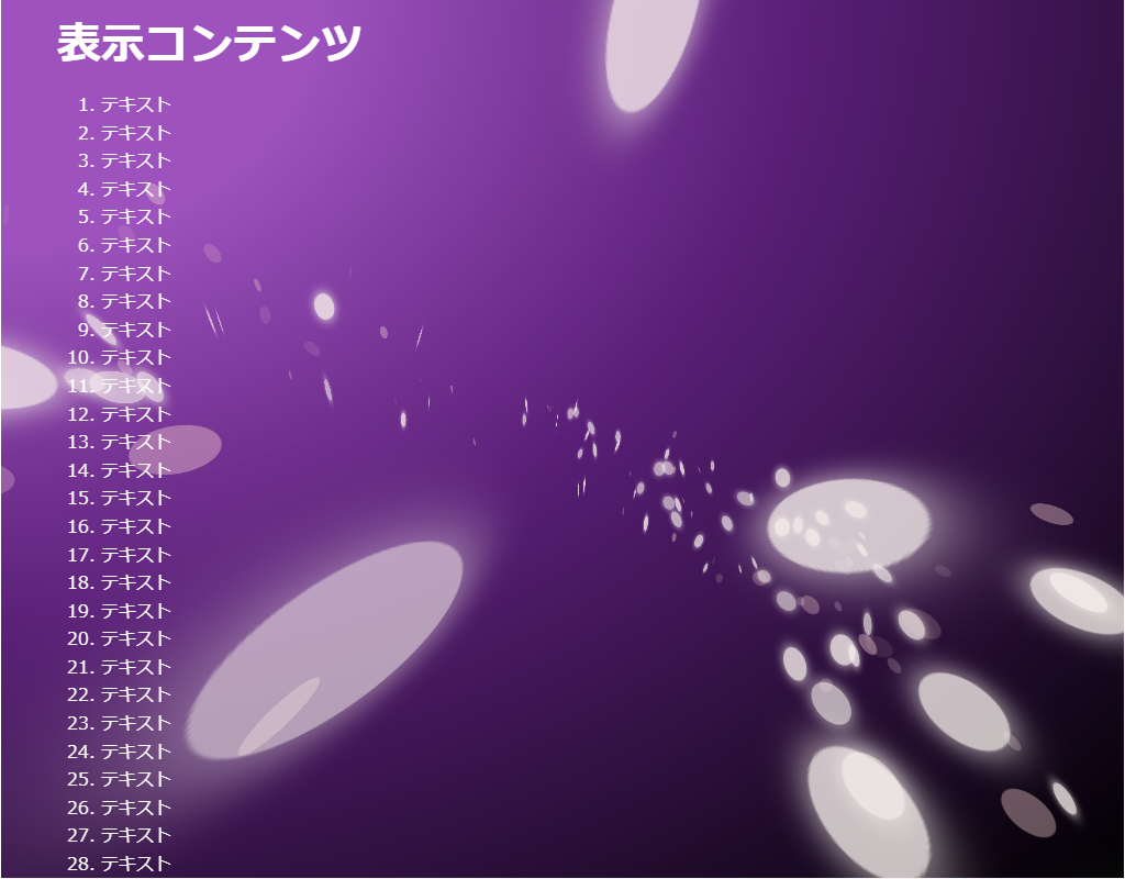
HTML(index.html)
<!DOCTYPE html>
<html lang="ja">
<!--	参考サイト
		背景にひと手間加えたい時に参考になりそうなスニペット集
		https://try-m.co.jp/blog/web-create/6672/
-->
<!--
	・回る白い円を表示させます。
	・CSSだけで実現しています。
-->
<head>
<meta charset="UTF-8">
<title>パーティクル(CSS)のサンプル</title>
<meta name="viewport" content="width=device-width,initial-scale=1.0,viewport-fit=cover">
<style>
body,div,h1,h2,h3,h4,h5,h6,pre,p,a,select,header,nav,main,section,footer,ul,ol,li,label {
	padding: 0;
	margin: 0;
	font-size: 16px;
	line-height: 1.6;
	word-wrap: break-word;
	box-sizing: border-box;
}
body {
	font-family: "Hiragino Sans W3", "Hiragino Kaku Gothic ProN", "ヒラギノ角ゴ ProN W3", "メイリオ", "Meiryo", "MS Pゴシック", "MS PGothic", sans-serif;
}
.container {
	border: #fff 1px solid;
}
.wrapper {
	max-width: 960px;
	margin: 0 auto;
	padding: 0 20px;
	color: #fff;
	background: #00000000;
}

h1 {
	font-size: 2.5rem;
	padding: 10px 0;
}
ol {
	margin-left: 40px;
}

/* ▼▼▼ CSS(ここから)(※2) ▼▼▼ */
/* パーティクル(CSS)の設定 */

/* アニメーション枠指定 */
.back-container {
	width: 100%;
	height: 100vh;
	position: fixed;
	top: 0;
	left: 0;
	z-index: -1;
}
.back-container .back-container2 {
	width: 100%;
	height: 100vh;
	display: flex;
	justify-content: center;
	align-items: center;
	background: radial-gradient(ellipse at left top, #9d52bd 20%, #5a1f78 50%, #000000);
	overflow: hidden;
	position: relative;
}
.back-container .back-container2 div {
	transform-style: preserve-3d;
}
.back-container .back-container3 {
	perspective: 280px;
	transform: rotate(24deg);
}
.back-container .flip {
	position: absolute;
	top: -280px;
	width: 24px;
	height: 24px;
	border-radius: 50%;
}

/* アニメーション動作指定 */
@keyframes rotation {
	0% {
		transform: rotateY(0deg);
	}
	100% {
		transform: rotateY(360deg);
	}
}
@keyframes rotate01 {
	0% {
		transform: scale3d(0.5, 0.5, 0.5) rotateY(0);
		opacity: 0.8;
	}
	25% {
		opacity: 0.6;
	}
	50% {
		transform: rotateY(180deg);
		opacity: 0.8;
	}
	100% {
		transform: scale3d(0.5, 0.5, 0.5) rotateY(180deg);
		opacity: 0.6;
	}
}
@keyframes rotate02 {
	0% {
		transform: scale3d(0.5, 0.5, 0.5) rotateY(0);
		opacity: 0.4;
	}
	25% {
		opacity: 0.1;
	}
	50% {
		transform: scale3d(0.5, 0.5, 0.5) rotateY(180deg);
		opacity: 0.4;
	}
	100% {
		transform: scale3d(0.5, 0.5, 0.5) rotateY(180deg);
		opacity: 0.1;
	}
}

/* 色指定 */
.back-container .rotate.s01 .flip {
	background-color: #f9f2ee;
	box-shadow: 0px 0px 10px 1px #f9f2ee;
}
.back-container .rotate.c01 .flip {
	background-color: #f9d2d3;
}

/* 位置指定 */
.back-container .rotate.r001 {
	animation: rotation linear infinite reverse;
	animation-delay: -47179ms;
	animation-duration: 49986ms;
}
.back-container .rotate.r001 .flip_rotate {
	transform: rotateX(21deg);
}
.back-container .rotate.r001 .flip_pos {
	transform: translateY(305px);
}
.back-container .rotate.r001 .flip {
	left: calc(30% + 235px);
}
.back-container .rotate.r002 {
	animation: rotation linear infinite reverse;
	animation-delay: -41360ms;
	animation-duration: 30592ms;
}
.back-container .rotate.r002 .flip_rotate {
	transform: rotateX(25deg);
}
.back-container .rotate.r002 .flip_pos {
	transform: translateY(297px);
}
.back-container .rotate.r002 .flip {
	left: calc(30% + 261px);
}
.back-container .rotate.r003 {
	animation: rotation linear infinite reverse;
	animation-delay: -43356ms;
	animation-duration: 57070ms;
}
.back-container .rotate.r003 .flip_rotate {
	transform: rotateX(33deg);
}
.back-container .rotate.r003 .flip_pos {
	transform: translateY(288px);
}

.back-container .rotate.r003 .flip {
	left: calc(30% + 353px);
}
.back-container .rotate.r004 {
	animation: rotation linear infinite reverse;
	animation-delay: -43534ms;
	animation-duration: 43827ms;
}
.back-container .rotate.r004 .flip_rotate {
	transform: rotateX(22deg);
}
.back-container .rotate.r004 .flip_pos {
	transform: translateY(324px);
}
.back-container .rotate.r004 .flip {
	left: calc(30% + 426px);
}
.back-container .rotate.r005 {
	animation: rotation linear infinite reverse;
	animation-delay: -49650ms;
	animation-duration: 44111ms;
}
.back-container .rotate.r005 .flip_rotate {
	transform: rotateX(44deg);
}
.back-container .rotate.r005 .flip_pos {
	transform: translateY(340px);
}
.back-container .rotate.r005 .flip {
	left: calc(30% + 296px);
}
.back-container .rotate.r006 {
	animation: rotation linear infinite reverse;
	animation-delay: -41880ms;
	animation-duration: 28423ms;
}
.back-container .rotate.r006 .flip_rotate {
	transform: rotateX(5deg);
}

.back-container .rotate.r006 .flip_pos {
	transform: translateY(183px);
}

.back-container .rotate.r006 .flip {
	left: calc(30% + 233px);
}

.back-container .rotate.r007 {
	animation: rotation linear infinite reverse;
	animation-delay: -40288ms;
	animation-duration: 34960ms;
}
.back-container .rotate.r007 .flip_rotate {
	transform: rotateX(30deg);
}
.back-container .rotate.r007 .flip_pos {
	transform: translateY(342px);
}
.back-container .rotate.r007 .flip {
	left: calc(30% + 271px);
}
.back-container .rotate.r008 {
	animation: rotation linear infinite reverse;
	animation-delay: -48985ms;
	animation-duration: 58169ms;
}
.back-container .rotate.r008 .flip_rotate {
	transform: rotateX(29deg);
}
.back-container .rotate.r008 .flip_pos {
	transform: translateY(378px);
}
.back-container .rotate.r008 .flip {
	left: calc(30% + 246px);
}
.back-container .rotate.r009 {
	animation: rotation linear infinite reverse;
	animation-delay: -41169ms;
	animation-duration: 26870ms;
}
.back-container .rotate.r009 .flip_rotate {
	transform: rotateX(12deg);
}
.back-container .rotate.r009 .flip_pos {
	transform: translateY(313px);
}
.back-container .rotate.r009 .flip {
	left: calc(30% + 388px);
}
.back-container .rotate.r010 {
	animation: rotation linear infinite reverse;
	animation-delay: -48924ms;
	animation-duration: 35277ms;
}
.back-container .rotate.r010 .flip_rotate {
	transform: rotateX(18deg);
}
.back-container .rotate.r010 .flip_pos {
	transform: translateY(353px);
}
.back-container .rotate.r010 .flip {
	left: calc(30% + 341px);
}
.back-container .rotate.r011 {
	animation: rotation linear infinite reverse;
	animation-delay: -44091ms;
	animation-duration: 26330ms;
}
.back-container .rotate.r011 .flip_rotate {
	transform: rotateX(6deg);
}
.back-container .rotate.r011 .flip_pos {
	transform: translateY(259px);
}
.back-container .rotate.r011 .flip {
	left: calc(30% + 246px);
}
.back-container .rotate.r012 {
	animation: rotation linear infinite reverse;
	animation-delay: -47865ms;
	animation-duration: 45853ms;
}
.back-container .rotate.r012 .flip_rotate {
	transform: rotateX(28deg);
}
.back-container .rotate.r012 .flip_pos {
	transform: translateY(260px);
}
.back-container .rotate.r012 .flip {
	left: calc(30% + 215px);
}
.back-container .rotate.r013 {
	animation: rotation linear infinite reverse;
	animation-delay: -46823ms;
	animation-duration: 23311ms;
}
.back-container .rotate.r013 .flip_rotate {
	transform: rotateX(19deg);
}
.back-container .rotate.r013 .flip_pos {
	transform: translateY(319px);
}
.back-container .rotate.r013 .flip {
	left: calc(30% + 235px);
}
.back-container .rotate.r014 {
	animation: rotation linear infinite reverse;
	animation-delay: -44497ms;
	animation-duration: 45250ms;
}
.back-container .rotate.r014 .flip_rotate {
	transform: rotateX(20deg);
}
.back-container .rotate.r014 .flip_pos {
	transform: translateY(229px);
}
.back-container .rotate.r014 .flip {
	left: calc(30% + 436px);
}
.back-container .rotate.r015 {
	animation: rotation linear infinite reverse;
	animation-delay: -45859ms;
	animation-duration: 69883ms;
}
.back-container .rotate.r015 .flip_rotate {
	transform: rotateX(8deg);
}
.back-container .rotate.r015 .flip_pos {
	transform: translateY(284px);
}
.back-container .rotate.r015 .flip {
	left: calc(30% + 461px);
}
.back-container .rotate.r016 {
	animation: rotation linear infinite reverse;
	animation-delay: -40038ms;
	animation-duration: 43287ms;
}
.back-container .rotate.r016 .flip_rotate {
	transform: rotateX(7deg);
}
.back-container .rotate.r016 .flip_pos {
	transform: translateY(330px);
}
.back-container .rotate.r016 .flip {
	left: calc(30% + 328px);
}
.back-container .rotate.r017 {
	animation: rotation linear infinite reverse;
	animation-delay: -40827ms;
	animation-duration: 65664ms;
}
.back-container .rotate.r017 .flip_rotate {
	transform: rotateX(16deg);
}
.back-container .rotate.r017 .flip_pos {
	transform: translateY(245px);
}
.back-container .rotate.r017 .flip {
	left: calc(30% + 205px);
}
.back-container .rotate.r018 {
	animation: rotation linear infinite reverse;
	animation-delay: -47411ms;
	animation-duration: 52433ms;
}
.back-container .rotate.r018 .flip_rotate {
	transform: rotateX(37deg);
}
.back-container .rotate.r018 .flip_pos {
	transform: translateY(212px);
}
.back-container .rotate.r018 .flip {
	left: calc(30% + 339px);
}
.back-container .rotate.r019 {
	animation: rotation linear infinite reverse;
	animation-delay: -45903ms;
	animation-duration: 48081ms;
}
.back-container .rotate.r019 .flip_rotate {
	transform: rotateX(41deg);
}
.back-container .rotate.r019 .flip_pos {
	transform: translateY(295px);
}
.back-container .rotate.r019 .flip {
	left: calc(30% + 475px);
}
.back-container .rotate.r020 {
	animation: rotation linear infinite reverse;
	animation-delay: -48385ms;
	animation-duration: 44793ms;
}
.back-container .rotate.r020 .flip_rotate {
	transform: rotateX(8deg);
}
.back-container .rotate.r020 .flip_pos {
	transform: translateY(294px);
}
.back-container .rotate.r020 .flip {
	left: calc(30% + 238px);
}
.back-container .rotate.r021 {
	animation: rotation linear infinite reverse;
	animation-delay: -40714ms;
	animation-duration: 50695ms;
}
.back-container .rotate.r021 .flip_rotate {
	transform: rotateX(44deg);
}
.back-container .rotate.r021 .flip_pos {
	transform: translateY(255px);
}
.back-container .rotate.r021 .flip {
	left: calc(30% + 486px);
}
.back-container .rotate.r022 {
	animation: rotation linear infinite reverse;
	animation-delay: -42370ms;
	animation-duration: 68170ms;
}
.back-container .rotate.r022 .flip_rotate {
	transform: rotateX(30deg);
}
.back-container .rotate.r022 .flip_pos {
	transform: translateY(218px);
}
.back-container .rotate.r022 .flip {
	left: calc(30% + 245px);
}
.back-container .rotate.r023 {
	animation: rotation linear infinite reverse;
	animation-delay: -48216ms;
	animation-duration: 48230ms;
}
.back-container .rotate.r023 .flip_rotate {
	transform: rotateX(45deg);
}
.back-container .rotate.r023 .flip_pos {
	transform: translateY(316px);
}
.back-container .rotate.r023 .flip {
	left: calc(30% + 253px);
}
.back-container .rotate.r024 {
	animation: rotation linear infinite reverse;
	animation-delay: -44651ms;
	animation-duration: 59390ms;
}
.back-container .rotate.r024 .flip_rotate {
	transform: rotateX(19deg);
}
.back-container .rotate.r024 .flip_pos {
	transform: translateY(200px);
}
.back-container .rotate.r024 .flip {
	left: calc(30% + 365px);
}
.back-container .rotate.r025 {
	animation: rotation linear infinite reverse;
	animation-delay: -41252ms;
	animation-duration: 69446ms;
}
.back-container .rotate.r025 .flip_rotate {
	transform: rotateX(29deg);
}
.back-container .rotate.r025 .flip_pos {
	transform: translateY(240px);
}
.back-container .rotate.r025 .flip {
	left: calc(30% + 211px);
}
.back-container .rotate.r026 {
	animation: rotation linear infinite reverse;
	animation-delay: -44607ms;
	animation-duration: 48450ms;
}
.back-container .rotate.r026 .flip_rotate {
	transform: rotateX(32deg);
}
.back-container .rotate.r026 .flip_pos {
	transform: translateY(192px);
}
.back-container .rotate.r026 .flip {
	left: calc(30% + 380px);
}
.back-container .rotate.r027 {
	animation: rotation linear infinite reverse;
	animation-delay: -46296ms;
	animation-duration: 23060ms;
}
.back-container .rotate.r027 .flip_rotate {
	transform: rotateX(30deg);
}
.back-container .rotate.r027 .flip_pos {
	transform: translateY(256px);
}
.back-container .rotate.r027 .flip {
	left: calc(30% + 294px);
}
.back-container .rotate.r028 {
	animation: rotation linear infinite reverse;
	animation-delay: -49151ms;
	animation-duration: 61083ms;
}
.back-container .rotate.r028 .flip_rotate {
	transform: rotateX(44deg);
}
.back-container .rotate.r028 .flip_pos {
	transform: translateY(230px);
}
.back-container .rotate.r028 .flip {
	left: calc(30% + 295px);
}
.back-container .rotate.r029 {
	animation: rotation linear infinite reverse;
	animation-delay: -46770ms;
	animation-duration: 49225ms;
}
.back-container .rotate.r029 .flip_rotate {
	transform: rotateX(18deg);
}
.back-container .rotate.r029 .flip_pos {
	transform: translateY(242px);
}
.back-container .rotate.r029 .flip {
	left: calc(30% + 252px);
}
.back-container .rotate.r030 {
	animation: rotation linear infinite reverse;
	animation-delay: -44322ms;
	animation-duration: 38851ms;
}
.back-container .rotate.r030 .flip_rotate {
	transform: rotateX(41deg);
}
.back-container .rotate.r030 .flip_pos {
	transform: translateY(201px);
}
.back-container .rotate.r030 .flip {
	left: calc(30% + 405px);
}
.back-container .rotate.r031 {
	animation: rotation linear infinite reverse;
	animation-delay: -43983ms;
	animation-duration: 69620ms;
}
.back-container .rotate.r031 .flip_rotate {
	transform: rotateX(28deg);
}
.back-container .rotate.r031 .flip_pos {
	transform: translateY(196px);
}
.back-container .rotate.r031 .flip {
	left: calc(30% + 499px);
}
.back-container .rotate.r032 {
	animation: rotation linear infinite reverse;
	animation-delay: -49498ms;
	animation-duration: 66750ms;
}
.back-container .rotate.r032 .flip_rotate {
	transform: rotateX(31deg);
}
.back-container .rotate.r032 .flip_pos {
	transform: translateY(298px);
}
.back-container .rotate.r032 .flip {
	left: calc(30% + 292px);
}
.back-container .rotate.r033 {
	animation: rotation linear infinite reverse;
	animation-delay: -44046ms;
	animation-duration: 41073ms;
}
.back-container .rotate.r033 .flip_rotate {
	transform: rotateX(45deg);
}
.back-container .rotate.r033 .flip_pos {
	transform: translateY(249px);
}
.back-container .rotate.r033 .flip {
	left: calc(30% + 287px);
}
.back-container .rotate.r034 {
	animation: rotation linear infinite reverse;
	animation-delay: -47617ms;
	animation-duration: 50979ms;
}
.back-container .rotate.r034 .flip_rotate {
	transform: rotateX(40deg);
}
.back-container .rotate.r034 .flip_pos {
	transform: translateY(353px);
}
.back-container .rotate.r034 .flip {
	left: calc(30% + 376px);
}
.back-container .rotate.r035 {
	animation: rotation linear infinite reverse;
	animation-delay: -41800ms;
	animation-duration: 47233ms;
}
.back-container .rotate.r035 .flip_rotate {
	transform: rotateX(11deg);
}
.back-container .rotate.r035 .flip_pos {
	transform: translateY(228px);
}
.back-container .rotate.r035 .flip {
	left: calc(30% + 366px);
}
.back-container .rotate.r036 {
	animation: rotation linear infinite reverse;
	animation-delay: -45836ms;
	animation-duration: 68160ms;
}
.back-container .rotate.r036 .flip_rotate {
	transform: rotateX(29deg);
}
.back-container .rotate.r036 .flip_pos {
	transform: translateY(263px);
}
.back-container .rotate.r036 .flip {
	left: calc(30% + 270px);
}
.back-container .rotate.r037 {
	animation: rotation linear infinite reverse;
	animation-delay: -47713ms;
	animation-duration: 58709ms;
}
.back-container .rotate.r037 .flip_rotate {
	transform: rotateX(11deg);
}
.back-container .rotate.r037 .flip_pos {
	transform: translateY(198px);
}
.back-container .rotate.r037 .flip {
	left: calc(30% + 288px);
}
.back-container .rotate.r038 {
	animation: rotation linear infinite reverse;
	animation-delay: -48721ms;
	animation-duration: 45244ms;
}
.back-container .rotate.r038 .flip_rotate {
	transform: rotateX(40deg);
}
.back-container .rotate.r038 .flip_pos {
	transform: translateY(375px);
}
.back-container .rotate.r038 .flip {
	left: calc(30% + 383px);
}
.back-container .rotate.r039 {
	animation: rotation linear infinite reverse;
	animation-delay: -45003ms;
	animation-duration: 48546ms;
}
.back-container .rotate.r039 .flip_rotate {
	transform: rotateX(42deg);
}
.back-container .rotate.r039 .flip_pos {
	transform: translateY(306px);
}
.back-container .rotate.r039 .flip {
	left: calc(30% + 321px);
}
.back-container .rotate.r040 {
	animation: rotation linear infinite reverse;
	animation-delay: -49733ms;
	animation-duration: 23481ms;
}
.back-container .rotate.r040 .flip_rotate {
	transform: rotateX(26deg);
}
.back-container .rotate.r040 .flip_pos {
	transform: translateY(368px);
}
.back-container .rotate.r040 .flip {
	left: calc(30% + 285px);
}
.back-container .rotate.r041 {
	animation: rotation linear infinite reverse;
	animation-delay: -49943ms;
	animation-duration: 25214ms;
}
.back-container .rotate.r041 .flip_rotate {
	transform: rotateX(43deg);
}
.back-container .rotate.r041 .flip_pos {
	transform: translateY(245px);
}
.back-container .rotate.r041 .flip {
	left: calc(30% + 485px);
}
.back-container .rotate.r042 {
	animation: rotation linear infinite reverse;
	animation-delay: -48815ms;
	animation-duration: 20860ms;
}
.back-container .rotate.r042 .flip_rotate {
	transform: rotateX(23deg);
}
.back-container .rotate.r042 .flip_pos {
	transform: translateY(264px);
}
.back-container .rotate.r042 .flip {
	left: calc(30% + 383px);
}
.back-container .rotate.r043 {
	animation: rotation linear infinite reverse;
	animation-delay: -41633ms;
	animation-duration: 55403ms;
}
.back-container .rotate.r043 .flip_rotate {
	transform: rotateX(38deg);
}
.back-container .rotate.r043 .flip_pos {
	transform: translateY(367px);
}
.back-container .rotate.r043 .flip {
	left: calc(30% + 486px);
}
.back-container .rotate.r044 {
	animation: rotation linear infinite reverse;
	animation-delay: -49257ms;
	animation-duration: 24172ms;
}
.back-container .rotate.r044 .flip_rotate {
	transform: rotateX(41deg);
}
.back-container .rotate.r044 .flip_pos {
	transform: translateY(223px);
}
.back-container .rotate.r044 .flip {
	left: calc(30% + 335px);
}
.back-container .rotate.r045 {
	animation: rotation linear infinite reverse;
	animation-delay: -49923ms;
	animation-duration: 54061ms;
}
.back-container .rotate.r045 .flip_rotate {
	transform: rotateX(12deg);
}
.back-container .rotate.r045 .flip_pos {
	transform: translateY(370px);
}
.back-container .rotate.r045 .flip {
	left: calc(30% + 391px);
}
.back-container .rotate.r046 {
	animation: rotation linear infinite reverse;
	animation-delay: -49337ms;
	animation-duration: 61051ms;
}
.back-container .rotate.r046 .flip_rotate {
	transform: rotateX(28deg);
}
.back-container .rotate.r046 .flip_pos {
	transform: translateY(349px);
}
.back-container .rotate.r046 .flip {
	left: calc(30% + 338px);
}
.back-container .rotate.r047 {
	animation: rotation linear infinite reverse;
	animation-delay: -49792ms;
	animation-duration: 26944ms;
}
.back-container .rotate.r047 .flip_rotate {
	transform: rotateX(24deg);
}
.back-container .rotate.r047 .flip_pos {
	transform: translateY(188px);
}
.back-container .rotate.r047 .flip {
	left: calc(30% + 440px);
}
.back-container .rotate.r048 {
	animation: rotation linear infinite reverse;
	animation-delay: -42603ms;
	animation-duration: 37656ms;
}
.back-container .rotate.r048 .flip_rotate {
	transform: rotateX(31deg);
}
.back-container .rotate.r048 .flip_pos {
	transform: translateY(185px);
}
.back-container .rotate.r048 .flip {
	left: calc(30% + 461px);
}
.back-container .rotate.r049 {
	animation: rotation linear infinite reverse;
	animation-delay: -45425ms;
	animation-duration: 21656ms;
}
.back-container .rotate.r049 .flip_rotate {
	transform: rotateX(40deg);
}
.back-container .rotate.r049 .flip_pos {
	transform: translateY(358px);
}
.back-container .rotate.r049 .flip {
	left: calc(30% + 348px);
}
.back-container .rotate.r050 {
	animation: rotation linear infinite reverse;
	animation-delay: -44887ms;
	animation-duration: 40893ms;
}
.back-container .rotate.r050 .flip_rotate {
	transform: rotateX(25deg);
}
.back-container .rotate.r050 .flip_pos {
	transform: translateY(181px);
}
.back-container .rotate.r050 .flip {
	left: calc(30% + 207px);
}
.back-container .rotate.r051 {
	animation: rotation linear infinite reverse;
	animation-delay: -41370ms;
	animation-duration: 43166ms;
}
.back-container .rotate.r051 .flip_rotate {
	transform: rotateX(45deg);
}
.back-container .rotate.r051 .flip_pos {
	transform: translateY(243px);
}
.back-container .rotate.r051 .flip {
	left: calc(30% + 436px);
}
.back-container .rotate.r052 {
	animation: rotation linear infinite reverse;
	animation-delay: -47029ms;
	animation-duration: 41441ms;
}
.back-container .rotate.r052 .flip_rotate {
	transform: rotateX(7deg);
}
.back-container .rotate.r052 .flip_pos {
	transform: translateY(216px);
}
.back-container .rotate.r052 .flip {
	left: calc(30% + 427px);
}
.back-container .rotate.r053 {
	animation: rotation linear infinite reverse;
	animation-delay: -46488ms;
	animation-duration: 38502ms;
}
.back-container .rotate.r053 .flip_rotate {
	transform: rotateX(11deg);
}
.back-container .rotate.r053 .flip_pos {
	transform: translateY(339px);
}
.back-container .rotate.r053 .flip {
	left: calc(30% + 248px);
}
.back-container .rotate.r054 {
	animation: rotation linear infinite reverse;
	animation-delay: -42538ms;
	animation-duration: 66501ms;
}
.back-container .rotate.r054 .flip_rotate {
	transform: rotateX(13deg);
}
.back-container .rotate.r054 .flip_pos {
	transform: translateY(192px);
}
.back-container .rotate.r054 .flip {
	left: calc(30% + 371px);
}
.back-container .rotate.r055 {
	animation: rotation linear infinite reverse;
	animation-delay: -45640ms;
	animation-duration: 28619ms;
}
.back-container .rotate.r055 .flip_rotate {
	transform: rotateX(40deg);
}
.back-container .rotate.r055 .flip_pos {
	transform: translateY(321px);
}
.back-container .rotate.r055 .flip {
	left: calc(30% + 252px);
}
.back-container .rotate.r056 {
	animation: rotation linear infinite reverse;
	animation-delay: -49614ms;
	animation-duration: 42815ms;
}
.back-container .rotate.r056 .flip_rotate {
	transform: rotateX(5deg);
}
.back-container .rotate.r056 .flip_pos {
	transform: translateY(188px);
}
.back-container .rotate.r056 .flip {
	left: calc(30% + 323px);
}
.back-container .rotate.r057 {
	animation: rotation linear infinite reverse;
	animation-delay: -43047ms;
	animation-duration: 24780ms;
}
.back-container .rotate.r057 .flip_rotate {
	transform: rotateX(28deg);
}
.back-container .rotate.r057 .flip_pos {
	transform: translateY(191px);
}
.back-container .rotate.r057 .flip {
	left: calc(30% + 417px);
}
.back-container .rotate.r058 {
	animation: rotation linear infinite reverse;
	animation-delay: -41267ms;
	animation-duration: 61223ms;
}
.back-container .rotate.r058 .flip_rotate {
	transform: rotateX(19deg);
}
.back-container .rotate.r058 .flip_pos {
	transform: translateY(213px);
}
.back-container .rotate.r058 .flip {
	left: calc(30% + 379px);
}
.back-container .rotate.r059 {
	animation: rotation linear infinite reverse;
	animation-delay: -40465ms;
	animation-duration: 33011ms;
}
.back-container .rotate.r059 .flip_rotate {
	transform: rotateX(9deg);
}
.back-container .rotate.r059 .flip_pos {
	transform: translateY(356px);
}
.back-container .rotate.r059 .flip {
	left: calc(30% + 387px);
}
.back-container .rotate.r060 {
	animation: rotation linear infinite reverse;
	animation-delay: -43513ms;
	animation-duration: 60750ms;
}
.back-container .rotate.r060 .flip_rotate {
	transform: rotateX(18deg);
}
.back-container .rotate.r060 .flip_pos {
	transform: translateY(344px);
}
.back-container .rotate.r060 .flip {
	left: calc(30% + 282px);
}
.back-container .rotate.r061 {
	animation: rotation linear infinite reverse;
	animation-delay: -44198ms;
	animation-duration: 45395ms;
}
.back-container .rotate.r061 .flip_rotate {
	transform: rotateX(24deg);
}
.back-container .rotate.r061 .flip_pos {
	transform: translateY(333px);
}
.back-container .rotate.r061 .flip {
	left: calc(30% + 214px);
}
.back-container .rotate.r062 {
	animation: rotation linear infinite reverse;
	animation-delay: -40726ms;
	animation-duration: 53485ms;
}
.back-container .rotate.r062 .flip_rotate {
	transform: rotateX(21deg);
}
.back-container .rotate.r062 .flip_pos {
	transform: translateY(226px);
}
.back-container .rotate.r062 .flip {
	left: calc(30% + 393px);
}
.back-container .rotate.r063 {
	animation: rotation linear infinite reverse;
	animation-delay: -49787ms;
	animation-duration: 41200ms;
}
.back-container .rotate.r063 .flip_rotate {
	transform: rotateX(28deg);
}
.back-container .rotate.r063 .flip_pos {
	transform: translateY(325px);
}
.back-container .rotate.r063 .flip {
	left: calc(30% + 318px);
}
.back-container .rotate.r064 {
	animation: rotation linear infinite reverse;
	animation-delay: -42807ms;
	animation-duration: 58602ms;
}
.back-container .rotate.r064 .flip_rotate {
	transform: rotateX(32deg);
}
.back-container .rotate.r064 .flip_pos {
	transform: translateY(220px);
}
.back-container .rotate.r064 .flip {
	left: calc(30% + 372px);
}
.back-container .rotate.r065 {
	animation: rotation linear infinite reverse;
	animation-delay: -41873ms;
	animation-duration: 31608ms;
}
.back-container .rotate.r065 .flip_rotate {
	transform: rotateX(8deg);
}
.back-container .rotate.r065 .flip_pos {
	transform: translateY(226px);
}
.back-container .rotate.r065 .flip {
	left: calc(30% + 216px);
}
.back-container .rotate.r066 {
	animation: rotation linear infinite reverse;
	animation-delay: -42502ms;
	animation-duration: 51070ms;
}
.back-container .rotate.r066 .flip_rotate {
	transform: rotateX(38deg);
}
.back-container .rotate.r066 .flip_pos {
	transform: translateY(246px);
}
.back-container .rotate.r066 .flip {
	left: calc(30% + 250px);
}
.back-container .rotate.r067 {
	animation: rotation linear infinite reverse;
	animation-delay: -42511ms;
	animation-duration: 24259ms;
}
.back-container .rotate.r067 .flip_rotate {
	transform: rotateX(24deg);
}
.back-container .rotate.r067 .flip_pos {
	transform: translateY(342px);
}
.back-container .rotate.r067 .flip {
	left: calc(30% + 204px);
}
.back-container .rotate.r068 {
	animation: rotation linear infinite reverse;
	animation-delay: -46792ms;
	animation-duration: 24182ms;
}
.back-container .rotate.r068 .flip_rotate {
	transform: rotateX(36deg);
}
.back-container .rotate.r068 .flip_pos {
	transform: translateY(300px);
}
.back-container .rotate.r068 .flip {
	left: calc(30% + 290px);
}
.back-container .rotate.r069 {
	animation: rotation linear infinite reverse;
	animation-delay: -43905ms;
	animation-duration: 58445ms;
}
.back-container .rotate.r069 .flip_rotate {
	transform: rotateX(5deg);
}
.back-container .rotate.r069 .flip_pos {
	transform: translateY(379px);
}
.back-container .rotate.r069 .flip {
	left: calc(30% + 432px);
}
.back-container .rotate.r070 {
	animation: rotation linear infinite reverse;
	animation-delay: -41314ms;
	animation-duration: 51825ms;
}
.back-container .rotate.r070 .flip_rotate {
	transform: rotateX(28deg);
}
.back-container .rotate.r070 .flip_pos {
	transform: translateY(378px);
}
.back-container .rotate.r070 .flip {
	left: calc(30% + 426px);
}
.back-container .rotate.r071 {
	animation: rotation linear infinite reverse;
	animation-delay: -46201ms;
	animation-duration: 48986ms;
}
.back-container .rotate.r071 .flip_rotate {
	transform: rotateX(18deg);
}
.back-container .rotate.r071 .flip_pos {
	transform: translateY(341px);
}
.back-container .rotate.r071 .flip {
	left: calc(30% + 409px);
}
.back-container .rotate.r072 {
	animation: rotation linear infinite reverse;
	animation-delay: -49647ms;
	animation-duration: 43784ms;
}
.back-container .rotate.r072 .flip_rotate {
	transform: rotateX(32deg);
}
.back-container .rotate.r072 .flip_pos {
	transform: translateY(322px);
}
.back-container .rotate.r072 .flip {
	left: calc(30% + 244px);
}
.back-container .rotate.r073 {
	animation: rotation linear infinite reverse;
	animation-delay: -45035ms;
	animation-duration: 60934ms;
}
.back-container .rotate.r073 .flip_rotate {
	transform: rotateX(31deg);
}
.back-container .rotate.r073 .flip_pos {
	transform: translateY(238px);
}
.back-container .rotate.r073 .flip {
	left: calc(30% + 267px);
}
.back-container .rotate.r074 {
	animation: rotation linear infinite reverse;
	animation-delay: -49840ms;
	animation-duration: 50023ms;
}
.back-container .rotate.r074 .flip_rotate {
	transform: rotateX(17deg);
}
.back-container .rotate.r074 .flip_pos {
	transform: translateY(206px);
}
.back-container .rotate.r074 .flip {
	left: calc(30% + 371px);
}
.back-container .rotate.r075 {
	animation: rotation linear infinite reverse;
	animation-delay: -41368ms;
	animation-duration: 52625ms;
}
.back-container .rotate.r075 .flip_rotate {
	transform: rotateX(27deg);
}
.back-container .rotate.r075 .flip_pos {
	transform: translateY(207px);
}
.back-container .rotate.r075 .flip {
	left: calc(30% + 484px);
}
.back-container .rotate.r076 {
	animation: rotation linear infinite reverse;
	animation-delay: -41248ms;
	animation-duration: 46981ms;
}
.back-container .rotate.r076 .flip_rotate {
	transform: rotateX(39deg);
}
.back-container .rotate.r076 .flip_pos {
	transform: translateY(268px);
}
.back-container .rotate.r076 .flip {
	left: calc(30% + 498px);
}
.back-container .rotate.r077 {
	animation: rotation linear infinite reverse;
	animation-delay: -41722ms;
	animation-duration: 39563ms;
}
.back-container .rotate.r077 .flip_rotate {
	transform: rotateX(33deg);
}
.back-container .rotate.r077 .flip_pos {
	transform: translateY(231px);
}
.back-container .rotate.r077 .flip {
	left: calc(30% + 378px);
}
.back-container .rotate.r078 {
	animation: rotation linear infinite reverse;
	animation-delay: -46625ms;
	animation-duration: 33479ms;
}
.back-container .rotate.r078 .flip_rotate {
	transform: rotateX(41deg);
}
.back-container .rotate.r078 .flip_pos {
	transform: translateY(267px);
}
.back-container .rotate.r078 .flip {
	left: calc(30% + 401px);
}
.back-container .rotate.r079 {
	animation: rotation linear infinite reverse;
	animation-delay: -48633ms;
	animation-duration: 55905ms;
}
.back-container .rotate.r079 .flip_rotate {
	transform: rotateX(32deg);
}
.back-container .rotate.r079 .flip_pos {
	transform: translateY(310px);
}
.back-container .rotate.r079 .flip {
	left: calc(30% + 268px);
}
.back-container .rotate.r080 {
	animation: rotation linear infinite reverse;
	animation-delay: -45135ms;
	animation-duration: 39244ms;
}
.back-container .rotate.r080 .flip_rotate {
	transform: rotateX(45deg);
}
.back-container .rotate.r080 .flip_pos {
	transform: translateY(207px);
}
.back-container .rotate.r080 .flip {
	left: calc(30% + 297px);
}
.back-container .rotate.r081 {
	animation: rotation linear infinite reverse;
	animation-delay: -40878ms;
	animation-duration: 37671ms;
}
.back-container .rotate.r081 .flip_rotate {
	transform: rotateX(39deg);
}
.back-container .rotate.r081 .flip_pos {
	transform: translateY(266px);
}
.back-container .rotate.r081 .flip {
	left: calc(30% + 470px);
}
.back-container .rotate.r082 {
	animation: rotation linear infinite reverse;
	animation-delay: -47932ms;
	animation-duration: 50001ms;
}
.back-container .rotate.r082 .flip_rotate {
	transform: rotateX(36deg);
}
.back-container .rotate.r082 .flip_pos {
	transform: translateY(279px);
}
.back-container .rotate.r082 .flip {
	left: calc(30% + 347px);
}
.back-container .rotate.r083 {
	animation: rotation linear infinite reverse;
	animation-delay: -48764ms;
	animation-duration: 58611ms;
}
.back-container .rotate.r083 .flip_rotate {
	transform: rotateX(37deg);
}
.back-container .rotate.r083 .flip_pos {
	transform: translateY(236px);
}
.back-container .rotate.r083 .flip {
	left: calc(30% + 408px);
}
.back-container .rotate.r084 {
	animation: rotation linear infinite reverse;
	animation-delay: -43793ms;
	animation-duration: 25494ms;
}
.back-container .rotate.r084 .flip_rotate {
	transform: rotateX(35deg);
}
.back-container .rotate.r084 .flip_pos {
	transform: translateY(356px);
}
.back-container .rotate.r084 .flip {
	left: calc(30% + 349px);
}
.back-container .rotate.r085 {
	animation: rotation linear infinite reverse;
	animation-delay: -43555ms;
	animation-duration: 33836ms;
}
.back-container .rotate.r085 .flip_rotate {
	transform: rotateX(17deg);
}
.back-container .rotate.r085 .flip_pos {
	transform: translateY(244px);
}
.back-container .rotate.r085 .flip {
	left: calc(30% + 255px);
}
.back-container .rotate.r086 {
	animation: rotation linear infinite reverse;
	animation-delay: -47188ms;
	animation-duration: 38967ms;
}
.back-container .rotate.r086 .flip_rotate {
	transform: rotateX(1deg);
}
.back-container .rotate.r086 .flip_pos {
	transform: translateY(219px);
}
.back-container .rotate.r086 .flip {
	left: calc(30% + 468px);
}
.back-container .rotate.r087 {
	animation: rotation linear infinite reverse;
	animation-delay: -44408ms;
	animation-duration: 43418ms;
}
.back-container .rotate.r087 .flip_rotate {
	transform: rotateX(7deg);
}
.back-container .rotate.r087 .flip_pos {
	transform: translateY(275px);
}
.back-container .rotate.r087 .flip {
	left: calc(30% + 447px);
}
.back-container .rotate.r088 {
	animation: rotation linear infinite reverse;
	animation-delay: -46802ms;
	animation-duration: 50591ms;
}
.back-container .rotate.r088 .flip_rotate {
	transform: rotateX(15deg);
}
.back-container .rotate.r088 .flip_pos {
	transform: translateY(332px);
}
.back-container .rotate.r088 .flip {
	left: calc(30% + 321px);
}
.back-container .rotate.r089 {
	animation: rotation linear infinite reverse;
	animation-delay: -47827ms;
	animation-duration: 31692ms;
}
.back-container .rotate.r089 .flip_rotate {
	transform: rotateX(17deg);
}
.back-container .rotate.r089 .flip_pos {
	transform: translateY(212px);
}
.back-container .rotate.r089 .flip {
	left: calc(30% + 345px);
}
.back-container .rotate.r090 {
	animation: rotation linear infinite reverse;
	animation-delay: -47427ms;
	animation-duration: 55372ms;
}
.back-container .rotate.r090 .flip_rotate {
	transform: rotateX(14deg);
}
.back-container .rotate.r090 .flip_pos {
	transform: translateY(339px);
}
.back-container .rotate.r090 .flip {
	left: calc(30% + 286px);
}
.back-container .rotate.r091 {
	animation: rotation linear infinite reverse;
	animation-delay: -41878ms;
	animation-duration: 46993ms;
}
.back-container .rotate.r091 .flip_rotate {
	transform: rotateX(4deg);
}
.back-container .rotate.r091 .flip_pos {
	transform: translateY(344px);
}
.back-container .rotate.r091 .flip {
	left: calc(30% + 457px);
}
.back-container .rotate.r092 {
	animation: rotation linear infinite reverse;
	animation-delay: -48561ms;
	animation-duration: 22288ms;
}
.back-container .rotate.r092 .flip_rotate {
	transform: rotateX(32deg);
}
.back-container .rotate.r092 .flip_pos {
	transform: translateY(317px);
}
.back-container .rotate.r092 .flip {
	left: calc(30% + 453px);
}
.back-container .rotate.r093 {
	animation: rotation linear infinite reverse;
	animation-delay: -46043ms;
	animation-duration: 46029ms;
}
.back-container .rotate.r093 .flip_rotate {
	transform: rotateX(7deg);
}
.back-container .rotate.r093 .flip_pos {
	transform: translateY(276px);
}
.back-container .rotate.r093 .flip {
	left: calc(30% + 337px);
}
.back-container .rotate.r094 {
	animation: rotation linear infinite reverse;
	animation-delay: -41731ms;
	animation-duration: 35634ms;
}
.back-container .rotate.r094 .flip_rotate {
	transform: rotateX(13deg);
}
.back-container .rotate.r094 .flip_pos {
	transform: translateY(330px);
}
.back-container .rotate.r094 .flip {
	left: calc(30% + 226px);
}
.back-container .rotate.r095 {
	animation: rotation linear infinite reverse;
	animation-delay: -41062ms;
	animation-duration: 61131ms;
}
.back-container .rotate.r095 .flip_rotate {
	transform: rotateX(3deg);
}
.back-container .rotate.r095 .flip_pos {
	transform: translateY(235px);
}
.back-container .rotate.r095 .flip {
	left: calc(30% + 350px);
}
.back-container .rotate.r096 {
	animation: rotation linear infinite reverse;
	animation-delay: -46690ms;
	animation-duration: 24968ms;
}
.back-container .rotate.r096 .flip_rotate {
	transform: rotateX(18deg);
}
.back-container .rotate.r096 .flip_pos {
	transform: translateY(292px);
}
.back-container .rotate.r096 .flip {
	left: calc(30% + 364px);
}
.back-container .rotate.r097 {
	animation: rotation linear infinite reverse;
	animation-delay: -48028ms;
	animation-duration: 41590ms;
}
.back-container .rotate.r097 .flip_rotate {
	transform: rotateX(12deg);
}
.back-container .rotate.r097 .flip_pos {
	transform: translateY(234px);
}
.back-container .rotate.r097 .flip {
	left: calc(30% + 473px);
}
.back-container .rotate.r098 {
	animation: rotation linear infinite reverse;
	animation-delay: -48485ms;
	animation-duration: 67671ms;
}
.back-container .rotate.r098 .flip_rotate {
	transform: rotateX(7deg);
}
.back-container .rotate.r098 .flip_pos {
	transform: translateY(201px);
}
.back-container .rotate.r098 .flip {
	left: calc(30% + 491px);
}
.back-container .rotate.r099 {
	animation: rotation linear infinite reverse;
	animation-delay: -48237ms;
	animation-duration: 59591ms;
}
.back-container .rotate.r099 .flip_rotate {
	transform: rotateX(20deg);
}
.back-container .rotate.r099 .flip_pos {
	transform: translateY(251px);
}
.back-container .rotate.r099 .flip {
	left: calc(30% + 401px);
}
.back-container .rotate.r100 {
	animation: rotation linear infinite reverse;
	animation-delay: -49121ms;
	animation-duration: 47725ms;
}
.back-container .rotate.r100 .flip_rotate {
	transform: rotateX(42deg);
}
.back-container .rotate.r100 .flip_pos {
	transform: translateY(199px);
}
.back-container .rotate.r100 .flip {
	left: calc(30% + 271px);
}
.back-container .rotate.r101 {
	animation: rotation linear infinite reverse;
	animation-delay: -44604ms;
	animation-duration: 67502ms;
}
.back-container .rotate.r101 .flip_rotate {
	transform: rotateX(21deg);
}
.back-container .rotate.r101 .flip_pos {
	transform: translateY(335px);
}
.back-container .rotate.r101 .flip {
	left: calc(30% + 284px);
}
.back-container .rotate.r102 {
	animation: rotation linear infinite reverse;
	animation-delay: -47074ms;
	animation-duration: 62296ms;
}
.back-container .rotate.r102 .flip_rotate {
	transform: rotateX(4deg);
}
.back-container .rotate.r102 .flip_pos {
	transform: translateY(337px);
}
.back-container .rotate.r102 .flip {
	left: calc(30% + 391px);
}
.back-container .rotate.r103 {
	animation: rotation linear infinite reverse;
	animation-delay: -49439ms;
	animation-duration: 30840ms;
}
.back-container .rotate.r103 .flip_rotate {
	transform: rotateX(10deg);
}
.back-container .rotate.r103 .flip_pos {
	transform: translateY(249px);
}
.back-container .rotate.r103 .flip {
	left: calc(30% + 255px);
}
.back-container .rotate.r104 {
	animation: rotation linear infinite reverse;
	animation-delay: -44416ms;
	animation-duration: 68086ms;
}
.back-container .rotate.r104 .flip_rotate {
	transform: rotateX(26deg);
}
.back-container .rotate.r104 .flip_pos {
	transform: translateY(350px);
}
.back-container .rotate.r104 .flip {
	left: calc(30% + 258px);
}
.back-container .rotate.r105 {
	animation: rotation linear infinite reverse;
	animation-delay: -44491ms;
	animation-duration: 28150ms;
}
.back-container .rotate.r105 .flip_rotate {
	transform: rotateX(37deg);
}
.back-container .rotate.r105 .flip_pos {
	transform: translateY(298px);
}
.back-container .rotate.r105 .flip {
	left: calc(30% + 344px);
}
.back-container .rotate.r106 {
	animation: rotation linear infinite reverse;
	animation-delay: -43729ms;
	animation-duration: 67018ms;
}
.back-container .rotate.r106 .flip_rotate {
	transform: rotateX(3deg);
}
.back-container .rotate.r106 .flip_pos {
	transform: translateY(238px);
}
.back-container .rotate.r106 .flip {
	left: calc(30% + 415px);
}
.back-container .rotate.r107 {
	animation: rotation linear infinite reverse;
	animation-delay: -40668ms;
	animation-duration: 61277ms;
}
.back-container .rotate.r107 .flip_rotate {
	transform: rotateX(38deg);
}
.back-container .rotate.r107 .flip_pos {
	transform: translateY(220px);
}
.back-container .rotate.r107 .flip {
	left: calc(30% + 256px);
}
.back-container .rotate.r108 {
	animation: rotation linear infinite reverse;
	animation-delay: -44109ms;
	animation-duration: 52292ms;
}
.back-container .rotate.r108 .flip_rotate {
	transform: rotateX(25deg);
}
.back-container .rotate.r108 .flip_pos {
	transform: translateY(297px);
}
.back-container .rotate.r108 .flip {
	left: calc(30% + 354px);
}
.back-container .rotate.r109 {
	animation: rotation linear infinite reverse;
	animation-delay: -43592ms;
	animation-duration: 57580ms;
}
.back-container .rotate.r109 .flip_rotate {
	transform: rotateX(41deg);
}
.back-container .rotate.r109 .flip_pos {
	transform: translateY(348px);
}
.back-container .rotate.r109 .flip {
	left: calc(30% + 436px);
}
.back-container .rotate.r110 {
	animation: rotation linear infinite reverse;
	animation-delay: -44035ms;
	animation-duration: 62618ms;
}
.back-container .rotate.r110 .flip_rotate {
	transform: rotateX(11deg);
}
.back-container .rotate.r110 .flip_pos {
	transform: translateY(296px);
}
.back-container .rotate.r110 .flip {
	left: calc(30% + 368px);
}
.back-container .rotate.r111 {
	animation: rotation linear infinite reverse;
	animation-delay: -44585ms;
	animation-duration: 34862ms;
}
.back-container .rotate.r111 .flip_rotate {
	transform: rotateX(33deg);
}
.back-container .rotate.r111 .flip_pos {
	transform: translateY(331px);
}
.back-container .rotate.r111 .flip {
	left: calc(30% + 230px);
}
.back-container .rotate.r112 {
	animation: rotation linear infinite reverse;
	animation-delay: -46343ms;
	animation-duration: 39685ms;
}
.back-container .rotate.r112 .flip_rotate {
	transform: rotateX(41deg);
}
.back-container .rotate.r112 .flip_pos {
	transform: translateY(288px);
}
.back-container .rotate.r112 .flip {
	left: calc(30% + 295px);
}
.back-container .rotate.r113 {
	animation: rotation linear infinite reverse;
	animation-delay: -48009ms;
	animation-duration: 63107ms;
}
.back-container .rotate.r113 .flip_rotate {
	transform: rotateX(32deg);
}
.back-container .rotate.r113 .flip_pos {
	transform: translateY(368px);
}
.back-container .rotate.r113 .flip {
	left: calc(30% + 462px);
}
.back-container .rotate.r114 {
	animation: rotation linear infinite reverse;
	animation-delay: -44466ms;
	animation-duration: 49295ms;
}
.back-container .rotate.r114 .flip_rotate {
	transform: rotateX(21deg);
}
.back-container .rotate.r114 .flip_pos {
	transform: translateY(371px);
}
.back-container .rotate.r114 .flip {
	left: calc(30% + 233px);
}
.back-container .rotate.r115 {
	animation: rotation linear infinite reverse;
	animation-delay: -42610ms;
	animation-duration: 66189ms;
}
.back-container .rotate.r115 .flip_rotate {
	transform: rotateX(21deg);
}
.back-container .rotate.r115 .flip_pos {
	transform: translateY(196px);
}
.back-container .rotate.r115 .flip {
	left: calc(30% + 408px);
}
.back-container .rotate.r116 {
	animation: rotation linear infinite reverse;
	animation-delay: -43867ms;
	animation-duration: 44803ms;
}
.back-container .rotate.r116 .flip_rotate {
	transform: rotateX(44deg);
}
.back-container .rotate.r116 .flip_pos {
	transform: translateY(231px);
}
.back-container .rotate.r116 .flip {
	left: calc(30% + 459px);
}
.back-container .rotate.r117 {
	animation: rotation linear infinite reverse;
	animation-delay: -43216ms;
	animation-duration: 25890ms;
}
.back-container .rotate.r117 .flip_rotate {
	transform: rotateX(29deg);
}
.back-container .rotate.r117 .flip_pos {
	transform: translateY(189px);
}
.back-container .rotate.r117 .flip {
	left: calc(30% + 380px);
}
.back-container .rotate.r118 {
	animation: rotation linear infinite reverse;
	animation-delay: -49011ms;
	animation-duration: 37935ms;
}
.back-container .rotate.r118 .flip_rotate {
	transform: rotateX(40deg);
}
.back-container .rotate.r118 .flip_pos {
	transform: translateY(314px);
}
.back-container .rotate.r118 .flip {
	left: calc(30% + 351px);
}
.back-container .rotate.r119 {
	animation: rotation linear infinite reverse;
	animation-delay: -48345ms;
	animation-duration: 26619ms;
}
.back-container .rotate.r119 .flip_rotate {
	transform: rotateX(25deg);
}
.back-container .rotate.r119 .flip_pos {
	transform: translateY(304px);
}
.back-container .rotate.r119 .flip {
	left: calc(30% + 366px);
}
.back-container .rotate.r120 {
	animation: rotation linear infinite reverse;
	animation-delay: -43051ms;
	animation-duration: 55348ms;
}
.back-container .rotate.r120 .flip_rotate {
	transform: rotateX(32deg);
}
.back-container .rotate.r120 .flip_pos {
	transform: translateY(246px);
}
.back-container .rotate.r120 .flip {
	left: calc(30% + 229px);
}
.back-container .rotate.r121 {
	animation: rotation linear infinite reverse;
	animation-delay: -48938ms;
	animation-duration: 55986ms;
}
.back-container .rotate.r121 .flip_rotate {
	transform: rotateX(36deg);
}
.back-container .rotate.r121 .flip_pos {
	transform: translateY(254px);
}
.back-container .rotate.r121 .flip {
	left: calc(30% + 249px);
}
.back-container .rotate.r122 {
	animation: rotation linear infinite reverse;
	animation-delay: -49313ms;
	animation-duration: 62724ms;
}
.back-container .rotate.r122 .flip_rotate {
	transform: rotateX(12deg);
}
.back-container .rotate.r122 .flip_pos {
	transform: translateY(361px);
}
.back-container .rotate.r122 .flip {
	left: calc(30% + 312px);
}
.back-container .rotate.r123 {
	animation: rotation linear infinite reverse;
	animation-delay: -47885ms;
	animation-duration: 50221ms;
}
.back-container .rotate.r123 .flip_rotate {
	transform: rotateX(36deg);
}
.back-container .rotate.r123 .flip_pos {
	transform: translateY(322px);
}
.back-container .rotate.r123 .flip {
	left: calc(30% + 302px);
}
.back-container .rotate.r124 {
	animation: rotation linear infinite reverse;
	animation-delay: -44854ms;
	animation-duration: 26428ms;
}
.back-container .rotate.r124 .flip_rotate {
	transform: rotateX(12deg);
}
.back-container .rotate.r124 .flip_pos {
	transform: translateY(313px);
}
.back-container .rotate.r124 .flip {
	left: calc(30% + 205px);
}
.back-container .rotate.r125 {
	animation: rotation linear infinite reverse;
	animation-delay: -46048ms;
	animation-duration: 46625ms;
}
.back-container .rotate.r125 .flip_rotate {
	transform: rotateX(33deg);
}
.back-container .rotate.r125 .flip_pos {
	transform: translateY(363px);
}
.back-container .rotate.r125 .flip {
	left: calc(30% + 449px);
}
.back-container .rotate.r126 {
	animation: rotation linear infinite reverse;
	animation-delay: -41205ms;
	animation-duration: 36552ms;
}
.back-container .rotate.r126 .flip_rotate {
	transform: rotateX(6deg);
}
.back-container .rotate.r126 .flip_pos {
	transform: translateY(275px);
}
.back-container .rotate.r126 .flip {
	left: calc(30% + 252px);
}
.back-container .rotate.r127 {
	animation: rotation linear infinite reverse;
	animation-delay: -47975ms;
	animation-duration: 44075ms;
}
.back-container .rotate.r127 .flip_rotate {
	transform: rotateX(29deg);
}
.back-container .rotate.r127 .flip_pos {
	transform: translateY(277px);
}
.back-container .rotate.r127 .flip {
	left: calc(30% + 268px);
}
.back-container .rotate.r128 {
	animation: rotation linear infinite reverse;
	animation-delay: -45049ms;
	animation-duration: 47638ms;
}
.back-container .rotate.r128 .flip_rotate {
	transform: rotateX(34deg);
}
.back-container .rotate.r128 .flip_pos {
	transform: translateY(193px);
}
.back-container .rotate.r128 .flip {
	left: calc(30% + 249px);
}
.back-container .rotate.r129 {
	animation: rotation linear infinite reverse;
	animation-delay: -47854ms;
	animation-duration: 39767ms;
}
.back-container .rotate.r129 .flip_rotate {
	transform: rotateX(9deg);
}
.back-container .rotate.r129 .flip_pos {
	transform: translateY(220px);
}
.back-container .rotate.r129 .flip {
	left: calc(30% + 308px);
}
.back-container .rotate.r130 {
	animation: rotation linear infinite reverse;
	animation-delay: -42882ms;
	animation-duration: 25819ms;
}
.back-container .rotate.r130 .flip_rotate {
	transform: rotateX(2deg);
}
.back-container .rotate.r130 .flip_pos {
	transform: translateY(250px);
}
.back-container .rotate.r130 .flip {
	left: calc(30% + 340px);
}
.back-container .rotate.r131 {
	animation: rotation linear infinite reverse;
	animation-delay: -49777ms;
	animation-duration: 26445ms;
}
.back-container .rotate.r131 .flip_rotate {
	transform: rotateX(22deg);
}
.back-container .rotate.r131 .flip_pos {
	transform: translateY(376px);
}
.back-container .rotate.r131 .flip {
	left: calc(30% + 409px);
}
.back-container .rotate.r132 {
	animation: rotation linear infinite reverse;
	animation-delay: -40608ms;
	animation-duration: 33269ms;
}
.back-container .rotate.r132 .flip_rotate {
	transform: rotateX(10deg);
}
.back-container .rotate.r132 .flip_pos {
	transform: translateY(281px);
}
.back-container .rotate.r132 .flip {
	left: calc(30% + 352px);
}
.back-container .rotate.r133 {
	animation: rotation linear infinite reverse;
	animation-delay: -48220ms;
	animation-duration: 38157ms;
}
.back-container .rotate.r133 .flip_rotate {
	transform: rotateX(37deg);
}
.back-container .rotate.r133 .flip_pos {
	transform: translateY(288px);
}
.back-container .rotate.r133 .flip {
	left: calc(30% + 204px);
}
.back-container .rotate.r134 {
	animation: rotation linear infinite reverse;
	animation-delay: -47926ms;
	animation-duration: 34213ms;
}
.back-container .rotate.r134 .flip_rotate {
	transform: rotateX(30deg);
}
.back-container .rotate.r134 .flip_pos {
	transform: translateY(268px);
}
.back-container .rotate.r134 .flip {
	left: calc(30% + 258px);
}
.back-container .rotate.r135 {
	animation: rotation linear infinite reverse;
	animation-delay: -45368ms;
	animation-duration: 26999ms;
}
.back-container .rotate.r135 .flip_rotate {
	transform: rotateX(38deg);
}
.back-container .rotate.r135 .flip_pos {
	transform: translateY(358px);
}
.back-container .rotate.r135 .flip {
	left: calc(30% + 371px);
}
.back-container .rotate.r136 {
	animation: rotation linear infinite reverse;
	animation-delay: -42414ms;
	animation-duration: 61303ms;
}
.back-container .rotate.r136 .flip_rotate {
	transform: rotateX(13deg);
}
.back-container .rotate.r136 .flip_pos {
	transform: translateY(277px);
}
.back-container .rotate.r136 .flip {
	left: calc(30% + 333px);
}
.back-container .rotate.r137 {
	animation: rotation linear infinite reverse;
	animation-delay: -46232ms;
	animation-duration: 45240ms;
}
.back-container .rotate.r137 .flip_rotate {
	transform: rotateX(13deg);
}
.back-container .rotate.r137 .flip_pos {
	transform: translateY(203px);
}
.back-container .rotate.r137 .flip {
	left: calc(30% + 348px);
}
.back-container .rotate.r138 {
	animation: rotation linear infinite reverse;
	animation-delay: -44928ms;
	animation-duration: 47662ms;
}
.back-container .rotate.r138 .flip_rotate {
	transform: rotateX(42deg);
}
.back-container .rotate.r138 .flip_pos {
	transform: translateY(279px);
}
.back-container .rotate.r138 .flip {
	left: calc(30% + 297px);
}
.back-container .rotate.r139 {
	animation: rotation linear infinite reverse;
	animation-delay: -47466ms;
	animation-duration: 40342ms;
}
.back-container .rotate.r139 .flip_rotate {
	transform: rotateX(1deg);
}
.back-container .rotate.r139 .flip_pos {
	transform: translateY(358px);
}
.back-container .rotate.r139 .flip {
	left: calc(30% + 234px);
}
.back-container .rotate.r140 {
	animation: rotation linear infinite reverse;
	animation-delay: -49526ms;
	animation-duration: 27243ms;
}
.back-container .rotate.r140 .flip_rotate {
	transform: rotateX(32deg);
}
.back-container .rotate.r140 .flip_pos {
	transform: translateY(280px);
}
.back-container .rotate.r140 .flip {
	left: calc(30% + 217px);
}
.back-container .rotate.r141 {
	animation: rotation linear infinite reverse;
	animation-delay: -46508ms;
	animation-duration: 40689ms;
}
.back-container .rotate.r141 .flip_rotate {
	transform: rotateX(42deg);
}
.back-container .rotate.r141 .flip_pos {
	transform: translateY(195px);
}
.back-container .rotate.r141 .flip {
	left: calc(30% + 356px);
}
.back-container .rotate.r142 {
	animation: rotation linear infinite reverse;
	animation-delay: -40781ms;
	animation-duration: 43953ms;
}
.back-container .rotate.r142 .flip_rotate {
	transform: rotateX(9deg);
}
.back-container .rotate.r142 .flip_pos {
	transform: translateY(323px);
}
.back-container .rotate.r142 .flip {
	left: calc(30% + 255px);
}
.back-container .rotate.r143 {
	animation: rotation linear infinite reverse;
	animation-delay: -49687ms;
	animation-duration: 32807ms;
}
.back-container .rotate.r143 .flip_rotate {
	transform: rotateX(34deg);
}
.back-container .rotate.r143 .flip_pos {
	transform: translateY(317px);
}
.back-container .rotate.r143 .flip {
	left: calc(30% + 267px);
}
.back-container .rotate.r144 {
	animation: rotation linear infinite reverse;
	animation-delay: -49273ms;
	animation-duration: 59399ms;
}
.back-container .rotate.r144 .flip_rotate {
	transform: rotateX(37deg);
}
.back-container .rotate.r144 .flip_pos {
	transform: translateY(211px);
}
.back-container .rotate.r144 .flip {
	left: calc(30% + 443px);
}
.back-container .rotate.r145 {
	animation: rotation linear infinite reverse;
	animation-delay: -45560ms;
	animation-duration: 37683ms;
}
.back-container .rotate.r145 .flip_rotate {
	transform: rotateX(3deg);
}
.back-container .rotate.r145 .flip_pos {
	transform: translateY(343px);
}
.back-container .rotate.r145 .flip {
	left: calc(30% + 448px);
}
.back-container .rotate.r146 {
	animation: rotation linear infinite reverse;
	animation-delay: -48253ms;
	animation-duration: 40916ms;
}
.back-container .rotate.r146 .flip_rotate {
	transform: rotateX(16deg);
}
.back-container .rotate.r146 .flip_pos {
	transform: translateY(322px);
}
.back-container .rotate.r146 .flip {
	left: calc(30% + 487px);
}
.back-container .rotate.r147 {
	animation: rotation linear infinite reverse;
	animation-delay: -47012ms;
	animation-duration: 44493ms;
}
.back-container .rotate.r147 .flip_rotate {
	transform: rotateX(25deg);
}
.back-container .rotate.r147 .flip_pos {
	transform: translateY(375px);
}
.back-container .rotate.r147 .flip {
	left: calc(30% + 433px);
}
.back-container .rotate.r148 {
	animation: rotation linear infinite reverse;
	animation-delay: -45194ms;
	animation-duration: 61026ms;
}
.back-container .rotate.r148 .flip_rotate {
	transform: rotateX(17deg);
}
.back-container .rotate.r148 .flip_pos {
	transform: translateY(300px);
}
.back-container .rotate.r148 .flip {
	left: calc(30% + 381px);
}
.back-container .rotate.r149 {
	animation: rotation linear infinite reverse;
	animation-delay: -48819ms;
	animation-duration: 38438ms;
}
.back-container .rotate.r149 .flip_rotate {
	transform: rotateX(22deg);
}
.back-container .rotate.r149 .flip_pos {
	transform: translateY(226px);
}
.back-container .rotate.r149 .flip {
	left: calc(30% + 315px);
}
.back-container .rotate.r150 {
	animation: rotation linear infinite reverse;
	animation-delay: -44669ms;
	animation-duration: 40526ms;
}
.back-container .rotate.r150 .flip_rotate {
	transform: rotateX(11deg);
}
.back-container .rotate.r150 .flip_pos {
	transform: translateY(302px);
}
.back-container .rotate.r150 .flip {
	left: calc(30% + 217px);
}
.back-container .rotate.r151 {
	animation: rotation linear infinite reverse;
	animation-delay: -43390ms;
	animation-duration: 33584ms;
}
.back-container .rotate.r151 .flip_rotate {
	transform: rotateX(33deg);
}
.back-container .rotate.r151 .flip_pos {
	transform: translateY(248px);
}
.back-container .rotate.r151 .flip {
	left: calc(30% + 348px);
}
.back-container .rotate.r152 {
	animation: rotation linear infinite reverse;
	animation-delay: -44105ms;
	animation-duration: 22188ms;
}
.back-container .rotate.r152 .flip_rotate {
	transform: rotateX(10deg);
}
.back-container .rotate.r152 .flip_pos {
	transform: translateY(220px);
}
.back-container .rotate.r152 .flip {
	left: calc(30% + 424px);
}
.back-container .rotate.r153 {
	animation: rotation linear infinite reverse;
	animation-delay: -44012ms;
	animation-duration: 48756ms;
}
.back-container .rotate.r153 .flip_rotate {
	transform: rotateX(3deg);
}
.back-container .rotate.r153 .flip_pos {
	transform: translateY(278px);
}
.back-container .rotate.r153 .flip {
	left: calc(30% + 361px);
}
.back-container .rotate.r154 {
	animation: rotation linear infinite reverse;
	animation-delay: -40601ms;
	animation-duration: 54484ms;
}
.back-container .rotate.r154 .flip_rotate {
	transform: rotateX(11deg);
}
.back-container .rotate.r154 .flip_pos {
	transform: translateY(357px);
}
.back-container .rotate.r154 .flip {
	left: calc(30% + 401px);
}
.back-container .rotate.r155 {
	animation: rotation linear infinite reverse;
	animation-delay: -45409ms;
	animation-duration: 21667ms;
}
.back-container .rotate.r155 .flip_rotate {
	transform: rotateX(18deg);
}
.back-container .rotate.r155 .flip_pos {
	transform: translateY(274px);
}
.back-container .rotate.r155 .flip {
	left: calc(30% + 223px);
}
.back-container .rotate.r156 {
	animation: rotation linear infinite reverse;
	animation-delay: -41008ms;
	animation-duration: 46130ms;
}
.back-container .rotate.r156 .flip_rotate {
	transform: rotateX(5deg);
}
.back-container .rotate.r156 .flip_pos {
	transform: translateY(242px);
}
.back-container .rotate.r156 .flip {
	left: calc(30% + 371px);
}
.back-container .rotate.r157 {
	animation: rotation linear infinite reverse;
	animation-delay: -40382ms;
	animation-duration: 58023ms;
}
.back-container .rotate.r157 .flip_rotate {
	transform: rotateX(18deg);
}
.back-container .rotate.r157 .flip_pos {
	transform: translateY(336px);
}
.back-container .rotate.r157 .flip {
	left: calc(30% + 224px);
}
.back-container .rotate.r158 {
	animation: rotation linear infinite reverse;
	animation-delay: -40030ms;
	animation-duration: 39566ms;
}
.back-container .rotate.r158 .flip_rotate {
	transform: rotateX(39deg);
}
.back-container .rotate.r158 .flip_pos {
	transform: translateY(283px);
}
.back-container .rotate.r158 .flip {
	left: calc(30% + 477px);
}
.back-container .rotate.r159 {
	animation: rotation linear infinite reverse;
	animation-delay: -49362ms;
	animation-duration: 28701ms;
}
.back-container .rotate.r159 .flip_rotate {
	transform: rotateX(32deg);
}
.back-container .rotate.r159 .flip_pos {
	transform: translateY(226px);
}
.back-container .rotate.r159 .flip {
	left: calc(30% + 416px);
}
.back-container .rotate.r160 {
	animation: rotation linear infinite reverse;
	animation-delay: -49152ms;
	animation-duration: 38838ms;
}
.back-container .rotate.r160 .flip_rotate {
	transform: rotateX(25deg);
}
.back-container .rotate.r160 .flip_pos {
	transform: translateY(369px);
}
.back-container .rotate.r160 .flip {
	left: calc(30% + 333px);
}
.back-container .rotate.r161 {
	animation: rotation linear infinite reverse;
	animation-delay: -46333ms;
	animation-duration: 21314ms;
}
.back-container .rotate.r161 .flip_rotate {
	transform: rotateX(26deg);
}
.back-container .rotate.r161 .flip_pos {
	transform: translateY(240px);
}
.back-container .rotate.r161 .flip {
	left: calc(30% + 207px);
}
.back-container .rotate.r162 {
	animation: rotation linear infinite reverse;
	animation-delay: -48799ms;
	animation-duration: 66445ms;
}
.back-container .rotate.r162 .flip_rotate {
	transform: rotateX(38deg);
}
.back-container .rotate.r162 .flip_pos {
	transform: translateY(288px);
}
.back-container .rotate.r162 .flip {
	left: calc(30% + 448px);
}
.back-container .rotate.r163 {
	animation: rotation linear infinite reverse;
	animation-delay: -45513ms;
	animation-duration: 34415ms;
}
.back-container .rotate.r163 .flip_rotate {
	transform: rotateX(25deg);
}
.back-container .rotate.r163 .flip_pos {
	transform: translateY(352px);
}
.back-container .rotate.r163 .flip {
	left: calc(30% + 412px);
}
.back-container .rotate.r164 {
	animation: rotation linear infinite reverse;
	animation-delay: -49801ms;
	animation-duration: 50867ms;
}
.back-container .rotate.r164 .flip_rotate {
	transform: rotateX(3deg);
}
.back-container .rotate.r164 .flip_pos {
	transform: translateY(193px);
}
.back-container .rotate.r164 .flip {
	left: calc(30% + 348px);
}
.back-container .rotate.r165 {
	animation: rotation linear infinite reverse;
	animation-delay: -40877ms;
	animation-duration: 48829ms;
}
.back-container .rotate.r165 .flip_rotate {
	transform: rotateX(28deg);
}
.back-container .rotate.r165 .flip_pos {
	transform: translateY(244px);
}
.back-container .rotate.r165 .flip {
	left: calc(30% + 287px);
}
.back-container .rotate.r166 {
	animation: rotation linear infinite reverse;
	animation-delay: -44071ms;
	animation-duration: 45469ms;
}
.back-container .rotate.r166 .flip_rotate {
	transform: rotateX(3deg);
}
.back-container .rotate.r166 .flip_pos {
	transform: translateY(325px);
}
.back-container .rotate.r166 .flip {
	left: calc(30% + 341px);
}
.back-container .rotate.r167 {
	animation: rotation linear infinite reverse;
	animation-delay: -48107ms;
	animation-duration: 28893ms;
}
.back-container .rotate.r167 .flip_rotate {
	transform: rotateX(33deg);
}
.back-container .rotate.r167 .flip_pos {
	transform: translateY(338px);
}
.back-container .rotate.r167 .flip {
	left: calc(30% + 468px);
}
.back-container .rotate.r168 {
	animation: rotation linear infinite reverse;
	animation-delay: -48678ms;
	animation-duration: 38274ms;
}
.back-container .rotate.r168 .flip_rotate {
	transform: rotateX(28deg);
}
.back-container .rotate.r168 .flip_pos {
	transform: translateY(246px);
}
.back-container .rotate.r168 .flip {
	left: calc(30% + 281px);
}
.back-container .rotate.r169 {
	animation: rotation linear infinite reverse;
	animation-delay: -41590ms;
	animation-duration: 37268ms;
}
.back-container .rotate.r169 .flip_rotate {
	transform: rotateX(30deg);
}
.back-container .rotate.r169 .flip_pos {
	transform: translateY(318px);
}
.back-container .rotate.r169 .flip {
	left: calc(30% + 437px);
}
.back-container .rotate.r170 {
	animation: rotation linear infinite reverse;
	animation-delay: -46993ms;
	animation-duration: 69401ms;
}
.back-container .rotate.r170 .flip_rotate {
	transform: rotateX(31deg);
}
.back-container .rotate.r170 .flip_pos {
	transform: translateY(207px);
}
.back-container .rotate.r170 .flip {
	left: calc(30% + 327px);
}
.back-container .rotate.r171 {
	animation: rotation linear infinite reverse;
	animation-delay: -48136ms;
	animation-duration: 50839ms;
}
.back-container .rotate.r171 .flip_rotate {
	transform: rotateX(28deg);
}
.back-container .rotate.r171 .flip_pos {
	transform: translateY(348px);
}
.back-container .rotate.r171 .flip {
	left: calc(30% + 313px);
}
.back-container .rotate.r172 {
	animation: rotation linear infinite reverse;
	animation-delay: -42777ms;
	animation-duration: 41037ms;
}
.back-container .rotate.r172 .flip_rotate {
	transform: rotateX(23deg);
}
.back-container .rotate.r172 .flip_pos {
	transform: translateY(228px);
}
.back-container .rotate.r172 .flip {
	left: calc(30% + 426px);
}
.back-container .rotate.r173 {
	animation: rotation linear infinite reverse;
	animation-delay: -44998ms;
	animation-duration: 36663ms;
}
.back-container .rotate.r173 .flip_rotate {
	transform: rotateX(19deg);
}
.back-container .rotate.r173 .flip_pos {
	transform: translateY(289px);
}
.back-container .rotate.r173 .flip {
	left: calc(30% + 389px);
}
.back-container .rotate.r174 {
	animation: rotation linear infinite reverse;
	animation-delay: -48369ms;
	animation-duration: 54006ms;
}
.back-container .rotate.r174 .flip_rotate {
	transform: rotateX(44deg);
}
.back-container .rotate.r174 .flip_pos {
	transform: translateY(321px);
}
.back-container .rotate.r174 .flip {
	left: calc(30% + 234px);
}
.back-container .rotate.r175 {
	animation: rotation linear infinite reverse;
	animation-delay: -40389ms;
	animation-duration: 46378ms;
}
.back-container .rotate.r175 .flip_rotate {
	transform: rotateX(36deg);
}
.back-container .rotate.r175 .flip_pos {
	transform: translateY(271px);
}
.back-container .rotate.r175 .flip {
	left: calc(30% + 224px);
}
.back-container .rotate.r176 {
	animation: rotation linear infinite reverse;
	animation-delay: -44371ms;
	animation-duration: 42064ms;
}
.back-container .rotate.r176 .flip_rotate {
	transform: rotateX(42deg);
}
.back-container .rotate.r176 .flip_pos {
	transform: translateY(183px);
}
.back-container .rotate.r176 .flip {
	left: calc(30% + 347px);
}
.back-container .rotate.r177 {
	animation: rotation linear infinite reverse;
	animation-delay: -42161ms;
	animation-duration: 35516ms;
}
.back-container .rotate.r177 .flip_rotate {
	transform: rotateX(16deg);
}
.back-container .rotate.r177 .flip_pos {
	transform: translateY(272px);
}
.back-container .rotate.r177 .flip {
	left: calc(30% + 347px);
}
.back-container .rotate.r178 {
	animation: rotation linear infinite reverse;
	animation-delay: -43699ms;
	animation-duration: 49922ms;
}
.back-container .rotate.r178 .flip_rotate {
	transform: rotateX(26deg);
}
.back-container .rotate.r178 .flip_pos {
	transform: translateY(310px);
}
.back-container .rotate.r178 .flip {
	left: calc(30% + 210px);
}
.back-container .rotate.r179 {
	animation: rotation linear infinite reverse;
	animation-delay: -44962ms;
	animation-duration: 35484ms;
}
.back-container .rotate.r179 .flip_rotate {
	transform: rotateX(16deg);
}
.back-container .rotate.r179 .flip_pos {
	transform: translateY(261px);
}
.back-container .rotate.r179 .flip {
	left: calc(30% + 350px);
}
.back-container .rotate.r180 {
	animation: rotation linear infinite reverse;
	animation-delay: -43047ms;
	animation-duration: 36703ms;
}
.back-container .rotate.r180 .flip_rotate {
	transform: rotateX(45deg);
}
.back-container .rotate.r180 .flip_pos {
	transform: translateY(339px);
}
.back-container .rotate.r180 .flip {
	left: calc(30% + 413px);
}
.back-container .rotate.r181 {
	animation: rotation linear infinite reverse;
	animation-delay: -46412ms;
	animation-duration: 33368ms;
}
.back-container .rotate.r181 .flip_rotate {
	transform: rotateX(24deg);
}
.back-container .rotate.r181 .flip_pos {
	transform: translateY(344px);
}
.back-container .rotate.r181 .flip {
	left: calc(30% + 469px);
}
.back-container .rotate.r182 {
	animation: rotation linear infinite reverse;
	animation-delay: -43340ms;
	animation-duration: 63019ms;
}
.back-container .rotate.r182 .flip_rotate {
	transform: rotateX(28deg);
}
.back-container .rotate.r182 .flip_pos {
	transform: translateY(206px);
}
.back-container .rotate.r182 .flip {
	left: calc(30% + 385px);
}
.back-container .rotate.r183 {
	animation: rotation linear infinite reverse;
	animation-delay: -47977ms;
	animation-duration: 29877ms;
}
.back-container .rotate.r183 .flip_rotate {
	transform: rotateX(14deg);
}
.back-container .rotate.r183 .flip_pos {
	transform: translateY(237px);
}
.back-container .rotate.r183 .flip {
	left: calc(30% + 329px);
}
.back-container .rotate.r184 {
	animation: rotation linear infinite reverse;
	animation-delay: -41289ms;
	animation-duration: 41697ms;
}
.back-container .rotate.r184 .flip_rotate {
	transform: rotateX(8deg);
}
.back-container .rotate.r184 .flip_pos {
	transform: translateY(204px);
}
.back-container .rotate.r184 .flip {
	left: calc(30% + 246px);
}
.back-container .rotate.r185 {
	animation: rotation linear infinite reverse;
	animation-delay: -49119ms;
	animation-duration: 57900ms;
}
.back-container .rotate.r185 .flip_rotate {
	transform: rotateX(42deg);
}
.back-container .rotate.r185 .flip_pos {
	transform: translateY(379px);
}
.back-container .rotate.r185 .flip {
	left: calc(30% + 452px);
}
.back-container .rotate.r186 {
	animation: rotation linear infinite reverse;
	animation-delay: -49833ms;
	animation-duration: 47200ms;
}
.back-container .rotate.r186 .flip_rotate {
	transform: rotateX(24deg);
}
.back-container .rotate.r186 .flip_pos {
	transform: translateY(201px);
}
.back-container .rotate.r186 .flip {
	left: calc(30% + 285px);
}
.back-container .rotate.r187 {
	animation: rotation linear infinite reverse;
	animation-delay: -49552ms;
	animation-duration: 32824ms;
}
.back-container .rotate.r187 .flip_rotate {
	transform: rotateX(27deg);
}
.back-container .rotate.r187 .flip_pos {
	transform: translateY(220px);
}
.back-container .rotate.r187 .flip {
	left: calc(30% + 312px);
}
.back-container .rotate.r188 {
	animation: rotation linear infinite reverse;
	animation-delay: -45663ms;
	animation-duration: 52083ms;
}
.back-container .rotate.r188 .flip_rotate {
	transform: rotateX(38deg);
}
.back-container .rotate.r188 .flip_pos {
	transform: translateY(324px);
}
.back-container .rotate.r188 .flip {
	left: calc(30% + 245px);
}
.back-container .rotate.r189 {
	animation: rotation linear infinite reverse;
	animation-delay: -45521ms;
	animation-duration: 61030ms;
}
.back-container .rotate.r189 .flip_rotate {
	transform: rotateX(7deg);
}
.back-container .rotate.r189 .flip_pos {
	transform: translateY(195px);
}
.back-container .rotate.r189 .flip {
	left: calc(30% + 217px);
}
.back-container .rotate.r190 {
	animation: rotation linear infinite reverse;
	animation-delay: -44934ms;
	animation-duration: 58981ms;
}
.back-container .rotate.r190 .flip_rotate {
	transform: rotateX(13deg);
}
.back-container .rotate.r190 .flip_pos {
	transform: translateY(332px);
}
.back-container .rotate.r190 .flip {
	left: calc(30% + 233px);
}
.back-container .rotate.r191 {
	animation: rotation linear infinite reverse;
	animation-delay: -49522ms;
	animation-duration: 23996ms;
}
.back-container .rotate.r191 .flip_rotate {
	transform: rotateX(45deg);
}
.back-container .rotate.r191 .flip_pos {
	transform: translateY(324px);
}
.back-container .rotate.r191 .flip {
	left: calc(30% + 492px);
}
.back-container .rotate.r192 {
	animation: rotation linear infinite reverse;
	animation-delay: -47898ms;
	animation-duration: 59215ms;
}
.back-container .rotate.r192 .flip_rotate {
	transform: rotateX(13deg);
}
.back-container .rotate.r192 .flip_pos {
	transform: translateY(343px);
}
.back-container .rotate.r192 .flip {
	left: calc(30% + 416px);
}
.back-container .rotate.r193 {
	animation: rotation linear infinite reverse;
	animation-delay: -47331ms;
	animation-duration: 33568ms;
}
.back-container .rotate.r193 .flip_rotate {
	transform: rotateX(34deg);
}
.back-container .rotate.r193 .flip_pos {
	transform: translateY(341px);
}
.back-container .rotate.r193 .flip {
	left: calc(30% + 217px);
}
.back-container .rotate.r194 {
	animation: rotation linear infinite reverse;
	animation-delay: -46011ms;
	animation-duration: 34937ms;
}
.back-container .rotate.r194 .flip_rotate {
	transform: rotateX(17deg);
}
.back-container .rotate.r194 .flip_pos {
	transform: translateY(200px);
}
.back-container .rotate.r194 .flip {
	left: calc(30% + 255px);
}
.back-container .rotate.r195 {
	animation: rotation linear infinite reverse;
	animation-delay: -48785ms;
	animation-duration: 44621ms;
}
.back-container .rotate.r195 .flip_rotate {
	transform: rotateX(8deg);
}
.back-container .rotate.r195 .flip_pos {
	transform: translateY(333px);
}
.back-container .rotate.r195 .flip {
	left: calc(30% + 215px);
}
.back-container .rotate.r196 {
	animation: rotation linear infinite reverse;
	animation-delay: -44613ms;
	animation-duration: 52051ms;
}
.back-container .rotate.r196 .flip_rotate {
	transform: rotateX(1deg);
}
.back-container .rotate.r196 .flip_pos {
	transform: translateY(374px);
}
.back-container .rotate.r196 .flip {
	left: calc(30% + 294px);
}
.back-container .rotate.r197 {
	animation: rotation linear infinite reverse;
	animation-delay: -47511ms;
	animation-duration: 28143ms;
}
.back-container .rotate.r197 .flip_rotate {
	transform: rotateX(23deg);
}
.back-container .rotate.r197 .flip_pos {
	transform: translateY(262px);
}
.back-container .rotate.r197 .flip {
	left: calc(30% + 413px);
}
.back-container .rotate.r198 {
	animation: rotation linear infinite reverse;
	animation-delay: -40234ms;
	animation-duration: 54870ms;
}
.back-container .rotate.r198 .flip_rotate {
	transform: rotateX(38deg);
}
.back-container .rotate.r198 .flip_pos {
	transform: translateY(194px);
}
.back-container .rotate.r198 .flip {
	left: calc(30% + 470px);
}
.back-container .rotate.r199 {
	animation: rotation linear infinite reverse;
	animation-delay: -43344ms;
	animation-duration: 44393ms;
}
.back-container .rotate.r199 .flip_rotate {
	transform: rotateX(4deg);
}
.back-container .rotate.r199 .flip_pos {
	transform: translateY(266px);
}
.back-container .rotate.r199 .flip {
	left: calc(30% + 377px);
}
.back-container .rotate.r200 {
	animation: rotation linear infinite reverse;
	animation-delay: -47185ms;
	animation-duration: 65229ms;
}
.back-container .rotate.r200 .flip_rotate {
	transform: rotateX(11deg);
}
.back-container .rotate.r200 .flip_pos {
	transform: translateY(207px);
}
.back-container .rotate.r200 .flip {
	left: calc(30% + 399px);
}

/* アニメーション指定 */
.back-container .rotate.r001 .flip {
	animation: rotate01 19390ms infinite;
}
.back-container .rotate.r002 .flip {
	animation: rotate01 26586ms infinite;
}
.back-container .rotate.r003 .flip {
	animation: rotate01 25099ms infinite;
}
.back-container .rotate.r004 .flip {
	animation: rotate01 25336ms infinite;
}
.back-container .rotate.r005 .flip {
	animation: rotate01 4032ms infinite;
}
.back-container .rotate.r006 .flip {
	animation: rotate01 16160ms infinite;
}
.back-container .rotate.r007 .flip {
	animation: rotate01 30549ms infinite;
}
.back-container .rotate.r008 .flip {
	animation: rotate01 5502ms infinite;
}
.back-container .rotate.r009 .flip {
	animation: rotate01 11504ms infinite;
}
.back-container .rotate.r010 .flip {
	animation: rotate01 18670ms infinite;
}
.back-container .rotate.r011 .flip {
	animation: rotate01 12349ms infinite;
}
.back-container .rotate.r012 .flip {
	animation: rotate01 15886ms infinite;
}
.back-container .rotate.r013 .flip {
	animation: rotate01 13385ms infinite;
}
.back-container .rotate.r014 .flip {
	animation: rotate01 6926ms infinite;
}
.back-container .rotate.r015 .flip {
	animation: rotate01 27212ms infinite;
}
.back-container .rotate.r016 .flip {
	animation: rotate01 8340ms infinite;
}
.back-container .rotate.r017 .flip {
	animation: rotate01 19300ms infinite;
}
.back-container .rotate.r018 .flip {
	animation: rotate01 5553ms infinite;
}
.back-container .rotate.r019 .flip {
	animation: rotate01 26751ms infinite;
}
.back-container .rotate.r020 .flip {
	animation: rotate01 28203ms infinite;
}
.back-container .rotate.r021 .flip {
	animation: rotate01 25391ms infinite;
}
.back-container .rotate.r022 .flip {
	animation: rotate01 9016ms infinite;
}
.back-container .rotate.r023 .flip {
	animation: rotate01 32288ms infinite;
}
.back-container .rotate.r024 .flip {
	animation: rotate01 11288ms infinite;
}
.back-container .rotate.r025 .flip {
	animation: rotate01 12934ms infinite;
}
.back-container .rotate.r026 .flip {
	animation: rotate01 6683ms infinite;
}
.back-container .rotate.r027 .flip {
	animation: rotate01 20659ms infinite;
}
.back-container .rotate.r028 .flip {
	animation: rotate01 31519ms infinite;
}
.back-container .rotate.r029 .flip {
	animation: rotate01 14253ms infinite;
}
.back-container .rotate.r030 .flip {
	animation: rotate01 4835ms infinite;
}
.back-container .rotate.r031 .flip {
	animation: rotate01 10352ms infinite;
}
.back-container .rotate.r032 .flip {
	animation: rotate01 6278ms infinite;
}
.back-container .rotate.r033 .flip {
	animation: rotate01 26094ms infinite;
}
.back-container .rotate.r034 .flip {
	animation: rotate01 29075ms infinite;
}
.back-container .rotate.r035 .flip {
	animation: rotate01 3309ms infinite;
}
.back-container .rotate.r036 .flip {
	animation: rotate01 22253ms infinite;
}
.back-container .rotate.r037 .flip {
	animation: rotate01 21345ms infinite;
}
.back-container .rotate.r038 .flip {
	animation: rotate01 32555ms infinite;
}
.back-container .rotate.r039 .flip {
	animation: rotate01 31119ms infinite;
}
.back-container .rotate.r040 .flip {
	animation: rotate01 25289ms infinite;
}
.back-container .rotate.r041 .flip {
	animation: rotate01 3235ms infinite;
}
.back-container .rotate.r042 .flip {
	animation: rotate01 27113ms infinite;
}
.back-container .rotate.r043 .flip {
	animation: rotate01 6479ms infinite;
}
.back-container .rotate.r044 .flip {
	animation: rotate01 5409ms infinite;
}
.back-container .rotate.r045 .flip {
	animation: rotate01 18643ms infinite;
}
.back-container .rotate.r046 .flip {
	animation: rotate01 32819ms infinite;
}
.back-container .rotate.r047 .flip {
	animation: rotate01 29437ms infinite;
}
.back-container .rotate.r048 .flip {
	animation: rotate01 5609ms infinite;
}
.back-container .rotate.r049 .flip {
	animation: rotate01 3346ms infinite;
}
.back-container .rotate.r050 .flip {
	animation: rotate01 19580ms infinite;
}
.back-container .rotate.r051 .flip {
	animation: rotate01 4278ms infinite;
}
.back-container .rotate.r052 .flip {
	animation: rotate01 19681ms infinite;
}
.back-container .rotate.r053 .flip {
	animation: rotate01 8474ms infinite;
}
.back-container .rotate.r054 .flip {
	animation: rotate01 20344ms infinite;
}
.back-container .rotate.r055 .flip {
	animation: rotate01 24974ms infinite;
}
.back-container .rotate.r056 .flip {
	animation: rotate01 26868ms infinite;
}
.back-container .rotate.r057 .flip {
	animation: rotate01 21801ms infinite;
}
.back-container .rotate.r058 .flip {
	animation: rotate01 25057ms infinite;
}
.back-container .rotate.r059 .flip {
	animation: rotate01 23659ms infinite;
}
.back-container .rotate.r060 .flip {
	animation: rotate01 15047ms infinite;
}
.back-container .rotate.r061 .flip {
	animation: rotate01 18528ms infinite;
}
.back-container .rotate.r062 .flip {
	animation: rotate01 8791ms infinite;
}
.back-container .rotate.r063 .flip {
	animation: rotate01 23758ms infinite;
}
.back-container .rotate.r064 .flip {
	animation: rotate01 5372ms infinite;
}
.back-container .rotate.r065 .flip {
	animation: rotate01 29796ms infinite;
}
.back-container .rotate.r066 .flip {
	animation: rotate01 3675ms infinite;
}
.back-container .rotate.r067 .flip {
	animation: rotate01 11475ms infinite;
}
.back-container .rotate.r068 .flip {
	animation: rotate01 19891ms infinite;
}
.back-container .rotate.r069 .flip {
	animation: rotate01 11380ms infinite;
}
.back-container .rotate.r070 .flip {
	animation: rotate01 13379ms infinite;
}
.back-container .rotate.r071 .flip {
	animation: rotate01 27463ms infinite;
}
.back-container .rotate.r072 .flip {
	animation: rotate01 15910ms infinite;
}
.back-container .rotate.r073 .flip {
	animation: rotate01 29621ms infinite;
}
.back-container .rotate.r074 .flip {
	animation: rotate01 11679ms infinite;
}
.back-container .rotate.r075 .flip {
	animation: rotate01 27077ms infinite;
}
.back-container .rotate.r076 .flip {
	animation: rotate01 4378ms infinite;
}
.back-container .rotate.r077 .flip {
	animation: rotate01 19159ms infinite;
}
.back-container .rotate.r078 .flip {
	animation: rotate01 23490ms infinite;
}
.back-container .rotate.r079 .flip {
	animation: rotate01 7029ms infinite;
}
.back-container .rotate.r080 .flip {
	animation: rotate01 16036ms infinite;
}
.back-container .rotate.r081 .flip {
	animation: rotate01 18398ms infinite;
}
.back-container .rotate.r082 .flip {
	animation: rotate01 27123ms infinite;
}
.back-container .rotate.r083 .flip {
	animation: rotate01 10523ms infinite;
}
.back-container .rotate.r084 .flip {
	animation: rotate01 7568ms infinite;
}
.back-container .rotate.r085 .flip {
	animation: rotate01 17285ms infinite;
}
.back-container .rotate.r086 .flip {
	animation: rotate01 3178ms infinite;
}
.back-container .rotate.r087 .flip {
	animation: rotate01 19196ms infinite;
}
.back-container .rotate.r088 .flip {
	animation: rotate01 19470ms infinite;
}
.back-container .rotate.r089 .flip {
	animation: rotate01 6168ms infinite;
}
.back-container .rotate.r090 .flip {
	animation: rotate01 15387ms infinite;
}
.back-container .rotate.r091 .flip {
	animation: rotate01 20871ms infinite;
}
.back-container .rotate.r092 .flip {
	animation: rotate01 26370ms infinite;
}
.back-container .rotate.r093 .flip {
	animation: rotate01 28644ms infinite;
}
.back-container .rotate.r094 .flip {
	animation: rotate01 4540ms infinite;
}
.back-container .rotate.r095 .flip {
	animation: rotate01 19557ms infinite;
}
.back-container .rotate.r096 .flip {
	animation: rotate01 12015ms infinite;
}
.back-container .rotate.r097 .flip {
	animation: rotate01 18922ms infinite;
}
.back-container .rotate.r098 .flip {
	animation: rotate01 21563ms infinite;
}
.back-container .rotate.r099 .flip {
	animation: rotate01 24620ms infinite;
}
.back-container .rotate.r100 .flip {
	animation: rotate01 32730ms infinite;
}
.back-container .rotate.r101 .flip {
	animation: rotate01 18254ms infinite;
}
.back-container .rotate.r102 .flip {
	animation: rotate01 22960ms infinite;
}
.back-container .rotate.r103 .flip {
	animation: rotate01 29414ms infinite;
}
.back-container .rotate.r104 .flip {
	animation: rotate01 14497ms infinite;
}
.back-container .rotate.r105 .flip {
	animation: rotate01 20292ms infinite;
}
.back-container .rotate.r106 .flip {
	animation: rotate01 21980ms infinite;
}
.back-container .rotate.r107 .flip {
	animation: rotate01 25832ms infinite;
}
.back-container .rotate.r108 .flip {
	animation: rotate01 21740ms infinite;
}
.back-container .rotate.r109 .flip {
	animation: rotate01 11600ms infinite;
}
.back-container .rotate.r110 .flip {
	animation: rotate01 27548ms infinite;
}
.back-container .rotate.r111 .flip {
	animation: rotate01 29768ms infinite;
}
.back-container .rotate.r112 .flip {
	animation: rotate01 14511ms infinite;
}
.back-container .rotate.r113 .flip {
	animation: rotate01 8509ms infinite;
}
.back-container .rotate.r114 .flip {
	animation: rotate01 24027ms infinite;
}
.back-container .rotate.r115 .flip {
	animation: rotate01 28874ms infinite;
}
.back-container .rotate.r116 .flip {
	animation: rotate01 10669ms infinite;
}
.back-container .rotate.r117 .flip {
	animation: rotate01 29518ms infinite;
}
.back-container .rotate.r118 .flip {
	animation: rotate01 30986ms infinite;
}
.back-container .rotate.r119 .flip {
	animation: rotate01 24313ms infinite;
}
.back-container .rotate.r120 .flip {
	animation: rotate01 9349ms infinite;
}
.back-container .rotate.r121 .flip {
	animation: rotate02 31355ms infinite;
}
.back-container .rotate.r122 .flip {
	animation: rotate02 26310ms infinite;
}
.back-container .rotate.r123 .flip {
	animation: rotate02 14236ms infinite;
}
.back-container .rotate.r124 .flip {
	animation: rotate02 24772ms infinite;
}
.back-container .rotate.r125 .flip {
	animation: rotate02 9137ms infinite;
}
.back-container .rotate.r126 .flip {
	animation: rotate02 12409ms infinite;
}
.back-container .rotate.r127 .flip {
	animation: rotate02 17337ms infinite;
}
.back-container .rotate.r128 .flip {
	animation: rotate02 14306ms infinite;
}
.back-container .rotate.r129 .flip {
	animation: rotate02 12269ms infinite;
}
.back-container .rotate.r130 .flip {
	animation: rotate02 26699ms infinite;
}
.back-container .rotate.r131 .flip {
	animation: rotate02 5034ms infinite;
}
.back-container .rotate.r132 .flip {
	animation: rotate02 31172ms infinite;
}
.back-container .rotate.r133 .flip {
	animation: rotate02 9282ms infinite;
}
.back-container .rotate.r134 .flip {
	animation: rotate02 19296ms infinite;
}
.back-container .rotate.r135 .flip {
	animation: rotate02 25320ms infinite;
	}
.back-container .rotate.r136 .flip {
	animation: rotate02 12831ms infinite;
}
.back-container .rotate.r137 .flip {
	animation: rotate02 5102ms infinite;
}
.back-container .rotate.r138 .flip {
	animation: rotate02 9302ms infinite;
}
.back-container .rotate.r139 .flip {
	animation: rotate02 23320ms infinite;
}
.back-container .rotate.r140 .flip {
	animation: rotate02 10640ms infinite;
}
.back-container .rotate.r141 .flip {
	animation: rotate02 31469ms infinite;
}
.back-container .rotate.r142 .flip {
	animation: rotate02 3857ms infinite;
}
.back-container .rotate.r143 .flip {
	animation: rotate02 11816ms infinite;
}
.back-container .rotate.r144 .flip {
	animation: rotate02 18650ms infinite;
}
.back-container .rotate.r145 .flip {
	animation: rotate02 9814ms infinite;
}
.back-container .rotate.r146 .flip {
	animation: rotate02 20567ms infinite;
}
.back-container .rotate.r147 .flip {
	animation: rotate02 17907ms infinite;
}
.back-container .rotate.r148 .flip {
	animation: rotate02 17230ms infinite;
}
.back-container .rotate.r149 .flip {
	animation: rotate02 5008ms infinite;
}
.back-container .rotate.r150 .flip {
	animation: rotate02 16559ms infinite;
}
.back-container .rotate.r151 .flip {
	animation: rotate02 21669ms infinite;
}
.back-container .rotate.r152 .flip {
	animation: rotate02 20384ms infinite;
}
.back-container .rotate.r153 .flip {
	animation: rotate02 11449ms infinite;
}
.back-container .rotate.r154 .flip {
	animation: rotate02 8373ms infinite;
}
.back-container .rotate.r155 .flip {
	animation: rotate02 29017ms infinite;
}
.back-container .rotate.r156 .flip {
	animation: rotate02 25501ms infinite;
}
.back-container .rotate.r157 .flip {
	animation: rotate02 12156ms infinite;
}
.back-container .rotate.r158 .flip {
	animation: rotate02 21988ms infinite;
}
.back-container .rotate.r159 .flip {
	animation: rotate02 30110ms infinite;
}
.back-container .rotate.r160 .flip {
	animation: rotate02 21080ms infinite;
}
.back-container .rotate.r161 .flip {
	animation: rotate02 19727ms infinite;
}
.back-container .rotate.r162 .flip {
	animation: rotate02 16281ms infinite;
}
.back-container .rotate.r163 .flip {
	animation: rotate02 22819ms infinite;
}
.back-container .rotate.r164 .flip {
	animation: rotate02 12415ms infinite;
}
.back-container .rotate.r165 .flip {
	animation: rotate02 4286ms infinite;
}
.back-container .rotate.r166 .flip {
	animation: rotate02 26857ms infinite;
}
.back-container .rotate.r167 .flip {
	animation: rotate02 25095ms infinite;
}
.back-container .rotate.r168 .flip {
	animation: rotate02 10991ms infinite;
}
.back-container .rotate.r169 .flip {
	animation: rotate02 3071ms infinite;
}
.back-container .rotate.r170 .flip {
	animation: rotate02 7817ms infinite;
}
.back-container .rotate.r171 .flip {
	animation: rotate02 14074ms infinite;
}
.back-container .rotate.r172 .flip {
	animation: rotate02 21464ms infinite;
}
.back-container .rotate.r173 .flip {
	animation: rotate02 12609ms infinite;
}
.back-container .rotate.r174 .flip {
	animation: rotate02 32975ms infinite;
}
.back-container .rotate.r175 .flip {
	animation: rotate02 8767ms infinite;
}
.back-container .rotate.r176 .flip {
	animation: rotate02 17062ms infinite;
}
.back-container .rotate.r177 .flip {
	animation: rotate02 30450ms infinite;
}
.back-container .rotate.r178 .flip {
	animation: rotate02 3190ms infinite;
}
.back-container .rotate.r179 .flip {
	animation: rotate02 9086ms infinite;
}
.back-container .rotate.r180 .flip {
	animation: rotate02 31946ms infinite;
}
.back-container .rotate.r181 .flip {
	animation: rotate02 8026ms infinite;
}
.back-container .rotate.r182 .flip {
	animation: rotate02 3997ms infinite;
}
.back-container .rotate.r183 .flip {
	animation: rotate02 5069ms infinite;
}
.back-container .rotate.r184 .flip {
	animation: rotate02 6819ms infinite;
}
.back-container .rotate.r185 .flip {
	animation: rotate02 23677ms infinite;
}
.back-container .rotate.r186 .flip {
	animation: rotate02 12189ms infinite;
}
.back-container .rotate.r187 .flip {
	animation: rotate02 3337ms infinite;
}
.back-container .rotate.r188 .flip {
	animation: rotate02 4926ms infinite;
}
.back-container .rotate.r189 .flip {
	animation: rotate02 12350ms infinite;
}
.back-container .rotate.r190 .flip {
	animation: rotate02 16005ms infinite;
}
.back-container .rotate.r191 .flip {
	animation: rotate02 29127ms infinite;
}
.back-container .rotate.r192 .flip {
	animation: rotate02 24444ms infinite;
}
.back-container .rotate.r193 .flip {
	animation: rotate02 18946ms infinite;
}
.back-container .rotate.r194 .flip {
	animation: rotate02 28573ms infinite;
}
.back-container .rotate.r195 .flip {
	animation: rotate02 20283ms infinite;
}
.back-container .rotate.r196 .flip {
	animation: rotate02 11055ms infinite;
}
.back-container .rotate.r197 .flip {
	animation: rotate02 24065ms infinite;
}
.back-container .rotate.r198 .flip {
	animation: rotate02 14755ms infinite;
}
.back-container .rotate.r199 .flip {
	animation: rotate02 7175ms infinite;
}
.back-container .rotate.r200 .flip {
	animation: rotate02 24967ms infinite;
}
/* ▲▲▲ CSS(ここまで) ▲▲▲ */
</style>
</head>

<body>

<div class="container">
	<div class="wrapper">
		<h1>表示コンテンツ</h1>
		<ol>
			<li>テキスト</li><li>テキスト</li><li>テキスト</li><li>テキスト</li><li>テキスト</li>	<!-- 01~05行 -->
			<li>テキスト</li><li>テキスト</li><li>テキスト</li><li>テキスト</li><li>テキスト</li>	<!-- 06~10行 -->
			<li>テキスト</li><li>テキスト</li><li>テキスト</li><li>テキスト</li><li>テキスト</li>	<!-- 11~15行 -->
			<li>テキスト</li><li>テキスト</li><li>テキスト</li><li>テキスト</li><li>テキスト</li>	<!-- 16~20行 -->
			<li>テキスト</li><li>テキスト</li><li>テキスト</li><li>テキスト</li><li>テキスト</li>	<!-- 21~25行 -->
			<li>テキスト</li><li>テキスト</li><li>テキスト</li><li>テキスト</li><li>テキスト</li>	<!-- 26~30行 -->
			<li>テキスト</li><li>テキスト</li><li>テキスト</li><li>テキスト</li><li>テキスト</li>	<!-- 31~35行 -->
			<li>テキスト</li><li>テキスト</li><li>テキスト</li><li>テキスト</li><li>テキスト</li>	<!-- 36~40行 -->
			<li>テキスト</li><li>テキスト</li><li>テキスト</li><li>テキスト</li><li>テキスト</li>	<!-- 41~45行 -->
			<li>テキスト</li><li>テキスト</li><li>テキスト</li><li>テキスト</li><li>テキスト</li>	<!-- 46~50行 -->
			<li>テキスト</li><li>テキスト</li><li>テキスト</li><li>テキスト</li><li>テキスト</li>	<!-- 51~55行 -->
			<li>テキスト</li><li>テキスト</li><li>テキスト</li><li>テキスト</li><li>テキスト</li>	<!-- 56~60行 -->
			<li>テキスト</li><li>テキスト</li><li>テキスト</li><li>テキスト</li><li>テキスト</li>	<!-- 61~65行 -->
			<li>テキスト</li><li>テキスト</li><li>テキスト</li><li>テキスト</li><li>テキスト</li>	<!-- 66~70行 -->
		</ol>
	</div>

<!-- ▼▼▼ HTML(ここから) ▼▼▼(※3) -->
	<!-- パーティクル(CSS)の定義 -->
	<div class="back-container">
		<div class="back-container2">
			<div class="back-container3">
				<div class="rotate r001 s01"><div class="flip_rotate"><div class="flip_pos"><div class="flip"></div></div></div></div>
				<div class="rotate r002 s01"><div class="flip_rotate"><div class="flip_pos"><div class="flip"></div></div></div></div>
				<div class="rotate r003 s01"><div class="flip_rotate"><div class="flip_pos"><div class="flip"></div></div></div></div>
				<div class="rotate r004 s01"><div class="flip_rotate"><div class="flip_pos"><div class="flip"></div></div></div></div>
				<div class="rotate r005 s01"><div class="flip_rotate"><div class="flip_pos"><div class="flip"></div></div></div></div>
				<div class="rotate r006 s01"><div class="flip_rotate"><div class="flip_pos"><div class="flip"></div></div></div></div>
				<div class="rotate r007 s01"><div class="flip_rotate"><div class="flip_pos"><div class="flip"></div></div></div></div>
				<div class="rotate r008 s01"><div class="flip_rotate"><div class="flip_pos"><div class="flip"></div></div></div></div>
				<div class="rotate r009 s01"><div class="flip_rotate"><div class="flip_pos"><div class="flip"></div></div></div></div>
				<div class="rotate r010 s01"><div class="flip_rotate"><div class="flip_pos"><div class="flip"></div></div></div></div>
				<div class="rotate r011 s01"><div class="flip_rotate"><div class="flip_pos"><div class="flip"></div></div></div></div>
				<div class="rotate r012 s01"><div class="flip_rotate"><div class="flip_pos"><div class="flip"></div></div></div></div>
				<div class="rotate r013 s01"><div class="flip_rotate"><div class="flip_pos"><div class="flip"></div></div></div></div>
				<div class="rotate r014 s01"><div class="flip_rotate"><div class="flip_pos"><div class="flip"></div></div></div></div>
				<div class="rotate r015 s01"><div class="flip_rotate"><div class="flip_pos"><div class="flip"></div></div></div></div>
				<div class="rotate r016 s01"><div class="flip_rotate"><div class="flip_pos"><div class="flip"></div></div></div></div>
				<div class="rotate r017 s01"><div class="flip_rotate"><div class="flip_pos"><div class="flip"></div></div></div></div>
				<div class="rotate r018 s01"><div class="flip_rotate"><div class="flip_pos"><div class="flip"></div></div></div></div>
				<div class="rotate r019 s01"><div class="flip_rotate"><div class="flip_pos"><div class="flip"></div></div></div></div>
				<div class="rotate r020 s01"><div class="flip_rotate"><div class="flip_pos"><div class="flip"></div></div></div></div>
				<div class="rotate r021 s01"><div class="flip_rotate"><div class="flip_pos"><div class="flip"></div></div></div></div>
				<div class="rotate r022 s01"><div class="flip_rotate"><div class="flip_pos"><div class="flip"></div></div></div></div>
				<div class="rotate r023 s01"><div class="flip_rotate"><div class="flip_pos"><div class="flip"></div></div></div></div>
				<div class="rotate r024 s01"><div class="flip_rotate"><div class="flip_pos"><div class="flip"></div></div></div></div>
				<div class="rotate r025 s01"><div class="flip_rotate"><div class="flip_pos"><div class="flip"></div></div></div></div>
				<div class="rotate r026 s01"><div class="flip_rotate"><div class="flip_pos"><div class="flip"></div></div></div></div>
				<div class="rotate r027 s01"><div class="flip_rotate"><div class="flip_pos"><div class="flip"></div></div></div></div>
				<div class="rotate r028 s01"><div class="flip_rotate"><div class="flip_pos"><div class="flip"></div></div></div></div>
				<div class="rotate r029 s01"><div class="flip_rotate"><div class="flip_pos"><div class="flip"></div></div></div></div>
				<div class="rotate r030 s01"><div class="flip_rotate"><div class="flip_pos"><div class="flip"></div></div></div></div>
				<div class="rotate r031 s01"><div class="flip_rotate"><div class="flip_pos"><div class="flip"></div></div></div></div>
				<div class="rotate r032 s01"><div class="flip_rotate"><div class="flip_pos"><div class="flip"></div></div></div></div>
				<div class="rotate r033 s01"><div class="flip_rotate"><div class="flip_pos"><div class="flip"></div></div></div></div>
				<div class="rotate r034 s01"><div class="flip_rotate"><div class="flip_pos"><div class="flip"></div></div></div></div>
				<div class="rotate r035 s01"><div class="flip_rotate"><div class="flip_pos"><div class="flip"></div></div></div></div>
				<div class="rotate r036 s01"><div class="flip_rotate"><div class="flip_pos"><div class="flip"></div></div></div></div>
				<div class="rotate r037 s01"><div class="flip_rotate"><div class="flip_pos"><div class="flip"></div></div></div></div>
				<div class="rotate r038 s01"><div class="flip_rotate"><div class="flip_pos"><div class="flip"></div></div></div></div>
				<div class="rotate r039 s01"><div class="flip_rotate"><div class="flip_pos"><div class="flip"></div></div></div></div>
				<div class="rotate r040 s01"><div class="flip_rotate"><div class="flip_pos"><div class="flip"></div></div></div></div>
				<div class="rotate r041 s01"><div class="flip_rotate"><div class="flip_pos"><div class="flip"></div></div></div></div>
				<div class="rotate r042 s01"><div class="flip_rotate"><div class="flip_pos"><div class="flip"></div></div></div></div>
				<div class="rotate r043 s01"><div class="flip_rotate"><div class="flip_pos"><div class="flip"></div></div></div></div>
				<div class="rotate r044 s01"><div class="flip_rotate"><div class="flip_pos"><div class="flip"></div></div></div></div>
				<div class="rotate r045 s01"><div class="flip_rotate"><div class="flip_pos"><div class="flip"></div></div></div></div>
				<div class="rotate r046 s01"><div class="flip_rotate"><div class="flip_pos"><div class="flip"></div></div></div></div>
				<div class="rotate r047 s01"><div class="flip_rotate"><div class="flip_pos"><div class="flip"></div></div></div></div>
				<div class="rotate r048 s01"><div class="flip_rotate"><div class="flip_pos"><div class="flip"></div></div></div></div>
				<div class="rotate r049 s01"><div class="flip_rotate"><div class="flip_pos"><div class="flip"></div></div></div></div>
				<div class="rotate r050 s01"><div class="flip_rotate"><div class="flip_pos"><div class="flip"></div></div></div></div>
				<div class="rotate r051 s01"><div class="flip_rotate"><div class="flip_pos"><div class="flip"></div></div></div></div>
				<div class="rotate r052 s01"><div class="flip_rotate"><div class="flip_pos"><div class="flip"></div></div></div></div>
				<div class="rotate r053 s01"><div class="flip_rotate"><div class="flip_pos"><div class="flip"></div></div></div></div>
				<div class="rotate r054 s01"><div class="flip_rotate"><div class="flip_pos"><div class="flip"></div></div></div></div>
				<div class="rotate r055 s01"><div class="flip_rotate"><div class="flip_pos"><div class="flip"></div></div></div></div>
				<div class="rotate r056 s01"><div class="flip_rotate"><div class="flip_pos"><div class="flip"></div></div></div></div>
				<div class="rotate r057 s01"><div class="flip_rotate"><div class="flip_pos"><div class="flip"></div></div></div></div>
				<div class="rotate r058 s01"><div class="flip_rotate"><div class="flip_pos"><div class="flip"></div></div></div></div>
				<div class="rotate r059 s01"><div class="flip_rotate"><div class="flip_pos"><div class="flip"></div></div></div></div>
				<div class="rotate r060 s01"><div class="flip_rotate"><div class="flip_pos"><div class="flip"></div></div></div></div>
				<div class="rotate r061 s01"><div class="flip_rotate"><div class="flip_pos"><div class="flip"></div></div></div></div>
				<div class="rotate r062 s01"><div class="flip_rotate"><div class="flip_pos"><div class="flip"></div></div></div></div>
				<div class="rotate r063 s01"><div class="flip_rotate"><div class="flip_pos"><div class="flip"></div></div></div></div>
				<div class="rotate r064 s01"><div class="flip_rotate"><div class="flip_pos"><div class="flip"></div></div></div></div>
				<div class="rotate r065 s01"><div class="flip_rotate"><div class="flip_pos"><div class="flip"></div></div></div></div>
				<div class="rotate r066 s01"><div class="flip_rotate"><div class="flip_pos"><div class="flip"></div></div></div></div>
				<div class="rotate r067 s01"><div class="flip_rotate"><div class="flip_pos"><div class="flip"></div></div></div></div>
				<div class="rotate r068 s01"><div class="flip_rotate"><div class="flip_pos"><div class="flip"></div></div></div></div>
				<div class="rotate r069 s01"><div class="flip_rotate"><div class="flip_pos"><div class="flip"></div></div></div></div>
				<div class="rotate r070 s01"><div class="flip_rotate"><div class="flip_pos"><div class="flip"></div></div></div></div>
				<div class="rotate r071 s01"><div class="flip_rotate"><div class="flip_pos"><div class="flip"></div></div></div></div>
				<div class="rotate r072 s01"><div class="flip_rotate"><div class="flip_pos"><div class="flip"></div></div></div></div>
				<div class="rotate r073 s01"><div class="flip_rotate"><div class="flip_pos"><div class="flip"></div></div></div></div>
				<div class="rotate r074 s01"><div class="flip_rotate"><div class="flip_pos"><div class="flip"></div></div></div></div>
				<div class="rotate r075 s01"><div class="flip_rotate"><div class="flip_pos"><div class="flip"></div></div></div></div>
				<div class="rotate r076 s01"><div class="flip_rotate"><div class="flip_pos"><div class="flip"></div></div></div></div>
				<div class="rotate r077 s01"><div class="flip_rotate"><div class="flip_pos"><div class="flip"></div></div></div></div>
				<div class="rotate r078 s01"><div class="flip_rotate"><div class="flip_pos"><div class="flip"></div></div></div></div>
				<div class="rotate r079 s01"><div class="flip_rotate"><div class="flip_pos"><div class="flip"></div></div></div></div>
				<div class="rotate r080 s01"><div class="flip_rotate"><div class="flip_pos"><div class="flip"></div></div></div></div>
				<div class="rotate r081 s01"><div class="flip_rotate"><div class="flip_pos"><div class="flip"></div></div></div></div>
				<div class="rotate r082 s01"><div class="flip_rotate"><div class="flip_pos"><div class="flip"></div></div></div></div>
				<div class="rotate r083 s01"><div class="flip_rotate"><div class="flip_pos"><div class="flip"></div></div></div></div>
				<div class="rotate r084 s01"><div class="flip_rotate"><div class="flip_pos"><div class="flip"></div></div></div></div>
				<div class="rotate r085 s01"><div class="flip_rotate"><div class="flip_pos"><div class="flip"></div></div></div></div>
				<div class="rotate r086 s01"><div class="flip_rotate"><div class="flip_pos"><div class="flip"></div></div></div></div>
				<div class="rotate r087 s01"><div class="flip_rotate"><div class="flip_pos"><div class="flip"></div></div></div></div>
				<div class="rotate r088 s01"><div class="flip_rotate"><div class="flip_pos"><div class="flip"></div></div></div></div>
				<div class="rotate r089 s01"><div class="flip_rotate"><div class="flip_pos"><div class="flip"></div></div></div></div>
				<div class="rotate r090 s01"><div class="flip_rotate"><div class="flip_pos"><div class="flip"></div></div></div></div>
				<div class="rotate r091 s01"><div class="flip_rotate"><div class="flip_pos"><div class="flip"></div></div></div></div>
				<div class="rotate r092 s01"><div class="flip_rotate"><div class="flip_pos"><div class="flip"></div></div></div></div>
				<div class="rotate r093 s01"><div class="flip_rotate"><div class="flip_pos"><div class="flip"></div></div></div></div>
				<div class="rotate r094 s01"><div class="flip_rotate"><div class="flip_pos"><div class="flip"></div></div></div></div>
				<div class="rotate r095 s01"><div class="flip_rotate"><div class="flip_pos"><div class="flip"></div></div></div></div>
				<div class="rotate r096 s01"><div class="flip_rotate"><div class="flip_pos"><div class="flip"></div></div></div></div>
				<div class="rotate r097 s01"><div class="flip_rotate"><div class="flip_pos"><div class="flip"></div></div></div></div>
				<div class="rotate r098 s01"><div class="flip_rotate"><div class="flip_pos"><div class="flip"></div></div></div></div>
				<div class="rotate r099 s01"><div class="flip_rotate"><div class="flip_pos"><div class="flip"></div></div></div></div>
				<div class="rotate r100 s01"><div class="flip_rotate"><div class="flip_pos"><div class="flip"></div></div></div></div>
				<div class="rotate r101 s01"><div class="flip_rotate"><div class="flip_pos"><div class="flip"></div></div></div></div>
				<div class="rotate r102 s01"><div class="flip_rotate"><div class="flip_pos"><div class="flip"></div></div></div></div>
				<div class="rotate r103 s01"><div class="flip_rotate"><div class="flip_pos"><div class="flip"></div></div></div></div>
				<div class="rotate r104 s01"><div class="flip_rotate"><div class="flip_pos"><div class="flip"></div></div></div></div>
				<div class="rotate r105 s01"><div class="flip_rotate"><div class="flip_pos"><div class="flip"></div></div></div></div>
				<div class="rotate r106 s01"><div class="flip_rotate"><div class="flip_pos"><div class="flip"></div></div></div></div>
				<div class="rotate r107 s01"><div class="flip_rotate"><div class="flip_pos"><div class="flip"></div></div></div></div>
				<div class="rotate r108 s01"><div class="flip_rotate"><div class="flip_pos"><div class="flip"></div></div></div></div>
				<div class="rotate r109 s01"><div class="flip_rotate"><div class="flip_pos"><div class="flip"></div></div></div></div>
				<div class="rotate r110 s01"><div class="flip_rotate"><div class="flip_pos"><div class="flip"></div></div></div></div>
				<div class="rotate r111 s01"><div class="flip_rotate"><div class="flip_pos"><div class="flip"></div></div></div></div>
				<div class="rotate r112 s01"><div class="flip_rotate"><div class="flip_pos"><div class="flip"></div></div></div></div>
				<div class="rotate r113 s01"><div class="flip_rotate"><div class="flip_pos"><div class="flip"></div></div></div></div>
				<div class="rotate r114 s01"><div class="flip_rotate"><div class="flip_pos"><div class="flip"></div></div></div></div>
				<div class="rotate r115 s01"><div class="flip_rotate"><div class="flip_pos"><div class="flip"></div></div></div></div>
				<div class="rotate r116 s01"><div class="flip_rotate"><div class="flip_pos"><div class="flip"></div></div></div></div>
				<div class="rotate r117 s01"><div class="flip_rotate"><div class="flip_pos"><div class="flip"></div></div></div></div>
				<div class="rotate r118 s01"><div class="flip_rotate"><div class="flip_pos"><div class="flip"></div></div></div></div>
				<div class="rotate r119 s01"><div class="flip_rotate"><div class="flip_pos"><div class="flip"></div></div></div></div>
				<div class="rotate r120 s01"><div class="flip_rotate"><div class="flip_pos"><div class="flip"></div></div></div></div>
				<div class="rotate r121 c01"><div class="flip_rotate"><div class="flip_pos"><div class="flip"></div></div></div></div>
				<div class="rotate r122 c01"><div class="flip_rotate"><div class="flip_pos"><div class="flip"></div></div></div></div>
				<div class="rotate r123 c01"><div class="flip_rotate"><div class="flip_pos"><div class="flip"></div></div></div></div>
				<div class="rotate r124 c01"><div class="flip_rotate"><div class="flip_pos"><div class="flip"></div></div></div></div>
				<div class="rotate r125 c01"><div class="flip_rotate"><div class="flip_pos"><div class="flip"></div></div></div></div>
				<div class="rotate r126 c01"><div class="flip_rotate"><div class="flip_pos"><div class="flip"></div></div></div></div>
				<div class="rotate r127 c01"><div class="flip_rotate"><div class="flip_pos"><div class="flip"></div></div></div></div>
				<div class="rotate r128 c01"><div class="flip_rotate"><div class="flip_pos"><div class="flip"></div></div></div></div>
				<div class="rotate r129 c01"><div class="flip_rotate"><div class="flip_pos"><div class="flip"></div></div></div></div>
				<div class="rotate r130 c01"><div class="flip_rotate"><div class="flip_pos"><div class="flip"></div></div></div></div>
				<div class="rotate r131 c01"><div class="flip_rotate"><div class="flip_pos"><div class="flip"></div></div></div></div>
				<div class="rotate r132 c01"><div class="flip_rotate"><div class="flip_pos"><div class="flip"></div></div></div></div>
				<div class="rotate r133 c01"><div class="flip_rotate"><div class="flip_pos"><div class="flip"></div></div></div></div>
				<div class="rotate r134 c01"><div class="flip_rotate"><div class="flip_pos"><div class="flip"></div></div></div></div>
				<div class="rotate r135 c01"><div class="flip_rotate"><div class="flip_pos"><div class="flip"></div></div></div></div>
				<div class="rotate r136 c01"><div class="flip_rotate"><div class="flip_pos"><div class="flip"></div></div></div></div>
				<div class="rotate r137 c01"><div class="flip_rotate"><div class="flip_pos"><div class="flip"></div></div></div></div>
				<div class="rotate r138 c01"><div class="flip_rotate"><div class="flip_pos"><div class="flip"></div></div></div></div>
				<div class="rotate r139 c01"><div class="flip_rotate"><div class="flip_pos"><div class="flip"></div></div></div></div>
				<div class="rotate r140 c01"><div class="flip_rotate"><div class="flip_pos"><div class="flip"></div></div></div></div>
				<div class="rotate r141 c01"><div class="flip_rotate"><div class="flip_pos"><div class="flip"></div></div></div></div>
				<div class="rotate r142 c01"><div class="flip_rotate"><div class="flip_pos"><div class="flip"></div></div></div></div>
				<div class="rotate r143 c01"><div class="flip_rotate"><div class="flip_pos"><div class="flip"></div></div></div></div>
				<div class="rotate r144 c01"><div class="flip_rotate"><div class="flip_pos"><div class="flip"></div></div></div></div>
				<div class="rotate r145 c01"><div class="flip_rotate"><div class="flip_pos"><div class="flip"></div></div></div></div>
				<div class="rotate r146 c01"><div class="flip_rotate"><div class="flip_pos"><div class="flip"></div></div></div></div>
				<div class="rotate r147 c01"><div class="flip_rotate"><div class="flip_pos"><div class="flip"></div></div></div></div>
				<div class="rotate r148 c01"><div class="flip_rotate"><div class="flip_pos"><div class="flip"></div></div></div></div>
				<div class="rotate r149 c01"><div class="flip_rotate"><div class="flip_pos"><div class="flip"></div></div></div></div>
				<div class="rotate r150 c01"><div class="flip_rotate"><div class="flip_pos"><div class="flip"></div></div></div></div>
				<div class="rotate r151 c01"><div class="flip_rotate"><div class="flip_pos"><div class="flip"></div></div></div></div>
				<div class="rotate r152 c01"><div class="flip_rotate"><div class="flip_pos"><div class="flip"></div></div></div></div>
				<div class="rotate r153 c01"><div class="flip_rotate"><div class="flip_pos"><div class="flip"></div></div></div></div>
				<div class="rotate r154 c01"><div class="flip_rotate"><div class="flip_pos"><div class="flip"></div></div></div></div>
				<div class="rotate r155 c01"><div class="flip_rotate"><div class="flip_pos"><div class="flip"></div></div></div></div>
				<div class="rotate r156 c01"><div class="flip_rotate"><div class="flip_pos"><div class="flip"></div></div></div></div>
				<div class="rotate r157 c01"><div class="flip_rotate"><div class="flip_pos"><div class="flip"></div></div></div></div>
				<div class="rotate r158 c01"><div class="flip_rotate"><div class="flip_pos"><div class="flip"></div></div></div></div>
				<div class="rotate r159 c01"><div class="flip_rotate"><div class="flip_pos"><div class="flip"></div></div></div></div>
				<div class="rotate r160 c01"><div class="flip_rotate"><div class="flip_pos"><div class="flip"></div></div></div></div>
				<div class="rotate r161 c01"><div class="flip_rotate"><div class="flip_pos"><div class="flip"></div></div></div></div>
				<div class="rotate r162 c01"><div class="flip_rotate"><div class="flip_pos"><div class="flip"></div></div></div></div>
				<div class="rotate r163 c01"><div class="flip_rotate"><div class="flip_pos"><div class="flip"></div></div></div></div>
				<div class="rotate r164 c01"><div class="flip_rotate"><div class="flip_pos"><div class="flip"></div></div></div></div>
				<div class="rotate r165 c01"><div class="flip_rotate"><div class="flip_pos"><div class="flip"></div></div></div></div>
				<div class="rotate r166 c01"><div class="flip_rotate"><div class="flip_pos"><div class="flip"></div></div></div></div>
				<div class="rotate r167 c01"><div class="flip_rotate"><div class="flip_pos"><div class="flip"></div></div></div></div>
				<div class="rotate r168 c01"><div class="flip_rotate"><div class="flip_pos"><div class="flip"></div></div></div></div>
				<div class="rotate r169 c01"><div class="flip_rotate"><div class="flip_pos"><div class="flip"></div></div></div></div>
				<div class="rotate r170 c01"><div class="flip_rotate"><div class="flip_pos"><div class="flip"></div></div></div></div>
				<div class="rotate r171 c01"><div class="flip_rotate"><div class="flip_pos"><div class="flip"></div></div></div></div>
				<div class="rotate r172 c01"><div class="flip_rotate"><div class="flip_pos"><div class="flip"></div></div></div></div>
				<div class="rotate r173 c01"><div class="flip_rotate"><div class="flip_pos"><div class="flip"></div></div></div></div>
				<div class="rotate r174 c01"><div class="flip_rotate"><div class="flip_pos"><div class="flip"></div></div></div></div>
				<div class="rotate r175 c01"><div class="flip_rotate"><div class="flip_pos"><div class="flip"></div></div></div></div>
				<div class="rotate r176 c01"><div class="flip_rotate"><div class="flip_pos"><div class="flip"></div></div></div></div>
				<div class="rotate r177 c01"><div class="flip_rotate"><div class="flip_pos"><div class="flip"></div></div></div></div>
				<div class="rotate r178 c01"><div class="flip_rotate"><div class="flip_pos"><div class="flip"></div></div></div></div>
				<div class="rotate r179 c01"><div class="flip_rotate"><div class="flip_pos"><div class="flip"></div></div></div></div>
				<div class="rotate r180 c01"><div class="flip_rotate"><div class="flip_pos"><div class="flip"></div></div></div></div>
				<div class="rotate r181 c01"><div class="flip_rotate"><div class="flip_pos"><div class="flip"></div></div></div></div>
				<div class="rotate r182 c01"><div class="flip_rotate"><div class="flip_pos"><div class="flip"></div></div></div></div>
				<div class="rotate r183 c01"><div class="flip_rotate"><div class="flip_pos"><div class="flip"></div></div></div></div>
				<div class="rotate r184 c01"><div class="flip_rotate"><div class="flip_pos"><div class="flip"></div></div></div></div>
				<div class="rotate r185 c01"><div class="flip_rotate"><div class="flip_pos"><div class="flip"></div></div></div></div>
				<div class="rotate r186 c01"><div class="flip_rotate"><div class="flip_pos"><div class="flip"></div></div></div></div>
				<div class="rotate r187 c01"><div class="flip_rotate"><div class="flip_pos"><div class="flip"></div></div></div></div>
				<div class="rotate r188 c01"><div class="flip_rotate"><div class="flip_pos"><div class="flip"></div></div></div></div>
				<div class="rotate r189 c01"><div class="flip_rotate"><div class="flip_pos"><div class="flip"></div></div></div></div>
				<div class="rotate r190 c01"><div class="flip_rotate"><div class="flip_pos"><div class="flip"></div></div></div></div>
				<div class="rotate r191 c01"><div class="flip_rotate"><div class="flip_pos"><div class="flip"></div></div></div></div>
				<div class="rotate r192 c01"><div class="flip_rotate"><div class="flip_pos"><div class="flip"></div></div></div></div>
				<div class="rotate r193 c01"><div class="flip_rotate"><div class="flip_pos"><div class="flip"></div></div></div></div>
				<div class="rotate r194 c01"><div class="flip_rotate"><div class="flip_pos"><div class="flip"></div></div></div></div>
				<div class="rotate r195 c01"><div class="flip_rotate"><div class="flip_pos"><div class="flip"></div></div></div></div>
				<div class="rotate r196 c01"><div class="flip_rotate"><div class="flip_pos"><div class="flip"></div></div></div></div>
				<div class="rotate r197 c01"><div class="flip_rotate"><div class="flip_pos"><div class="flip"></div></div></div></div>
				<div class="rotate r198 c01"><div class="flip_rotate"><div class="flip_pos"><div class="flip"></div></div></div></div>
				<div class="rotate r199 c01"><div class="flip_rotate"><div class="flip_pos"><div class="flip"></div></div></div></div>
				<div class="rotate r200 c01"><div class="flip_rotate"><div class="flip_pos"><div class="flip"></div></div></div></div>
			</div>
		</div>
	</div>
<!-- ▲▲▲ HTML(ここまで) ▲▲▲ -->
</div>

</body>
</html>
HTML(index.html)
<!DOCTYPE html>
<html lang="ja">
<!--	参考サイト
		背景の動き -流体シェイプ-
		https://coco-factory.jp/ugokuweb/move02/5-3/
-->
<!--
	・流体シェイプを表示します。
	・CSSだけで実現しています。
-->
<head>
<meta charset="UTF-8">
<title>パーティクル(CSS)のサンプル</title>
<meta name="viewport" content="width=device-width,initial-scale=1.0,viewport-fit=cover">
<style>
body,div,h1,h2,h3,h4,h5,h6,pre,p,a,select,header,nav,main,section,footer,ul,ol,li,label {
	padding: 0;
	margin: 0;
	font-size: 16px;
	line-height: 1.6;
	word-wrap: break-word;
	box-sizing: border-box;
}
body {
	font-family: "Hiragino Sans W3", "Hiragino Kaku Gothic ProN", "ヒラギノ角ゴ ProN W3", "メイリオ", "Meiryo", "MS Pゴシック", "MS PGothic", sans-serif;
}
.container {
	border: #fff 1px solid;
}
.wrapper {
	max-width: 960px;
	margin: 0 auto;
	padding: 0 20px;
	color: #333;
	background: #00000000;
}
h1 {
	font-size: 2.5rem;
	padding: 10px 0;
}
ol {
	margin-left: 40px;
}

/* ▼▼▼ CSS(ここから)(※2) ▼▼▼ */
/* パーティクル(CSS)の設定 */

/* アニメーション枠指定 */
.back-container {
	width: 100%;
	height: 100vh;
	overflow: hidden;
	background: #fffcaa;
	position: fixed;
	top: 0;
	left: 0;
	z-index: -1;
}
.back-wrapper {
	width: 100%;
	height: 100%;
	position: relative;
}

/* 流体シェイプ */
.back-wrapper .shape {
	position: absolute;
	top: 50%;
	left: 50%;
	width: 30%;
	height: 60%;
	transform: translate(-50%, -50%);
	background: #ff7d7d;
	animation: shape-key 20s ease 0s infinite;
}
@keyframes shape-key {
	0%, 100% { border-radius: 63% 37% 54% 46%/55% 48% 52% 45%; }
	14% { border-radius: 40% 60% 54% 46%/49% 60% 40% 51%; }
	28% { border-radius: 54% 46% 38% 62%/49% 70% 30% 51%; }
	42% { border-radius: 61% 39% 55% 45%/61% 38% 62% 39%; }
	56% { border-radius: 61% 39% 67% 33%/70% 50% 50% 30%; }
	70% { border-radius: 50% 50% 34% 66%/56% 68% 32% 44%; }
	84% { border-radius: 46% 54% 50% 50%/35% 61% 39% 65%; }
}


/* ▲▲▲ CSS(ここまで) ▲▲▲ */
</style>
</head>

<body>

<div class="container">
	<div class="wrapper">
		<h1>表示コンテンツ</h1>
		<ol>
			<li>テキスト</li><li>テキスト</li><li>テキスト</li><li>テキスト</li><li>テキスト</li>	<!-- 01~05行 -->
			<li>テキスト</li><li>テキスト</li><li>テキスト</li><li>テキスト</li><li>テキスト</li>	<!-- 06~10行 -->
			<li>テキスト</li><li>テキスト</li><li>テキスト</li><li>テキスト</li><li>テキスト</li>	<!-- 11~15行 -->
			<li>テキスト</li><li>テキスト</li><li>テキスト</li><li>テキスト</li><li>テキスト</li>	<!-- 16~20行 -->
			<li>テキスト</li><li>テキスト</li><li>テキスト</li><li>テキスト</li><li>テキスト</li>	<!-- 21~25行 -->
			<li>テキスト</li><li>テキスト</li><li>テキスト</li><li>テキスト</li><li>テキスト</li>	<!-- 26~30行 -->
			<li>テキスト</li><li>テキスト</li><li>テキスト</li><li>テキスト</li><li>テキスト</li>	<!-- 31~35行 -->
			<li>テキスト</li><li>テキスト</li><li>テキスト</li><li>テキスト</li><li>テキスト</li>	<!-- 36~40行 -->
			<li>テキスト</li><li>テキスト</li><li>テキスト</li><li>テキスト</li><li>テキスト</li>	<!-- 41~45行 -->
			<li>テキスト</li><li>テキスト</li><li>テキスト</li><li>テキスト</li><li>テキスト</li>	<!-- 46~50行 -->
			<li>テキスト</li><li>テキスト</li><li>テキスト</li><li>テキスト</li><li>テキスト</li>	<!-- 51~55行 -->
			<li>テキスト</li><li>テキスト</li><li>テキスト</li><li>テキスト</li><li>テキスト</li>	<!-- 56~60行 -->
			<li>テキスト</li><li>テキスト</li><li>テキスト</li><li>テキスト</li><li>テキスト</li>	<!-- 61~65行 -->
			<li>テキスト</li><li>テキスト</li><li>テキスト</li><li>テキスト</li><li>テキスト</li>	<!-- 66~70行 -->
		</ol>
	</div>

<!-- ▼▼▼ HTML(ここから) ▼▼▼(※3) -->
<!-- パーティクル(CSS)の定義 -->
	<div class="back-container">
		<div class="back-wrapper">
			<div class="shape"></div>
		</div>
	</div>
<!-- ▲▲▲ HTML(ここまで) ▲▲▲ -->
</div>

</body>
</html>
HTML(index.html)
<!DOCTYPE html>
<html lang="ja">
<!--	参考サイト
		背景の動き -背景色が時間変化-
		https://coco-factory.jp/ugokuweb/move02/5-1/
-->
<!--
	・背景色を変化させます。
	・CSSだけで実現しています。
-->
<head>
<meta charset="UTF-8">
<title>パーティクル(JavaScript)のサンプル</title>
<meta name="viewport" content="width=device-width,initial-scale=1.0,viewport-fit=cover">
<style>
body,div,h1,h2,h3,h4,h5,h6,pre,p,a,select,header,nav,main,section,footer,ul,ol,li,label {
	padding: 0;
	margin: 0;
	font-size: 16px;
	line-height: 1.6;
	word-wrap: break-word;
	box-sizing: border-box;
}
body {
	font-family: "Hiragino Sans W3", "Hiragino Kaku Gothic ProN", "ヒラギノ角ゴ ProN W3", "メイリオ", "Meiryo", "MS Pゴシック", "MS PGothic", sans-serif;
}
.container {
	border: #fff 1px solid;
}
.wrapper {
	max-width: 960px;
	margin: 0 auto;
	padding: 0 20px;
	color: #333;
	background: #00000000;
}
h1 {
	font-size: 2.5rem;
	padding: 10px 0;
}
ol {
	margin-left: 40px;
}

/* ▼▼▼ CSS(ここから)(※2) ▼▼▼ */
/* パーティクル(JavaScript)の設定 */

/* アニメーション枠指定 */
.back-container {
	width: 100%;
	height: 100vh;
	overflow: hidden;
	position: fixed;
	top: 0;
	left: 0;
	z-index: -1;
	animation: bgchange 10s ease infinite;
}
@keyframes bgchange{
	0%   { background: #ffe6e1; }
	25%  { background: #fdcb9e; }
	50%  { background: #fdcbc1; }
	75%  { background: #ffff8c; }
	90%  { background: #b2dffb; }
	100% { background: #ffe6e1; }
}

/* ▲▲▲ CSS(ここまで) ▲▲▲ */
</style>
</head>

<body>

<div class="container">
	<div class="wrapper">
		<h1>表示コンテンツ</h1>
		<ol>
			<li>テキスト</li><li>テキスト</li><li>テキスト</li><li>テキスト</li><li>テキスト</li>	<!-- 01~05行 -->
			<li>テキスト</li><li>テキスト</li><li>テキスト</li><li>テキスト</li><li>テキスト</li>	<!-- 06~10行 -->
			<li>テキスト</li><li>テキスト</li><li>テキスト</li><li>テキスト</li><li>テキスト</li>	<!-- 11~15行 -->
			<li>テキスト</li><li>テキスト</li><li>テキスト</li><li>テキスト</li><li>テキスト</li>	<!-- 16~20行 -->
			<li>テキスト</li><li>テキスト</li><li>テキスト</li><li>テキスト</li><li>テキスト</li>	<!-- 21~25行 -->
			<li>テキスト</li><li>テキスト</li><li>テキスト</li><li>テキスト</li><li>テキスト</li>	<!-- 26~30行 -->
			<li>テキスト</li><li>テキスト</li><li>テキスト</li><li>テキスト</li><li>テキスト</li>	<!-- 31~35行 -->
			<li>テキスト</li><li>テキスト</li><li>テキスト</li><li>テキスト</li><li>テキスト</li>	<!-- 36~40行 -->
			<li>テキスト</li><li>テキスト</li><li>テキスト</li><li>テキスト</li><li>テキスト</li>	<!-- 41~45行 -->
			<li>テキスト</li><li>テキスト</li><li>テキスト</li><li>テキスト</li><li>テキスト</li>	<!-- 46~50行 -->
			<li>テキスト</li><li>テキスト</li><li>テキスト</li><li>テキスト</li><li>テキスト</li>	<!-- 51~55行 -->
			<li>テキスト</li><li>テキスト</li><li>テキスト</li><li>テキスト</li><li>テキスト</li>	<!-- 56~60行 -->
			<li>テキスト</li><li>テキスト</li><li>テキスト</li><li>テキスト</li><li>テキスト</li>	<!-- 61~65行 -->
			<li>テキスト</li><li>テキスト</li><li>テキスト</li><li>テキスト</li><li>テキスト</li>	<!-- 66~70行 -->
		</ol>
	</div>

<!-- ▼▼▼ HTML(ここから) ▼▼▼(※3) -->
<!-- パーティクル(JavaScript)の定義 -->
	<div class="back-container"></div>
<!-- ▲▲▲ HTML(ここまで) ▲▲▲ -->
</div>

</body>
</html>
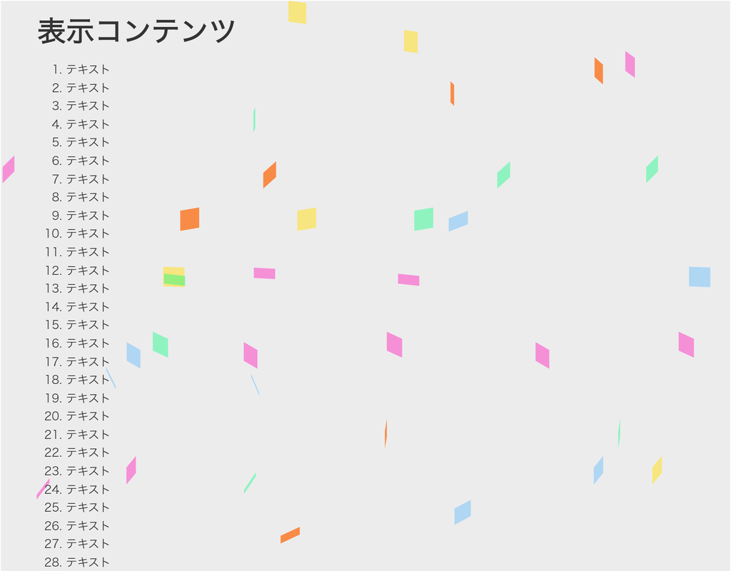
HTML(index.html)
<!DOCTYPE html>
<html lang="ja">
<head>
<meta charset="UTF-8">
<title>パーティクル(CSS)のサンプル</title>
<meta name="viewport" content="width=device-width,initial-scale=1.0,viewport-fit=cover">
<style>
body,div,h1,h2,h3,h4,h5,h6,pre,p,a,select,header,nav,main,section,footer,ul,ol,li,label {
	padding: 0;
	margin: 0;
	font-size: 16px;
	line-height: 1.6;
	word-wrap: break-word;
	box-sizing: border-box;
}
body {
	font-family: "Hiragino Sans W3", "Hiragino Kaku Gothic ProN", "ヒラギノ角ゴ ProN W3", "メイリオ", "Meiryo", "MS Pゴシック", "MS PGothic", sans-serif;
}
.container {
	border: #fff 1px solid;
}
.wrapper {
	max-width: 960px;
	margin: 0 auto;
	padding: 0 20px;
	color: #333;
	background: #00000000;
}
h1 {
	font-size: 2.5rem;
	padding: 10px 0;
}
ol {
	margin-left: 40px;
}

/* ▼▼▼ CSS(ここから)(※2) ▼▼▼ */
/* パーティクル(CSS)の設定 */

/* アニメーション枠指定 */
.back-container {
	width: 100%;
	height: 100vh;
	overflow: hidden;
	position: fixed;
	top: 0;
	left: 0;
	z-index: -1;
	background: #eee;
}
.back-wapper {
	position: absolute;
	width: 100%;
	height: 100%;
	overflow: hidden;
	top: 0;
	left: 0;
	z-index: 1;
}
.back-wapper span {
	position: absolute;
	top: -10%;
	left: 0;
	width: 30px;
	height: 30px;
	background: #FFF;
}
.back-wapper span:nth-child(2n+1) {
	animation: back-anim-1 10s 0s linear infinite;
}
.back-wapper span:nth-child(2n+2) {
	animation: back-anim-2 10s 0s linear infinite;
}
/* position */
.back-wapper span:nth-child(1)  { left:  0%; }
.back-wapper span:nth-child(2)  { left:  2%; }
.back-wapper span:nth-child(3)  { left:  4%; }
.back-wapper span:nth-child(4)  { left:  6%; }
.back-wapper span:nth-child(5)  { left:  8%; }
.back-wapper span:nth-child(6)  { left: 10%; }
.back-wapper span:nth-child(7)  { left: 12%; }
.back-wapper span:nth-child(8)  { left: 14%; }
.back-wapper span:nth-child(9)  { left: 16%; }
.back-wapper span:nth-child(10) { left: 18%; }
.back-wapper span:nth-child(11) { left: 20%; }
.back-wapper span:nth-child(12) { left: 22%; }
.back-wapper span:nth-child(13) { left: 24%; }
.back-wapper span:nth-child(14) { left: 26%; }
.back-wapper span:nth-child(15) { left: 28%; }
.back-wapper span:nth-child(16) { left: 30%; }
.back-wapper span:nth-child(17) { left: 32%; }
.back-wapper span:nth-child(18) { left: 34%; }
.back-wapper span:nth-child(19) { left: 36%; }
.back-wapper span:nth-child(20) { left: 38%; }
.back-wapper span:nth-child(21) { left: 40%; }
.back-wapper span:nth-child(22) { left: 42%; }
.back-wapper span:nth-child(23) { left: 44%; }
.back-wapper span:nth-child(24) { left: 46%; }
.back-wapper span:nth-child(25) { left: 48%; }
.back-wapper span:nth-child(26) { left: 50%; }
.back-wapper span:nth-child(27) { left: 52%; }
.back-wapper span:nth-child(28) { left: 54%; }
.back-wapper span:nth-child(29) { left: 56%; }
.back-wapper span:nth-child(30) { left: 58%; }
.back-wapper span:nth-child(31) { left: 60%; }
.back-wapper span:nth-child(32) { left: 62%; }
.back-wapper span:nth-child(33) { left: 64%; }
.back-wapper span:nth-child(34) { left: 66%; }
.back-wapper span:nth-child(35) { left: 68%; }
.back-wapper span:nth-child(36) { left: 70%; }
.back-wapper span:nth-child(37) { left: 72%; }
.back-wapper span:nth-child(38) { left: 74%; }
.back-wapper span:nth-child(39) { left: 76%; }
.back-wapper span:nth-child(40) { left: 78%; }
.back-wapper span:nth-child(41) { left: 80%; }
.back-wapper span:nth-child(42) { left: 82%; }
.back-wapper span:nth-child(43) { left: 84%; }
.back-wapper span:nth-child(44) { left: 86%; }
.back-wapper span:nth-child(45) { left: 88%; }
.back-wapper span:nth-child(46) { left: 90%; }
.back-wapper span:nth-child(47) { left: 92%; }
.back-wapper span:nth-child(48) { left: 94%; }
.back-wapper span:nth-child(49) { left: 96%; }
.back-wapper span:nth-child(50) { left: 98%; }
/* color */
.back-wapper span:nth-child(5n+1) { background: rgba(255, 49, 193, 0.5); }
.back-wapper span:nth-child(5n+2) { background: rgba(254, 228, 80, 0.7); }
.back-wapper span:nth-child(5n+3) { background: rgba(86, 183, 255, 0.4); }
.back-wapper span:nth-child(5n+4) { background: rgba(255, 98, 0, 0.7); }
.back-wapper span:nth-child(5n+5) { background: rgba(0, 255, 128, 0.4); }
/* animation-duration */
.back-wapper span:nth-child(4n+1) { animation-duration: 5s; }
.back-wapper span:nth-child(4n+2) { animation-duration: 12s; }
.back-wapper span:nth-child(4n+3) { animation-duration: 8s; }
.back-wapper span:nth-child(4n+4) { animation-duration: 6s; }
/* animation-delay */
.back-wapper span:nth-child(11n+1)  { animation-delay:  0s; }
.back-wapper span:nth-child(11n+2)  { animation-delay:  9s; }
.back-wapper span:nth-child(11n+3)  { animation-delay:  2s; }
.back-wapper span:nth-child(11n+4)  { animation-delay:  5s; }
.back-wapper span:nth-child(11n+5)  { animation-delay:  6s; }
.back-wapper span:nth-child(11n+6)  { animation-delay:  7s; }
.back-wapper span:nth-child(11n+7)  { animation-delay:  3s; }
.back-wapper span:nth-child(11n+8)  { animation-delay:  1s; }
.back-wapper span:nth-child(11n+9)  { animation-delay:  2s; }
.back-wapper span:nth-child(11n+10) { animation-delay: 11s; }
.back-wapper span:nth-child(11n+11) { animation-delay: 10s; }
/* animation */
@keyframes back-anim-1 {
	0%   { top: -10%; transform: translateX(0) rotateX(0) rotateY(0); }
	100% { top: 100%; transform: translateX(20vw) rotateX(45deg) rotateY(360deg); }
}
@keyframes back-anim-2 {
	0%   { top: -10%; transform: translateX(0) rotateX(0) rotateY(0) }
	100% { top: 100%; transform: translateX(-30vw) rotateX(120deg) rotateY(360deg); }
}
/* ▲▲▲ CSS(ここまで) ▲▲▲ */
</style>
</head>

<body>

<div class="container">
	<div class="wrapper">
		<h1>表示コンテンツ</h1>
		<ol>
			<li>テキスト</li><li>テキスト</li><li>テキスト</li><li>テキスト</li><li>テキスト</li>	<!-- 01~05行 -->
			<li>テキスト</li><li>テキスト</li><li>テキスト</li><li>テキスト</li><li>テキスト</li>	<!-- 06~10行 -->
			<li>テキスト</li><li>テキスト</li><li>テキスト</li><li>テキスト</li><li>テキスト</li>	<!-- 11~15行 -->
			<li>テキスト</li><li>テキスト</li><li>テキスト</li><li>テキスト</li><li>テキスト</li>	<!-- 16~20行 -->
			<li>テキスト</li><li>テキスト</li><li>テキスト</li><li>テキスト</li><li>テキスト</li>	<!-- 21~25行 -->
			<li>テキスト</li><li>テキスト</li><li>テキスト</li><li>テキスト</li><li>テキスト</li>	<!-- 26~30行 -->
			<li>テキスト</li><li>テキスト</li><li>テキスト</li><li>テキスト</li><li>テキスト</li>	<!-- 31~35行 -->
			<li>テキスト</li><li>テキスト</li><li>テキスト</li><li>テキスト</li><li>テキスト</li>	<!-- 36~40行 -->
			<li>テキスト</li><li>テキスト</li><li>テキスト</li><li>テキスト</li><li>テキスト</li>	<!-- 41~45行 -->
			<li>テキスト</li><li>テキスト</li><li>テキスト</li><li>テキスト</li><li>テキスト</li>	<!-- 46~50行 -->
			<li>テキスト</li><li>テキスト</li><li>テキスト</li><li>テキスト</li><li>テキスト</li>	<!-- 51~55行 -->
			<li>テキスト</li><li>テキスト</li><li>テキスト</li><li>テキスト</li><li>テキスト</li>	<!-- 56~60行 -->
			<li>テキスト</li><li>テキスト</li><li>テキスト</li><li>テキスト</li><li>テキスト</li>	<!-- 61~65行 -->
			<li>テキスト</li><li>テキスト</li><li>テキスト</li><li>テキスト</li><li>テキスト</li>	<!-- 66~70行 -->
		</ol>
	</div>

<!-- ▼▼▼ HTML(ここから) ▼▼▼(※3) -->
<!-- パーティクル(CSS)の定義 -->
	<div class="back-container">
		<div class="back-wapper">
			<span></span><span></span><span></span><span></span><span></span>
			<span></span><span></span><span></span><span></span><span></span>
			<span></span><span></span><span></span><span></span><span></span>
			<span></span><span></span><span></span><span></span><span></span>
			<span></span><span></span><span></span><span></span><span></span>
			<span></span><span></span><span></span><span></span><span></span>
			<span></span><span></span><span></span><span></span><span></span>
			<span></span><span></span><span></span><span></span><span></span>
			<span></span><span></span><span></span><span></span><span></span>
			<span></span><span></span><span></span><span></span><span></span>
		</div>
	</div>
<!-- ▲▲▲ HTML(ここまで) ▲▲▲ -->
</div>

</body>
</html>
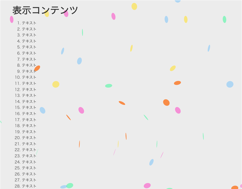
HTML(index.html)
<!DOCTYPE html>
<html lang="ja">
<head>
<meta charset="UTF-8">
<title>パーティクル(CSS)のサンプル</title>
<meta name="viewport" content="width=device-width,initial-scale=1.0,viewport-fit=cover">
<style>
body,div,h1,h2,h3,h4,h5,h6,pre,p,a,select,header,nav,main,section,footer,ul,ol,li,label {
	padding: 0;
	margin: 0;
	font-size: 16px;
	line-height: 1.6;
	word-wrap: break-word;
	box-sizing: border-box;
}
body {
	font-family: "Hiragino Sans W3", "Hiragino Kaku Gothic ProN", "ヒラギノ角ゴ ProN W3", "メイリオ", "Meiryo", "MS Pゴシック", "MS PGothic", sans-serif;
}
.container {
	border: #fff 1px solid;
}
.wrapper {
	max-width: 960px;
	margin: 0 auto;
	padding: 0 20px;
	color: #333;
	background: #00000000;
}
h1 {
	font-size: 2.5rem;
	padding: 10px 0;
}
ol {
	margin-left: 40px;
}

/* ▼▼▼ CSS(ここから)(※2) ▼▼▼ */
/* パーティクル(CSS)の設定 */

/* アニメーション枠指定 */
.back-container {
	width: 100%;
	height: 100vh;
	overflow: hidden;
	position: fixed;
	top: 0;
	left: 0;
	z-index: -1;
	background: #eee;
}
.back-wapper {
	position: absolute;
	width: 100%;
	height: 100%;
	overflow: hidden;
	top: 0;
	left: 0;
	z-index: 1;
}
.back-wapper span {
	position: absolute;
	top: -10%;
	left: 0;
	width: 30px;
	height: 30px;
	border-radius: 15px;
	background: #FFF;
}
.back-wapper span:nth-child(2n+1) {
	animation: back-anim-1 10s 0s linear infinite;
}
.back-wapper span:nth-child(2n+2) {
	animation: back-anim-2 10s 0s linear infinite;
}
/* position */
.back-wapper span:nth-child(1)  { left:  0%; }
.back-wapper span:nth-child(2)  { left:  2%; }
.back-wapper span:nth-child(3)  { left:  4%; }
.back-wapper span:nth-child(4)  { left:  6%; }
.back-wapper span:nth-child(5)  { left:  8%; }
.back-wapper span:nth-child(6)  { left: 10%; }
.back-wapper span:nth-child(7)  { left: 12%; }
.back-wapper span:nth-child(8)  { left: 14%; }
.back-wapper span:nth-child(9)  { left: 16%; }
.back-wapper span:nth-child(10) { left: 18%; }
.back-wapper span:nth-child(11) { left: 20%; }
.back-wapper span:nth-child(12) { left: 22%; }
.back-wapper span:nth-child(13) { left: 24%; }
.back-wapper span:nth-child(14) { left: 26%; }
.back-wapper span:nth-child(15) { left: 28%; }
.back-wapper span:nth-child(16) { left: 30%; }
.back-wapper span:nth-child(17) { left: 32%; }
.back-wapper span:nth-child(18) { left: 34%; }
.back-wapper span:nth-child(19) { left: 36%; }
.back-wapper span:nth-child(20) { left: 38%; }
.back-wapper span:nth-child(21) { left: 40%; }
.back-wapper span:nth-child(22) { left: 42%; }
.back-wapper span:nth-child(23) { left: 44%; }
.back-wapper span:nth-child(24) { left: 46%; }
.back-wapper span:nth-child(25) { left: 48%; }
.back-wapper span:nth-child(26) { left: 50%; }
.back-wapper span:nth-child(27) { left: 52%; }
.back-wapper span:nth-child(28) { left: 54%; }
.back-wapper span:nth-child(29) { left: 56%; }
.back-wapper span:nth-child(30) { left: 58%; }
.back-wapper span:nth-child(31) { left: 60%; }
.back-wapper span:nth-child(32) { left: 62%; }
.back-wapper span:nth-child(33) { left: 64%; }
.back-wapper span:nth-child(34) { left: 66%; }
.back-wapper span:nth-child(35) { left: 68%; }
.back-wapper span:nth-child(36) { left: 70%; }
.back-wapper span:nth-child(37) { left: 72%; }
.back-wapper span:nth-child(38) { left: 74%; }
.back-wapper span:nth-child(39) { left: 76%; }
.back-wapper span:nth-child(40) { left: 78%; }
.back-wapper span:nth-child(41) { left: 80%; }
.back-wapper span:nth-child(42) { left: 82%; }
.back-wapper span:nth-child(43) { left: 84%; }
.back-wapper span:nth-child(44) { left: 86%; }
.back-wapper span:nth-child(45) { left: 88%; }
.back-wapper span:nth-child(46) { left: 90%; }
.back-wapper span:nth-child(47) { left: 92%; }
.back-wapper span:nth-child(48) { left: 94%; }
.back-wapper span:nth-child(49) { left: 96%; }
.back-wapper span:nth-child(50) { left: 98%; }
/* color */
.back-wapper span:nth-child(5n+1) { background: rgba(255, 49, 193, 0.5); }
.back-wapper span:nth-child(5n+2) { background: rgba(254, 228, 80, 0.7); }
.back-wapper span:nth-child(5n+3) { background: rgba(86, 183, 255, 0.4); }
.back-wapper span:nth-child(5n+4) { background: rgba(255, 98, 0, 0.7); }
.back-wapper span:nth-child(5n+5) { background: rgba(0, 255, 128, 0.4); }
/* animation-duration */
.back-wapper span:nth-child(4n+1) { animation-duration: 5s; }
.back-wapper span:nth-child(4n+2) { animation-duration: 12s; }
.back-wapper span:nth-child(4n+3) { animation-duration: 8s; }
.back-wapper span:nth-child(4n+4) { animation-duration: 6s; }
/* animation-delay */
.back-wapper span:nth-child(11n+1)  { animation-delay:  0s; }
.back-wapper span:nth-child(11n+2)  { animation-delay:  9s; }
.back-wapper span:nth-child(11n+3)  { animation-delay:  2s; }
.back-wapper span:nth-child(11n+4)  { animation-delay:  5s; }
.back-wapper span:nth-child(11n+5)  { animation-delay:  6s; }
.back-wapper span:nth-child(11n+6)  { animation-delay:  7s; }
.back-wapper span:nth-child(11n+7)  { animation-delay:  3s; }
.back-wapper span:nth-child(11n+8)  { animation-delay:  1s; }
.back-wapper span:nth-child(11n+9)  { animation-delay:  2s; }
.back-wapper span:nth-child(11n+10) { animation-delay: 11s; }
.back-wapper span:nth-child(11n+11) { animation-delay: 10s; }
/* animation */
@keyframes back-anim-1 {
	0%   { top: -10%; transform: translateX(0) rotateX(0) rotateY(0); }
	100% { top: 100%; transform: translateX(20vw) rotateX(45deg) rotateY(360deg); }
}
@keyframes back-anim-2 {
	0%   { top: -10%; transform: translateX(0) rotateX(0) rotateY(0) }
	100% { top: 100%; transform: translateX(-30vw) rotateX(120deg) rotateY(360deg); }
}
/* ▲▲▲ CSS(ここまで) ▲▲▲ */
</style>
</head>

<body>

<div class="container">
	<div class="wrapper">
		<h1>表示コンテンツ</h1>
		<ol>
			<li>テキスト</li><li>テキスト</li><li>テキスト</li><li>テキスト</li><li>テキスト</li>	<!-- 01~05行 -->
			<li>テキスト</li><li>テキスト</li><li>テキスト</li><li>テキスト</li><li>テキスト</li>	<!-- 06~10行 -->
			<li>テキスト</li><li>テキスト</li><li>テキスト</li><li>テキスト</li><li>テキスト</li>	<!-- 11~15行 -->
			<li>テキスト</li><li>テキスト</li><li>テキスト</li><li>テキスト</li><li>テキスト</li>	<!-- 16~20行 -->
			<li>テキスト</li><li>テキスト</li><li>テキスト</li><li>テキスト</li><li>テキスト</li>	<!-- 21~25行 -->
			<li>テキスト</li><li>テキスト</li><li>テキスト</li><li>テキスト</li><li>テキスト</li>	<!-- 26~30行 -->
			<li>テキスト</li><li>テキスト</li><li>テキスト</li><li>テキスト</li><li>テキスト</li>	<!-- 31~35行 -->
			<li>テキスト</li><li>テキスト</li><li>テキスト</li><li>テキスト</li><li>テキスト</li>	<!-- 36~40行 -->
			<li>テキスト</li><li>テキスト</li><li>テキスト</li><li>テキスト</li><li>テキスト</li>	<!-- 41~45行 -->
			<li>テキスト</li><li>テキスト</li><li>テキスト</li><li>テキスト</li><li>テキスト</li>	<!-- 46~50行 -->
			<li>テキスト</li><li>テキスト</li><li>テキスト</li><li>テキスト</li><li>テキスト</li>	<!-- 51~55行 -->
			<li>テキスト</li><li>テキスト</li><li>テキスト</li><li>テキスト</li><li>テキスト</li>	<!-- 56~60行 -->
			<li>テキスト</li><li>テキスト</li><li>テキスト</li><li>テキスト</li><li>テキスト</li>	<!-- 61~65行 -->
			<li>テキスト</li><li>テキスト</li><li>テキスト</li><li>テキスト</li><li>テキスト</li>	<!-- 66~70行 -->
		</ol>
	</div>

<!-- ▼▼▼ HTML(ここから) ▼▼▼(※3) -->
<!-- パーティクル(CSS)の定義 -->
	<div class="back-container">
		<div class="back-wapper">
			<span></span><span></span><span></span><span></span><span></span>
			<span></span><span></span><span></span><span></span><span></span>
			<span></span><span></span><span></span><span></span><span></span>
			<span></span><span></span><span></span><span></span><span></span>
			<span></span><span></span><span></span><span></span><span></span>
			<span></span><span></span><span></span><span></span><span></span>
			<span></span><span></span><span></span><span></span><span></span>
			<span></span><span></span><span></span><span></span><span></span>
			<span></span><span></span><span></span><span></span><span></span>
			<span></span><span></span><span></span><span></span><span></span>
		</div>
	</div>
<!-- ▲▲▲ HTML(ここまで) ▲▲▲ -->
</div>

</body>
</html>