背景は、ページや部分領域の背景装飾です。
HTML(index.html)
<!DOCTYPE html>
<html lang="ja">
<head>
<meta charset="UTF-8">
<title>ノート風のバックグラウンドのサンプル</title>
<meta name="viewport" content="width=device-width,initial-scale=1.0,viewport-fit=cover">
<style>
body,div,h1,h2,h3,h4,h5,h6,pre,p,a,select,header,nav,main,section,footer,ul,ol,li,label {
padding: 0;
margin: 0;
font-size: 16px;
line-height: 1.6;
word-wrap: break-word;
box-sizing: border-box;
}
body {
font-family: "Hiragino Sans W3", "Hiragino Kaku Gothic ProN", "ヒラギノ角ゴ ProN W3", "メイリオ", "Meiryo", "MS Pゴシック", "MS PGothic", sans-serif;
}
.container {
padding: 10px;
border: #fff 1px solid;
}
/* ▼▼▼ CSS(ここから)(※2) ▼▼▼ */
/* ノート風のバックグラウンドの設定 */
@font-face {
font-family: "KleeOne-Regular";
src: url("fonts/KleeOne-Regular.otf") format("opentype");
}
.wrapper {
max-width: 960px;
margin: 0 auto;
font-family: 'KleeOne-Regular';
overflow: hidden;
}
.wrapper .note {
width: calc(100% - 60px);
padding: 0 15px;
background-color: #faf7f4;
filter: drop-shadow(2px 2px 2px rgba(0,0,0,.3));
float: left;
}
.wrapper .note header {
padding-top: 50px;
position: relative;
}
.wrapper .note header p {
width: 160px;
margin-left: auto;
}
.wrapper .note header p.category {
margin-bottom: 10px;
font-size: 1.5rem;
line-height: 1;
text-align: center;
border-bottom: 1px solid rgba(125,115,107,0.6);
}
.wrapper .note header p.date {
margin-bottom: 4px;
font-size: 1.1rem;
line-height: 1;
}
.wrapper .note header p.date span {
color: rgba(125,115,107,0.6);
font-family: "游明朝", YuMincho, "YuMincho", "Hiragino Mincho ProN W3", "ヒラギノ明朝 ProN W3", "Hiragino Mincho ProN", "HG明朝E", "MS P明朝", "MS 明朝", "Times New Roman", serif;
padding-right: 10px;
}
.wrapper .note header h1 {
font-size: 1.9rem;
line-height: 1;
padding: 5px 15px;
border-top: 2px solid rgba(125,115,107,0.6);
border-bottom: 2px solid rgba(125,115,107,0.6);
position: relative;
}
.wrapper .note header h1::after {
content: '';
width: calc(100% - 30px);
height: 30px;
background: radial-gradient(circle farthest-side, rgba(125,115,107,0.6), rgba(125,115,107,1) 6%, transparent 6%, transparent);
background-size: 30px 30px;
display: inline-block;
position: absolute;
bottom: -18px;
left: 15px;
}
.wrapper .note main {
padding-top: 2rem;
margin-bottom: 50px;
background-image: linear-gradient(to top, rgba(125,115,107,0.2) 1px, transparent 1px);
background-size: 100% 2rem;
position: relative;
}
.wrapper .note main h2 {
margin-left: 10px;
line-height: 2rem;
font-size: 1.4rem;
}
.wrapper .note main p {
margin-left: 10px;
line-height: 2rem;
font-size: 1.2rem;
}
.wrapper .note main div {
padding: 10px;
height: 4rem;
margin-left: 10px;
font-size: 1.2rem;
background: pink;
}
.wrapper .note main ul {
margin-left: 40px;
}
.wrapper .note main ul li {
line-height: 2rem;
font-size: 1.2rem;
}
.wrapper .note main ol {
margin-left: 40px;
}
.wrapper .note main ol li {
line-height: 2rem;
font-size: 1.2rem;
}
.wrapper .note footer {
border-top: 2px solid rgba(125,115,107,0.6);
position: relative;
}
.wrapper .note footer::before {
content: "";
width: calc(100% - 30px);
height: 30px;
background: radial-gradient(circle farthest-side, rgba(125,115,107,0.8), rgba(125,115,107,1) 6%, transparent 6%, transparent);
background-size: 30px 30px;
display: inline-block;
position: absolute;
top: -18px;
left: 15px;
}
.wrapper .note footer p {
padding: 10px 0 15px 0;
text-align: center;
}
.wrapper .note footer p small {
font-size: 1rem;
font-family: "游明朝", YuMincho, "YuMincho", "Hiragino Mincho ProN W3", "ヒラギノ明朝 ProN W3", "Hiragino Mincho ProN", "HG明朝E", "MS P明朝", "MS 明朝", "Times New Roman", serif;
}
.marker {
line-height: 16px;
text-shadow: 1px 0px 3px rgb(0 0 0 / 10%);
background-repeat: no-repeat;
background-position: center center;
background-size: auto 16px;
position: relative;
}
.marker.pink {
background-image: linear-gradient(to bottom,rgba(0,0,0,0) 0,rgba(0,0,0,0) 10%, rgba(242,98,200,0.3) 10%, rgba(242,98,200,0.5) 14%,rgba(242,98,200,0.3) 25%,rgba(242,98,200,0.5) 40%,rgba(242,98,200,0.5) 60%,rgba(242,98,200,0.4) 65%,rgba(242,98,200,0.5) 68%,rgba(242,98,200,0.5) 92%,rgba(242,98,200,0.3) 96%,rgba(0,0,0,0) 100%);
}
.marker.lightblue {
background-image: linear-gradient(to bottom,rgba(0,0,0,0) 0,rgba(0,0,0,0) 10%, rgba(163, 226, 252, 0.5) 10%, rgba(163, 226, 252, 0.7) 14%,rgba(163, 226, 252, 0.4) 25%,rgba(163, 226, 252, 0.7) 40%,rgba(163, 226, 252, 0.7) 60%,rgba(163, 226, 252, 0.4) 65%,rgba(163, 226, 252, 0.7) 68%,rgba(163, 226, 252, 0.7) 92%,rgba(163, 226, 252, 0.5) 96%,rgba(0,0,0,0) 100%);
}
.marker::before,
.marker::after {
display: inline-block;
content: " ";
white-space: pre;
width: 0.3em;
transform-origin: bottom left;
transform: rotate(10deg);
transform: rotate(10deg) translateX(-0.2em);
background-repeat: no-repeat;
background-position: center center;
background-size: auto 16px;
filter: blur(0.05em);
position: relative;
z-index: -2;
}
.marker.pink::before {
background-image: linear-gradient(to bottom,rgba(0,0,0,0) 0,rgba(0,0,0,0) 7%, rgba(242,98,200,0.7) 14%,rgba(242,98,200,0.7) 92%,rgba(0,0,0,0)100%);
}
.marker.pink::after {
background-image: linear-gradient(to bottom,rgba(0,0,0,0) 0,rgba(0,0,0,0) 7%, rgba(242,98,200,0.7) 14%,rgba(242,98,200,0.7) 92%,rgba(0,0,0,0)100%);
}
.marker.lightblue::before {
background-image: linear-gradient(to bottom,rgba(0,0,0,0) 0,rgba(0,0,0,0) 7%, rgba(163, 226, 252,1) 14%,rgba(163, 226, 252,1) 92%,rgba(0,0,0,0)100%);
}
.marker.lightblue::after {
background-image: linear-gradient(to bottom,rgba(0,0,0,0) 0,rgba(0,0,0,0) 7%, rgba(163, 226, 252,1) 14%,rgba(163, 226, 252,1) 92%,rgba(0,0,0,0)100%);
}
.wrapper aside {
width: 60px;
float: left;
position: relative;
z-index: -1;
}
.wrapper aside .label {
width: 75px;
height: 60px;
position: absolute;
margin: 0 0 30px -15px;
padding-top: 15px;
font-size: 1.2rem;
text-align: center;
filter: drop-shadow(2px 2px 3px rgba(0,0,0,.2));
}
.wrapper aside .label.orange {
background: linear-gradient(to top,#fff 0% 75%,#ee652a 75% 100%);
}
.wrapper aside .label.blue {
background: linear-gradient(to top,#fff 0% 75%,#0b86c1 75% 100%);
}
.wrapper aside .label.lime {
background: linear-gradient(to top,#fff 0% 75%,#99EB3E 75% 100%);
}
/* ▲▲▲ CSS(ここまで) ▲▲▲ */
</style>
</head>
<body>
<div class="container">
<!-- ▼▼▼ HTML(ここから)(※3) ▼▼▼ -->
<!-- ノート風のバックグラウンドの定義 -->
<div class="wrapper">
<div class="note">
<header>
<p class="category">分類ABC</p>
<p class="date"><span>Date.</span>2022.01.15</p>
<h1>ノート風のバックグラウンドのサンプル</h1>
</header>
<main>
<h2>ノート風のバックグラウンドのサンプル</h2>
<p><span class="marker pink">ノート風の背景</span>に文章を記述できます。<br><span class="marker lightblue">マーカー</span>も引けます。<br>長い文章を書くとこうなります。あいうえおかきくけこさしすせそたちつてとなにぬねのはひふへほまみむめもやゆよらりるれろわをん。</p>
<ul>
<li>テキスト</li><li>テキスト</li><li>テキスト</li><li>テキスト</li><li>テキスト</li> <!-- 01~05行 -->
<li>テキスト</li><li>テキスト</li><li>テキスト</li><li>テキスト</li><li>テキスト</li> <!-- 06~10行 -->
</ul>
<div>ボックスも作れます。</div>
<ol>
<li>テキスト</li><li>テキスト</li><li>テキスト</li><li>テキスト</li><li>テキスト</li> <!-- 01~05行 -->
<li>テキスト</li><li>テキスト</li><li>テキスト</li><li>テキスト</li><li>テキスト</li> <!-- 06~10行 -->
</ol>
</main>
<footer>
<p><small>© 2022 xxxxxxxxxx.</small></p>
</footer>
</div>
<aside>
<div class="label orange" style="top: 100px; transform: rotate(90deg);">メモ1</div>
<div class="label blue" style="top: 250px; transform: rotate(85deg);">MEMO2</div>
<div class="label lime" style="top: 350px; transform: rotate(95deg);">Memo3</div>
</aside>
</div>
<!-- ▲▲▲ HTML(ここまで) ▲▲▲ -->
</div>
</body>
</html>
 (shadow.png:背景:背景色を lime に設定)
HTML(index.html)
<!DOCTYPE html>
<html lang="ja">
<head>
<meta charset="UTF-8">
<title>バックグラウンドのサンプル</title>
<meta name="viewport" content="width=device-width,initial-scale=1.0,viewport-fit=cover">
<style>
body,div,h1,h2,h3,h4,h5,h6,pre,p,a,select,header,nav,main,section,footer,ul,ol,li,label {
	padding: 0;
	margin: 0;
	font-size: 16px;
	line-height: 1.6;
	word-wrap: break-word;
	box-sizing: border-box;
}
body {
	font-family: "Hiragino Sans W3", "Hiragino Kaku Gothic ProN", "ヒラギノ角ゴ ProN W3", "メイリオ", "Meiryo", "MS Pゴシック", "MS PGothic", sans-serif;
}
.container {
	padding: 10px;
	border: #fff 1px solid;
}
.wrapper {
	max-width: 960px;
	margin: 0 auto;
	text-align: center;
}

/* ▼▼▼ CSS(ここから)(※2) ▼▼▼ */
/* バックグランドの設定 */
.wrap {
	display: inline-block;
	width: 220px;
	margin: 0 auto 10px auto;
	padding: 15px;
    position:relative;
    z-index:0;
    overflow: hidden;
}
.wrap p {
	padding-bottom: 10px;
	font-size: 1.2rem;
	text-align: center;
	color: red;
	font-weight: bold;
	text-shadow: 1px 0px 0px white, 0px 1px 0px white, -1px 0px 0px white, 0px -1px 0px white, 1px 1px 0px white, -1px 1px 0px white, -1px -1px 0px white, 1px -1px 0px white;
	position:relative;
	z-index:0;
}
.wrap div {
	width: 100%;
	margin: 0 auto;
	padding-top: 60px;
	height: 150px;
	background: white;
	text-align: center;
}
.wrap.red {
	background: red;
}
.wrap.blue {
	background: blue;
}
.wrap.red p {
	color: red;
}
.wrap.blue p {
	color: blue;
}
.wrap .shadow{
    height: 320px;
    width: 320px;
    opacity: 0.8;
    text-align: center;
    position:absolute;
    z-index:-1;
    top: -50px;
    left: -50px;
    background-image:url("images/shadow.png");
    background-position:center center, center center;
    background-repeat:repeat, no-repeat;
    animation: spin 20s linear infinite;
}
@keyframes spin {
    0% {transform: rotate(0deg);}
    100% {transform: rotate(360deg);}
}
/* ▲▲▲ CSS(ここまで) ▲▲▲ */
</style>
</head>

<body>

<div class="container">
<!-- ▼▼▼ HTML(ここから)(※3) ▼▼▼ -->
	<!-- バックグランドの定義 -->
	<div class="wrapper">
		<div class="wrap red">
			<p>\ タイトル /</p>
			<div>ボックス</div>
			<span class="shadow"></span>
		</div>
		<div class="wrap blue">
			<p>\ タイトル /</p>
			<div>ボックス</div>
			<span class="shadow"></span>
		</div>
	</div>
<!-- ▲▲▲ HTML(ここまで) ▲▲▲ -->
</div>

</body>
</html>
 (aquamarine-1.png:背景
 (aquamarine-2.png:背景
 (aquamarine-3.png:背景
 (black-1.png:背景
 (black-2.png:背景
 (black-3.png:背景
 (lavender-1.png:背景
 (lavender-2.png:背景
 (lavender-3.png:背景
 (pink-1.png:背景
 (pink-2.png:背景
 (pink-3.png:背景
 (silver-1.png:背景
 (silver-2.png:背景
 (silver-3.png:背景
 (transparent-1.png:背景:背景色を red に設定)
 (transparent-2.png:背景:背景色を red に設定)
 (transparent-3.png:背景:背景色を red に設定)
HTML(index.html)
<!DOCTYPE html>
<html lang="ja">
<head>
<meta charset="UTF-8">
<title>背景のサンプル</title>
<meta name="viewport" content="width=device-width,initial-scale=1.0,viewport-fit=cover">
<style>
body,div,h1,h2,h3,h4,h5,h6,pre,p,a,select,header,nav,main,section,footer,ul,ol,li,label {
	padding: 0;
	margin: 0;
	font-size: 16px;
	line-height: 1.6;
	word-wrap: break-word;
	box-sizing: border-box;
}
body {
	font-family: "Hiragino Sans W3", "Hiragino Kaku Gothic ProN", "ヒラギノ角ゴ ProN W3", "メイリオ", "Meiryo", "MS Pゴシック", "MS PGothic", sans-serif;
}
.container {
	padding: 10px;
	border: #fff 1px solid;
}
.wrapper {
	max-width: 760px;
	margin: 0 auto;
	overflow: hidden;
}
.wrapper div {
	float: left;
	width: 240px;
	height: 128px;
	margin: 5px;
	border: 1px #ccc solid;
	text-align: center;
}
@media screen and (max-width: 760px) {
	.wrapper div {
		width: 128px;
	}
}

/* ▼▼▼ CSS(ここから/使用するCSSを選択してコピーしてください)(※2) ▼▼▼ */
/* 背景の設定 */
.aquamarine-1 {
	background: url("images/aquamarine-1.png");
}
.aquamarine-2 {
	background: url("images/aquamarine-2.png");
}
.aquamarine-3 {
	background: url("images/aquamarine-3.png");
}
.black-1 {
	background: url("images/black-1.png");
}
.black-2 {
	background: url("images/black-2.png");
}
.black-3 {
	background: url("images/black-3.png");
}
.lavender-1 {
	background: url("images/lavender-1.png");
}
.lavender-2 {
	background: url("images/lavender-2.png");
}
.lavender-3 {
	background: url("images/lavender-3.png");
}
.pink-1 {
	background: url("images/pink-1.png");
}
.pink-2 {
	background: url("images/pink-2.png");
}
.pink-3 {
	background: url("images/pink-3.png");
}
.silver-1 {
	background: url("images/silver-1.png");
}
.silver-2 {
	background: url("images/silver-2.png");
}
.silver-3 {
	background: url("images/silver-3.png");
}
.transparent-11 {
	background: url("images/transparent-1.png") red;
}
.transparent-12 {
	background: url("images/transparent-2.png") red;
}
.transparent-13 {
	background: url("images/transparent-3.png") red;
}
.transparent-21 {
	background: url("images/transparent-1.png") lime;
}
.transparent-22 {
	background: url("images/transparent-2.png") lime;
}
.transparent-23 {
	background: url("images/transparent-3.png") lime;
}
.transparent-31 {
	background: url("images/transparent-1.png") blue;
}
.transparent-32 {
	background: url("images/transparent-2.png") blue;
}
.transparent-33 {
	background: url("images/transparent-3.png") blue;
}

/* ▲▲▲ CSS(ここまで) ▲▲▲ */
</style>
</head>

<body>

<div class="container">
<!-- ▼▼▼ HTML(ここから/使用するHTMLを選択してコピーしてください)(※3) ▼▼▼ -->
	<!-- 背景の定義 -->
	<div class="wrapper">
		<div class="aquamarine-1">aquamarine-1<br>細い線</div>
		<div class="aquamarine-2">aquamarine-2<br>太めの線</div>
		<div class="aquamarine-3">aquamarine-3<br>格子</div>
		<div class="black-1">black-1<br>細い線</div>
		<div class="black-2">black-2<br>太めの線</div>
		<div class="black-3">black-3<br>格子</div>
		<div class="lavender-1">lavender-1<br>細い線</div>
		<div class="lavender-2">lavender-2<br>太めの線</div>
		<div class="lavender-3">lavender-3<br>格子</div>
		<div class="pink-1">pink-1<br>細い線</div>
		<div class="pink-2">pink-2<br>太めの線</div>
		<div class="pink-3">pink-3<br>格子</div>
		<div class="silver-1">silver-1<br>細い線</div>
		<div class="silver-2">silver-2<br>太めの線</div>
		<div class="silver-3">silver-3<br>格子</div>
		<div class="transparent-11">transparent-1<br>細い線<br>背景:red</div>
		<div class="transparent-12">transparent-2<br>太めの線<br>背景:red</div>
		<div class="transparent-13">transparent-3<br>格子<br>背景:red</div>
		<div class="transparent-21">transparent-1<br>細い線<br>背景:lime</div>
		<div class="transparent-22">transparent-2<br>太めの線<br>背景:lime</div>
		<div class="transparent-23">transparent-3<br>格子<br>背景:lime</div>
		<div class="transparent-31">transparent-1<br>細い線<br>背景:blue</div>
		<div class="transparent-32">transparent-2<br>太めの線<br>背景:blue</div>
		<div class="transparent-33">transparent-3<br>格子<br>背景:blue</div>
	</div>
<!-- ▲▲▲ HTML(ここまで) ▲▲▲ -->
</div>

</body>
</html>
HTML(index.html)
<!DOCTYPE html>
<html lang="ja">
<head>
<meta charset="UTF-8">
<title>きらりと光が流れる</title>
<meta name="viewport" content="width=device-width,initial-scale=1.0,viewport-fit=cover">
<style>
* {
	padding: 0;
	margin: 0;
	word-wrap: break-word;
	box-sizing: border-box;
}
body {
	font-family: "Hiragino Sans W3", "Hiragino Kaku Gothic ProN", "ヒラギノ角ゴ ProN W3", "メイリオ", "Meiryo", "MS Pゴシック", "MS PGothic", sans-serif;
}
.container {
	padding: 10px;
	border: #fff 1px solid;
}
.wrapper {
	max-width: 760px;
	margin: 0 auto;
}
a {
	color: #333;
	text-decoration: none;
}

/* ▼▼▼ CSS(ここから/使用するCSSを選択してコピーしてください)(※2) ▼▼▼ */
/* ▼▼▼ CSS(ここから)(※2) ▼▼▼ */
/* きらりと光が流れる設定 */
.btn {
	padding-bottom: 20px;
	display: flex;
	justify-content: space-between;
}
.btn div {
	width: 30%;
	border-radius: 24px;
}
.btn div.c1 {
	background: red;
}
.btn div.c2 {
	background: green;
}
.btn div.c3 {
	background: blue;
}
.btn div a {
	display: block;
	font-size: 1.8rem;
	text-align: center;
	color: #fff;
}
.img img {
	width: 100%;
}
.shine {
	position: relative;
	overflow: hidden;
}
.shine::before {
	content:"";
	position: absolute;
	width: 50%;
	height: 100%;
	top: 0;
	left: -75%;
	background: linear-gradient(to right, #ffffff00, #ffffff80);
	transform: skewX(-25deg);
}
.shine:hover::before {
	animation: shine 0.6s;
}
@keyframes shine {
	100% {
		left: 125%;
	}
}
/* ▲▲▲ CSS(ここまで) ▲▲▲ */
</style>
</head>

<body>

<div class="container">
<!-- ▼▼▼ HTML(ここから/使用するHTMLを選択してコピーしてください)(※3) ▼▼▼ -->
<!-- ▼▼▼ HTML(ここから) ▼▼▼(※3) -->
	<!--きらりと光が流れる定義 -->
	<div class="wrapper">
		<div class="btn">
			<div class="shine c1"><a href="#">ボタン</a></div>
			<div class="shine c2"><a href="#">ボタン</a></div>
			<div class="shine c3"><a href="#">ボタン</a></div>
		</div>
		<div class="shine img"><a href="#"><img src="images/sample-1920x1080-10.jpg" alt="サンプル画像"></a></div>
		<div class="shine img"><a href="#"><img src="images/sample-1920x1080-11.jpg" alt="サンプル画像"></a></div>
	</div>
<!-- ▲▲▲ HTML(ここまで) ▲▲▲ -->
</div>

</body>
</html>
HTML(index.html)
<!DOCTYPE html>
<html lang="ja">
<head>
<meta charset="UTF-8">
<title>きらりと光が流れる</title>
<meta name="viewport" content="width=device-width,initial-scale=1.0,viewport-fit=cover">
<style>
* {
	padding: 0;
	margin: 0;
	word-wrap: break-word;
	box-sizing: border-box;
}
body {
	font-family: "Hiragino Sans W3", "Hiragino Kaku Gothic ProN", "ヒラギノ角ゴ ProN W3", "メイリオ", "Meiryo", "MS Pゴシック", "MS PGothic", sans-serif;
}
.container {
	padding: 10px;
	border: #fff 1px solid;
}
.wrapper {
	max-width: 760px;
	margin: 0 auto;
}
a {
	color: #333;
	text-decoration: none;
}

/* ▼▼▼ CSS(ここから/使用するCSSを選択してコピーしてください)(※2) ▼▼▼ */
/* ▼▼▼ CSS(ここから)(※2) ▼▼▼ */
/* きらりと光が流れる設定 */
.btn {
	padding-bottom: 20px;
	display: flex;
	justify-content: space-between;
}
.btn div {
	width: 30%;
	border-radius: 24px;
}
.btn div.c1 {
	background: red;
}
.btn div.c2 {
	background: green;
}
.btn div.c3 {
	background: blue;
}
.btn div a {
	display: block;
	font-size: 1.8rem;
	text-align: center;
	color: #fff;
}
.img img {
	width: 100%;
}
.shine {
	position: relative;
	overflow: hidden;
}
.shine::before {
	content:"";
	width: 100%;
	height: 100%;
	transform: scale(0);
	opacity: 0;
	border-radius: 50%;
	background: #ffffff60;
	position: absolute;
}
.shine:hover::before {
	animation: shine 1.2s;
}
@keyframes shine {
	0% {
		transform: scale(0);
		opacity: 1;
	}
	30% {
		opacity: 1;
	}
	100% {
		transform: scale(2);
	}
}
/* ▲▲▲ CSS(ここまで) ▲▲▲ */
</style>
</head>

<body>

<div class="container">
<!-- ▼▼▼ HTML(ここから/使用するHTMLを選択してコピーしてください)(※3) ▼▼▼ -->
<!-- ▼▼▼ HTML(ここから) ▼▼▼(※3) -->
	<!--きらりと光が流れる定義 -->
	<div class="wrapper">
		<div class="btn">
			<div class="shine c1"><a href="#">ボタン</a></div>
			<div class="shine c2"><a href="#">ボタン</a></div>
			<div class="shine c3"><a href="#">ボタン</a></div>
		</div>
		<div class="shine img"><a href="#"><img src="images/sample-1920x1080-10.jpg" alt="サンプル画像"></a></div>
		<div class="shine img"><a href="#"><img src="images/sample-1920x1080-11.jpg" alt="サンプル画像"></a></div>
	</div>
<!-- ▲▲▲ HTML(ここまで) ▲▲▲ -->
</div>

</body>
</html>
HTML(index.html)
<!DOCTYPE html>
<html lang="ja">
<head>
<meta charset="UTF-8">
<title>背景(流れ星)のサンプル</title>
<meta name="viewport" content="width=device-width,initial-scale=1.0,viewport-fit=cover">
<style>
body,div,h1,h2,h3,h4,h5,h6,pre,p,a,select,header,nav,main,section,footer,ul,li {
	padding: 0;
	margin: 0;
	font-size: 16px;
	line-height: 1.6;
	word-wrap: break-word;
	box-sizing: border-box;
}
body {
	font-family: "Hiragino Sans W3", "Hiragino Kaku Gothic ProN", "ヒラギノ角ゴ ProN W3", "メイリオ", "Meiryo", "MS Pゴシック", "MS PGothic", sans-serif;
}
.container {
	padding: 10px;
	border: #fff 1px solid;
}

/* ▼▼▼ CSS(ここから)(※2) ▼▼▼ */
/* 背景(流れ星)の設定 */
.wrapper {								/* 星空の枠 */
	width: 100%;
	height: 200px;
	background: rgb(93,96,115);
	background: linear-gradient(0deg, rgba(93,96,115,1) 0%, rgba(6,8,14,1) 100%);
	position: relative;
	overflow: hidden;
}
svg {
	vertical-align: top;
}
@keyframes star-key1 {					/* 時計回りの星 */
	0% {
		transform: rotate(0deg);
	}
	100% {
		transform: rotate(360deg);
	}
}
@keyframes star-key2 {					/* 反時計回りの星 */
	0% {
		transform: rotate(0deg);
	}
	100% {
		transform: rotate(-360deg);
	}
}
@keyframes star-key3 {					/* 流れ星 */
	0% {
		transform: rotate(0deg);
		top: -20px;
		left: 20%;
		width: 12px;
		height: 12px;
	}
	100% {
		transform: rotate(720deg);
		top: 100%;
		leFt: 90%;
		width: 30px;
		height: 30px;
	}
}
@keyframes mes-key1 {					/* 左下のメッセージ */
	0% {
		opacity: 0;
	}
	20% {
		opacity: 0;
	}
	100% {
		opacity: 1;
	}
}
.star01 {								/* 星-01 */
	position: absolute;
	top: 20%;
	left: 10%;
	width: 20px;
	height: 20px;
	animation: star-key2 8s linear 0s infinite;
}
.star02 {								/* 星-02 */
	position: absolute;
	top: 50%;
	left: 15%;
	width: 14px;
	height: 14px;
	animation: star-key1 4s linear 0s infinite;
}
.star03 {								/* 星-03 */
	position: absolute;
	top: 40%;
	left: 20%;
	width: 16px;
	height: 16px;
	animation: star-key2 10s linear 0s infinite;
}
.star04 {								/* 星-04 */
	position: absolute;
	top: 30%;
	left: 40%;
	width: 16px;
	height: 16px;
	animation: star-key1 4s linear 0s infinite;
}
.star05 {								/* 星-05 */
	position: absolute;
	top: 70%;
	left: 50%;
	width: 16px;
	height: 16px;
	animation: star-key2 4s linear 0s infinite;
}
.star06 {								/* 星-06 */
	position: absolute;
	top: 20%;
	left: 70%;
	width: 20px;
	height: 20px;
	animation: star-key1 8s linear 0s infinite;
}
.star07 {								/* 星-07 */
	position: absolute;
	top: 80%;
	left: 80%;
	width: 10px;
	height: 10px;
	animation: star-key1 2s linear 0s infinite;
}
.star08 {								/* 星-08 */
	position: absolute;
	top: 20%;
	left: 85%;
	width: 14px;
	height: 14px;
	animation: star-key1 4s linear 0s infinite;
}
.star09 {								/* 星-09 */
	position: absolute;
	top: 50%;
	left: 90%;
	width: 12px;
	height: 12px;
	animation: star-key2 6s linear 0s infinite;
}
.star10 {								/* 流れ星 */
	position: absolute;
	top: -20px;
	left: 20%;
	width: 12px;
	height:12px;
	animation: star-key3 10s ease-in 0s infinite;
}
.mes {
	position: absolute;
	bottom: 10px;
	left: 20px;
	color: #fff;
	font-size: 1.4rem;
	animation: mes-key1 10s ease-in 0s infinite;
}
/* ▲▲▲ CSS(ここまで) ▲▲▲ */
</style>
</head>

<body>

<div class="container">
	<!-- 背景(流れ星)の定義 -->
<!-- ▼▼▼ HTML(ここから)(※3) ▼▼▼ -->
	<div class="wrapper">
		<div class="star01">
			<svg viewbox="0 0 94 94"><polygon points="47,0 17,94 92,34 2,34 77,94" style="fill: #CC0;"></svg>
		</div>
		<div class="star02">
			<svg viewbox="0 0 94 94"><polygon points="47,0 17,94 92,34 2,34 77,94" style="fill: #CC0;"></svg>
		</div>
		<div class="star03">
			<svg viewbox="0 0 94 94"><polygon points="47,0 17,94 92,34 2,34 77,94" style="fill: #CC0;"></svg>
		</div>
		<div class="star04">
			<svg viewbox="0 0 94 94"><polygon points="47,0 17,94 92,34 2,34 77,94" style="fill: #CC0;"></svg>
		</div>
		<div class="star05">
			<svg viewbox="0 0 94 94"><polygon points="47,0 17,94 92,34 2,34 77,94" style="fill: #CC0;"></svg>
		</div>
		<div class="star06">
			<svg viewbox="0 0 94 94"><polygon points="47,0 17,94 92,34 2,34 77,94" style="fill: #CC0;"></svg>
		</div>
		<div class="star07">
			<svg viewbox="0 0 94 94"><polygon points="47,0 17,94 92,34 2,34 77,94" style="fill: #CC0;"></svg>
		</div>
		<div class="star08">
			<svg viewbox="0 0 94 94"><polygon points="47,0 17,94 92,34 2,34 77,94" style="fill: #CC0;"></svg>
		</div>
		<div class="star09">
			<svg viewbox="0 0 94 94"><polygon points="47,0 17,94 92,34 2,34 77,94" style="fill: #CC0;"></svg>
		</div>
		<div class="star10">
			<svg viewbox="0 0 94 94"><polygon points="47,0 17,94 92,34 2,34 77,94" style="fill: #CC0;"></svg>
		</div>
		<p class="mes">流れ星に願いを!</p>
	</div>
<!-- ▲▲▲ HTML(ここまで) ▲▲▲ -->
</div>

</body>
</html>
 (konbu1.png:昆布 その1)
 (konbu2.png:昆布 その2)
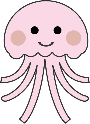 (kurage1.png:クラゲ)
HTML(index.html)
<!DOCTYPE html>
<html lang="ja">
<head>
<meta charset="UTF-8">
<title>背景(クラゲの散歩)のサンプル</title>
<meta name="viewport" content="width=device-width,initial-scale=1.0,viewport-fit=cover">
<style>
body,div,h1,h2,h3,h4,h5,h6,pre,p,a,select,header,nav,main,section,footer,ul,li {
	padding: 0;
	margin: 0;
	font-size: 16px;
	line-height: 1.6;
	word-wrap: break-word;
	box-sizing: border-box;
}
body {
	font-family: "Hiragino Sans W3", "Hiragino Kaku Gothic ProN", "ヒラギノ角ゴ ProN W3", "メイリオ", "Meiryo", "MS Pゴシック", "MS PGothic", sans-serif;
}
.container {
	padding: 10px;
	border: #fff 1px solid;
}
img {
	width: 100%;
}

/* ▼▼▼ CSS(ここから)(※2) ▼▼▼ */
/* 背景(クラゲの散歩)の設定 */
.wrapper {
	width: 100%;
	height: 200px;
	background: rgb(0,0,36);
	background: linear-gradient(0deg, rgb(0,0,36) 0%, rgb(9,77,121) 60%, rgb(0,212,255) 100%);
	position: relative;
	overflow: hidden;
}
@keyframes kurage-key1 {				/* クラゲのアニメーション */
	0% {
		top: 0%;
		left: -70px;
		transform: scale(0.9, 1.1);
	}
	10% {
		top: 10%;
		left: 0%;
		transform: scale(1.1, 0.9);
	}
	20% {
		top: 20%;
		left: 11%;
		transform: scale(0.9, 1.1);
	}
	30% {
		top: 10%;
		left: 22%;
		transform: scale(1.1, 0.9);
	}
	40% {
		top: 40%;
		left: 33%;
		transform: scale(0.9, 1.1);
	}
	50% {
		top: 20%;
		left: 44%;
		transform: scale(1.1, 0.9);
	}
	60% {
		top: 5%;
		left: 55%;
		transform: scale(0.9, 1.1);
	}
	70% {
		top: 20%;
		left: 66%;
		transform: scale(1.1, 0.9);
	}
	80% {
		top: 30%;
		left: 77%;
		transform: scale(0.9, 1.1);
	}
	90% {
		top: 20%;
		left: 88%;
		transform: scale(1.1, 0.9);
	}
	100% {
		top: 10%;
		left: 100%;
		transform: scale(0.9, 1.1);
	}
}
.kurage01 {								/* クラゲ */
	position: absolute;
	top: 20px;
	left: 20px;
	width: 70px;
	animation: kurage-key1 20s linear 0s infinite;
}
@keyframes konbu-key1 {					/* 昆布アニメーション */
	from {
		transform: rotate(-15deg);
	}
	to {
		transform: rotate(15deg);
	}
}
.konbu01 {								/* 昆布	1 */
	position: absolute;
	bottom: 0px;
	right: 25%;
	width: 25px;
	transform-origin: 50% bottom;
	animation: konbu-key1 3s linear 0s alternate infinite;
}
.konbu02 {								/* 昆布2 */
	position: absolute;
	bottom: 0px;
	right: 22%;
	width: 20px;
	transform-origin: 50% bottom;
	animation: konbu-key1 3s linear 0s alternate infinite;
}
.konbu03 {								/* 昆布3 */
	position: absolute;
	bottom: 0px;
	right: 19%;
	width: 20px;
	transform-origin: 50% bottom;
	animation: konbu-key1 3s linear 0s alternate infinite;
}
.konbu04 {								/* 昆布4 */
	position: absolute;
	bottom: 0px;
	right: 16%;
	width: 25px;
	transform-origin: 50% bottom;
	animation: konbu-key1 3s linear 0s alternate infinite;
}
@keyframes bubble-key1 {				/* 泡1 */
	from {
		bottom: -1%;
	}
	to {
		bottom: 105%;
	}
}
.bubble01 {
	position: absolute;
	right: 24%;
	width: 12px;
	height: 12px;
	background: #fff;
	border-radius: 50%;
	animation: bubble-key1 5s linear 0s infinite;
}
@keyframes bubble-key2 {				/* 泡2 */
	from {
		bottom: -5%;
	}
	to {
		bottom: 101%;
	}
}
.bubble02 {
	position: absolute;
	right: 21%;
	width: 7px;
	height: 7px;
	background: #fff;
	border-radius: 50%;
	animation: bubble-key2 5s linear 0s infinite;
}
@keyframes bubble-key3 {				/* 泡3 */
	from {
		bottom: -2%;
	}
	to {
		bottom: 104%;
	}
}
.bubble03 {
	position: absolute;
	right: 19%;
	width: 10px;
	height: 10px;
	background: #fff;
	border-radius: 50%;
	animation: bubble-key3 5s linear 0s infinite;
}
@keyframes mes-key1 {					/* メッセージ */
	0% {
		opacity: 0;
	}
	20% {
		opacity: 0;
	}
	100% {
		opacity: 1;
	}
}
.mes {
	position: absolute;
	bottom: 10px;
	left: 20px;
	color: #fff;
	font-size: 1.4rem;
	animation: mes-key1 20s ease-in 0s infinite;
}
/* ▲▲▲ CSS(ここまで) ▲▲▲ */
</style>
</head>

<body>

<div class="container">
<!-- ▼▼▼ HTML(ここから)(※3) ▼▼▼ -->
	<!-- 背景(クラゲの散歩)の定義 -->
	<div class="wrapper">
		<div class="konbu01"><img src="images/konbu1.png" alt="昆布1"></div>
		<div class="konbu02"><img src="images/konbu2.png" alt="昆布2"></div>
		<div class="konbu03"><img src="images/konbu1.png" alt="昆布3"></div>
		<div class="konbu04"><img src="images/konbu2.png" alt="昆布4"></div>
		<div class="bubble01"></div>
		<div class="bubble02"></div>
		<div class="bubble03"></div>
		<div class="kurage01"><img src="images/kurage1.png" alt="クラゲ"></div>
		<div class="kurage01"><img src="images/kurage1.png" alt="クラゲ"></div>
		<p class="mes">クラゲの海中散歩</p>
	</div>
<!-- ▲▲▲ HTML(ここまで) ▲▲▲ -->
</div>

</body>
</html>